Tailwind SVG Icons: Style SVG Icons with HTML & Tailwind CSS
Hey there, fellow coders!
If you’ve ever wanted to make your web projects truly shine, you’re in the perfect spot. Today, we’re diving deep into Tailwind SVG Icons. We will learn to integrate and style scalable vector graphics with the power of Tailwind CSS. Get ready to add some visual magic to your sites!
What We Are Building: Awesome Tailwind SVG Icons!
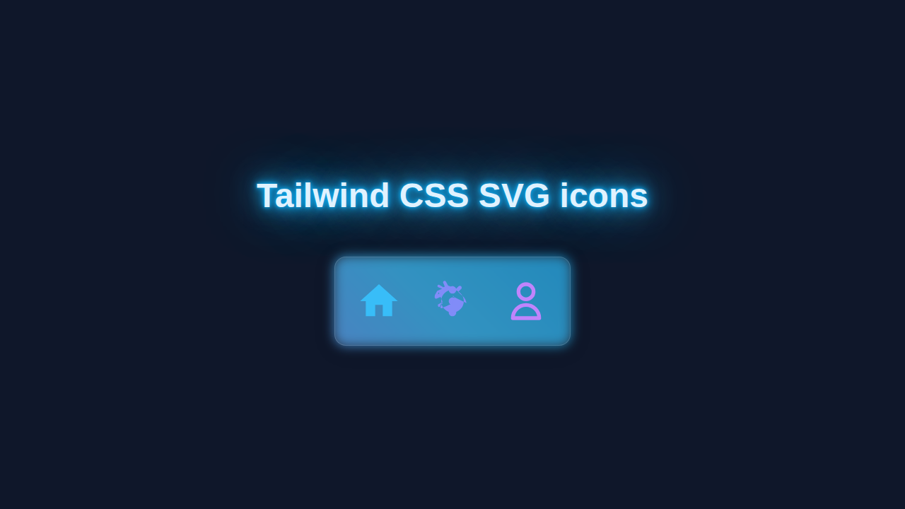
We’re going to build a small, engaging UI component. This component will feature several beautiful SVG icons. They will be styled dynamically with Tailwind CSS. Imagine a stylish social media button group. Or maybe a clear, icon-driven feature list. Our goal is dynamic and responsive icon styling. This project is super useful for any modern website. You’ll grasp the core techniques quickly.
HTML Structure for Our Tailwind SVG Icons
First, let’s lay down the HTML foundation. We’ll use simple div elements and svg tags. Each icon will live inside its own container. This makes styling a breeze with Tailwind. Here is the cool part, the SVG code is directly embedded!
index.html
<!DOCTYPE html>
<html lang="en">
<head>
    <meta charset="UTF-8">
    <meta name="viewport" content="width=device-width, initial-scale=1.0">
    <title>Tailwind CSS SVG Icons Tutorial</title>
    <!-- Link to Tailwind CSS CDN for easy setup -->
    <script src="https://cdn.tailwindcss.com"></script>
    <!-- Optional: Link to your custom styles.css for any non-Tailwind specific styles -->
    <link rel="stylesheet" href="styles.css">
</head>
<body class="bg-gray-100 flex items-center justify-center min-h-screen p-4 font-sans antialiased box-border">

    <div class="bg-white p-8 rounded-lg shadow-xl max-w-2xl w-full text-center overflow-hidden">
        <h1 class="text-3xl font-bold text-gray-800 mb-6">Styling SVG Icons with Tailwind CSS</h1>
        <p class="text-gray-600 mb-8">
            Easily integrate and style SVG icons directly in your HTML using Tailwind's utility classes.
            Below are examples demonstrating how to control size, color, and add hover effects.
        </p>

        <div class="flex flex-wrap justify-center items-center gap-10">

            <!-- Example 1: Basic Filled Icon -->
            <div class="flex flex-col items-center">
                <p class="text-gray-700 text-lg font-medium mb-2">Home Icon (Filled)</p>
                <!--
                    Use 'w-' and 'h-' classes for width and height.
                    'text-blue-500' sets the fill color because 'fill="currentColor"' is present on the SVG.
                    'hover:text-blue-700' provides a color change on hover.
                    'transition-colors duration-200' adds a smooth animation to the color change.
                -->
                <svg class="w-12 h-12 text-blue-500 hover:text-blue-700 transition-colors duration-200"
                     fill="currentColor" viewBox="0 0 24 24" xmlns="http://www.w3.org/2000/svg">
                    <path d="M10 20v-6h4v6h5v-8h3L12 3 2 12h3v8z"/>
                </svg>
                <code class="mt-4 text-sm text-gray-500">w-12 h-12 text-blue-500</code>
            </div>

            <!-- Example 2: Outlined Icon with Stroke -->
            <div class="flex flex-col items-center">
                <p class="text-gray-700 text-lg font-medium mb-2">User Icon (Outlined)</p>
                <!--
                    For outlined SVGs, use 'stroke="currentColor"' or the 'stroke-current' Tailwind class
                    to make the stroke color controllable by Tailwind's 'text-' classes.
                    'fill="none"' ensures the interior of the icon is transparent.
                -->
                <svg class="w-16 h-16 text-purple-600 hover:text-purple-800 transition-colors duration-200 stroke-current"
                     fill="none" viewBox="0 0 24 24" xmlns="http://www.w3.org/2000/svg">
                    <path stroke-linecap="round" stroke-linejoin="round" stroke-width="2" d="M16 7a4 4 0 11-8 0 4 4 0 018 0zM12 14a7 7 0 00-7 7h14a7 7 0 00-7-7z"/>
                </svg>
                <code class="mt-4 text-sm text-gray-500">w-16 h-16 text-purple-600 stroke-current</code>
            </div>

            <!-- Example 3: Different Size and Color -->
            <div class="flex flex-col items-center">
                <p class="text-gray-700 text-lg font-medium mb-2">Settings Icon (Large)</p>
                <svg class="w-20 h-20 text-green-500 hover:text-green-700 transition-colors duration-200"
                     fill="currentColor" viewBox="0 0 24 24" xmlns="http://www.w3.org/2000/svg">
                    <path d="M12 8c1.1 0 2-.9 2-2s-.9-2-2-2-2 .9-2 2 .9 2 2 2zm0 2c-1.1 0-2 .9-2 2s.9 2 2 2 2-.9 2-2-.9-2-2-2zm0 6c-1.1 0-2 .9-2 2s.9 2 2 2 2-.9 2-2-.9-2-2-2z"/>
                    <path d="M19.4 12.99c-.06-.3-.12-.59-.2-.88-.42-1.46-1.39-2.73-2.7-3.62L15 7.1l1.6-1.6c.39-.39.39-1.02 0-1.41-.39-.39-1.02-.39-1.41 0l-1.6 1.6-1.29-.87c-.88-.42-1.75-.8-2.61-1.1l-1.2-2.1c-.2-.35-.6-.47-1-.31-.4.15-.6.54-.45.94l.87 2.1c-.26.08-.52.17-.78.27l-2.1-1.2c-.35-.2-.74-.15-.94.25-.15.4-.05.8.3.94l2.1.87c-.88.42-1.75.8-2.61 1.1l-1.2 2.1c-.2.35-.15.75.25.94.4.15.8.05.94-.3l.87-2.1c.08.26.17.52.27.78l-2.1 1.2c-.35-.2-.47.6-.31 1 .15.4.54.6.94.45l2.1-.87c.42.88.8 1.75 1.1 2.61l-2.1 1.2c-.35-.2-.47.6-.31 1 .15.4.54.6.94.45l.87-2.1c.26-.08.52-.17.78-.27l-1.2 2.1c-.2.35-.15.75.25.94.4.15.8.05.94-.3l2.1-.87c.88-.42 1.75-.8 2.61-1.1l1.2-2.1c.2-.35.15-.75-.25-.94-.4-.15-.8-.05-.94.3l-.87 2.1c-.08-.26-.17-.52-.27-.78l2.1-1.2c.35-.2.47-.6.31-1-.15-.4-.54-.6-.94-.45zM12 18c-3.31 0-6-2.69-6-6s2.69-6 6-6 6 2.69 6 6-2.69 6-6 6z"/>
                </svg>
                <code class="mt-4 text-sm text-gray-500">w-20 h-20 text-green-500</code>
            </div>

        </div>

        <p class="text-gray-600 mt-8">
            <strong>Key takeaway:</strong> For <code><svg></code> elements, when you set <code>fill="currentColor"</code>
            or <code>stroke="currentColor"</code> on the SVG or its child <code><path></code> elements,
            Tailwind's <code>text-<color></code> utility classes will directly control that attribute.
            Alternatively, you can use the dedicated Tailwind classes <code>fill-current</code> and <code>stroke-current</code>.
        </p>
    </div>

</body>
</html>
CSS Styling with Tailwind CSS for SVG Icons
Now for the fun part: styling! We’ll use Tailwind CSS utility classes directly in our HTML. This approach keeps our CSS lean and focused. We will control size, color, and even hover effects. It’s incredibly powerful and efficient. You will see how simple it is!
styles.css
/*
 * styles.css
 *
 * This file is intended for any custom CSS that is not directly handled by Tailwind CSS utility classes.
 * For this specific tutorial, all styling for the SVG icons and their container is managed by Tailwind CSS
 * directly within the `index.html` file using utility classes.
 *
 * You would typically use this file for:
 * - Global custom font imports (if not using safe fonts or a build process).
 * - Complex custom component styles that are difficult to express with utility classes alone.
 * - Overriding default browser styles not covered by Tailwind's Preflight.
 *
 * For this tutorial, it remains intentionally empty as all styling is utility-first.
 */
How It All Works Together: Mastering Tailwind SVG Icons
Let’s break down the magic behind this setup. Combining SVG’s inherent flexibility with Tailwind’s utility-first approach is fantastic. You get powerful, maintainable, and highly customizable icons. Here’s a closer look at each step.
Embedding SVGs Directly
We’re embedding the SVG code right into our HTML. This is an excellent method for many reasons. It gives us total control over the icon’s properties. We can manipulate its fill, stroke, and size. Plus, there are no extra HTTP requests. This improves page load speed significantly. You can find many free SVG icons online. For instance, learn more about the SVG element on MDN. Furthermore, sites like Heroicons offer easy-to-copy SVG code snippets. This makes implementation very fast.
“Direct SVG embedding means peak performance and ultimate styling flexibility. It’s a game-changer for custom UIs!”
Tailwind CSS Utility Classes
Tailwind CSS is our styling superpower. We apply classes like w-6, h-6, text-blue-500, and hover:text-blue-700. These classes control the icon’s dimensions and color. The hover: prefix creates interactive effects. This makes our icons dynamic. Remember our Tailwind Dashboard Cards tutorial? We used similar principles there for rapid styling. Utility classes make styling consistent. They also speed up development significantly. Therefore, your workflow becomes more efficient. For more on how these utility classes work, you can explore the official Tailwind CSS documentation.
Responsive Design with SVGs
SVG icons are inherently scalable. They look sharp on any screen size. Tailwind CSS enhances this further. We can use responsive prefixes like md:w-8 or lg:text-red-500. These adjust icon styles based on breakpoints. This ensures your icons look perfect everywhere. You get a truly responsive design. It’s crucial for modern web applications. Think about the flexibility we achieved with our Tailwind CSS Dark Mode Toggle Tutorial with HTML & JS.
“Tailwind CSS + SVGs = Responsive, pixel-perfect icons that adapt to any device. It’s design freedom!”
Tips to Customise Your Tailwind SVG Icons
You’ve built a fantastic foundation. Now, let’s make it truly yours! Here are some ideas to spark your creativity.
- **Change Icon Shapes:** Experiment with different SVG icons from various libraries. Heroicons or Feather Icons offer a great start. Just paste their SVG code directly into your HTML.
- **Add Animations:** Use Tailwind’s transition and animation utilities. Create subtle hovers, rotations, or fades. Make your icons come alive with smooth movements. For instance, add a
transitionandduration-300class. - **Dynamic Theming:** Combine this with a theme switcher. You could change icon colors based on dark mode, for example. We explored dark mode extensively in our Tailwind CSS v4: The Future of Utility-First Design post. This adds a layer of personalization.
- **Icon Button Components:** Wrap your icons in
buttonoratags. Add padding, background colors, and borders. This creates interactive icon buttons. They are perfect for navigation or actions.
Conclusion: You Mastered Tailwind SVG Icons!
Fantastic job, pro coder! You’ve successfully integrated and styled Tailwind SVG Icons into your project. You now understand the power of inline SVGs. You also wield the flexibility of Tailwind CSS. This combination is a staple for professional web development. It offers unparalleled control and performance. Keep experimenting and building amazing things. Share your creations with us on social media! We can’t wait to see them. Happy coding!