Tailwind Dashboard Cards: Build Responsive UI with HTML & CSS
Hey there, fellow coders! If you’ve been wanting to build stunning, modern interfaces but weren’t sure where to start, you are in the right place. Today, we’re diving deep into creating beautiful Tailwind Dashboard Cards. These cards are essential for any data-driven application. They help you display key information clearly and stylishly. So, let’s craft some amazing UI components together!
What We Are Building
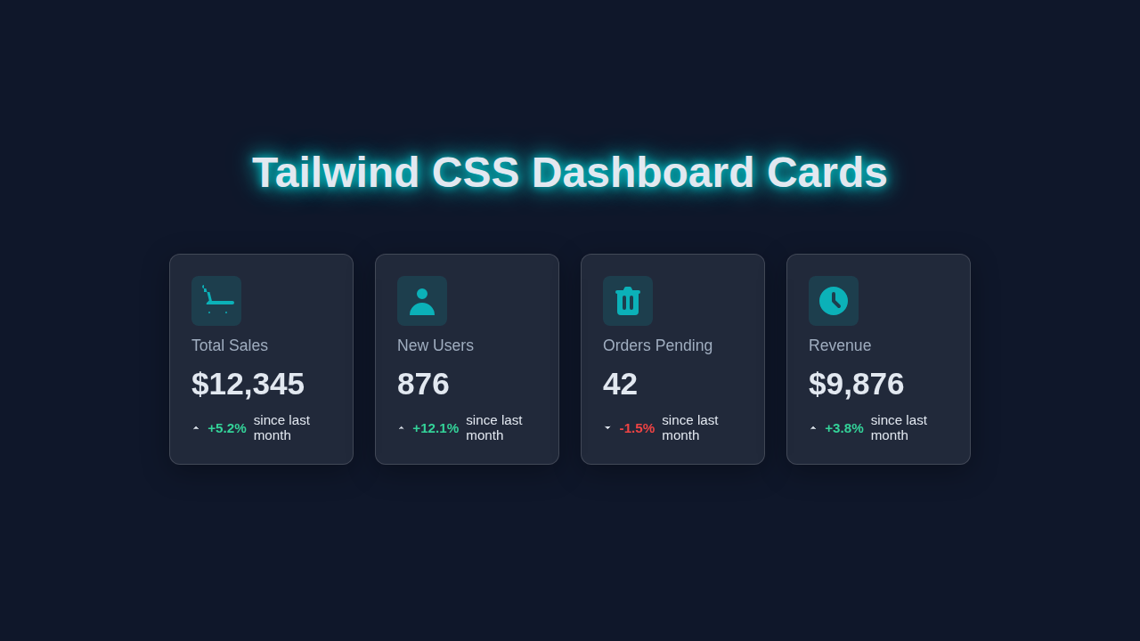
We are going to build a set of sleek, responsive dashboard cards. Imagine seeing important metrics like “Total Sales” or “New Users” at a glance. Our cards will feature a clear title, a prominent value, and even a small indicator for trends. They will automatically adjust to different screen sizes. This makes them perfect for desktops, tablets, and mobile phones alike. These components are incredibly useful for almost any web project!
HTML Structure: The Foundation of Our Cards
First, let’s lay down the basic HTML for our cards. We’ll use simple, semantic tags to define each card. Each card will contain a heading, a value, and a small trend indicator. Don’t worry, we’ll keep it super clean and easy to understand.
index.html
<!DOCTYPE html>
<html lang="en">
<head>
    <meta charset="UTF-8">
    <meta name="viewport" content="width=device-width, initial-scale=1.0">
    <title>Tailwind CSS Dashboard Cards</title>
    <!-- Link to your compiled Tailwind CSS file -->
    <link href="./styles.css" rel="stylesheet">
</head>
<!--
    The `bg-gray-900` sets a dark background.
    `text-gray-100` sets light text color.
    `min-h-screen` ensures the body takes at least the full viewport height.
    `flex items-center justify-center` centers the content vertically and horizontally.
    `font-sans` uses a system font stack for clean typography.
    `overflow-x-hidden` prevents horizontal scrollbars.
-->
<body class="bg-gray-900 text-gray-100 min-h-screen flex items-center justify-center font-sans overflow-x-hidden">
    <!-- Main container for the dashboard content -->
    <div class="container mx-auto p-4 md:p-8 w-full max-w-screen-xl">
        <!-- Dashboard Title -->
        <h1 class="text-4xl md:text-5xl font-bold text-center mb-10 text-cyan-400 drop-shadow-lg [text-shadow:0_0_15px_rgba(0,255,255,0.7),0_0_25px_rgba(0,255,255,0.5),0_0_35px_rgba(0,255,255,0.3)]">
            Dashboard Overview
        </h1>

        <!-- Grid container for the cards -->
        <!--
            `grid grid-cols-1` makes it a single column on small screens.
            `sm:grid-cols-2` makes it two columns on small-medium screens.
            `lg:grid-cols-4` makes it four columns on large screens.
            `gap-6` adds spacing between grid items.
        -->
        <div class="grid grid-cols-1 sm:grid-cols-2 lg:grid-cols-4 gap-6">

            <!-- Card 1: Total Sales -->
            <!--
                `relative` for child absolute positioning.
                `bg-white bg-opacity-5` provides a translucent white background.
                `backdrop-filter backdrop-blur-lg` creates the glassmorphism blur effect.
                `border border-gray-700` for a subtle border.
                `rounded-xl` for rounded corners.
                `p-6` for internal padding.
                `flex flex-col gap-3` for vertical stacking of elements.
                `shadow-lg hover:shadow-2xl hover:border-cyan-500` adds subtle interaction and glow.
                `transition-all duration-300 ease-in-out` for smooth animations.
                `group` class enables group-hover effects on child elements.
            -->
            <div class="relative bg-white bg-opacity-5 backdrop-filter backdrop-blur-lg border border-gray-700 rounded-xl p-6 flex flex-col gap-3 shadow-lg hover:shadow-2xl hover:border-cyan-500 transition-all duration-300 ease-in-out group">
                <!--
                    Absolute positioned gradient for hover effect.
                    Starts hidden (`opacity-0`) and fades in on group hover.
                    `-z-10` places it behind other content.
                -->
                <div class="absolute inset-0 bg-gradient-to-br from-cyan-500/10 to-blue-500/5 rounded-xl opacity-0 group-hover:opacity-100 transition-opacity duration-300 ease-in-out -z-10"></div>

                <!-- Icon container -->
                <div class="flex items-center justify-center p-3 rounded-lg bg-cyan-500/20 text-cyan-400 w-12 h-12">
                    <svg class="w-6 h-6" fill="currentColor" viewBox="0 0 20 20" xmlns="http://www.w3.org/2000/svg"><path d="M3 1a1 1 0 000 2h1.22l.305 1.222a.997.997 0 00.01.042l1.358 5.43-.893.892C3.74 11.846 4.5 12 5 12h14a1 1 0 000-2H7.468l-.938-3.75a1.002 1.002 0 00-.01-.042l-.305-1.222H3z"></path><path d="M16 16.5a.5.5 0 11-1 0 .5.5 0 011 0zM6.5 16.5a.5.5 0 11-1 0 .5.5 0 011 0z"></path></svg>
                </div>
                <div class="text-sm text-gray-300">Total Sales</div>
                <div class="text-3xl font-bold text-white">$12,345</div>
                <div class="flex items-center text-sm">
                    <svg class="w-4 h-4 text-emerald-400 mr-1" viewBox="0 0 24 24" fill="none" stroke="currentColor" stroke-width="2" stroke-linecap="round" stroke-linejoin="round"><polyline points="18 15 12 9 6 15"></polyline></svg>
                    <span class="text-emerald-400 font-semibold">+5.2%</span>
                    <span class="ml-1 text-gray-400">since last month</span>
                </div>
            </div>

            <!-- Card 2: New Users -->
            <div class="relative bg-white bg-opacity-5 backdrop-filter backdrop-blur-lg border border-gray-700 rounded-xl p-6 flex flex-col gap-3 shadow-lg hover:shadow-2xl hover:border-cyan-500 transition-all duration-300 ease-in-out group">
                <div class="absolute inset-0 bg-gradient-to-br from-purple-500/10 to-pink-500/5 rounded-xl opacity-0 group-hover:opacity-100 transition-opacity duration-300 ease-in-out -z-10"></div>
                <div class="flex items-center justify-center p-3 rounded-lg bg-purple-500/20 text-purple-400 w-12 h-12">
                    <svg class="w-6 h-6" fill="currentColor" viewBox="0 0 20 20" xmlns="http://www.w3.org/2000/svg"><path fill-rule="evenodd" d="M10 9a3 3 0 100-6 3 3 0 000 6zm-7 9a7 7 0 1114 0H3z" clip-rule="evenodd"></path></svg>
                </div>
                <div class="text-sm text-gray-300">New Users</div>
                <div class="text-3xl font-bold text-white">876</div>
                <div class="flex items-center text-sm">
                    <svg class="w-4 h-4 text-emerald-400 mr-1" viewBox="0 0 24 24" fill="none" stroke="currentColor" stroke-width="2" stroke-linecap="round" stroke-linejoin="round"><polyline points="18 15 12 9 6 15"></polyline></svg>
                    <span class="text-emerald-400 font-semibold">+12.1%</span>
                    <span class="ml-1 text-gray-400">since last month</span>
                </div>
            </div>

            <!-- Card 3: Orders Pending -->
            <div class="relative bg-white bg-opacity-5 backdrop-filter backdrop-blur-lg border border-gray-700 rounded-xl p-6 flex flex-col gap-3 shadow-lg hover:shadow-2xl hover:border-cyan-500 transition-all duration-300 ease-in-out group">
                <div class="absolute inset-0 bg-gradient-to-br from-orange-500/10 to-yellow-500/5 rounded-xl opacity-0 group-hover:opacity-100 transition-opacity duration-300 ease-in-out -z-10"></div>
                <div class="flex items-center justify-center p-3 rounded-lg bg-orange-500/20 text-orange-400 w-12 h-12">
                    <svg class="w-6 h-6" fill="currentColor" viewBox="0 0 20 20" xmlns="http://www.w3.org/2000/svg"><path fill-rule="evenodd" d="M9 2a1 1 0 00-.894.553L7.382 4H4a1 1 0 000 2v10a2 2 0 002 2h8a2 2 0 002-2V6a1 1 0 000-2h-3.382l-.724-1.447A1 1 0 0011 2H9zM7 8a1 1 0 012 0v6a1 1 0 11-2 0V8zm5-1a1 1 0 00-1 1v6a1 1 0 102 0V8a1 1 0 00-1-1z" clip-rule="evenodd"></path></svg>
                </div>
                <div class="text-sm text-gray-300">Orders Pending</div>
                <div class="text-3xl font-bold text-white">42</div>
                <div class="flex items-center text-sm">
                    <svg class="w-4 h-4 text-red-500 mr-1" viewBox="0 0 24 24" fill="none" stroke="currentColor" stroke-width="2" stroke-linecap="round" stroke-linejoin="round"><polyline points="6 9 12 15 18 9"></polyline></svg>
                    <span class="text-red-500 font-semibold">-1.5%</span>
                    <span class="ml-1 text-gray-400">since last month</span>
                </div>
            </div>

            <!-- Card 4: Revenue -->
            <div class="relative bg-white bg-opacity-5 backdrop-filter backdrop-blur-lg border border-gray-700 rounded-xl p-6 flex flex-col gap-3 shadow-lg hover:shadow-2xl hover:border-cyan-500 transition-all duration-300 ease-in-out group">
                <div class="absolute inset-0 bg-gradient-to-br from-green-500/10 to-emerald-500/5 rounded-xl opacity-0 group-hover:opacity-100 transition-opacity duration-300 ease-in-out -z-10"></div>
                <div class="flex items-center justify-center p-3 rounded-lg bg-green-500/20 text-green-400 w-12 h-12">
                    <svg class="w-6 h-6" fill="currentColor" viewBox="0 0 20 20" xmlns="http://www.w3.org/2000/svg"><path fill-rule="evenodd" d="M10 18a8 8 0 100-16 8 8 0 000 16zm1-12a1 1 0 10-2 0v4a1 1 0 00.293.707l3 3a1 1 0 001.414-1.414L11 9.586V6z" clip-rule="evenodd"></path></svg>
                </div>
                <div class="text-sm text-gray-300">Revenue</div>
                <div class="text-3xl font-bold text-white">$9,876</div>
                <div class="flex items-center text-sm">
                    <svg class="w-4 h-4 text-emerald-400 mr-1" viewBox="0 0 24 24" fill="none" stroke="currentColor" stroke-width="2" stroke-linecap="round" stroke-linejoin="round"><polyline points="18 15 12 9 6 15"></polyline></svg>
                    <span class="text-emerald-400 font-semibold">+3.8%</span>
                    <span class="ml-1 text-gray-400">since last month</span>
                </div>
            </div>

        </div>
    </div>
</body>
</html>
CSS Styling with Tailwind CSS: Making Them Shine
Now, for the really fun part: making our cards look incredible with Tailwind CSS! We’ll apply utility classes directly in our HTML. This approach lets us style everything quickly and efficiently. We’ll add backgrounds, shadows, padding, and make them responsive.
styles.css
/*
 * Tailwind CSS Dashboard Cards Tutorial
 *
 * This file is for your compiled Tailwind CSS.
 * To get started, make sure you have Tailwind CSS installed and configured.
 *
 * 1. Install Tailwind CSS:
 *    npm install -D tailwindcss postcss autoprefixer
 *    npx tailwindcss init -p
 *
 * 2. Configure your tailwind.config.js to scan your HTML files:
 *    // tailwind.config.js
 *    module.exports = {
 *      content: ["./*.html"], // Adjust to your project structure
 *      theme: {
 *        extend: {},
 *      },
 *      plugins: [],
 *    }
 *
 * 3. Add the Tailwind directives to this file (styles.css):
 */

@tailwind base;
@tailwind components;
@tailwind utilities;

/* Ensure box-sizing is border-box globally for consistent layout */
html {
    box-sizing: border-box;
}
*, *::before, *::after {
    box-sizing: inherit;
}

/*
 * Optional: Custom scrollbar styles (uncomment and adjust if your content overflows)
 * This provides a more aesthetic scrollbar for dark themes.
 */
/*
body::-webkit-scrollbar {
    width: 8px;
}
body::-webkit-scrollbar-track {
    background: #1a202c; /* Dark track matching background */
}
body::-webkit-scrollbar-thumb {
    background-color: #4a5568; /* Greyish thumb */
    border-radius: 20px;
    border: 2px solid #1a202c;
}
*/
JavaScript: Is It Needed Here?
For these basic, static dashboard cards, we actually don’t need any JavaScript! That’s right. Our design is purely handled by HTML and Tailwind CSS. This keeps things lightweight and fast. Of course, you could add JavaScript later for dynamic data loading or interactive elements. But for now, let’s keep it simple and powerful.
How It All Works Together
You’ve just built some fantastic Tailwind Dashboard Cards! Let’s break down how our HTML and Tailwind CSS collaborate. Understanding this will empower you to create even more amazing designs.
The Card Container
First, we wrap each card’s content in a div element. This div acts as our main card container. We apply Tailwind classes like bg-white, rounded-lg, and shadow-md to it. bg-white gives us a clean white background. rounded-lg provides nicely rounded corners. The shadow-md class adds a subtle depth effect. This makes the card pop off the page a bit. We also add p-6 for consistent internal padding.
Responsive Layout with Flexbox and Grid
To arrange multiple cards, we use Tailwind’s powerful layout utilities. On small screens, cards might stack vertically. However, on larger screens, we can use grid or flexbox to create columns. For example, grid grid-cols-1 md:grid-cols-2 lg:grid-cols-3 gap-6 creates a responsive grid. This means one column on mobile, two on medium screens, and three on large screens. The gap-6 class adds space between the cards. This ensures everything looks neat and organized. You can explore more about responsive design using utility classes by checking out this resource on Responsive Portfolio: Build a Developer Portfolio with Tailwind CSS & HTML.
Card Content Styling
Inside each card, we structure our information clearly. We typically have a title, a main value, and a trend indicator.
Pro Tip: Always prioritize readability! Make sure your main numbers stand out. Use clear, contrasting text colors for important data.
- The Title: We use a
divorptag with classes liketext-sm,font-medium, andtext-gray-500. This creates a smaller, muted label. It tells the user what the card represents, like “Total Sales”. - The Value: For the main number, we use larger text. Classes such as
text-3xl,font-bold, andtext-gray-900make it prominent. This draws immediate attention to the key metric. - The Trend Indicator: A small
divorspanoften shows a percentage change. We can style it withtext-green-500ortext-red-500for positive or negative trends. Utility classes likeflex items-centerhelp align an icon and text. This provides quick visual feedback on performance. Learn more about text sizing and colors on MDN’s CSS text properties page. This can really improve your typography skills.
Importance of Utility-First
Tailwind CSS embraces a “utility-first” philosophy. This means you compose designs by applying small, single-purpose utility classes directly in your HTML. Instead of writing custom CSS for every component, you combine classes like pt-4 (padding-top 1rem), bg-blue-500, and text-white. This approach leads to incredibly fast development. It also makes your styles highly consistent across your project. Tailwind is constantly evolving, so keep an eye on developments like Tailwind CSS v4: The Future of Utility-First Design for what’s next!
Encouragement: Don’t be afraid to experiment with different Tailwind classes! That’s how you learn best. Try changing colors or font sizes to see the immediate effect.
This immediate feedback is one of the best parts. It makes building UI feel like playing with LEGO bricks. It’s a very different experience than traditional CSS. You can compare it to our article on Tailwind CSS vs Plain CSS Blog Thumbnail Design to see the differences in action.
Tips to Customise Your Tailwind Dashboard Cards
You’ve got the basics down. Now, let’s think about making these cards uniquely yours!
- Add Icons: Integrate SVG icons or popular icon libraries like Heroicons or Font Awesome. Place them next to titles or trend indicators for visual flair.
- Interactive States: Add
hover:classes for simple interactions. For example,hover:shadow-lgorhover:scale-105. This makes cards feel more dynamic when a user points at them. - Dynamic Data: Connect your cards to real data using JavaScript. Update the values, colors, and trends based on live API responses. This brings your dashboard to life!
- Charts & Graphs: For more advanced dashboards, embed small sparkline charts or mini bar graphs directly into the cards. Libraries like Chart.js can help with this.
Conclusion
Awesome job, everyone! You just mastered building beautiful, responsive Tailwind Dashboard Cards. You’ve learned how to structure your HTML and apply powerful utility classes from Tailwind CSS. These skills are invaluable for any modern web developer. Keep practicing, keep building, and don’t forget to share your creations with the procoder09.com community. We can’t wait to see what you build next!