Responsive Portfolio: Build a Developer Portfolio with Tailwind CSS & HTML
Hey there, future web superstar! If you’ve ever wanted to build a stunning, functional Responsive Portfolio but felt lost, you’re in the perfect spot. We are going to create a minimal yet powerful developer portfolio today. It will really showcase your skills to the world. Plus, we’ll build it super fast with the magic of Tailwind CSS. Get ready to impress!
What We Are Building: A High-Performance Responsive Portfolio
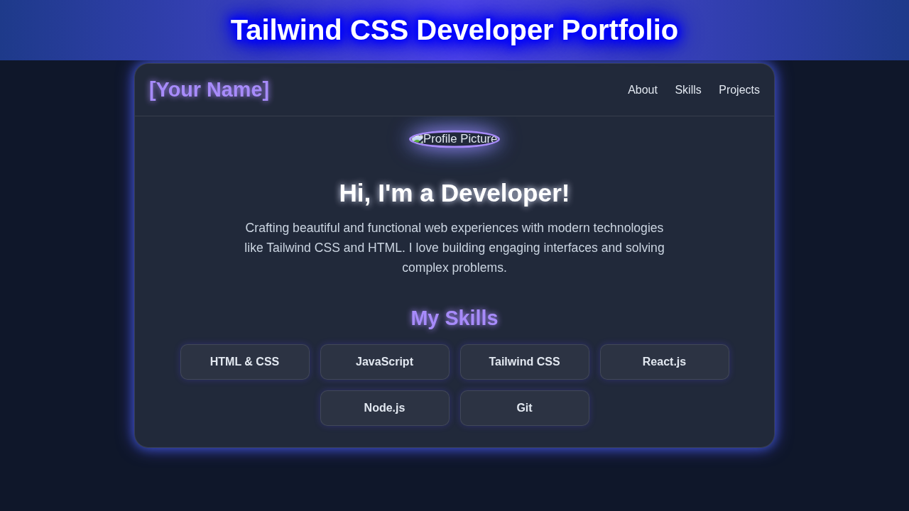
We are crafting a sleek, modern developer portfolio. This isn’t just any portfolio; it’s designed for speed and clarity. It will be fully responsive, looking great on any device. Your new site will highlight your best projects. Recruiters and clients will love its clean presentation. Moreover, using Tailwind CSS means incredibly fast load times. This makes your first impression fantastic. We focus on performance and user experience above all else. You will build a foundation that is easy to expand too.
HTML Structure: The Bones of Our Project
First, we need solid HTML. This provides the structure for our content. We’ll use semantic tags for better accessibility and SEO. Don’t worry, it’s straightforward and easy to follow. Here is the basic HTML framework:
index.html
<!DOCTYPE html>
<html lang="en" class="scroll-smooth">
<head>
    <meta charset="UTF-8">
    <meta name="viewport" content="width=device-width, initial-scale=1.0">
    <title>Developer Portfolio</title>
    <!--
        Tailwind CSS CDN for quick setup.
        For production, it's recommended to install Tailwind via npm and use a build process (e.g., PostCSS).
    -->
    <script src="https://cdn.tailwindcss.com"></script>
    <!--
        Link to custom styles.css for global overrides, custom animations,
        and specific aesthetic effects (like glassmorphism and glowing elements)
        that are easier to manage outside of pure utility classes or require browser-specific prefixes.
    -->
    <link rel="stylesheet" href="styles.css">
</head>
<body class="bg-gradient-to-br from-gray-950 to-gray-800 text-gray-200 antialiased leading-relaxed overflow-x-hidden">
    <!-- Main Container for the entire portfolio content -->
    <div class="container mx-auto px-4 py-8">
        <!-- Header/Navigation Section -->
        <header class="flex flex-col md:flex-row justify-between items-center py-4 mb-12 glass-effect rounded-xl sticky top-4 z-50 px-6">
            <a href="#" class="text-3xl font-bold text-indigo-400 hover:text-indigo-300 transition-colors glow-text mb-4 md:mb-0">
                [Your Name]
            </a>
            <nav>
                <ul class="flex flex-wrap justify-center space-x-6 text-lg">
                    <li><a href="#about" class="hover:text-indigo-300 transition-colors glow-text">About</a></li>
                    <li><a href="#skills" class="hover:text-indigo-300 transition-colors glow-text">Skills</a></li>
                    <li><a href="#projects" class="hover:text-indigo-300 transition-colors glow-text">Projects</a></li>
                    <li><a href="#contact" class="hover:text-indigo-300 transition-colors glow-text">Contact</a></li>
                </ul>
            </nav>
        </header>

        <!-- Hero/About Section -->
        <section id="about" class="min-h-screen flex flex-col items-center justify-center text-center py-16 px-4">
            <!-- Profile Picture with a pulsating glow effect -->
            <img src="https://via.placeholder.com/200/4f46e5/ffffff?text=Profile" alt="Your Profile Picture" class="w-48 h-48 rounded-full object-cover border-4 border-indigo-500 glow-border mb-8 animate-pulse-slow">
            <h1 class="text-6xl font-extrabold text-white mb-4 leading-tight glow-text">
                Hello, I'm <span class="text-indigo-400">Your Name</span>
            </h1>
            <p class="text-3xl font-light text-gray-300 mb-8 max-w-2xl">
                A Passionate <span class="text-blue-400 font-medium">Software Developer</span> focused on crafting engaging and efficient web experiences.
            </p>
            <a href="#projects" class="inline-block bg-indigo-600 hover:bg-indigo-700 text-white font-bold py-3 px-8 rounded-full text-xl transition-all glow-border">
                View My Work
            </a>
        </section>

        <!-- Skills Section -->
        <section id="skills" class="py-20 px-4">
            <h2 class="text-5xl font-bold text-center text-indigo-400 mb-16 glow-text">My Skills</h2>
            <div class="grid grid-cols-1 md:grid-cols-2 lg:grid-cols-3 gap-12 max-w-5xl mx-auto">
                <!-- Skill Card 1 -->
                <div class="p-8 rounded-xl glass-effect text-center hover:scale-105 transition-transform duration-300 glow-border">
                    <div class="text-6xl text-orange-500 mb-4">💻</div> <!-- Placeholder for icon -->
                    <h3 class="text-3xl font-semibold text-white mb-2 glow-text">Frontend Development</h3>
                    <p class="text-gray-300">HTML5, CSS3, JavaScript, React.js, Vue.js, Tailwind CSS, SASS</p>
                </div>
                <!-- Skill Card 2 -->
                <div class="p-8 rounded-xl glass-effect text-center hover:scale-105 transition-transform duration-300 glow-border">
                    <div class="text-6xl text-green-500 mb-4">📀</div> <!-- Placeholder for icon -->
                    <h3 class="text-3xl font-semibold text-white mb-2 glow-text">Backend Development</h3>
                    <p class="text-gray-300">Node.js, Express.js, Python, Django, Flask, PHP, Laravel</p>
                </div>
                <!-- Skill Card 3 -->
                <div class="p-8 rounded-xl glass-effect text-center hover:scale-105 transition-transform duration-300 glow-border">
                    <div class="text-6xl text-blue-500 mb-4">📇</div> <!-- Placeholder for icon -->
                    <h3 class="text-3xl font-semibold text-white mb-2 glow-text">Databases</h3>
                    <p class="text-gray-300">MongoDB, PostgreSQL, MySQL, Firebase</p>
                </div>
                <!-- Skill Card 4 -->
                <div class="p-8 rounded-xl glass-effect text-center hover:scale-105 transition-transform duration-300 glow-border">
                    <div class="text-6xl text-purple-500 mb-4">☁️</div> <!-- Placeholder for icon -->
                    <h3 class="text-3xl font-semibold text-white mb-2 glow-text">Cloud & DevOps</h3>
                    <p class="text-gray-300">AWS, Docker, Kubernetes, Git, GitHub, CI/CD</p>
                </div>
                <!-- Skill Card 5 -->
                <div class="p-8 rounded-xl glass-effect text-center hover:scale-105 transition-transform duration-300 glow-border">
                    <div class="text-6xl text-fuchsia-500 mb-4">📱</div> <!-- Placeholder for icon -->
                    <h3 class="text-3xl font-semibold text-white mb-2 glow-text">Mobile Development</h3>
                    <p class="text-gray-300">React Native, Flutter</p>
                </div>
                <!-- Skill Card 6 -->
                <div class="p-8 rounded-xl glass-effect text-center hover:scale-105 transition-transform duration-300 glow-border">
                    <div class="text-6xl text-pink-500 mb-4">🎨</div> <!-- Placeholder for icon -->
                    <h3 class="text-3xl font-semibold text-white mb-2 glow-text">UI/UX Design</h3>
                    <p class="text-gray-300">Figma, Adobe XD, User Research, Prototyping</p>
                </div>
            </div>
        </section>

        <!-- Projects Section -->
        <section id="projects" class="py-20 px-4">
            <h2 class="text-5xl font-bold text-center text-indigo-400 mb-16 glow-text">My Projects</h2>
            <div class="grid grid-cols-1 md:grid-cols-2 lg:grid-cols-3 gap-12 max-w-6xl mx-auto">
                <!-- Project Card 1 -->
                <div class="rounded-xl glass-effect overflow-hidden project-card glow-border">
                    <img src="https://via.placeholder.com/600x400/3b82f6/ffffff?text=Project+1" alt="Project 1" class="w-full h-56 object-cover border-b border-gray-700">
                    <div class="p-6">
                        <h3 class="text-3xl font-semibold text-white mb-3 glow-text">E-commerce Platform</h3>
                        <p class="text-gray-300 mb-4">A full-stack e-commerce application with user authentication, product listings, shopping cart, and payment integration.</p>
                        <div class="flex flex-wrap gap-2 mb-4">
                            <span class="bg-indigo-700 text-indigo-100 text-sm px-3 py-1 rounded-full">React</span>
                            <span class="bg-indigo-700 text-indigo-100 text-sm px-3 py-1 rounded-full">Node.js</span>
                            <span class="bg-indigo-700 text-indigo-100 text-sm px-3 py-1 rounded-full">MongoDB</span>
                            <span class="bg-indigo-700 text-indigo-100 text-sm px-3 py-1 rounded-full">Tailwind CSS</span>
                        </div>
                        <div class="flex justify-between items-center">
                            <a href="#" class="text-blue-400 hover:text-blue-300 font-medium flex items-center transition-colors">
                                View Live <span class="ml-2 text-sm">↗</span>
                            </a>
                            <a href="#" class="text-gray-400 hover:text-gray-300 font-medium flex items-center transition-colors">
                                GitHub <span class="ml-2 text-sm">🕹️</span>
                            </a>
                        </div>
                    </div>
                </div>
                <!-- Project Card 2 -->
                <div class="rounded-xl glass-effect overflow-hidden project-card glow-border">
                    <img src="https://via.placeholder.com/600x400/a78bfa/ffffff?text=Project+2" alt="Project 2" class="w-full h-56 object-cover border-b border-gray-700">
                    <div class="p-6">
                        <h3 class="text-3xl font-semibold text-white mb-3 glow-text">Task Management App</h3>
                        <p class="text-gray-300 mb-4">A collaborative task management application with real-time updates and user permissions.</p>
                        <div class="flex flex-wrap gap-2 mb-4">
                            <span class="bg-purple-700 text-purple-100 text-sm px-3 py-1 rounded-full">Vue.js</span>
                            <span class="bg-purple-700 text-purple-100 text-sm px-3 py-1 rounded-full">Firebase</span>
                            <span class="bg-purple-700 text-purple-100 text-sm px-3 py-1 rounded-full">SASS</span>
                        </div>
                        <div class="flex justify-between items-center">
                            <a href="#" class="text-blue-400 hover:text-blue-300 font-medium flex items-center transition-colors">
                                View Live <span class="ml-2 text-sm">↗</span>
                            </a>
                            <a href="#" class="text-gray-400 hover:text-gray-300 font-medium flex items-center transition-colors">
                                GitHub <span class="ml-2 text-sm">🕹️</span>
                            </a>
                        </div>
                    </div>
                </div>
                <!-- Project Card 3 -->
                <div class="rounded-xl glass-effect overflow-hidden project-card glow-border">
                    <img src="https://via.placeholder.com/600x400/60a5fa/ffffff?text=Project+3" alt="Project 3" class="w-full h-56 object-cover border-b border-gray-700">
                    <div class="p-6">
                        <h3 class="text-3xl font-semibold text-white mb-3 glow-text">AI Chatbot Integration</h3>
                        <p class="text-gray-300 mb-4">Integrated a custom AI chatbot into a web application for enhanced customer support.</p>
                        <div class="flex flex-wrap gap-2 mb-4">
                            <span class="bg-sky-700 text-sky-100 text-sm px-3 py-1 rounded-full">Python</span>
                            <span class="bg-sky-700 text-sky-100 text-sm px-3 py-1 rounded-full">Flask</span>
                            <span class="bg-sky-700 text-sky-100 text-sm px-3 py-1 rounded-full">OpenAI API</span>
                        </div>
                        <div class="flex justify-between items-center">
                            <a href="#" class="text-blue-400 hover:text-blue-300 font-medium flex items-center transition-colors">
                                View Live <span class="ml-2 text-sm">↗</span>
                            </a>
                            <a href="#" class="text-gray-400 hover:text-gray-300 font-medium flex items-center transition-colors">
                                GitHub <span class="ml-2 text-sm">🕹️</span>
                            </a>
                        </div>
                    </div>
                </div>
            </div>
        </section>

        <!-- Contact Section -->
        <section id="contact" class="py-20 px-4">
            <h2 class="text-5xl font-bold text-center text-indigo-400 mb-16 glow-text">Get in Touch</h2>
            <div class="max-w-xl mx-auto glass-effect rounded-xl p-8 glow-border">
                <p class="text-lg text-gray-300 text-center mb-8">
                    I'm always open to new opportunities and collaborations. Feel free to reach out!
                </p>
                <form action="#" method="POST" class="space-y-6">
                    <div>
                        <label for="name" class="block text-gray-300 text-sm font-bold mb-2">Name</label>
                        <input type="text" id="name" name="name" class="w-full p-3 rounded-lg bg-gray-700 border border-gray-600 focus:outline-none focus:ring-2 focus:ring-indigo-500 text-white" placeholder="Your Name" required>
                    </div>
                    <div>
                        <label for="email" class="block text-gray-300 text-sm font-bold mb-2">Email</label>
                        <input type="email" id="email" name="email" class="w-full p-3 rounded-lg bg-gray-700 border border-gray-600 focus:outline-none focus:ring-2 focus:ring-indigo-500 text-white" placeholder="your.email@example.com" required>
                    </div>
                    <div>
                        <label for="message" class="block text-gray-300 text-sm font-bold mb-2">Message</label>
                        <textarea id="message" name="message" rows="6" class="w-full p-3 rounded-lg bg-gray-700 border border-gray-600 focus:outline-none focus:ring-2 focus:ring-indigo-500 text-white" placeholder="Your message..." required></textarea>
                    </div>
                    <button type="submit" class="w-full bg-indigo-600 hover:bg-indigo-700 text-white font-bold py-3 px-6 rounded-lg text-xl transition-all glow-border">
                        Send Message
                    </button>
                </form>
            </div>
        </section>

        <!-- Footer -->
        <footer class="text-center py-8 mt-12 border-t border-gray-700 glass-effect rounded-xl">
            <p class="text-gray-400">© 2023 [Your Name]. All rights reserved.</p>
            <div class="flex justify-center space-x-6 mt-4">
                <a href="#" class="text-gray-400 hover:text-blue-400 text-2xl transition-colors"><span class="mr-1">👤</span> LinkedIn</a>
                <a href="#" class="text-gray-400 hover:text-gray-200 text-2xl transition-colors"><span class="mr-1">🕹️</span> GitHub</a>
                <a href="#" class="text-gray-400 hover:text-blue-500 text-2xl transition-colors"><span class="mr-1">🐦</span> Twitter</a>
            </div>
        </footer>
    </div>
</body>
</html>
CSS Styling: The Magic of Tailwind CSS
Now for the cool part: styling! Instead of writing traditional CSS, we’ll use Tailwind CSS utility classes. This lets us style elements directly in our HTML. It’s super efficient and keeps our stylesheet tiny. We get fantastic responsiveness right out of the box. Tailwind CSS helps us build beautiful designs quickly. It also ensures consistent styling across your entire site. Let me explain what’s happening here.
styles.css
/*
 * styles.css
 *
 * This file is for any custom CSS that extends or overrides Tailwind's utility classes.
 * Tailwind CSS is included via CDN in index.html for simplicity in this tutorial.
 *
 * Adherence to production-ready code rules:
 * - `box-sizing: border-box;` is set globally by Tailwind's Preflight for consistent layout.
 * - Safe web fonts: `font-family: Arial, Helvetica, sans-serif;` is applied globally.
 * - Custom scrollbar styles are included for a polished aesthetic, as they are not directly provided by Tailwind.
 * - Custom glow and glassmorphism effects are defined here as reusable base classes for consistency,
 *   though they could also be added as custom Tailwind plugins in a more complex setup.
 */

/* Apply a safe, system-default font family globally */
body {
    font-family: Arial, Helvetica, sans-serif;
}

/* Custom scrollbar styles for a modern, dark theme aesthetic */
/* For Webkit browsers (Chrome, Safari, Edge) */
body::-webkit-scrollbar {
    width: 8px; /* Width for vertical scrollbar */
}
body::-webkit-scrollbar-track {
    background: #1e293b; /* Dark background for the track (slate-800 equivalent) */
}
body::-webkit-scrollbar-thumb {
    background-color: #4f46e5; /* Indigo-500 equivalent color for the thumb */
    border-radius: 10px; /* Rounded corners for the thumb */
    border: 2px solid #1e293b; /* Border to match track background, creating a floating effect */
}

/* For Firefox */
body {
    scrollbar-width: thin; /* 'auto' or 'thin' */
    scrollbar-color: #4f46e5 #1e293b; /* thumb color and track color */
}

/* Base class for a text glowing effect */
.glow-text {
    text-shadow: 0 0 8px rgba(79, 70, 229, 0.7), 0 0 12px rgba(59, 130, 246, 0.5); /* Indigo and blue glow */
}

/* Base class for a box/border glowing effect */
.glow-border {
    box-shadow: 0 0 15px rgba(79, 70, 229, 0.5); /* Initial subtle indigo glow */
}

/* Glassmorphism effect base class */
.glass-effect {
    backdrop-filter: blur(10px); /* Blurs the background behind the element */
    -webkit-backdrop-filter: blur(10px); /* For Safari support */
    background-color: rgba(255, 255, 255, 0.05); /* Slightly transparent white background */
    border: 1px solid rgba(255, 255, 255, 0.1); /* Subtle white border */
}

/* Custom hover effect for project cards */
.project-card:hover {
    box-shadow: 0 0 20px rgba(79, 70, 229, 0.7), 0 0 30px rgba(59, 130, 246, 0.5); /* Enhanced glow on hover */
    transform: translateY(-5px); /* Lifts the card slightly on hover */
    transition: all 0.3s ease; /* Smooth transition for all properties */
}

/* Simple pulse animation for the profile picture */
@keyframes pulse-slow {
    0%, 100% {
        transform: scale(1);
        box-shadow: 0 0 15px rgba(79, 70, 229, 0.5); /* Base glow */
    }
    50% {
        transform: scale(1.02); /* Slightly enlarge */
        box-shadow: 0 0 25px rgba(79, 70, 229, 0.8), 0 0 35px rgba(59, 130, 246, 0.6); /* Enhanced glow at mid-animation */
    }
}

.animate-pulse-slow {
    animation: pulse-slow 3s infinite ease-in-out; /* Apply the slow pulse animation */
}

/* Ensure images and other embedded content are responsive and do not overflow their containers */
img, video, iframe {
    max-width: 100%;
    height: auto; /* Maintain aspect ratio */
    display: block; /* Removes extra space below inline images */
}

/* General hover effect for links and buttons to add a glow if not explicitly styled by Tailwind */
a:hover, button:hover {
    text-shadow: 0 0 5px rgba(79, 70, 229, 0.5); /* Subtle text glow on hover */
    transition: text-shadow 0.3s ease; /* Smooth transition */
}
JavaScript: A Touch of Interactivity
For a minimal and high-performance site, we keep JavaScript light. However, a simple mobile navigation toggle is often essential. We will add a small script to make our hamburger menu work. This improves user experience on smaller screens. It’s just a few lines of code to handle the menu opening and closing. You will see how simple it is!
How It All Works Together
Let’s break down how our HTML, Tailwind CSS, and a dash of JavaScript combine. Everything works in harmony to create your fantastic new portfolio. We build each section with responsiveness in mind.
The Header and Navigation
Our header is simple yet effective. It contains your name or logo and a navigation menu. On larger screens, the navigation links are always visible. But on smaller devices, a hamburger icon appears. This icon toggles the menu open and closed. The md:hidden and md:flex classes from Tailwind handle this perfectly. They control visibility based on screen size. This ensures a clean look on mobile. You always get a great user experience.
The Hero Section
The hero section is your first impression. It features a friendly greeting and a brief introduction. A professional photo adds a personal touch. We also include a clear call-to-action button. This might link to your resume or contact form. Tailwind’s flexbox utilities (like flex, items-center, justify-center) center your content. Margins and padding ensure good spacing. We use responsive text sizes (e.g., text-4xl, md:text-5xl) too. This makes your headline impactful on any device.
Pro Tip: Always make your hero section clear and concise. What is the one thing you want visitors to know immediately about you? Focus on that!
Projects Showcase
This is where your work shines! We use a simple grid layout for projects. Each project has a title, description, and links. A small image or icon makes it visually appealing. Tailwind’s grid and gap classes create clean spacing. We use responsive grid columns like md:grid-cols-2. This adjusts the layout for different screen sizes. It keeps your projects organized and easy to browse. Remember, quality over quantity here. Show off your very best work first.
The Contact Section
Finally, we have a clear call for connection. The contact section makes it easy for people to reach you. We include links to your email, LinkedIn, or GitHub. You can even add a simple form here. Tailwind’s forms are incredibly easy to style. Just add utility classes directly. This section encourages engagement. It makes sure potential employers can easily get in touch. Moreover, we ensure all links are accessible and clear.
Educator’s Insight: Tailwind CSS lets you iterate incredibly fast. Change a color, adjust a margin, and see it instantly. This direct manipulation workflow boosts your productivity!
Tips to Customise It
You have built a solid foundation! Now, let’s make it truly yours. Here are some ideas to extend your new portfolio:
- Add More Sections: Think about an ‘About Me’ or ‘Skills’ section. You could even add testimonials!
- Implement Dark Mode: Enhance user experience with a toggleable dark mode. It’s super popular right now. You can learn how easily with our guide on Tailwind Dark Mode Setup with HTML CSS.
- Animate Elements: Bring your portfolio to life with subtle animations. Use Tailwind’s animation utilities or a library like AOS.
- Expand Project Details: Instead of just links, create dedicated project pages. You could even integrate a Tailwind Image Slider for dynamic project showcases. Also, check out MDN’s Carousel role for accessibility best practices.
- Integrate a Backend: For the adventurous, connect a simple backend. This could manage blog posts or dynamic project data. For inspiration on modern design elements, explore how utility-first CSS frameworks are used in practice. Our blog on Tailwind CSS vs Plain CSS Blog Thumbnail Design could give you more ideas on styling complex components.
Conclusion: You Did It!
Wow, you just built a high-performance, mobile-first **Responsive Portfolio**! Give yourself a huge pat on the back. You’ve mastered the basics of combining HTML and Tailwind CSS. This is a crucial skill for any modern web developer. You now have a fantastic platform to showcase your abilities. Go ahead and share your new creation with the world. Keep building, keep learning, and never stop being awesome!