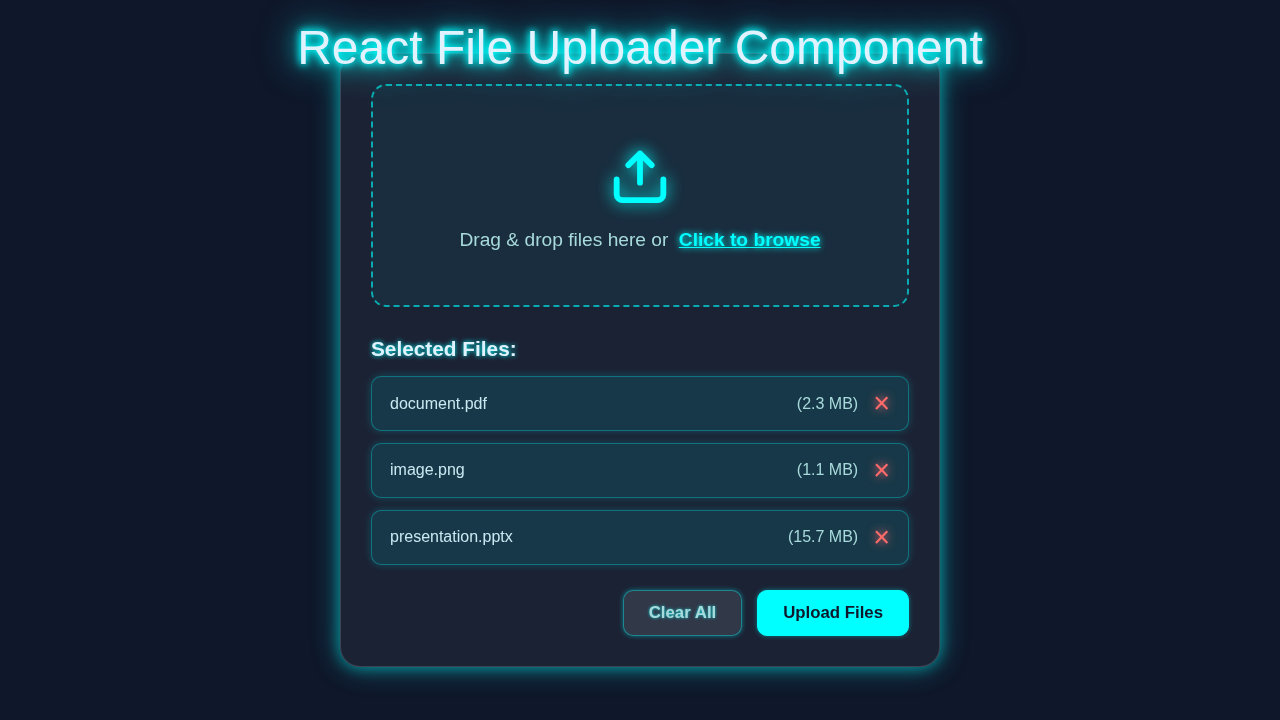
Hey! If you have wanted to build a React File Uploader but had no idea where to start, you are in the right place. Today, we are going to craft a super cool, responsive drag-and-drop file uploader. It will make your web apps feel incredibly modern and user-friendly. And guess what? We will use React hooks to build it beautifully. Get ready to add some serious wow factor to your projects!
What We Are Building: Your Modern React File Uploader
We are not just building any old uploader here. We are creating a sleek, interactive component. You can drag files right onto it. Or you can click to select them the old-fashioned way. This component will give clear visual feedback. It will show when files are dragged over. Plus, it will list the files you have chosen. Think of it as a friendly gateway for your users’ documents and images. It is going to be genuinely useful for many applications.
HTML Structure
First, we need a simple container for our uploader. This HTML gives us the basic elements. We will have a main div to hold everything. Inside, there’s a message for the user. We will also add an invisible file input. This allows clicking as well as dragging. Don’t worry, we will style it nicely later.
index.html
<!DOCTYPE html>
<html lang="en">
<head>
    <meta charset="UTF-8">
    <meta name="viewport" content="width=device-width, initial-scale=1.0">
    <title>React File Uploader</title>
    <link rel="stylesheet" href="styles.css">
</head>
<body>
    <div id="root"></div>

    <!-- React and ReactDOM libraries from CDN (for development/tutorial purposes) -->
    <script src="https://unpkg.com/react@18/umd/react.development.js"></script>
    <script src="https://unpkg.com/react-dom@18/umd/react-dom.development.js"></script>
    <!-- Babel for in-browser JSX transformation (for development/tutorial purposes) -->
    <script src="https://unpkg.com/@babel/standalone/babel.min.js"></script>

    <!-- Our React App component -->
    <script type="text/babel" src="App.jsx"></script>

    <script type="text/babel">
        // Mount the React App component to the 'root' div
        ReactDOM.createRoot(document.getElementById('root')).render(<App />);
    </script>
</body>
</html>
CSS Styling
Now for the fun part: making it look good! Our CSS will turn those basic HTML elements into a stylish component. We will make it responsive too. This means it will look great on any screen size. We will use display: flex for easy alignment. Plus, we’ll add some subtle animations for drag feedback. It’s all about creating a great user experience. If you want to dive deeper into responsive layouts, check out CSS-Tricks’ guide to Flexbox.
styles.css
/* Basic reset and body styles */
body {
    font-family: Arial, Helvetica, sans-serif; /* Safe sans-serif font */
    margin: 0;
    padding: 0;
    background-color: #f4f7f6; /* Light background for the tutorial itself */
    color: #333;
    display: flex;
    justify-content: center;
    align-items: flex-start; /* Align content to the top */
    min-height: 100vh;
    box-sizing: border-box;
}

.app-container {
    padding: 40px 20px;
    max-width: 800px;
    width: 100%;
    box-sizing: border-box;
    text-align: center;
}

.app-title {
    color: #2c3e50;
    margin-bottom: 30px;
    font-size: 2.5em;
}

.app-note {
    margin-top: 30px;
    color: #666;
    font-size: 1.1em;
}

/* File Uploader Component Styles */
.file-uploader-container {
    background: #ffffff;
    border-radius: 12px;
    box-shadow: 0 4px 20px rgba(0, 0, 0, 0.08);
    padding: 30px;
    margin: 20px auto;
    max-width: 600px;
    width: 100%;
    box-sizing: border-box;
    text-align: left;
}

.file-uploader-drag-area {
    border: 2px dashed #a8a8a8;
    border-radius: 10px;
    padding: 40px 20px;
    text-align: center;
    cursor: pointer;
    transition: background-color 0.3s ease, border-color 0.3s ease;
    position: relative;
}

.file-uploader-drag-area.drag-active {
    background-color: #e6f7ff;
    border-color: #1890ff;
}

.file-uploader-input {
    display: none; /* Hide the default file input */
}

.file-uploader-content {
    display: flex;
    flex-direction: column;
    align-items: center;
    justify-content: center;
    color: #555;
}

.file-uploader-icon {
    width: 60px;
    height: 60px;
    color: #40a9ff;
    margin-bottom: 15px;
}

.file-uploader-text {
    font-size: 1.1em;
    color: #666;
    margin: 0;
    line-height: 1.5;
}

.file-uploader-browse-link {
    color: #1890ff;
    font-weight: bold;
    cursor: pointer;
    margin-left: 5px;
    text-decoration: underline;
    transition: color 0.2s ease;
}

.file-uploader-browse-link:hover,
.file-uploader-browse-link:focus {
    color: #40a9ff;
    outline: none;
}

.file-uploader-preview {
    margin-top: 30px;
    border-top: 1px solid #eee;
    padding-top: 20px;
}

.file-uploader-preview-title {
    font-size: 1.2em;
    font-weight: bold;
    color: #333;
    margin-bottom: 15px;
}

.file-uploader-file-list {
    list-style: none;
    padding: 0;
    margin: 0;
}

.file-uploader-file-item {
    display: flex;
    justify-content: space-between;
    align-items: center;
    background-color: #f9f9f9;
    border: 1px solid #e0e0e0;
    border-radius: 8px;
    padding: 10px 15px;
    margin-bottom: 10px;
    font-size: 0.95em;
    color: #444;
}

.file-uploader-file-item .file-name {
    flex-grow: 1;
    word-break: break-all; /* Ensures long file names wrap */
    margin-right: 10px;
}

.file-uploader-file-item .file-size {
    color: #777;
    white-space: nowrap;
}

.file-uploader-remove-btn {
    background: none;
    border: none;
    color: #ff4d4f;
    font-size: 1.5em;
    cursor: pointer;
    margin-left: 10px;
    padding: 0 5px;
    line-height: 1;
    transition: color 0.2s ease;
}

.file-uploader-remove-btn:hover,
.file-uploader-remove-btn:focus {
    color: #cf1322;
    outline: none;
}

.file-uploader-actions {
    display: flex;
    justify-content: flex-end;
    gap: 15px;
    margin-top: 20px;
}

.file-uploader-clear-btn,
.file-uploader-upload-btn {
    padding: 10px 20px;
    border-radius: 8px;
    font-size: 1em;
    cursor: pointer;
    transition: background-color 0.2s ease, color 0.2s ease, border-color 0.2s ease;
    white-space: nowrap;
}

.file-uploader-clear-btn {
    background-color: #f0f0f0;
    color: #555;
    border: 1px solid #d9d9d9;
}

.file-uploader-clear-btn:hover,
.file-uploader-clear-btn:focus {
    background-color: #e0e0e0;
    border-color: #c0c0c0;
    outline: none;
}

.file-uploader-upload-btn {
    background-color: #1890ff;
    color: #ffffff;
    border: 1px solid #1890ff;
}

.file-uploader-upload-btn:hover,
.file-uploader-upload-btn:focus {
    background-color: #40a9ff;
    border-color: #40a9ff;
    outline: none;
}
JavaScript (The React Magic)
This is where our React File Uploader truly comes alive. We will use React hooks to manage its state and behavior. We need to handle file selection. And we need to manage drag-and-drop events. We will keep track of which files the user has chosen. This section brings all the interactivity to life. Get ready to dive into some exciting React code!
App.jsx
import React, { useState, useRef } from 'react';

/**
 * FileUploader Component
 * A reusable React component for uploading files with drag-and-drop functionality
 * and file preview.
 *
 * @param {object} props - Component props.
 * @param {function} props.onFilesSelected - Callback function triggered when files are selected or removed.
 *                                          Receives an array of File objects.
 */
const FileUploader = ({ onFilesSelected }) => {
  // State to manage drag activity for visual feedback on the drop zone
  const [dragActive, setDragActive] = useState(false);
  // Ref to directly access the hidden file input element
  const inputRef = useRef(null);
  // State to store the list of files currently selected by the user
  const [selectedFiles, setSelectedFiles] = useState([]);

  /**
   * Triggers a click event on the hidden file input element.
   * This allows custom UI elements (like a "Browse" link) to open the file selection dialog.
   */
  const handleButtonClick = () => {
    inputRef.current.click();
  };

  /**
   * Processes a list of files, adds them to the selectedFiles state (filtering duplicates),
   * and invokes the onFilesSelected callback with the updated list.
   *
   * @param {FileList | File[]} files - The files to be processed (either a FileList from input/drop or an array).
   */
  const handleFiles = (files) => {
    const newFiles = Array.from(files); // Convert FileList to array
    // Filter out files that already exist by name and size to prevent duplicates
    const uniqueNewFiles = newFiles.filter(newFile =>
      !selectedFiles.some(existingFile =>
        existingFile.name === newFile.name && existingFile.size === newFile.size
      )
    );

    const updatedFiles = [...selectedFiles, ...uniqueNewFiles];
    setSelectedFiles(updatedFiles);
    // Notify parent component about the updated list of files
    if (onFilesSelected) {
      onFilesSelected(updatedFiles);
    }
  };

  /**
   * Handles the change event from the file input (when files are selected via browse dialog).
   *
   * @param {Event} e - The change event.
   */
  const handleChange = (e) => {
    if (e.target.files && e.target.files.length > 0) {
      handleFiles(e.target.files);
      e.target.value = null; // Clear input value to allow selecting same file(s) again
    }
  };

  /**
   * Handles drag events (dragenter, dragover, dragleave) to manage
   * the dragActive state for visual feedback.
   *
   * @param {Event} e - The drag event.
   */
  const handleDrag = (e) => {
    e.preventDefault(); // Prevent default browser behavior (e.g., opening file in new tab)
    e.stopPropagation(); // Stop event propagation
    if (e.type === "dragenter" || e.type === "dragover") {
      setDragActive(true);
    } else if (e.type === "dragleave") {
      setDragActive(false);
    }
  };

  /**
   * Handles the file drop event.
   *
   * @param {Event} e - The drop event.
   */
  const handleDrop = (e) => {
    e.preventDefault();
    e.stopPropagation();
    setDragActive(false); // Reset drag active state
    if (e.dataTransfer.files && e.dataTransfer.files.length > 0) {
      handleFiles(e.dataTransfer.files);
      e.dataTransfer.clearData(); // Clear data transfer object after processing files
    }
  };

  /**
   * Removes a file from the selectedFiles list by its index.
   *
   * @param {number} indexToRemove - The index of the file to remove from the current list.
   */
  const handleRemoveFile = (indexToRemove) => {
    const updatedFiles = selectedFiles.filter((_, index) => index !== indexToRemove);
    setSelectedFiles(updatedFiles);
    // Notify parent component about the updated list
    if (onFilesSelected) {
      onFilesSelected(updatedFiles);
    }
  };

  /**
   * Clears all selected files from the list.
   */
  const handleClearFiles = () => {
    setSelectedFiles([]);
    // Notify parent component that the file list is now empty
    if (onFilesSelected) {
      onFilesSelected([]);
    }
  };

  /**
   * Simulates an upload process. In a real application, this would involve
   * sending files to a server using fetch, XMLHttpRequest, or a library like Axios.
   */
  const handleUpload = () => {
    if (selectedFiles.length === 0) {
      alert("Please select files to upload.");
      return;
    }
    console.log("Simulating upload of files:", selectedFiles);
    alert(`Uploading ${selectedFiles.length} file(s)! Check console for details.`);
    // In a real scenario, you'd handle API calls, progress, and error states here.
    // For demonstration, we'll just log and alert.
    // After successful upload, you might call handleClearFiles();
  };

  return (
    <div className="file-uploader-container">
      {/* Drag & Drop Area / File Input Form */}
      <form
        className={`file-uploader-drag-area ${dragActive ? 'drag-active' : ''}`}
        onDragEnter={handleDrag}
        onDragLeave={handleDrag}
        onDragOver={handleDrag}
        onDrop={handleDrop}
        aria-label="File upload area"
      >
        {/* Hidden file input element that gets triggered by the custom UI */}
        <input
          ref={inputRef}
          type="file"
          className="file-uploader-input"
          multiple // Allows selecting multiple files
          onChange={handleChange}
          aria-label="Select files from your computer"
        />
        <div className="file-uploader-content">
          {/* SVG Icon for visual appeal (Upload Cloud Icon) */}
          <svg className="file-uploader-icon" viewBox="0 0 24 24" fill="none" stroke="currentColor" strokeWidth="2" strokeLinecap="round" strokeLinejoin="round">
            <path d="M4 14.899V20a2 2 0 0 0 2 2h12a2 2 0 0 0 2-2v-5.101M16 10l-4-4-4 4M12 16V6"/>
          </svg>
          <p className="file-uploader-text">
            Drag & drop files here or
            {/* Custom browse link that triggers the hidden input click */}
            <span
              className="file-uploader-browse-link"
              onClick={handleButtonClick}
              role="button" // Indicate that this span acts as a button
              tabIndex="0" // Make it focusable
              onKeyDown={(e) => { if (e.key === 'Enter' || e.key === ' ') handleButtonClick(); }} // Handle keyboard activation
            >
              {' '}Click to browse
            </span>
          </p>
        </div>
      </form>

      {/* File preview and actions section, only visible if files are selected */}
      {selectedFiles.length > 0 && (
        <div className="file-uploader-preview">
          <p className="file-uploader-preview-title">Selected Files:</p>
          <ul className="file-uploader-file-list" role="list">
            {selectedFiles.map((file, index) => (
              <li key={index} className="file-uploader-file-item" role="listitem">
                <span className="file-name">{file.name}</span>
                <span className="file-size">({(file.size / 1024 / 1024).toFixed(2)} MB)</span>
                <button
                  type="button"
                  onClick={() => handleRemoveFile(index)}
                  className="file-uploader-remove-btn"
                  aria-label={`Remove ${file.name}`}
                  title={`Remove ${file.name}`} // Tooltip for accessibility
                >
                  × {/* HTML entity for multiplication sign, often used for 'close' or 'remove' */}
                </button>
              </li>
            ))}
          </ul>
          <div className="file-uploader-actions">
            <button type="button" onClick={handleClearFiles} className="file-uploader-clear-btn">
              Clear All
            </button>
            <button type="button" onClick={handleUpload} className="file-uploader-upload-btn">
              Upload Files
            </button>
          </div>
        </div>
      )}
    </div>
  );
};

/**
 * App Component
 * A simple container component to demonstrate the usage of the FileUploader.
 */
function App() {
  // Callback function to handle files selected by the FileUploader component
  const handleSelectedFiles = (files) => {
    console.log("Files selected in App component:", files);
    // In a real application, you might lift this state up further,
    // or trigger an actual upload process from here.
  };

  return (
    <div className="app-container">
      <h1 className="app-title">React File Uploader Component Demo</h1>
      {/* Integrate the FileUploader component and pass the callback */}
      <FileUploader onFilesSelected={handleSelectedFiles} />
      <p className="app-note">Easily upload your documents, images, or any files with drag & drop support.</p>
    </div>
  );
}

export default App;
How Your React File Uploader Works
Let’s break down the exciting logic behind our component. We are using several powerful React hooks. They help us manage state and side effects cleanly. This makes our code easy to understand. It also makes it easy to maintain. We build great applications this way.
Setting Up State and Refs
First, we need some important state variables. We use the useState hook for this. We track selectedFiles and isDragging. The selectedFiles state holds an array of all the files the user chooses. This could be images, documents, or anything! The isDragging state is a simple boolean flag. It tells us if a file is currently being dragged over our component area. This little flag is super helpful. It lets us show special visual feedback to the user. They know exactly where to drop their files!
We also make use of useRef. This powerful hook gives us a way to access DOM elements directly. In our case, we need a ref for our hidden file input. Why? Because it lets us trigger its click event programmatically. So, when a user clicks our custom-styled uploader, we can “click” the real input. It’s a neat trick for building custom UIs without losing native functionality.
Pro-Tip: Using
useRefis perfect when you need to interact with the underlying DOM element directly. Think about triggering clicks on hidden inputs or managing focus. It connects your React world to the raw browser DOM.
Handling Drag and Drop Events
This is the core of our drag-and-drop functionality. We listen for several specific browser events. These include dragover, dragleave, and drop. We attach these event listeners right to our main uploader container div. This ensures our component reacts correctly.
When a user drags a file over our component, the dragover event fires. Here, we must prevent its default browser behavior. This is absolutely crucial for allowing a file to actually be dropped. We also set our isDragging state to true at this moment. This immediately updates our UI, making the uploader glow or change color. It’s a fantastic visual cue for the user! When the file leaves our component’s area, the dragleave event fires. Then we promptly set isDragging back to false. This removes the visual feedback.
The most important event in this sequence is drop. When a file is finally dropped onto our component, the drop event fires. Again, we prevent its default behavior. We immediately set isDragging to false because the drag action is over. Then, we access the dropped files. These are found within the event object itself. We carefully update our selectedFiles state with these new files. This action triggers a vital React re-render. It ensures our component updates its display. It will now show the newly added file list!
This whole fantastic process relies on the browser’s built-in Drag and Drop API. We are simply providing a friendly, clean React interface over it. It makes complex interactions simple for your users.
The Magic of useEffect for Event Management
We leverage the incredibly useful React useEffect hook to manage our event listeners. This is essential for good component hygiene. We attach our dragover, dragleave, and drop listeners when the component first mounts. And, just as importantly, we clean them up when the component unmounts. This crucial cleanup step prevents annoying memory leaks. useEffect is perfect for performing “side effects” in our components. Attaching and detaching event listeners is a classic example. It keeps our component tidy, efficient, and well-behaved.
In our specific case, the useEffect hook helps to ensure that these event listeners are always active when our uploader is on screen. It also ensures they are properly removed. This is part of building robust React applications. For instance, if you were to attach these listeners globally (e.g., to the window object), useEffect would be absolutely critical for managing their lifecycle.
Processing Selected Files
Finally, we need a way to actually process the files you have chosen. When files are either dropped or selected via the traditional click method, they are added to our selectedFiles state array. You can then easily iterate over this array. What comes next is totally up to your application! You might, for example, upload these files to a backend server. For this, you would use something like FormData with axios or the native fetch API. Alternatively, you might just display beautiful image previews directly in the browser. This component provides the solid foundation for those next steps. We just focus on getting the file selection part perfect for now.
Clicking to Select Files
Remember our clever hidden file input? We used useRef to get a direct handle on it. When a user clicks anywhere on our custom-designed uploader area, we programmatically trigger a click on that hidden input. This action gracefully opens the native file selection dialog. It offers a familiar, accessible alternative for users.
This thoughtful dual approach gives your users ultimate flexibility. They can effortlessly choose files using the modern drag-and-drop method. Or they can stick with the traditional click-and-browse method they already know. It significantly improves both accessibility and overall usability. It makes your component delightful for everyone!
Tips to Customise Your React File Uploader
You have built an amazing React File Uploader! But this is just the beginning. Here are some ideas to make it even better:
- File Validation: Add checks for file types (e.g., images only) or file size. You can display error messages for invalid files.
- Progress Bars: Implement a visual progress bar during file uploads. This gives users real-time feedback.
- Image Previews: If images are uploaded, display small thumbnails. This is a great user experience touch.
- API Integration: Send the
selectedFilesto a backend server. You would useFormDataand anaxiosorfetchrequest. - Multi-component State: If you need to pass the selected files to a parent component, you would implement React Lifting State Up. This involves passing a callback function from the parent.
Challenge yourself! Try implementing one of these features. It’s the best way to solidify your learning and truly master React.
Conclusion
Wow, you did it! You have successfully built a fully functional and responsive React File Uploader. This component is not only practical but also demonstrates many core React concepts. You tackled state management, event handling, and modern CSS. You should be incredibly proud of this achievement. Go ahead, show off your new skill! Share your awesome creation with your friends. And keep building amazing things with React!