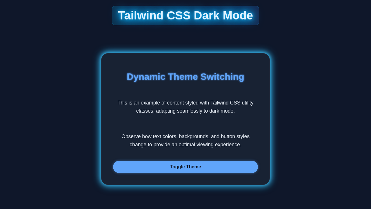
Hey there, fellow coders! If you’ve ever wanted to add a cool dark mode feature to your website but felt a bit lost, you are in the right place. Today, we’re diving deep into building a fantastic Tailwind Dark Mode toggle. This isn’t just about switching colors. It’s about enhancing user experience and giving your site a modern edge. So, let’s get building!
What We Are Building
We’re going to build an interactive dark mode toggle. Think of it like a light switch for your website! Users can click a button to instantly switch between a bright light theme and a sleek dark theme. This toggle will also remember their preference. Therefore, when they return, their chosen theme will load automatically. It’s super useful and makes your site feel much more professional.
HTML Structure for Your Tailwind Dark Mode Toggle
First, we’ll set up the basic bones of our project with HTML. We need a simple layout and a toggle switch. This will be the foundation for our beautiful theme changes. We will add a main container, some sample text, and a toggle button. It’s all very straightforward.
index.html
<!DOCTYPE html>
<html lang="en">
<head>
    <meta charset="UTF-8">
    <meta name="viewport" content="width=device-width, initial-scale=1.0">
    <title>Tailwind CSS Dark Mode</title>
    <!--
        Link to the compiled Tailwind CSS file.
        This 'output.css' file will be generated by the Tailwind CLI
        from 'input.css' after processing your Tailwind classes.
    -->
    <link rel="stylesheet" href="./dist/output.css">
    <style>
        /* Ensure basic layout properties for production code compatibility */
        body { margin: 0; box-sizing: border-box; font-family: Arial, Helvetica, sans-serif; }
        /* Prevent horizontal scroll issues that might arise from certain layouts */
        html, body { max-width: 100%; overflow-x: hidden; }
    </style>
</head>
<!--
    The `dark:` prefix on Tailwind classes applies styles only when the `dark` class
    is present on the <html> element.
    The `bg-gray-100` and `text-gray-900` are default light mode styles.
    The `dark:bg-slate-900` and `dark:text-slate-200` are dark mode specific overrides.
-->
<body class="bg-gray-100 dark:bg-slate-900 text-gray-900 dark:text-slate-200 min-h-screen flex items-center justify-center p-4 transition-colors duration-300">

    <div class="max-w-md w-full bg-white dark:bg-slate-800 shadow-lg dark:shadow-xl rounded-lg p-8 space-y-6 transition-all duration-300 transform hover:scale-105 border border-gray-200 dark:border-slate-700">
        <div class="flex items-center justify-between">
            <h1 class="text-3xl font-bold text-blue-600 dark:text-blue-400">Theme Switcher</h1>
            <!-- Dark Mode Toggle Button -->
            <button id="themeToggle" class="px-4 py-2 rounded-full bg-blue-500 text-white dark:bg-blue-400 dark:text-slate-900 font-semibold shadow-md hover:bg-blue-600 dark:hover:bg-blue-300 focus:outline-none focus:ring-2 focus:ring-blue-500 focus:ring-opacity-75 transition-colors duration-300">
                <span class="light-icon" style="display: none;">☀️ Light Mode</span>
                <span class="dark-icon" style="display: none;">🌙 Dark Mode</span>
                <span class="initial-text">Loading theme...</span> <!-- Shown until JS initializes -->
            </button>
        </div>

        <p class="text-gray-700 dark:text-slate-300 leading-relaxed">
            This card demonstrates how to implement a dynamic dark mode using Tailwind CSS and JavaScript. Click the toggle button above to switch between light and dark themes.
        </p>

        <div class="bg-gray-50 dark:bg-slate-700 p-4 rounded-md border border-gray-100 dark:border-slate-600">
            <h3 class="font-semibold text-lg text-gray-800 dark:text-slate-100 mb-2">Theme-Adaptive Content</h3>
            <p class="text-sm text-gray-600 dark:text-slate-400">
                Notice how the background, text, and border colors of this section change based on the active theme.
            </p>
        </div>

        <button class="w-full py-3 bg-indigo-500 text-white rounded-md font-semibold hover:bg-indigo-600 focus:outline-none focus:ring-2 focus:ring-indigo-500 focus:ring-opacity-75 dark:bg-indigo-400 dark:hover:bg-indigo-300 dark:text-slate-900 transition-colors duration-300">
            Learn More
        </button>
    </div>

    <script src="./script.js"></script>
</body>
</html>
Tailwind CSS Styling for Dynamic Themes
Next, we will bring our design to life using Tailwind CSS. Tailwind helps us style quickly and efficiently. We will use its utility classes to define our light and dark theme styles. The magic really happens with Tailwind’s dark: prefix. It makes theme switching simple.
input.css
/* input.css */

/*
   1. This file is the entry point for Tailwind CSS.
   2. It includes Tailwind's base styles, component styles, and utility classes.
   3. You will process this file using the Tailwind CLI to generate your final CSS bundle (e.g., output.css).
      Example CLI command: `npx tailwindcss -i ./input.css -o ./dist/output.css --watch`
*/

@tailwind base;
@tailwind components;
@tailwind utilities;

/*
   Add any custom global styles here if needed.
   For this tutorial, Tailwind utilities are sufficient and directly applied in HTML.
*/
JavaScript for Dynamic Tailwind Dark Mode
Now for the brain of our dark mode toggle! JavaScript handles the actual theme switching. It will detect user clicks and remember their preference. This means your website will always greet them with their chosen theme. We'll also ensure it works seamlessly.
tailwind.config.js
/** @type {import('tailwindcss').Config} */
module.exports = {
  // 1. Configure dark mode to use the 'class' strategy.
  //    This allows you to manually toggle dark mode by adding/removing a 'dark' class
  //    to the <html> element, giving users an explicit control over the theme.
  darkMode: 'class',

  // 2. Specify files where Tailwind should look for utility classes.
  //    Ensure this path correctly points to your HTML and/or JavaScript/TypeScript/JSX files.
  content: [
    "./index.html",
    // If you're using a framework like React, Vue, or Svelte, adjust these paths:
    // "./src/**/*.{js,ts,jsx,tsx}",
  ],

  // 3. Customize Tailwind's default theme (optional).
  theme: {
    extend: {
      // You can define custom colors, fonts, spacing, etc. here.
      // For this tutorial, we'll primarily stick to default Tailwind colors
      // which are already designed with good light/dark contrast.
    },
    fontFamily: {
      // Using safe web fonts as per tutorial rules.
      sans: ['Arial', 'Helvetica', 'sans-serif'],
    }
  },

  // 4. Add any Tailwind plugins (optional).
  plugins: [],
}
script.js
// script.js

document.addEventListener('DOMContentLoaded', () => {
    const themeToggle = document.getElementById('themeToggle');
    const htmlElement = document.documentElement; // This is the <html> tag

    /**
     * Updates the text/icon of the theme toggle button based on the current theme.
     * @param {boolean} isDark - True if dark mode is active, false otherwise.
     */
    function updateToggleButton(isDark) {
        const lightIcon = themeToggle.querySelector('.light-icon');
        const darkIcon = themeToggle.querySelector('.dark-icon');
        const initialText = themeToggle.querySelector('.initial-text');

        // Hide the initial loading text once the theme is determined
        if (initialText) {
            initialText.style.display = 'none';
        }

        if (isDark) {
            // Show 'Light Mode' icon/text when currently in Dark Mode (to suggest switching to light)
            if (lightIcon) lightIcon.style.display = 'inline-block';
            if (darkIcon) darkIcon.style.display = 'none';
        } else {
            // Show 'Dark Mode' icon/text when currently in Light Mode (to suggest switching to dark)
            if (lightIcon) lightIcon.style.display = 'none';
            if (darkIcon) darkIcon.style.display = 'inline-block';
        }
    }

    // 1. Initialize theme based on localStorage or system preference
    //    - Check if 'theme' is explicitly set in localStorage.
    //    - If not, check the user's system preference ('prefers-color-scheme').
    if (localStorage.theme === 'dark' || (!('theme' in localStorage) && window.matchMedia('(prefers-color-scheme: dark)').matches)) {
        htmlElement.classList.add('dark');
        updateToggleButton(true); // Set button state for dark mode
    } else {
        htmlElement.classList.remove('dark');
        updateToggleButton(false); // Set button state for light mode
    }

    // 2. Add event listener for the theme toggle button
    themeToggle.addEventListener('click', () => {
        // Toggle the 'dark' class on the <html> element
        htmlElement.classList.toggle('dark');

        // Update localStorage and button state
        if (htmlElement.classList.contains('dark')) {
            localStorage.theme = 'dark';
            updateToggleButton(true);
        } else {
            localStorage.theme = 'light';
            updateToggleButton(false);
        }
    });

    // 3. Listen for changes in the user's system theme preference
    //    This ensures the theme adapts automatically if the user changes their OS theme setting.
    window.matchMedia('(prefers-color-scheme: dark)').addEventListener('change', (e) => {
        // Only react to system changes if the user hasn't explicitly set a preference
        if (!('theme' in localStorage)) {
            if (e.matches) {
                htmlElement.classList.add('dark');
                updateToggleButton(true);
            } else {
                htmlElement.classList.remove('dark');
                updateToggleButton(false);
            }
        }
    });
});
How It All Works Together
Let’s break down how these pieces fit together. Each part plays a crucial role. Together, they create a smooth, dynamic dark mode experience for your users. We will walk through each step.
The HTML Foundation
Our HTML provides the basic layout. We start with a main container. Inside this, we place some content that will change color. Importantly, we add our dark mode toggle input. It’s a simple checkbox, visually styled to look like a toggle switch. The id="darkModeToggle" is key here. It allows our JavaScript to find and interact with it. This structure is clean and easy to understand. Plus, it gives us a clear place for our styles to land.
Tailwind Magic for Themes
Here’s the cool part about Tailwind CSS. We don’t write a ton of custom CSS rules. Instead, we apply classes directly in our HTML. For dark mode, Tailwind uses a special prefix: dark:. For example, dark:bg-gray-800 means "apply bg-gray-800 when dark mode is active." The trick is that Tailwind automatically adds or removes a dark class from the <html> element. Our JavaScript will handle this part. When the dark class is present, all dark: prefixed styles kick in. It’s a powerful way to manage themes!
Pro Tip: Tailwind’s
darkMode: 'class'configuration intailwind.config.jsis essential for this setup. It tells Tailwind to look for adarkclass on the HTML element. This approach gives you granular control over when dark mode styles apply.
JavaScript’s Smart Decisions
Our JavaScript acts as the conductor of this whole orchestra. First, it checks if a dark mode preference is saved in localStorage. localStorage is like a small storage cabinet in the user’s browser. It remembers things even after they close the tab. If a preference exists, it sets the theme immediately. Then, it listens for clicks on our toggle switch. When you click, it flips the dark class on the <html> element. This triggers all the Tailwind dark: styles. Finally, it updates the user’s preference in localStorage. This ensures consistency across visits. You can learn more about event listeners on CSS-Tricks.
We recently built a cool Tailwind Admin Dashboard: Sleek UI with HTML & CSS Utilities. You can see how essential good styling and interaction are there, too. This dark mode logic is crucial for modern interfaces.
Tips to Customise Your Tailwind Dark Mode
You’ve built a solid dark mode toggle, which is awesome! Now, let’s think about making it uniquely yours. Here are some ideas:
- Different Toggle Styles: Instead of a checkbox, use a sun/moon icon for your toggle. You could even animate the icons for a smoother transition.
- More Themed Elements: Apply
dark:classes to more components. Think about Tailwind Product Card: Build Stunning Cards with HTML & CSS backgrounds, borders, or even SVG icons. - System Preference Detection: Use
window.matchMedia('(prefers-color-scheme: dark)'). This detects if the user’s operating system prefers dark mode. You can set the initial theme based on this. - Custom Color Palettes: Dive into your
tailwind.config.js. Define your own custom dark mode colors. This gives your site a truly unique look.
Encouragement: Don’t be afraid to experiment! The best way to learn is by trying new things. Play with different styles and functionalities. Make this Tailwind Dark Mode toggle truly your own creation.
If you’re eager for more Tailwind goodness, check out our other Tailwind Dark Mode Tutorial: HTML & CSS Utilities. It dives deeper into the utility classes.
Conclusion
Wow, you just built a dynamic dark mode toggle! This is a fantastic step. You’ve mastered crucial concepts. You now understand HTML, Tailwind CSS, and JavaScript working together. This skill makes your websites more engaging. It also provides a better experience for users. Share your creation on social media! Show off what you’ve learned. Keep coding, keep creating, and keep making awesome things!