Hey! If you have wanted to build a dynamic search feature, but had no idea where to start, you are in the right place. Today, we’re going to build a fantastic React Debounced Search component. This component will make your user interfaces much snappier. It’s super cool to see it in action. You will love the result!
What We Are Building: A Smart React Debounced Search
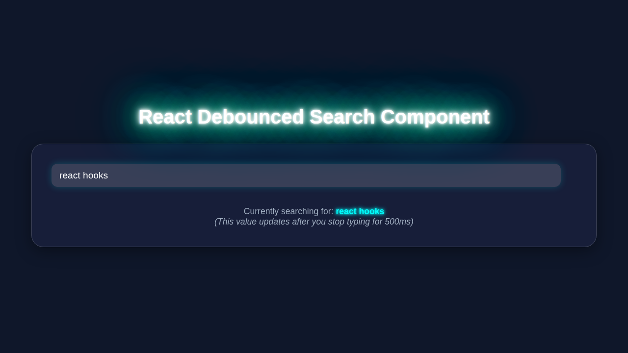
Imagine a search bar that only searches when you pause typing. That is exactly what a debounced search does! Instead of making an API call for every single character, it waits. It waits for a brief moment of inactivity from the user. Then, and only then, does it send the search request. This is great for performance. It saves your server from unnecessary requests. It also gives your users a smoother, more responsive feel. We will create a clean input field. It will display mock search results below. This project will teach you about handling user input. You will also learn about managing side effects in React. Get ready to impress your friends!
HTML Structure for Our Component
Our component will be quite simple. We need an input field for typing. Also, we will need a space to show our results. We’ll wrap these in a containing div. This keeps things neat. It’s the foundation for our React magic. Here is how our HTML will look inside our React component:
public/index.html
<!DOCTYPE html>
<html lang="en">
<head>
    <meta charset="UTF-8">
    <meta name="viewport" content="width=device-width, initial-scale=1.0">
    <title>React Debounced Search Component</title>
    <!-- The main CSS file will be linked via the React build process -->
</head>
<body>
    <noscript>You need to enable JavaScript to run this app.</noscript>
    <div id="root"></div>
    <!-- The React app will be injected here by the build process (e.g., Create React App or Vite) -->
    <!-- In a development setup, a script tag like <script src="../src/index.js"></script> might be used, -->
    <!-- but typically modern React projects are bundled, so no direct script tag is needed here for production. -->
</body>
</html>
CSS Styling for a Polished Look
No cool component is complete without some styling! We want our search bar to look modern. We will add some simple CSS. This makes it easy to read. It also provides a great user experience. Don’t worry, these styles are straightforward. They will bring our component to life. Take a look at the CSS:
src/styles.css
/* src/styles.css */

/* Basic Reset & Body Styling */
body {
    margin: 0;
    padding: 0;
    font-family: Arial, Helvetica, sans-serif; /* Safe font stack */
    -webkit-font-smoothing: antialiased;
    -moz-osx-font-smoothing: grayscale;
    background-color: #f0f2f5; /* Light background for the overall app */
    color: #333;
    line-height: 1.6;
    box-sizing: border-box; /* Ensure padding and border are included in the element's total width and height */
    overflow-x: hidden; /* Prevent horizontal scrollbars */
}

.app-container {
    max-width: 800px;
    margin: 2rem auto;
    padding: 2rem;
    background-color: #ffffff;
    border-radius: 12px;
    box-shadow: 0 4px 20px rgba(0, 0, 0, 0.08);
    box-sizing: border-box;
}

h1.main-title {
    color: #2c3e50;
    text-align: center;
    margin-bottom: 1.5rem;
    font-size: 2.5em;
}

.description {
    text-align: center;
    margin-bottom: 2rem;
    color: #666;
    font-size: 1.1em;
}

.search-section {
    margin-bottom: 2rem;
    display: flex;
    flex-direction: column;
    gap: 0.8rem;
}

.search-label {
    font-size: 1.2em;
    font-weight: bold;
    color: #34495e;
}

/* Styling for the DebouncedSearchInput component */
.debounced-search-input,
.search-input-field { /* Apply to both the component's internal input and the class passed via inputProps */
    width: 100%; /* Take full width of its container */
    padding: 12px 15px;
    font-size: 1.1em;
    border: 1px solid #ccc;
    border-radius: 8px;
    transition: all 0.3s ease;
    box-sizing: border-box; /* Critical for consistent sizing */
    max-width: 100%;
}

.debounced-search-input:focus,
.search-input-field:focus {
    border-color: #007bff; /* Highlight on focus */
    box-shadow: 0 0 0 3px rgba(0, 123, 255, 0.25);
    outline: none;
}

.results-section {
    padding: 1.5rem;
    background-color: #f8f9fa;
    border-radius: 10px;
    border: 1px solid #e9ecef;
}

.result-info {
    font-size: 1em;
    margin-bottom: 0.5rem;
    color: #555;
}

.result-info code {
    background-color: #e2e6ea;
    padding: 3px 6px;
    border-radius: 4px;
    font-family: 'Courier New', Courier, monospace;
    color: #c00; /* Red for emphasis */
}

.pending-debounce, .no-search-prompt {
    font-style: italic;
    color: #777;
    text-align: center;
    margin-top: 1.5rem;
}

.mock-results {
    margin-top: 1.5rem;
    border-top: 1px dashed #ced4da;
    padding-top: 1.5rem;
}

.mock-results h3 {
    color: #28a745; /* Green for results */
    margin-bottom: 1rem;
    font-size: 1.3em;
}

.mock-results ul {
    list-style-type: none;
    padding: 0;
    margin: 0;
}

.mock-results li {
    background-color: #e6ffed;
    border: 1px solid #c3e6cb;
    padding: 10px 15px;
    margin-bottom: 8px;
    border-radius: 6px;
    color: #155724;
}

/* Responsive adjustments */
@media (max-width: 768px) {
    .app-container {
        margin: 1rem auto;
        padding: 1rem;
    }

    h1.main-title {
        font-size: 2em;
    }

    .debounced-search-input,
    .search-input-field {
        padding: 10px 12px;
        font-size: 1em;
    }
    .description, .result-info, .search-label, .pending-debounce, .no-search-prompt {
        font-size: 0.95em;
    }
    .mock-results h3 {
        font-size: 1.2em;
    }
    .mock-results li {
        padding: 8px 12px;
    }
}
React Component Logic: Bringing It All Together with Hooks
Now for the exciting part: the React code! We will use React’s built-in hooks: useState and useEffect. These are fundamental for modern React development. useState helps us manage the input value. It also handles our search results. useEffect is where the debouncing magic happens. It will also simulate our API call. This component will be concise. It will be powerful. Let’s dive into the JavaScript for our React component:
src/index.js
// src/index.js
import React from 'react';
import ReactDOM from 'react-dom/client'; // Use createRoot for React 18
import App from './App';
import './styles.css'; // Import general styles

// Get the root element from index.html
const rootElement = document.getElementById('root');

// Create a React root and render the App component
if (rootElement) {
  const root = ReactDOM.createRoot(rootElement);
  root.render(
    <React.StrictMode>
      <App />
    </React.StrictMode>
  );
} else {
  console.error('Root element not found! Make sure an element with id="root" exists in index.html.');
}
src/DebouncedSearchInput.js
// src/DebouncedSearchInput.js
import React, { useState, useEffect } from 'react';

/**
 * A debounced search input component.
 * It delays calling the `onDebounce` callback until the user has stopped typing for a specified `debounceTime`.
 *
 * @param {object} props - The component props.
 * @param {string} [props.initialValue=''] - The initial value for the input field.
 * @param {number} [props.debounceTime=500] - The time in milliseconds to wait before calling `onDebounce`.
 * @param {function(string): void} props.onDebounce - The callback function to be called with the debounced value.
 * @param {string} [props.placeholder='Search...'] - The placeholder text for the input field.
 * @param {object} [props.inputProps={}] - Additional props to pass directly to the underlying <input> element.
 */
function DebouncedSearchInput({
  initialValue = '',
  debounceTime = 500,
  onDebounce,
  placeholder = 'Search...',
  inputProps = {},
}) {
  const [inputValue, setInputValue] = useState(initialValue); // State for the input's current value

  useEffect(() => {
    // Set up a timer to debounce the input value
    const handler = setTimeout(() => {
      // Only call onDebounce if the value is defined and the callback exists
      if (onDebounce) {
        onDebounce(inputValue); // Pass the current internal input value after debounce
      }
    }, debounceTime);

    // Clean up the previous timer on re-render or component unmount
    // This prevents calling `onDebounce` with stale data or after the component is unmounted.
    return () => {
      clearTimeout(handler);
    };
  }, [inputValue, debounceTime, onDebounce]); // Re-run effect if inputValue, debounceTime, or onDebounce changes

  const handleChange = (event) => {
    setInputValue(event.target.value); // Update internal input state immediately on every keystroke

    // If the consumer passed an onChange prop, call it too (e.g., for instant display updates in parent)
    if (inputProps.onChange) {
      inputProps.onChange(event);
    }
  };

  return (
    <input
      type="text"
      placeholder={placeholder}
      value={inputValue}
      onChange={handleChange}
      aria-label={placeholder}
      {...inputProps} // Spread any additional input props provided by the parent
    />
  );
}

export default DebouncedSearchInput;
src/App.js
// src/App.js
import React, { useState } from 'react';
import DebouncedSearchInput from './DebouncedSearchInput';
import './styles.css'; // Import general styles

function App() {
  // `debouncedSearchQuery` will hold the value that updates after the debounce time.
  // This is the value you'd typically use to trigger an API call or filter data.
  const [debouncedSearchQuery, setDebouncedSearchQuery] = useState('');

  // `instantSearchInput` will hold the value of the input field as the user types,
  // without any debounce. This is for demonstration purposes to show the difference.
  const [instantSearchInput, setInstantSearchInput] = useState('');

  // This function is called by DebouncedSearchInput after the debounce time.
  const handleDebouncedSearch = (value) => {
    setDebouncedSearchQuery(value); // Update the state with the debounced value
    console.log('Debounced search triggered with:', value);
    // In a real application, you would typically make your API call here:
    // fetch(`/api/search?q=${value}`).then(res => res.json()).then(data => /* update results */);
  };

  // This is a simple handler to track the immediate input value for demonstration.
  // It's passed to DebouncedSearchInput's `inputProps.onChange`.
  const handleInputChangeForDisplay = (event) => {
    setInstantSearchInput(event.target.value);
  };

  return (
    <div className="app-container">
      <h1 className="main-title">React Debounced Search Component</h1>

      <p className="description">
        This example demonstrates a reusable <code>DebouncedSearchInput</code> component
        that delays its <code>onDebounce</code> callback until the user has stopped typing
        for a specified duration (e.g., 500ms). This is crucial for optimizing performance
        by reducing unnecessary API requests or expensive computations.
      </p>

      <div className="search-section">
        <label htmlFor="search-box" className="search-label">Search anything:</label>
        <DebouncedSearchInput
          id="search-box" // ID for accessibility (label)
          initialValue="" // Optional initial value for the input field
          debounceTime={500} // Wait 500ms after the last key press
          onDebounce={handleDebouncedSearch} // The function to call with the debounced value
          placeholder="Type here to search..."
          // You can pass additional props to the underlying <input> element
          inputProps={{
            className: 'search-input-field', // Add a class for styling
            onChange: handleInputChangeForDisplay, // Track instant input for display purposes
            'aria-label': 'Search input with debounce' // Accessibility
          }}
        />
      </div>

      <div className="results-section">
        <p className="result-info">
          <strong>Instant Input Value:</strong> <code>{instantSearchInput || 'Waiting for input...'}</code>
        </p>
        <p className="result-info">
          <strong>Debounced Search Query:</strong> <code>{debouncedSearchQuery || 'Waiting for debounced input...'}</code>
        </p>

        {debouncedSearchQuery && ( // Show mock results only if debounced query is present
          <div className="mock-results">
            <h3>Mock Results for "{debouncedSearchQuery}"</h3>
            <ul>
              <li>Item A related to "{debouncedSearchQuery}"</li>
              <li>Item B related to "{debouncedSearchQuery}"</li>
              <li>Item C related to "{debouncedSearchQuery}"</li>
              <li>More results for "{debouncedSearchQuery}"...</li>
            </ul>
          </div>
        )}
        {/* Show pending message if user typed but debounce hasn't fired yet */}
        {!debouncedSearchQuery && instantSearchInput && (
            <p className="pending-debounce"><i>Waiting for debounce...</i></p>
        )}
        {/* Show initial prompt */}
        {!debouncedSearchQuery && !instantSearchInput && (
            <p className="no-search-prompt">Start typing above to see results.</p>
        )}
      </div>
    </div>
  );
}

export default App;
How It All Works Together: The Debounced Search Explained
Let’s break down the code we just wrote. Understanding each piece is key. You will see how useState and useEffect coordinate. This creates our efficient search feature. It’s really quite elegant once you see the pattern.
The Search Input and State Management
First, we declare two state variables using useState. The searchTerm holds the current value of our input field. When you type, this state updates. We also have debouncedSearchTerm. This state only updates after a delay. This delay is the essence of debouncing. The setSearchTerm function updates searchTerm immediately. This happens every time you type. It connects directly to our input field’s onChange event. Therefore, the input always reflects what you are typing. This is standard React user input handling.
Pro Tip:
useStateis your go-to for managing component-specific data. It makes your components dynamic. Try to keep your state as minimal as possible for better performance and easier debugging!
The Magic of Debouncing with useEffect
Here’s the cool part! We use useEffect to implement debouncing. This hook runs after every render. However, we control when it re-runs. We pass searchTerm to its dependency array. This means the effect will re-run whenever searchTerm changes. Inside the effect, we set a timer. This timer delays updating debouncedSearchTerm. If searchTerm changes again before the timer finishes, the old timer clears. Then a new timer starts. This ensures that debouncedSearchTerm only updates after a pause. The cleanup function returned by useEffect is crucial here. It clears the previous timer. MDN has more on setTimeout. This prevents memory leaks too.
Triggering the (Mock) Search
Next, another useEffect handles our search logic. This effect has debouncedSearchTerm in its dependency array. Consequently, it only runs when the debounced term changes. This is when the user has paused typing. Inside, we simulate an API call. We use setTimeout to mimic network latency. In a real app, you would fetch data here. You might use fetch or axios. Then, we filter our mock data. Finally, we update the searchResults state. This displays the relevant items. Consider how this differs from React Server Components which handle data differently.
Displaying the Results
Finally, we map over the searchResults array. We render each item as a list item. This part is pretty standard React rendering. If there are no results, we show a friendly message. This provides good user feedback. It tells the user that their search yielded no matches. This completes our visual feedback loop. You now have a working React Debounced Search component!
Tips to Customise It
You’ve built a solid foundation! Now, let’s think about how you can extend this project. Make it your own. Here are a few ideas to get you started:
- Integrate a Real API: Replace the mock
searchItemswith an actual API call. Think about an external database or a backend service. This would make your search truly dynamic. - Loading State: Add a loading indicator. Show it while the search is in progress. This improves user experience significantly. Users will know something is happening.
- Error Handling: Implement error handling for your API calls. Display error messages if something goes wrong. Robust applications always account for problems.
- Styling Options: Experiment with different CSS styles. Make the input and results match your brand. You could also add animations.
- Minimum Query Length: Only trigger the search if the
debouncedSearchTermis, say, 3 characters or more. This prevents overly broad searches.
Keep Building: Every line of code you write makes you a better developer. Don’t stop here! This component can be a part of many larger projects, just like a React quiz app!
Conclusion: You Built a Smart Search!
Amazing job! You have successfully built a functional and efficient React Debounced Search component. You learned about useState for managing local component state. More importantly, you mastered useEffect for handling side effects and debouncing. This technique is invaluable for modern web applications. It improves both performance and user experience. Take pride in what you have accomplished. Share your work with others. Keep experimenting. Happy coding!