CSS @property Animation: Enhance UI with Custom Property Effects (HTML/CSS)
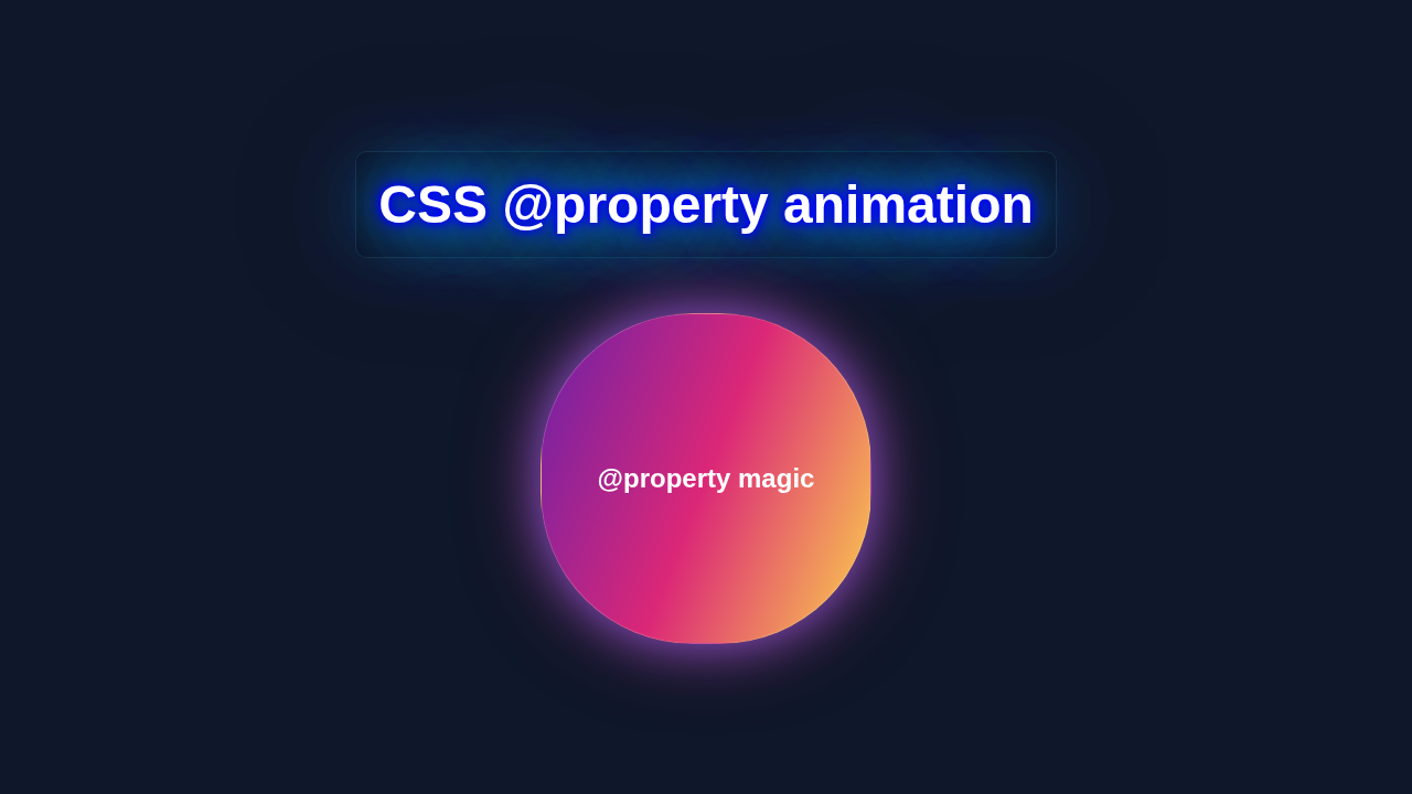
Hey there, awesome coder! If you’ve ever wanted to build a truly dynamic button that feels alive, you’re in the right spot. We’re diving into the amazing world of CSS @property Animation today. This powerful CSS feature lets us animate custom properties like never before! We will craft a sleek, interactive button. It will beautifully animate its background on hover. Get ready to elevate your UI skills!
What We Are Building
Today, we will build a modern button with a cool animation effect. When you hover over it, a background color will elegantly slide or expand. This makes the button feel incredibly responsive. It’s more than just a visual treat. This technique teaches you core concepts. These concepts are vital for advanced CSS animations. We’re moving beyond simple color changes. We will control specific values with custom properties. This opens up so many creative possibilities!
HTML Structure
First, let’s set up our basic HTML. We’ll use a simple <button> element. We will give it a class for our styling. This keeps our structure clean and easy to manage.
index.html
<!DOCTYPE html>
<html lang="en">
<head>
    <meta charset="UTF-8">
    <meta name="viewport" content="width=device-width, initial-scale=1.0">
    <title>CSS @property Animation Tutorial</title>
    <link rel="stylesheet" href="styles.css">
</head>
<body>
    <div class="animated-box">
        <p>Animating with @property</p>
    </div>
</body>
</html>
CSS Styling
Now for the fun part: the CSS! We’ll start with some base styles. Then, we will introduce the star of the show: @property. This is where we make our custom variables animatable. Pay close attention to how we define our custom properties!
styles.css
/* styles.css */

/* Basic body styles for a clean canvas and centering the component */
body {
    margin: 0;
    display: flex;
    justify-content: center;
    align-items: center;
    width: 100vw; /* Ensure full viewport width */
    height: 100vh; /* Ensure full viewport height */
    background-color: #282c34; /* Dark background for contrast */
    font-family: Arial, Helvetica, sans-serif; /* Safe font */
    color: #f0f0f0; /* Light text color */
    overflow: hidden; /* Prevent scrollbars */
    box-sizing: border-box; /* Standard box model */
}

/*
    1. Define Custom Properties with @property
    -------------------------------------------
    The @property CSS at-rule allows you to register custom properties,
    giving them a syntax, an initial value, and defining whether they inherit.
    This is crucial for animating custom properties because the browser needs
    to know how to interpolate between values (e.g., as a color, a length, an angle).
    Without @property, custom properties are treated as strings and cannot be animated
    smoothly (they would typically jump between values).
*/
@property --gradient-rotation {
    syntax: "<angle>"; /* Defines the expected type of value for the property */
    inherits: false;   /* Specifies if the property should inherit its value from its parent */
    initial-value: 0deg; /* The starting value for the property */
}

@property --box-border-radius {
    syntax: "<length-percentage>"; /* Can be a length (px, em, rem) or percentage */
    inherits: false;
    initial-value: 20%; /* A moderate initial radius */
}

@property --glow-intensity {
    syntax: "<length>"; /* Expected to be a length value (e.g., px, em) */
    inherits: false;
    initial-value: 0px; /* No glow initially */
}


/*
    2. Style the Animated Box
    ---------------------------
    This section styles our div element, applying the custom properties
    and linking them to animation keyframes.
*/
.animated-box {
    width: 280px;
    height: 280px;
    max-width: 100%; /* Ensure the box is responsive and doesn't overflow */
    display: flex;
    justify-content: center;
    align-items: center;
    font-size: 1.3em;
    text-align: center;

    /* Applying the custom properties to CSS declarations */
    background: linear-gradient(
        var(--gradient-rotation), /* This custom property will be animated */
        #61dafb, /* Cyan */
        #a626a6, /* Magenta */
        #f28c2c  /* Orange */
    );
    border-radius: var(--box-border-radius); /* This custom property will be animated */
    box-shadow:
        0 0 calc(10px + var(--glow-intensity)) #61dafb, /* First layer of glow */
        0 0 calc(20px + var(--glow-intensity) * 1.5) #a626a6, /* Second layer, more spread */
        0 0 calc(30px + var(--glow-intensity) * 2) #f28c2c; /* Third layer, even more spread */

    transition: transform 0.3s ease-in-out; /* Smooth hover effect for transform */
    overflow: hidden; /* Ensures content and background stay within rounded corners */
    box-sizing: border-box; /* Include padding and border in the element's total width and height */
    padding: 20px;
    color: #ffffff; /* White text for good contrast */
}

/* Hover effect to demonstrate interactive feedback */
.animated-box:hover {
    transform: scale(1.05); /* Slightly enlarge the box on hover */
}


/*
    3. Define Keyframe Animations
    -------------------------------
    Here we define standard CSS keyframe animations. The key difference
    is that instead of animating standard CSS properties like 'background-color'
    or 'border-radius' directly, we are animating our *registered custom properties*.
    Because we defined their 'syntax' in @property, the browser now understands
    how to interpolate the values smoothly.
*/

/* Animation for gradient rotation */
@keyframes rotateGradient {
    from { --gradient-rotation: 0deg; } /* Start from 0 degrees */
    to { --gradient-rotation: 360deg; } /* Rotate to 360 degrees */
}

/* Animation for border-radius morphing */
@keyframes morphRadius {
    0% { --box-border-radius: 20%; } /* Start with 20% border-radius */
    50% { --box-border-radius: 50%; } /* Morph to 50% (circular for a square) */
    100% { --box-border-radius: 20%; } /* Return to 20% */
}

/* Animation for the glow effect around the box */
@keyframes pulseGlow {
    0% { --glow-intensity: 0px; } /* No extra glow */
    50% { --glow-intensity: 15px; } /* Max glow intensity */
    100% { --glow-intensity: 0px; } /* Return to no extra glow */
}

/* Apply animations to the box element */
.animated-box {
    animation:
        rotateGradient 6s linear infinite,           /* Rotate the gradient continuously */
        morphRadius 4s ease-in-out infinite alternate, /* Morph radius back and forth */
        pulseGlow 3s ease-in-out infinite alternate;   /* Pulse the glow effect back and forth */
}
JavaScript
For this animated button, we won’t need any JavaScript! That’s the beauty of modern CSS. We can achieve complex animations directly in our stylesheets. Isn’t that awesome? Our button’s magic comes purely from HTML and CSS.
How It All Works Together
Let’s break down the magic behind our animated button. Each part plays a key role. Together, they create a smooth, engaging user experience. Understanding these steps will help you apply this to other projects. You’ll soon be building amazing interfaces!
The Power of @property for Animation
Here’s the cool part: the @property rule. This is a game-changer for CSS animation. Before, we could only animate a limited set of properties. Now, we can tell the browser how to animate our own custom properties. We define a custom property. Then, we tell CSS what type of value it holds. We also give it an initial value. We even specify if it should inherit its value. This makes CSS @property incredibly flexible. It’s like teaching the browser a new trick. Our button uses --button-background-start and --button-background-end. We declare them as percentages. This lets them change smoothly.
Defining Animatable Custom Properties
We declared two custom properties using @property. These are --button-background-start and --button-background-end. We set their syntax as <percentage>. This ensures they animate like numbers between 0% and 100%. We also give them an initial value of 50%. This is their starting state. We mark them as false for inheritance. This means they won’t automatically pass down to child elements. This level of control is what makes CSS @property Transition: Animate Custom Properties with HTML/CSS so effective. It gives us precise animation behavior.
Crafting the Dynamic Background with linear-gradient
The visual effect comes from our background property. We use a linear-gradient() here. This function creates a gradient along a straight line. Our gradient goes from left to right. It uses a transparent color. Then it transitions to our main button color. The key is how we define the color stops. We use our custom properties: --button-background-start and --button-background-end. These values tell the gradient where to begin and end its colored section. When these values change, the gradient visually expands or contracts. This creates our smooth animation. Learn more about CSS gradients for even more effects.
Pro Tip: Think of
@propertyas registering a variable with the browser. You’re saying, "Hey, this variable can change over time, and here’s how it should behave!" This is powerful for complex animations.
Animating on Hover
Finally, we link everything together with the :hover pseudo-class. When you hover over the button, we update our custom properties. We change --button-background-start to 0%. We change --button-background-end to 100%. Because we defined these properties with @property, the browser knows how to transition them smoothly. The transition property on the button ensures a graceful change. It applies to all animatable properties. This combination gives us that beautiful, expanding background effect. It’s all done with just CSS!
Tips to Customise It
You’ve built a fantastic animated button! Now, let’s think about how you can make it your own.
- Change the Direction: Adjust the
to rightinlinear-gradient()toto toporto bottom. Watch how the animation changes! - Experiment with Colors: Pick different colors for your gradient. Try a subtle fade with opacity. Maybe use different colors for hover and non-hover states.
- Vary the Timing: Play with the
transitionduration and timing function. Tryease-in-outorcubic-bezier(). This will alter the feel of the animation. - Add More Complexity: Combine this with other CSS features. You could use CSS Clip-path: Create Custom Shapes with HTML & CSS to make your button non-rectangular. Or, integrate this with a larger stylesheet built with CSS Cascade Layers: Master Your Styles with Visual Guide for better organization.
Keep Learning: The best way to improve is by experimenting. Don’t be afraid to break things and then fix them. That’s how we truly learn to code!
Conclusion
You just built an amazing animated button using the incredible power of CSS @property Animation! You learned how to define custom properties. You made them animatable. And you integrated them into a dynamic visual effect. This technique opens up a whole new world for UI design. It allows for highly custom and performant animations. Keep practicing these skills. Share your creations online! Show off what you’ve built on your portfolio. Happy coding, and keep exploring the endless possibilities of CSS!