Hey there, future UI wizard! Have you ever wanted to break free from boring rectangles on your websites? It’s time to add some serious flair! With CSS Clip-path, you can create truly unique UI shapes and stunning visual effects. We will build an awesome component today, using only HTML and CSS. You’ll soon craft custom shapes that truly stand out.
What We Are Building with CSS Clip-path
We are going to build an eye-catching content card. This card will feature a distinctive, wave-like bottom edge. It will look super modern and sleek. This design moves far beyond standard squares or circles. It is perfect for hero sections or featured content blocks. Plus, we will add a subtle hover effect. This will make our custom shape even more engaging for users. It is a fantastic way to capture attention!
HTML Structure
First, we need a simple base for our custom-shaped element. We will create a div with a specific class. Inside, we will add some headings and paragraph text. This will represent the content within our unique shape. It’s a clean and semantic way to start.
index.html
<!DOCTYPE html>
<html lang="en">
<head>
    <meta charset="UTF-8">
    <meta name="viewport" content="width=device-width, initial-scale=1.0">
    <title>CSS Clip-path Tutorial</title>
    <link rel="stylesheet" href="styles.css">
</head>
<body>
    <header class="tutorial-header">
        <h1>Mastering CSS `clip-path`</h1>
        <p>Shape your web elements with precision using only HTML and CSS.</p>
    </header>

    <main class="clip-path-examples-container">

        <div class="clip-path-example example-polygon-triangle">
            <h2>Polygon: Triangle</h2>
            <p><code>clip-path: polygon(50% 0%, 0% 100%, 100% 100%);</code></p>
        </div>

        <div class="clip-path-example example-polygon-speech-bubble">
            <h2>Polygon: Speech Bubble</h2>
            <p>Complex custom shapes are easy with polygons.</p>
        </div>

        <div class="clip-path-example example-circle">
            <h2>Circle</h2>
            <p><code>clip-path: circle(50% at 50% 50%);</code></p>
        </div>

        <div class="clip-path-example example-ellipse">
            <h2>Ellipse</h2>
            <p><code>clip-path: ellipse(60% 40% at 50% 50%);</code></p>
        </div>

        <div class="clip-path-example example-inset">
            <h2>Inset</h2>
            <p><code>clip-path: inset(20px 30px round 15px);</code></p>
        </div>

        <div class="clip-path-example example-animated">
            <h2>Animated `clip-path`</h2>
            <p>Hover to see a dynamic shape change!</p>
        </div>

    </main>

    <footer>
        <p>© 2023 CSS Clip-path Tutorial</p>
    </footer>
</body>
</html>
CSS Styling: Unleash Custom Shapes
Now, let’s make our div look fantastic and apply the magic of clip-path. We will add basic styles like dimensions and colors. Then, we will introduce the clip-path property. This is where our custom shape comes to life. We will also add a smooth transition for our hover effect.
styles.css
/* Global Reset and Base Styles */
body {
    margin: 0;
    font-family: Arial, Helvetica, sans-serif; /* Safe fonts */
    background-color: #1a1a2e; /* Dark background for contrast */
    color: #e0e0e0;
    line-height: 1.6;
    box-sizing: border-box;
    overflow-x: hidden; /* Prevent horizontal scroll */
}

*, *::before, *::after {
    box-sizing: inherit;
}

.tutorial-header {
    background-color: #0f3460;
    padding: 20px 0;
    text-align: center;
    margin-bottom: 40px;
    border-bottom: 3px solid #e94560;
}

.tutorial-header h1 {
    margin: 0;
    font-size: 2.8em;
    color: #fff;
    text-shadow: 2px 2px 4px rgba(0,0,0,0.3);
}

.tutorial-header p {
    font-size: 1.1em;
    color: #ccc;
}

.clip-path-examples-container {
    display: flex;
    flex-wrap: wrap;
    justify-content: center;
    gap: 30px;
    padding: 20px;
    max-width: 1200px;
    margin: 0 auto 50px auto;
}

.clip-path-example {
    width: 300px;
    height: 200px;
    background-color: #2e3b5e;
    border: 1px solid #4a5a7f;
    display: flex;
    flex-direction: column;
    justify-content: center;
    align-items: center;
    text-align: center;
    padding: 20px;
    position: relative;
    overflow: hidden; /* Important for clip-path to work as expected */
    box-shadow: 0 5px 15px rgba(0, 0, 0, 0.4);
    transition: background-color 0.3s ease, transform 0.3s ease;
}

.clip-path-example h2 {
    margin-top: 0;
    font-size: 1.4em;
    color: #9abaff;
}

.clip-path-example p {
    font-size: 0.9em;
    color: #c0c0c0;
}

/* --- Clip-path Examples --- */

/* Example 1: Polygon (Triangle) */
.example-polygon-triangle {
    /* Defines a triangle pointing upwards */
    /* Coordinates: (top-center), (bottom-left), (bottom-right) */
    clip-path: polygon(50% 0%, 0% 100%, 100% 100%);
    background-image: linear-gradient(to right top, #a6c0fe, #f68084);
    color: #1a1a2e;
}

/* Example 2: Polygon (Speech Bubble) */
.example-polygon-speech-bubble {
    /* A more complex polygon to create a speech bubble shape */
    /* Coordinates define the path points */
    clip-path: polygon(
        0% 0%,
        100% 0%,
        100% 75%,
        75% 75%,
        75% 100%,
        50% 75%,
        0% 75%
    );
    background-image: linear-gradient(to right, #43e97b 0%, #38f9d7 100%);
    color: #1a1a2e;
}

/* Example 3: Circle */
.example-circle {
    /* Creates a perfect circle */
    /* Value: circle(radius at position-x position-y) */
    clip-path: circle(50% at 50% 50%);
    background-image: linear-gradient(to top, #ffafbd 0%, #ffc3a0 100%);
    color: #1a1a2e;
}

/* Example 4: Ellipse */
.example-ellipse {
    /* Creates an oval shape */
    /* Value: ellipse(radius-x radius-y at position-x position-y) */
    clip-path: ellipse(60% 40% at 50% 50%);
    background-image: linear-gradient(to right, #fc6076, #ff9a44);
    color: #1a1a2e;
}

/* Example 5: Inset (Rounded Corners) */
.example-inset {
    /* Creates an inner rectangle with optional rounded corners */
    /* Value: inset(top right bottom left round border-radius) */
    clip-path: inset(20px 30px 20px 30px round 15px);
    background-image: linear-gradient(to right, #89f7fe 0%, #66a6ff 100%);
    color: #1a1a2e;
}

/* Example 6: Animated Clip-path */
.example-animated {
    background-image: linear-gradient(to right, #f83600 0%, #f9d423 100%);
    color: #1a1a2e;
    transition: clip-path 0.5s ease-in-out;
    /* Start as a simple rectangle (no clip-path initially, or a basic inset) */
    clip-path: inset(0% 0% 0% 0%); /* Start as a full rectangle */
}

.example-animated:hover {
    /* On hover, change to a star shape */
    clip-path: polygon(
        50% 0%,
        61% 35%,
        98% 35%,
        68% 57%,
        79% 91%,
        50% 70%,
        21% 91%,
        32% 57%,
        2% 35%,
        39% 35%
    );
    transform: scale(1.05);
}

/* Footer */
footer {
    text-align: center;
    padding: 20px;
    margin-top: 40px;
    background-color: #0f3460;
    border-top: 1px solid #e94560;
    color: #ccc;
    font-size: 0.9em;
}

/* Responsive Adjustments */
@media (max-width: 768px) {
    .tutorial-header h1 {
        font-size: 2em;
    }

    .clip-path-example {
        width: 90%; /* Take more width on smaller screens */
        height: 180px;
    }
}
How Our CSS Clip-path Shapes Come Alive
Setting Up Our Canvas (HTML)
Our HTML foundation is simple and easy to understand. We are using a single div element. This div has a class called creative-card. This class will be our primary hook for all the amazing CSS styling we are about to apply. Inside this main container, we have an h2 heading for our card’s title. Below that, a p tag holds some descriptive paragraph text. This setup is highly adaptable. You can easily swap out the text for images or other elements later. This is great for creating reusable UI components. For example, if you wanted to display many of these cards, you’d find tools like CSS Grid or Flexbox incredibly useful for arranging them neatly on your page.
The Magic of CSS Clip-path: Shaping the Web
Okay, get ready for the real star of the show: clip-path! This super cool CSS property lets you literally clip an element. Think of it like taking a pair of scissors to a piece of paper. Whatever shape you cut, only that part remains visible. The rest simply disappears from view. But don’t worry, the content is still there, just hidden. It also becomes unclickable.
We are specifically using the polygon() function with clip-path. This function is incredibly versatile. It allows us to define any custom shape imaginable! You provide a series of x and y coordinates. Each pair represents a point on the element. The browser then connects these points with straight lines. This forms your unique polygon. For example, polygon(0 0, 100% 0, 100% 75%, 0% 100%) would create a trapezoid. The percentages are key here. They make our design truly responsive. Your custom shape will automatically adjust its size. This ensures it looks great on any screen, big or small. Our wavy shape requires a few more points. These points are carefully placed to create that beautiful, smooth curve at the bottom of our card. It is an impressive visual effect!
Pro Tip: Don’t try to guess
polygon()coordinates! It’s super hard to get perfect curves manually. Instead, use an awesome online tool called Clippy by Bennett Feely. You can visually draw your desired shape right in your browser. Then, it gives you the exact CSSclip-pathcode. This saves tons of time and frustration!
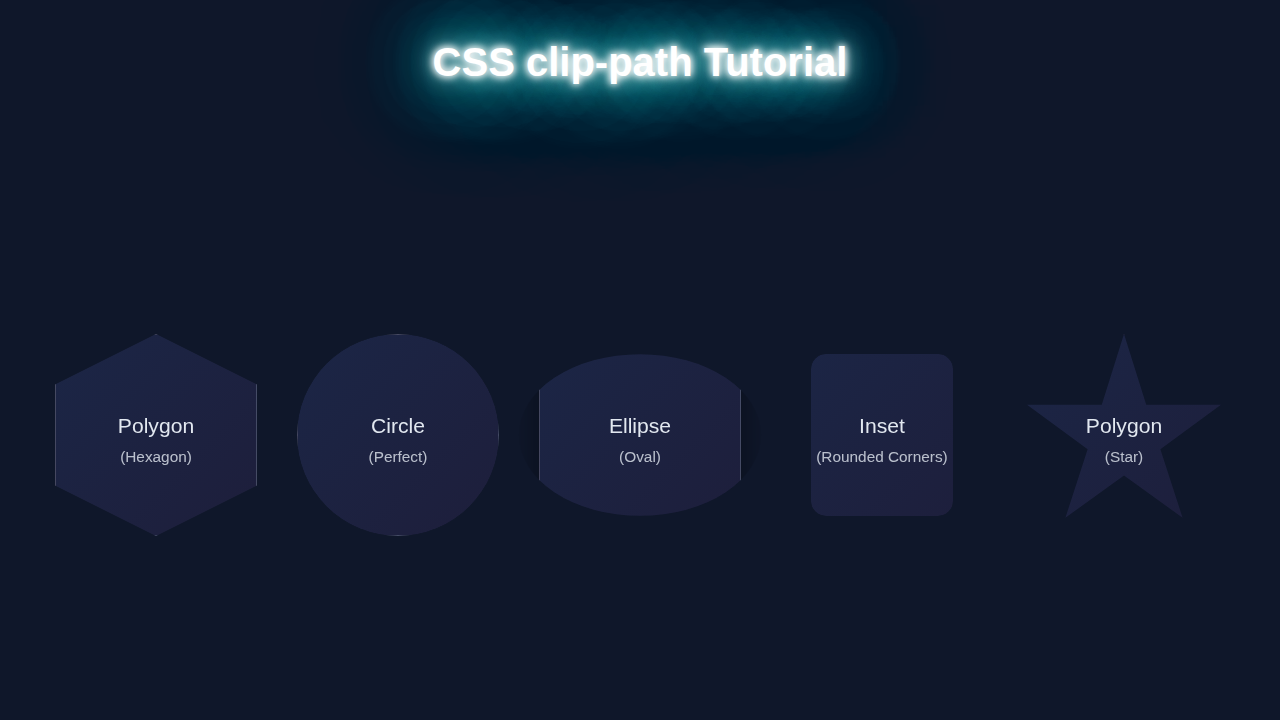
Remember, polygon() is just one option! You can also use circle(), ellipse(), or inset(). Each one offers a different way to cut out shapes. circle() creates perfect circles. ellipse() gives you ovals. inset() clips rectangular sections from the element’s edges. Exploring these functions will greatly expand your UI design capabilities. You will feel like a true design magician!
Bringing It to Life with Our Core CSS
Now let’s add some fundamental styling. We first set a width and height for our card. This gives it a defined space on the page. A background-color provides immediate visual feedback. It makes our card pop! We also add a border-radius to the top corners. This softens the overall look. It contrasts nicely with our sharp custom clip-path shape. Then, padding around the content ensures text isn’t cramped.
We use display: flex, flex-direction: column, and justify-content: center for perfect text alignment. This neatly centers our title and paragraph within the card. It looks very professional!
The transition property is absolutely essential for our interactive effect. It ensures that changes to our clip-path are not abrupt. Instead, they animate smoothly over a specified duration. We set a transition on clip-path and transform. This means when these properties change, they will gracefully transition. This creates a much more polished and engaging user experience. Small details like this make a huge difference!
Enhancing Interaction with Dynamic Hover Effects
This is where our card truly comes alive! We use the :hover pseudo-class. This allows us to apply specific styles when a user’s mouse cursor hovers over our creative-card. On hover, we subtly change the clip-path value. We adjust a few coordinates. This gently alters the wave shape at the bottom. It creates a dynamic "breathing" or "wiggling" effect. This simple change instantly signals interactivity to the user.
We also apply a transform: scale(1.02) on hover. This makes the card slightly larger. It draws the user’s eye and adds another layer of feedback. These combined effects are powerful. They make the card feel alive and responsive. Remember, CSS transitions handle all this animation for us automatically. No JavaScript needed for these stunning visual touches! For more advanced styling control, especially when managing many interacting components, understanding how CSS Cascade Layers work can save you a lot of headaches in larger projects.
Tips to Customise Your Clip-path Designs
Ready to make this project truly your own? You’ve got the skills! Here are some fantastic ideas to extend your creativity.
- Wilder Shapes: Don’t stop at a wave! Experiment with
polygon()to create triangles, stars, crosses, or even custom speech bubbles. The possibilities are endless. Just play with those coordinates! - Image Masking: Go beyond background colors. Apply
clip-pathdirectly to an<img>element. This lets you crop images into unique shapes. Think hexagonal profile pictures or abstract photo galleries. It is a fantastic visual trick! - Interactive Galleries & Menus: Use
clip-pathon overlays or menu items. Change the shape on hover to reveal hidden text or create cool peek-through effects. This adds a layer of delightful discovery for users. - Dynamic Theming: Combine
clip-pathwith CSS Custom Properties Theming with HTML & CSS for Dynamic UIs. You could then dynamically changeclip-pathpoints based on user preferences or theme selections! This unlocks incredible power for truly dynamic and personalized UIs.
Encouragement: Smaller: Don’t ever be afraid to break things and experiment! The very best way to master CSS
clip-path(and any new CSS feature) is by playing around. Change values, see what happens, and have fun. You’re building amazing things!
Conclusion
Awesome job, UI architect! You’ve just designed and built a truly unique component. You broke free from boring box shapes. You mastered the incredible power of CSS Clip-path. This skill opens up so many creative avenues for your web projects. You can now craft captivating designs that grab attention. Share what you have created. Inspire others with your unique UI! Keep exploring, keep building, and keep being awesome. The web is your canvas, so paint something incredible!