Hello there, fellow pro-coder-to-be! If you are brand new to structuring web pages, you might feel a little lost. Terms like “CSS Grid” and “Flexbox” probably sound like complex spells. Don’t worry, you are not alone on this journey. Many beginners wonder which one to use. Here’s the good news: they are not rivals. Instead, CSS Grid Flexbox are truly complementary tools. Understanding this key idea will make your layout work much smoother.
What You Need to Know First: Building with Blocks
Imagine you are building with LEGO bricks. On the web, everything is essentially a rectangular box. Your browser places these boxes on the screen. In the past, arranging these boxes exactly where you wanted them was a real headache. You might have heard of “floats” or “inline-block.” These methods worked, but they often felt like wrestling with your layout. They required tricky workarounds for common tasks.
But things have changed! Modern CSS gives us powerful tools. These tools help you control where those rectangular boxes go. You can precisely position your elements. This makes creating beautiful, organized web pages much simpler. You can think of it as upgrading from simple blocks to a sophisticated building system. Now, let’s meet our two star players.
Flexbox: Your One-Dimensional Maestro
Think of Flexbox as your expert for arranging items in a single line. This line can be horizontal, like books on a shelf. Or it can be vertical, like a stack of plates. Flexbox excels at distributing space among items. It also helps you align them perfectly. You tell a parent container, “Hey, make your children flexible!” Then, those children (your content boxes) adapt to the available space. This is done by applying display: flex to the parent element.
For instance, if you have three items, Flexbox can make them equally spaced. Or it can push one to the left and another to the right. It’s incredibly handy for small groups of elements. Navigational menus are a perfect example. You want your menu items to line up nicely. Creating a responsive navbar often relies on Flexbox magic. It makes sure everything looks great on any screen size. You can quickly center an item with just a few rules. Ever struggled to get something exactly in the middle of its container? Flexbox makes that a breeze.
It’s your go-to for component-level layouts. This means arranging items within a smaller part of your page. Maybe you have a group of social media icons. Perhaps it’s a series of product cards that need even spacing. Flexbox is your friend for these scenarios. It gives you precise control over one axis at a time. This simplicity is its biggest strength.
CSS Grid: The Two-Dimensional City Planner
Now, let’s talk about CSS Grid. If Flexbox handles a single line, Grid handles both rows and columns at the same time. Imagine you are designing a city layout. You define streets (columns) and avenues (rows). Then you place buildings (your content) into specific blocks. That’s what CSS Grid does for your web page. You apply display: grid to a container. This container then becomes a grid. You define its structure with rows and columns.
You can specify how wide your columns should be. You can also say how tall your rows need to be. It’s perfect for overall page structures. Think about a complex dashboard. You might have a sidebar on the left, a header at the top, and a main content area. Grid lets you define all these areas with clarity. It helps you control the entire canvas. MDN Web Docs has amazing resources to explore Grid deeply. You can make certain elements span multiple columns or rows. This gives you immense power over your design.
It helps you create intricate, organized layouts. You can ensure your main content area always takes up the remaining space. Or you can easily create photo galleries with varying image sizes. Grid gives you a holistic view of your layout. You are thinking about the page as a whole. You are mapping out every major section. This is a game-changer for responsive design, too. You can easily rearrange your entire page structure for different screen sizes.
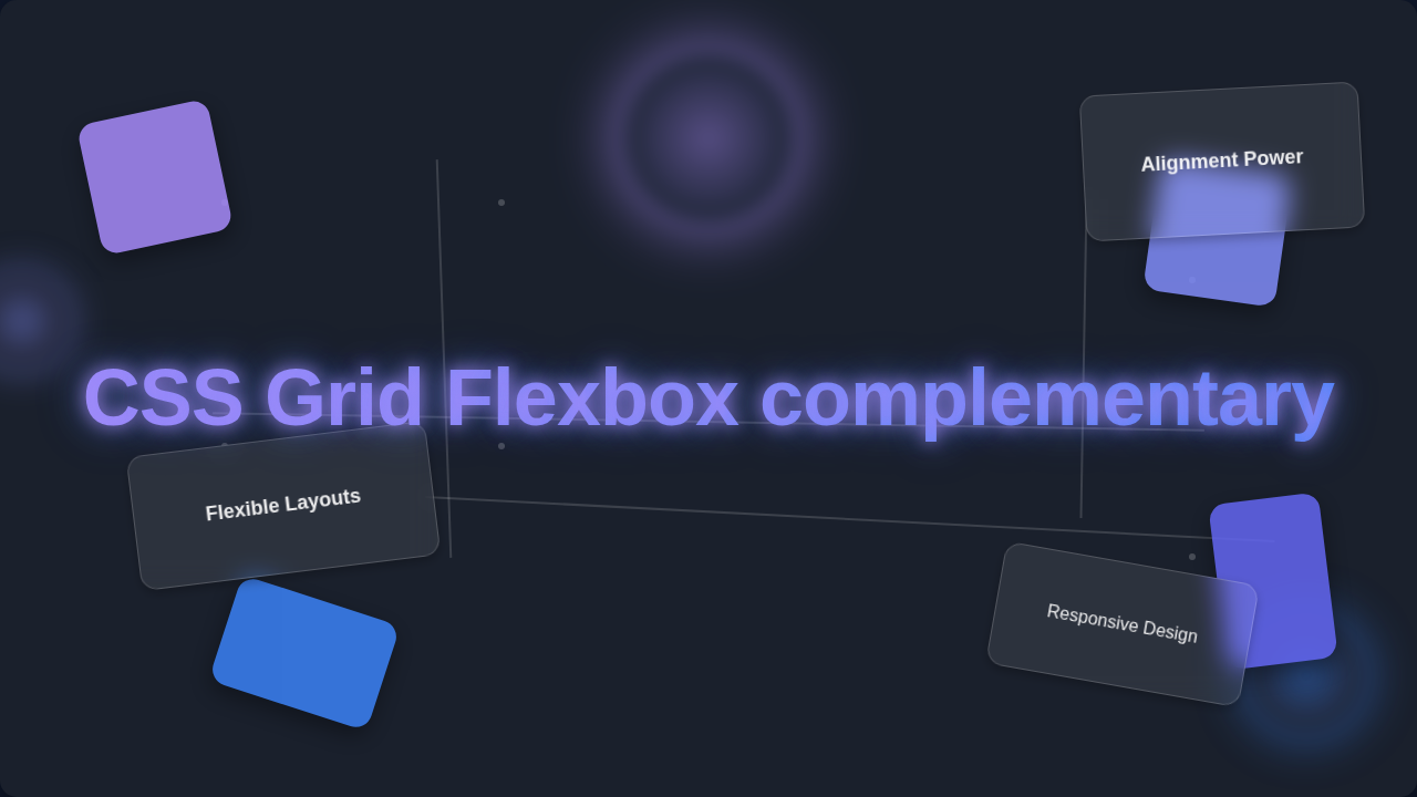
The Power Duo: CSS Grid Flexbox Complementary Layouts
Here’s where the magic truly happens: understanding how CSS Grid Flexbox are complementary. Many beginners try to pick one over the other. But they work best when used together. Think of building a house. Grid designs the floor plan. It sets up the rooms, the hallways, and where the windows go. It gives you the big picture. Meanwhile, Flexbox is like arranging the furniture within each room. It positions the sofa, aligns the bookshelf, and centers the coffee table. You wouldn’t use a floor plan to arrange cushions, right?
This is the core idea. You use Grid to define the main sections of your page. Perhaps you have a header, a footer, a sidebar, and a main content area. Those are Grid’s job. Then, inside your main content area, you might have a set of product cards. You want those cards to be evenly spaced. You want them to align their titles. That’s where Flexbox steps in. You apply display: flex to the container holding your product cards. It elegantly handles their internal arrangement.
Pro-Coder Tip: Grid is for the big layout structure of your page, like the blueprint of a building. Flexbox is for arranging contents within smaller components, like decorating a single room.
You can even use Flexbox inside a Grid cell! Or you can use Grid inside a Flex item. They truly nest and enhance each other. This combination gives you incredible flexibility and power. You gain control over both large-scale design and small-scale detail. Mastering this pairing elevates your CSS skills significantly. You will find yourself building complex layouts with much more ease.
Choosing Your Tools: Understanding CSS Grid Flexbox Complementary Use Cases
So, how do you decide which tool to grab? It’s all about dimension. If you need to arrange items along a single axis (either a row or a column), go for Flexbox. Navbars, simple image galleries, form elements, or lists of tags are perfect Flexbox candidates. If you are creating a responsive navigation menu that stacks on mobile, Flexbox is your friend. It makes centering things vertically or horizontally super simple too. You often use it to space out items dynamically. For example, distributing space between buttons in a toolbar. A Guide to Flexbox on CSS-Tricks is an excellent resource for deeper understanding.
On the other hand, if you need a layout with both rows and columns, CSS Grid is your answer. Think about the overall layout of your entire webpage. Perhaps a blog post layout with a main content area and a sidebar. Or a complex product display with images, descriptions, and ratings all arranged in specific spots. Grid helps you define clear sections. You can easily manage responsive changes across your entire page. It’s fantastic for creating “magazine-style” layouts. You might even want to apply custom styling using CSS Custom Properties within your grid cells.
Quick Check: Ask yourself, “Do I need to arrange things in a line, or do I need to define rows AND columns?” Your answer will guide you to Flexbox or Grid.
Remember, you don’t have to choose just one. You can use Grid for your main page layout. Then, within one of your Grid cells, use Flexbox to arrange its specific contents. This nested approach is incredibly common and powerful. It allows you to tackle virtually any layout challenge. You will quickly find your rhythm with both tools.
What to Explore Next on Your Layout Journey
Once you feel comfortable with the basics of Flexbox and Grid, your web development world will open up. You can start exploring advanced responsive design techniques. Learn about media queries and how they work with Grid and Flexbox. You can also dive deeper into specific properties. Look into things like grid-template-areas for Grid. Or explore flex-wrap and align-self for Flexbox. These will give you even finer control. Considering dynamic styling? CSS Custom Properties Theming is a fantastic next step. It lets you create flexible and powerful designs that adapt to user preferences.
Resources to Keep You Learning
- MDN Web Docs: CSS Flexible Box Layout – Your comprehensive guide to Flexbox.
- MDN Web Docs: CSS Grid Layout – Dive into the details of Grid.
- CSS-Tricks: A Complete Guide to Flexbox – A beloved and visual guide.
- CSS-Tricks: A Complete Guide to Grid – Another amazing visual resource.
- Procoder09.com: CSS Custom Properties Explained – Understand how to supercharge your CSS.
You have taken the first step toward mastering modern CSS layouts. It might feel like a lot right now, but every pro started exactly where you are. Keep practicing. Keep experimenting with both Flexbox and Grid. You will soon be building layouts you once thought were impossible. You’ve got this!