Hey there, future web wizard! If you’ve ever wanted to build a professional-looking website but felt overwhelmed, you are in the perfect spot. Today, we’re diving into creating a fantastic Responsive Landing Page for a SaaS product. This page will look amazing on any device. We’ll use the power of HTML, Tailwind CSS, and a dash of vanilla JavaScript. Get ready to build something truly impressive!
What We Are Building
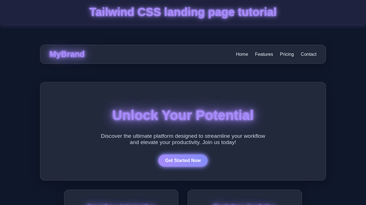
We are going to build a sleek, modern landing page. Imagine a front-end for a cutting-edge software service. This page will feature a dynamic hero section. It will also have a clear call-to-action. We will include a responsive navigation bar. This bar will collapse into a hamburger menu on smaller screens. Plus, it will showcase features and testimonials. Finally, we’ll add a simple footer. This project will teach you key responsive design principles. It’s super useful for your portfolio!
HTML Structure
First, we’ll lay down the foundation with HTML. This is the skeleton of our page. We will define all our sections and elements. Think of it as mapping out the rooms in a house. It provides the essential structure. Don’t worry, we’ll keep it clean and semantic.
index.html
<!DOCTYPE html>
<html lang="en">
<head>
    <meta charset="UTF-8">
    <meta name="viewport" content="width=device-width, initial-scale=1.0">
    <title>Responsive Landing Page with Tailwind CSS</title>
    <!--
        Tailwind CSS Setup:
        For a quick start, we're using the Play CDN.

        For production, it's highly recommended to install Tailwind CSS via npm/yarn
        and use the Tailwind CLI or PostCSS plugin for better performance, smaller file sizes,
        and access to all of Tailwind's features (like custom configurations, plugins, etc.).

        To set up Tailwind CLI:
        1. Install Node.js if you haven't already.
        2. Open your terminal in your project directory and run:
           npm install -D tailwindcss postcss autoprefixer
           npx tailwindcss init -p
        3. Configure your `tailwind.config.js` to scan your HTML files:
           module.exports = {
             content: ["./*.html"],
             theme: {
               extend: {},
             },
             plugins: [],
           }
        4. Create a `styles.css` (or `main.css`) file and add the Tailwind directives:
           @tailwind base;
           @tailwind components;
           @tailwind utilities;
        5. Build your CSS:
           npx tailwindcss -i ./styles.css -o ./dist/output.css --watch
        6. Link the generated `output.css` in your HTML instead of the CDN:
           <link href="./dist/output.css" rel="stylesheet">
    -->
    <script src="https://cdn.tailwindcss.com"></script>
    <style>
        /* Ensure safe fonts are used across the application */
        body {
            font-family: Arial, Helvetica, sans-serif;
        }
        /* Universal box-sizing for consistent layout calculations */
        *, ::before, ::after {
            box-sizing: border-box;
        }
    </style>
</head>
<!--
    Tailwind utility classes are used extensively here:
    - `bg-gray-900`: Sets the background color.
    - `text-gray-100`: Sets the default text color.
    - `antialiased`: Smooths text rendering.
-->
<body class="bg-gray-900 text-gray-100 antialiased">
    <!--
        Main container for the entire landing page.
        - `min-h-screen`: Ensures the body takes at least the full viewport height.
        - `flex flex-col`: Stacks content vertically using flexbox.
        - `overflow-x-hidden`: Prevents horizontal scrollbars on smaller screens.
        - `max-w-full`: Ensures content doesn't exceed 100% width.
    -->
    <div class="min-h-screen flex flex-col overflow-x-hidden max-w-full">

        <!-- Header Section -->
        <!--
            - `bg-gray-800`: Dark background for the header.
            - `py-4`: Vertical padding.
            - `shadow-lg`: Adds a large shadow for depth.
        -->
        <header class="bg-gray-800 py-4 shadow-lg">
            <!--
                Navigation container.
                - `container mx-auto`: Centers the content horizontally.
                - `flex justify-between items-center`: Arranges logo and nav links with space between.
                - `px-4`: Horizontal padding.
            -->
            <nav class="container mx-auto flex justify-between items-center px-4">
                <!-- Logo -->
                <a href="#" class="text-2xl font-bold text-indigo-400 hover:text-indigo-300 transition-colors duration-300">
                    MyBrand
                </a>

                <!-- Navigation Links (Hidden on small screens, shown as menu button) -->
                <!--
                    - `hidden md:flex`: Hides links on mobile, displays as flex on medium screens and up.
                    - `space-x-6`: Adds horizontal space between links.
                -->
                <div class="hidden md:flex space-x-6">
                    <a href="#" class="text-lg text-gray-200 hover:text-indigo-400 transition-colors duration-300">Home</a>
                    <a href="#" class="text-lg text-gray-200 hover:text-indigo-400 transition-colors duration-300">Features</a>
                    <a href="#" class="text-lg text-gray-200 hover:text-indigo-400 transition-colors duration-300">Pricing</a>
                    <a href="#" class="text-lg text-gray-200 hover:text-indigo-400 transition-colors duration-300">Contact</a>
                </div>

                <!-- Mobile Menu Button (Hamburger) -->
                <!--
                    - `md:hidden`: Hides the button on medium screens and up.
                    - `focus:outline-none`: Removes outline on focus.
                -->
                <button id="mobile-menu-button" class="md:hidden text-gray-200 hover:text-indigo-400 focus:outline-none">
                    <svg class="w-8 h-8" fill="none" stroke="currentColor" viewBox="0 0 24 24" xmlns="http://www.w3.org/2000/svg">
                        <path stroke-linecap="round" stroke-linejoin="round" stroke-width="2" d="M4 6h16M4 12h16m-7 6h7"></path>
                    </svg>
                </button>
            </nav>

            <!-- Mobile Menu (Hidden by default, toggled by JS) -->
            <div id="mobile-menu" class="md:hidden hidden bg-gray-800 text-center py-4">
                <a href="#" class="block text-lg py-2 text-gray-200 hover:bg-gray-700 transition-colors duration-300">Home</a>
                <a href="#" class="block text-lg py-2 text-gray-200 hover:bg-gray-700 transition-colors duration-300">Features</a>
                <a href="#" class="block text-lg py-2 text-gray-200 hover:bg-gray-700 transition-colors duration-300">Pricing</a>
                <a href="#" class="block text-lg py-2 text-gray-200 hover:bg-gray-700 transition-colors duration-300">Contact</a>
            </div>
        </header>

        <!-- Hero Section -->
        <!--
            - `relative`: Positions child elements absolutely within this section.
            - `bg-gradient-to-br from-gray-900 to-gray-800`: Gradient background.
            - `py-20 md:py-32`: Responsive vertical padding.
            - `text-center`: Centers text content.
            - `overflow-hidden`: Hides any overflowing background elements.
        -->
        <section class="relative bg-gradient-to-br from-gray-900 to-gray-800 py-20 md:py-32 text-center overflow-hidden">
            <!--
                Background Image for visual interest.
                - `absolute inset-0`: Covers the entire section.
                - `bg-cover bg-center`: Styles the background image.
                - `opacity-10`: Makes the image very subtle.
                (Using a placeholder image; replace with your own)
            -->
            <div class="absolute inset-0 bg-cover bg-center opacity-10" style="background-image: url('https://picsum.photos/1920/1080?grayscale');"></div>
            <!--
                Hero content wrapper.
                - `relative`: Keeps content above the background image.
                - `container mx-auto px-6 max-w-4xl`: Centers content and limits its width.
            -->
            <div class="relative container mx-auto px-6 max-w-4xl">
                <!-- Headline -->
                <h1 class="text-4xl md:text-6xl font-extrabold leading-tight text-white mb-4 drop-shadow-lg">
                    Elevate Your Workflow with <span class="text-indigo-400">Next-Gen Solutions</span>
                </h1>
                <!-- Sub-headline -->
                <p class="text-lg md:text-xl text-gray-300 mb-8 max-w-2xl mx-auto">
                    Streamline your processes, boost productivity, and achieve unparalleled results with our innovative platform.
                </p>
                <!-- Call-to-Action Buttons -->
                <div class="space-x-4">
                    <a href="#" class="bg-indigo-600 hover:bg-indigo-700 text-white font-bold py-3 px-8 rounded-full shadow-lg transition duration-300 transform hover:scale-105">
                        Get Started
                    </a>
                    <a href="#" class="bg-transparent border border-indigo-400 hover:bg-indigo-400 text-indigo-400 hover:text-white font-bold py-3 px-8 rounded-full transition duration-300 transform hover:scale-105">
                        Learn More
                    </a>
                </div>
            </div>
        </section>

        <!-- Features Section -->
        <section class="py-16 md:py-24 bg-gray-900">
            <div class="container mx-auto px-6">
                <h2 class="text-3xl md:text-4xl font-bold text-center text-white mb-12">Powerful Features Designed for You</h2>
                <!--
                    Grid for feature cards.
                    - `grid grid-cols-1`: Single column on mobile.
                    - `md:grid-cols-2 lg:grid-cols-3`: 2 columns on medium, 3 columns on large screens.
                    - `gap-10`: Space between grid items.
                -->
                <div class="grid grid-cols-1 md:grid-cols-2 lg:grid-cols-3 gap-10">
                    <!-- Feature Card 1 -->
                    <div class="bg-gray-800 rounded-lg p-8 shadow-xl hover:shadow-2xl transition-shadow duration-300 transform hover:-translate-y-2">
                        <!-- Icon container -->
                        <div class="flex items-center justify-center w-16 h-16 bg-indigo-500 rounded-full mb-6 mx-auto">
                            <!-- SVG Icon (replace with your desired icons) -->
                            <svg class="w-8 h-8 text-white" fill="none" stroke="currentColor" viewBox="0 0 24 24" xmlns="http://www.w3.org/2000/svg"><path stroke-linecap="round" stroke-linejoin="round" stroke-width="2" d="M9 19v-6a2 2 0 00-2-2H5a2 2 0 00-2 2v6a2 2 0 002 2h2a2 2 0 002-2zm0 0V9a2 2 0 012-2h2a2 0 012 2v10m-6 0a2 2 0 002 2h2a2 0 002-2m0 0V5a2 2 0 012-2h2a2 0 012 2v14a2 2 0 01-2 2h-2a2 0 01-2-2z"></path></svg>
                        </div>
                        <h3 class="text-xl font-semibold text-white mb-4 text-center">Real-time Analytics</h3>
                        <p class="text-gray-300 text-center">Gain deep insights into your performance with live data and customizable dashboards.</p>
                    </div>

                    <!-- Feature Card 2 -->
                    <div class="bg-gray-800 rounded-lg p-8 shadow-xl hover:shadow-2xl transition-shadow duration-300 transform hover:-translate-y-2">
                        <div class="flex items-center justify-center w-16 h-16 bg-green-500 rounded-full mb-6 mx-auto">
                            <svg class="w-8 h-8 text-white" fill="none" stroke="currentColor" viewBox="0 0 24 24" xmlns="http://www.w3.org/2000/svg"><path stroke-linecap="round" stroke-linejoin="round" stroke-width="2" d="M12 8c-1.657 0-3 .895-3 2s1.343 2 3 2 3 .895 3 2-1.343 2-3 2m0-8c1.11 0 2.08.402 2.599 1M12 8V7m0 1v8m0 4a2 2 0 110-4 2 2 0 010 4zm-7-2h14a2 2 0 002-2V5a2 2 0 00-2-2H5a2 2 0 00-2 2v10a2 2 0 002 2z"></path></svg>
                        </div>
                        <h3 class="text-xl font-semibold text-white mb-4 text-center">Secure & Scalable</h3>
                        <p class="text-gray-300 text-center">Built with enterprise-grade security and designed to scale with your growing needs.</p>
                    </div>

                    <!-- Feature Card 3 -->
                    <div class="bg-gray-800 rounded-lg p-8 shadow-xl hover:shadow-2xl transition-shadow duration-300 transform hover:-translate-y-2">
                        <div class="flex items-center justify-center w-16 h-16 bg-purple-500 rounded-full mb-6 mx-auto">
                            <svg class="w-8 h-8 text-white" fill="none" stroke="currentColor" viewBox="0 0 24 24" xmlns="http://www.w3.org/2000/svg"><path stroke-linecap="round" stroke-linejoin="round" stroke-width="2" d="M8 9l3 3-3 3m5 0h3M5 20h14a2 2 0 002-2V6a2 2 0 00-2-2H5a2 2 0 00-2 2v12a2 2 0 002 2z"></path></svg>
                        </div>
                        <h3 class="text-xl font-semibold text-white mb-4 text-center">Easy Integration</h3>
                        <p class="text-gray-300 text-center">Connect seamlessly with your existing tools and platforms via robust APIs.</p>
                    </div>
                </div>
            </div>
        </section>

        <!-- Testimonial Section -->
        <section class="py-16 md:py-24 bg-gradient-to-br from-gray-800 to-gray-900">
            <div class="container mx-auto px-6">
                <h2 class="text-3xl md:text-4xl font-bold text-center text-white mb-12">What Our Users Say</h2>
                <!--
                    Grid for testimonial cards.
                    - `grid grid-cols-1 md:grid-cols-2`: Single column on mobile, two on medium screens and up.
                    - `gap-8`: Space between grid items.
                    - `max-w-4xl mx-auto`: Limits width and centers the grid.
                -->
                <div class="grid grid-cols-1 md:grid-cols-2 gap-8 max-w-4xl mx-auto">
                    <!-- Testimonial Card 1 -->
                    <div class="bg-gray-700 rounded-lg p-6 shadow-xl border border-gray-600">
                        <p class="text-gray-200 text-lg italic mb-4">
                            "This platform has revolutionized our team's productivity. The analytics are incredibly insightful!"
                        </p>
                        <div class="flex items-center">
                            <img class="w-12 h-12 rounded-full mr-4 object-cover" src="https://via.placeholder.com/150/0000FF/FFFFFF?text=JD" alt="User Avatar">
                            <div>
                                <p class="font-semibold text-white">Jane Doe</p>
                                <p class="text-sm text-gray-400">CEO, Tech Innovators</p>
                            </div>
                        </div>
                    </div>
                    <!-- Testimonial Card 2 -->
                    <div class="bg-gray-700 rounded-lg p-6 shadow-xl border border-gray-600">
                        <p class="text-gray-200 text-lg italic mb-4">
                            "The ease of integration and the responsive support make this an essential tool for our business."
                        </p>
                        <div class="flex items-center">
                            <img class="w-12 h-12 rounded-full mr-4 object-cover" src="https://via.placeholder.com/150/FF0000/FFFFFF?text=AS" alt="User Avatar">
                            <div>
                                <p class="font-semibold text-white">Alex Smith</p>
                                <p class="text-sm text-gray-400">Lead Developer, Creative Solutions</p>
                            </div>
                        </div>
                    </div>
                </div>
            </div>
        </section>

        <!-- Call to Action Section -->
        <section class="py-16 md:py-24 bg-gray-900 text-center">
            <div class="container mx-auto px-6 max-w-3xl">
                <h2 class="text-3xl md:text-4xl font-bold text-white mb-6">Ready to Transform Your Business?</h2>
                <p class="text-lg md:text-xl text-gray-300 mb-8">
                    Join thousands of satisfied customers who are already experiencing the difference.
                </p>
                <a href="#" class="bg-indigo-600 hover:bg-indigo-700 text-white font-bold py-4 px-10 rounded-full shadow-xl transition duration-300 transform hover:scale-105">
                    Sign Up for Free
                </a>
            </div>
        </section>

        <!-- Footer Section -->
        <!--
            - `mt-auto`: Pushes the footer to the bottom of the flex container.
        -->
        <footer class="bg-gray-800 py-8 mt-auto">
            <div class="container mx-auto px-6 text-center text-gray-400">
                <div class="flex flex-wrap justify-center gap-6 mb-6">
                    <a href="#" class="hover:text-white transition-colors duration-300">About Us</a>
                    <a href="#" class="hover:text-white transition-colors duration-300">Services</a>
                    <a href="#" class="hover:text-white transition-colors duration-300">Privacy Policy</a>
                    <a href="#" class="hover:text-white transition-colors duration-300">Terms of Service</a>
                </div>
                <p class="text-sm">© 2023 MyBrand. All rights reserved.</p>
            </div>
        </footer>

    </div>

    <!-- JavaScript for Mobile Menu Toggle -->
    <script>
        document.addEventListener('DOMContentLoaded', function () {
            const mobileMenuButton = document.getElementById('mobile-menu-button');
            const mobileMenu = document.getElementById('mobile-menu');

            if (mobileMenuButton && mobileMenu) {
                mobileMenuButton.addEventListener('click', function () {
                    mobileMenu.classList.toggle('hidden');
                });
            }
        });
    </script>
</body>
</html>
CSS Styling
Now, for the fun part: making it beautiful with Tailwind CSS! Tailwind is a utility-first CSS framework. It lets us style directly in our HTML. This means fast development and easy customization. For some base styles or specific overrides, we might use a dedicated CSS file. This keeps our global styles minimal. You’ll see how little custom CSS we truly need. Get ready to see your page come alive!
JavaScript
Our landing page needs a bit of interactivity. That’s where vanilla JavaScript comes in. We will use it to handle our responsive navigation. Specifically, we’ll make the hamburger menu toggle open and close. This adds a smooth user experience. It’s simple, yet powerful!
How It All Works Together
Let’s tie everything into a neat bow. Our project comes alive through the combined efforts of HTML, Tailwind, and JavaScript. We’ll break down the key parts. This will show you exactly how each piece contributes. You’ll see the magic unfold.
Setting Up Your Environment
First things first, let’s get our workspace ready. You’ll need Node.js installed on your machine. This powers our development tools. If you don’t have it, grab it from their official website. Then, open your terminal. Navigate to your project folder. We’ll install Tailwind CSS. Run npm install -D tailwindcss in your terminal. This command adds Tailwind as a development dependency. Next, generate your Tailwind config file. Use npx tailwindcss init. This creates tailwind.config.js. It’s where you customize Tailwind. Finally, set up your input and output CSS files. Your style.css will often just import Tailwind’s layers. Then, Tailwind generates the final CSS. You can run a build command like npx tailwindcss -i ./input.css -o ./dist/output.css --watch. This command continuously compiles your CSS. It ensures your styles are always fresh. You’re now completely ready to style!
Pro Tip: Always check the official Tailwind CSS documentation for the most up-to-date installation instructions. It’s your best friend for framework specifics!
The HTML Foundation
Our index.html file truly holds everything together. We start with the head section. Here, we link our compiled CSS file. We also define important meta tags. These tags ensure proper responsiveness across devices. Your page title also goes here. The body element contains all our visible content. This includes our main navigation header. There’s also an exciting hero section. We add feature blocks to showcase our product. A clear call-to-action (CTA) encourages user interaction. Finally, a simple footer provides essential links. Each section is a semantic building block. We use <div> elements to group content logically. Moreover, <a> tags create our navigation links. We integrate a toggle button for our mobile menu. This button will show or hide the navigation on small screens. For more in-depth navigation ideas, consider exploring our Responsive Navbar with Tailwind CSS & HTML – Complete Guide. Remember, good HTML structure is incredibly key! It supports both styling and accessibility.
Styling with Tailwind CSS
This is where our landing page truly gets its distinct look. We apply Tailwind utility classes directly in our HTML markup. This utility-first approach is super efficient. For example, flex, justify-between, and items-center are used to arrange elements. These classes give us powerful flexbox layouts. Typography is handled with classes like text-lg, font-bold, and leading-tight. Spacing is managed using py-4 (padding-y) and px-6 (padding-x). These make quick work of responsive layouts. Tailwind also makes responsiveness a breeze. We use responsive prefixes like sm:, md:, and lg:. For instance, md:flex will only apply display: flex on medium screens and up. This completely changes how you build a Responsive Landing Page. It helps you focus on design. You write significantly less custom CSS this way. It truly is a game-changer for speed and consistency!
Bringing Interactivity with JavaScript
Our JavaScript adds that crucial layer of interaction. Its primary job is to manage the mobile navigation toggle. First, we select the necessary DOM elements. This includes our menu button and the navigation links container. We typically use document.querySelector for this. Then, we attach an event listener to the menu button. When this button is clicked, a function runs. This function usually toggles a CSS class on the navigation container. For instance, it might add or remove a hidden class. Or, it could apply an active class for a more animated transition. We also consider accessibility. We update aria-expanded attributes. This helps users with screen readers. Finally, we might add a listener to close the menu. This happens if a link is clicked. Or if the user clicks outside the menu area. This ensures a super clean user experience. It keeps the navigation tidy on all devices. You’ll find it’s a small script with a big, positive impact!
Pro Tip: For accessibility, always add
aria-expandedandaria-controlsattributes to your toggle buttons. This helps screen readers understand the button’s purpose and state. Learn more about ARIA attributes on MDN Web Docs.
Tips to Customise It
You’ve built an awesome and solid foundation! Now, let’s make this landing page uniquely yours.
- Add More Engaging Sections: Think about what else your SaaS might need. Consider a detailed pricing table. Perhaps a “How It Works” section with illustrations. You could even add a client logo carousel. This adds more value for your potential visitors.
- Integrate a Functional Contact Form: Move beyond a simple link. Use a well-designed contact form for lead generation. You can use a service like Formspree for easy backend integration. This actively turns visitors into potential customers.
- Experiment with Subtle Animations: Tailwind makes transitions and transforms easy. You could animate elements as they enter the viewport. Think about a fade-in effect. Or maybe a subtle scale-up on hover. This adds a polished feel.
- Explore Different Thematic Designs: Change the entire look and feel! Modify the colors, fonts, and spacing in your
tailwind.config.jsfile. Create a stunning dark mode for your site. This lets users personalize their viewing experience. For more ideas on cool UI components, check out our guide on building a Retro Terminal UI: HTML & CSS Component Guide. You could also get inspiration from how to structure a HTML/CSS Kanban Board Layout: Drag & Drop Prep (No JS Functionality) for more complex layouts. The possibilities are truly endless!
Conclusion
Wow, you did it! You just built a fully functional and amazing Responsive Landing Page. You used HTML for structure, Tailwind CSS for styling, and JavaScript for interactivity. This is a huge accomplishment. You have gained valuable skills in modern web development. Now, deploy it and show it off! Share your creation with the world. Keep building, keep learning, and keep creating. We are super proud of your progress!