Keyboard Navigation is an absolute cornerstone of accessible web design. As developers, we often focus on dazzling visual interfaces, but what about users who can’t rely on a mouse or trackpad? People with motor impairments, those using screen readers, or even power users who prefer their keyboard demand a thoughtful, intuitive experience. Today, we’re diving deep into practical keyboard navigation patterns, showing you how to implement them effectively using plain HTML, CSS, and JavaScript. Get ready to supercharge your web accessibility!
What We Are Building
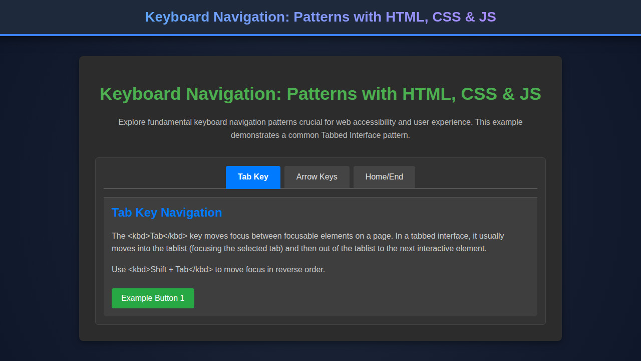
For our journey into accessible interactions, we’ll construct a common yet critical UI component: a tabbed interface. Think of the settings pages you navigate on your favorite apps or the product details sections on e-commerce sites. These tabbed components allow users to switch between different content panels without refreshing the page, conserving space and improving organization.
This pattern is incredibly trending because it directly addresses core user experience principles: content organization, efficiency, and accessibility. By building a robust tab component, we’re not just learning about tabs; we’re understanding fundamental principles that apply across all interactive elements, from accordions to complex menus. We’ll use this example to demonstrate how to manage focus, respond to various key presses, and update ARIA attributes for screen reader users.
You can deploy this pattern wherever content needs to be neatly compartmentalized. Imagine a profile page with tabs for ‘Account Settings’, ‘Privacy’, and ‘Notifications’. Or a documentation site with sections like ‘Getting Started’, ‘API Reference’, and ‘Troubleshooting’. The techniques we cover here are universally applicable, setting a strong foundation for any complex interactive component you might tackle next. For instance, consider how similar principles would apply when building something like a Kanban Board UI Design: HTML, CSS & JavaScript, where drag-and-drop actions also need keyboard equivalents.
HTML Structure
Our HTML provides the semantic foundation. We’ll use standard HTML elements combined with ARIA roles and attributes to describe the component’s structure and state to assistive technologies. Pay close attention to role="tablist", role="tab", and role="tabpanel".
<div class="tab-container">
    <div class="tab-list" role="tablist" aria-label="Keyboard Navigation Example Tabs">
        <button id="tab1" class="tab-button" role="tab" aria-selected="true" aria-controls="panel1" tabindex="0">
            HTML Structure
        </button>
        <button id="tab2" class="tab-button" role="tab" aria-selected="false" aria-controls="panel2" tabindex="-1">
            CSS Styling
        </button>
        <button id="tab3" class="tab-button" role="tab" aria-selected="false" aria-controls="panel3" tabindex="-1">
            JavaScript Logic
        </button>
    </div>
    <div id="panel1" class="tab-panel" role="tabpanel" tabindex="0" aria-labelledby="tab1">
        <h3>Building the Foundation</h3>
        <p>This panel explains the foundational HTML for our interactive component, ensuring semantic correctness and accessibility from the start.</p>
        <p>We use appropriate ARIA roles like <code>tablist</code>, <code>tab</code>, and <code>tabpanel</code> to clearly define the structure for assistive technologies.</p>
    </div>
    <div id="panel2" class="tab-panel" role="tabpanel" tabindex="0" aria-labelledby="tab2" hidden>
        <h3>Styling for Clarity and Focus</h3>
        <p>Here, we discuss the CSS that brings our component to life, focusing on visual cues for interactive elements and ensuring proper feedback during keyboard navigation.</p>
        <p>Special attention is given to <code>:focus-visible</code> for an optimal user experience.</p>
    </div>
    <div id="panel3" class="tab-panel" role="tabpanel" tabindex="0" aria-labelledby="tab3" hidden>
        <h3>Bringing Interactivity with JS</h3>
        <p>This section delves into the JavaScript code responsible for handling user interactions, managing focus, and updating ARIA attributes dynamically to reflect the component's state.</p>
        <p>Event listeners for keyboard actions are key to a seamless experience.</p>
    </div>
</div>
CSS Styling
Our CSS is about more than just aesthetics; it’s fundamental for usability. We’ll ensure visible focus indicators, which are absolutely crucial for keyboard users to understand where they are on the page. Furthermore, we’ll style the active tab distinctly to provide clear visual feedback.
/* Basic Reset & Container */
.tab-container {
    max-width: 800px;
    margin: 2em auto;
    border: 1px solid #ddd;
    border-radius: 8px;
    overflow: hidden;
    font-family: 'Segoe UI', Tahoma, Geneva, Verdana, sans-serif;
}

/* Tab List */
.tab-list {
    display: flex;
    background-color: #f4f4f4;
    border-bottom: 1px solid #ddd;
}

/* Tab Buttons */
.tab-button {
    flex: 1;
    padding: 1rem 1.5rem;
    border: none;
    background-color: transparent;
    cursor: pointer;
    font-size: 1rem;
    font-weight: 600;
    color: #555;
    transition: background-color 0.2s, color 0.2s, box-shadow 0.2s;
    outline: none; /* Remove default outline, we'll add our own */
}

.tab-button:hover:not([aria-selected="true"]) {
    background-color: #e9e9e9;
    color: #333;
}

/* Selected Tab */
.tab-button[aria-selected="true"] {
    background-color: #fff;
    color: #007bff;
    border-bottom: 2px solid #007bff;
    box-shadow: 0 -2px 5px rgba(0, 0, 0, 0.05);
}

/* Focus Styles - crucial for keyboard navigation */
.tab-button:focus-visible {
    outline: 2px solid #007bff;
    outline-offset: 2px;
    border-radius: 4px;
}

/* Tab Panels */
.tab-panel {
    padding: 1.5rem;
    background-color: #fff;
    line-height: 1.6;
    color: #333;
}

.tab-panel h3 {
    margin-top: 0;
    color: #007bff;
}

/* Hide panels by default for JS to control */
.tab-panel[hidden] {
    display: none;
}
Step-by-Step Breakdown: Enhancing Keyboard Navigation with JavaScript
This is where the magic truly happens! Our JavaScript handles the dynamic behavior, responding to user input, managing focus, and updating ARIA attributes. This ensures that assistive technologies always have the most up-to-date information about our component’s state.
document.addEventListener('DOMContentLoaded', () => {
    const tabList = document.querySelector('.tab-list');
    const tabs = Array.from(tabList.querySelectorAll('.tab-button'));
    const panels = Array.from(document.querySelectorAll('.tab-panel'));

    let activeTabIndex = 0; // Keep track of the currently active tab index

    const activateTab = (tabElement) => {
        tabs.forEach(tab => {
            tab.setAttribute('aria-selected', 'false');
            tab.setAttribute('tabindex', '-1');
        });
        panels.forEach(panel => panel.setAttribute('hidden', 'true'));

        tabElement.setAttribute('aria-selected', 'true');
        tabElement.setAttribute('tabindex', '0');
        tabElement.focus(); // Ensure focus moves to the activated tab

        const targetPanelId = tabElement.getAttribute('aria-controls');
        const targetPanel = document.getElementById(targetPanelId);
        if (targetPanel) {
            targetPanel.removeAttribute('hidden');
        }

        activeTabIndex = tabs.indexOf(tabElement);
    };

    tabList.addEventListener('click', (event) => {
        const clickedTab = event.target.closest('.tab-button');
        if (clickedTab && clickedTab.getAttribute('role') === 'tab') {
            activateTab(clickedTab);
        }
    });

    tabList.addEventListener('keydown', (event) => {
        let newTabIndex = activeTabIndex;

        switch (event.key) {
            case 'ArrowLeft':
                newTabIndex = (activeTabIndex - 1 + tabs.length) % tabs.length;
                break;
            case 'ArrowRight':
                newTabIndex = (activeTabIndex + 1) % tabs.length;
                break;
            case 'Home':
                newTabIndex = 0;
                break;
            case 'End':
                newTabIndex = tabs.length - 1;
                break;
            default:
                return; // Do nothing for other keys
        }

        event.preventDefault(); // Prevent default browser behavior (e.g., scrolling)
        activateTab(tabs[newTabIndex]);
    });
});
Initializing the Tabs
First, we wait for the DOM to be fully loaded. This is a best practice, ensuring all elements are available for our JavaScript to interact with. We then select our .tab-list, and gather all individual .tab-button and .tab-panel elements, converting them into arrays for easier manipulation. Crucially, we maintain an activeTabIndex variable. This helps us track which tab is currently selected, which is vital for keyboard navigation.
It’s important to note how we initialize the ARIA states directly in the HTML. The first tab has aria-selected="true" and tabindex="0", making it focusable by default. All other tabs have aria-selected="false" and tabindex="-1", meaning they are not reachable via the Tab key initially, but can be focused programmatically.
Handling Tab Activation
The activateTab function is our core logic. When a tab is activated, it performs several critical actions. It first deactivates all other tabs by setting their aria-selected to false and their tabindex to -1. Similarly, all panels are hidden using the hidden attribute. Next, the selected tab gets aria-selected="true" and tabindex="0". This ensures it’s the only tab in the group that can receive focus via the Tab key, following the ARIA tab pattern.
Most importantly, the function programmatically calls tabElement.focus(). This moves the keyboard focus directly to the newly selected tab, providing immediate feedback to the user. Finally, the associated content panel is revealed by removing its hidden attribute, completing the tab switch. For more details on focus management, MDN Web Docs has an excellent resource on tabindex.
Listening for Mouse Clicks
Naturally, users will click on tabs. We attach a click event listener to the tabList container. Using event delegation, we check if the clicked element (or its closest ancestor) is a .tab-button. If it is, we call our activateTab function with the clicked tab element. This ensures that mouse users have a smooth, expected experience while interacting with our component.
Mastering Keyboard Interactions for Focus
This is where dedicated keyboard navigation truly shines. We attach a keydown event listener to the tabList. This allows us to intercept specific key presses and manage focus programmatically. We use a switch statement to handle ArrowLeft, ArrowRight, Home, and End keys:
ArrowLeft: Moves focus to the previous tab, wrapping around to the last tab if currently on the first.ArrowRight: Moves focus to the next tab, wrapping around to the first tab if currently on the last.Home: Moves focus directly to the first tab.End: Moves focus directly to the last tab.
Crucially, event.preventDefault() is called for these keys. This prevents the browser’s default behavior (e.g., scrolling the page when arrow keys are pressed) and ensures our custom focus management takes precedence. After determining the newTabIndex, we call activateTab to switch to the corresponding tab, bringing focus with it. This creates a highly intuitive and accessible keyboard experience, allowing users to navigate tabs entirely without a mouse. Understanding how to manage these events is essential for building complex web components, similar to how one might manage state in a DI JavaScript: Dependency Injection Pattern Tutorial for better maintainability.
Making It Responsive
Responsiveness is about more than just fluid layouts; it’s about adaptability. Our tabbed interface, by design, will naturally adjust to different screen sizes. The display: flex on the .tab-list helps ensure the tabs align properly across various viewports. For truly small screens, one might consider stacking the tabs vertically if horizontal space becomes too constrained, although for this example, our horizontal layout scales well.
Media queries would come into play if we wanted to drastically change the layout, for example, converting the tabs into an accordion on mobile. However, the core keyboard navigation principles remain unchanged. Focus must always be clear, and interaction patterns consistent, regardless of screen size. The CSS :focus-visible pseudo-class ensures that our focus indicators are always present for keyboard users, a critical detail often overlooked when optimizing for mobile interfaces.
Final Output
When our HTML, CSS, and JavaScript come together, we achieve a highly functional and accessible tabbed component. Visually, users will see a clear distinction between selected and unselected tabs. Upon hovering or clicking, the styling will indicate interactivity. Most importantly, when navigating with the keyboard, a prominent outline will appear around the focused tab, guiding the user every step of the way. This visual feedback is paramount for a good user experience and accessibility.
Screen reader users will experience a semantic structure where the tablist and tabpanel roles clearly describe the component. The aria-selected attribute dynamically tells them which tab is currently active, and the aria-controls and aria-labelledby attributes create vital programmatic connections between tabs and their corresponding content panels. This layered approach ensures everyone, regardless of their interaction method, gets a full and complete understanding of the interface. You can learn more about responsive design techniques on CSS-Tricks.
Accessibility isn’t a feature; it’s a fundamental aspect of inclusive design. Thinking about keyboard users from the start elevates your entire application’s quality.
Conclusion
Mastering keyboard navigation is more than just a checklist item for WCAG compliance; it’s a commitment to building a web that works for everyone. By carefully implementing ARIA attributes, managing focus with JavaScript, and providing clear visual cues with CSS, we create interfaces that are robust, intuitive, and truly inclusive. The tabbed interface example here serves as a potent demonstration of these principles, but the lessons learned are broadly applicable.
You can apply these keyboard navigation patterns to virtually any interactive component. Whether you’re building a complex data table, a custom dropdown menu, or even exploring advanced front-end concepts like a Virtual DOM: JS Implementation Guide (Web Component), the core tenets of focus management and ARIA states remain crucial. Always remember to test your components thoroughly with just a keyboard and, if possible, with a screen reader. Your users, and your commitment to accessibility, will thank you.
A truly user-friendly interface is one that adapts to its users, not the other way around. Keyboard accessibility is a non-negotiable part of that adaptation.