Hey there, pro-coder-in-training! If you’ve ever wanted to build a Responsive Navbar Tailwind component but felt a bit lost, you are absolutely in the right place. We’re diving into creating a sleek, adaptable navigation bar. This project uses Tailwind CSS for beautiful styling and a dash of vanilla JavaScript for interactive magic. Get ready to impress yourself with what you can build!
What We Are Building: A Modern Responsive Navbar
Today, we’re crafting a fully responsive navigation bar. This isn’t just any navbar; it’s one that looks fantastic on any device. From a giant desktop monitor to the smallest smartphone screen, your navigation will always shine. We’ll make sure it collapses into a neat menu icon on smaller screens. Then, it expands smoothly when clicked, showing all your links. It’s super useful for any website you want to build. Plus, mastering this skill is a huge win for your web development journey.
We’ll achieve this clean, modern look using the power of Tailwind CSS utility classes. These classes let us style directly in our HTML, speeding up development. For the interactive part, like toggling the menu, we’ll use vanilla JavaScript. No complex libraries are needed here, just plain, simple JS. You will love how easy it is to manage.
HTML Structure: The Backbone of Our Navbar
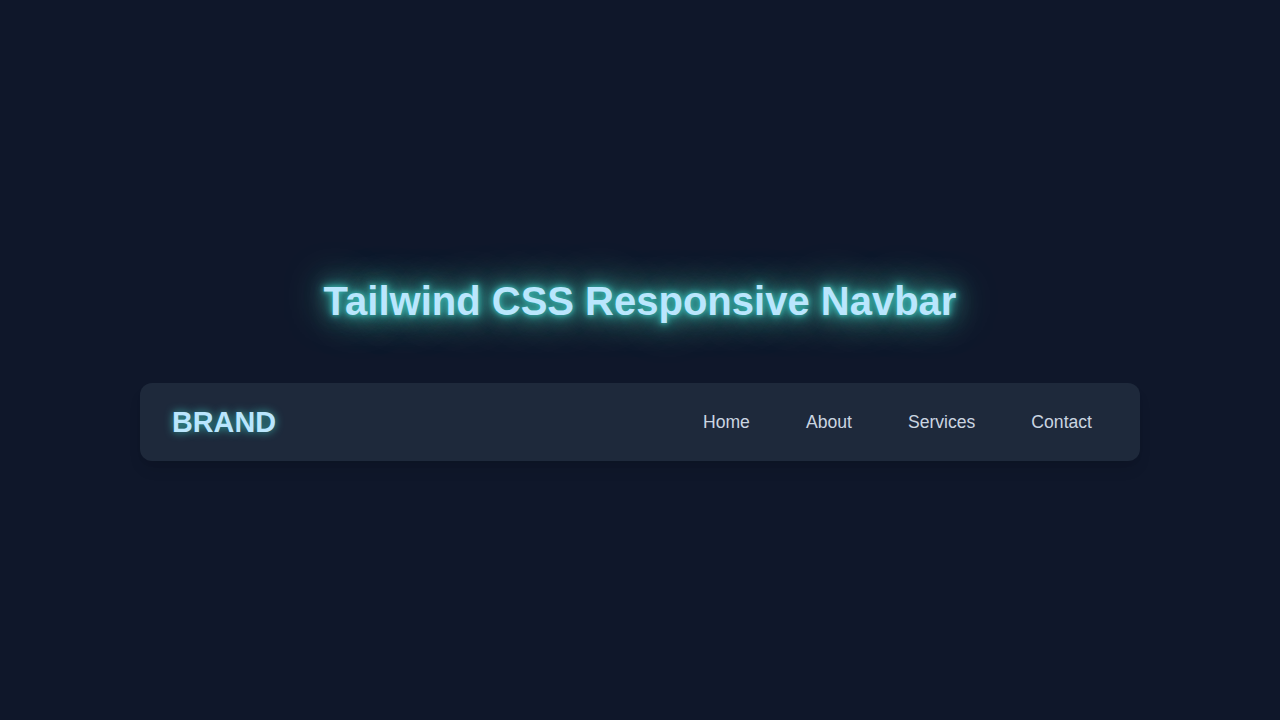
Let’s start with the fundamental HTML structure. This sets up the basic layout for our navigation bar. We will include a brand logo, our navigation links, and a special button for mobile menus. Every element has a clear purpose, making our code easy to understand. We’ll also use semantic HTML tags where possible, which is great for accessibility and SEO.
Remember, we’ll be adding many Tailwind CSS utility classes directly to these HTML elements. This is how Tailwind works its magic! It keeps our CSS files tiny and our styling super efficient. This approach really streamlines your workflow. It allows you to focus on the structure and content.
Pro Tip: Semantic HTML! Always try to use HTML tags like
<nav>,<header>, and<ul>for their intended purpose. It’s like giving your website clear labels. This helps search engines and assistive technologies understand your content better. Plus, it makes your code much more readable for other developers, and for future you!
index.html
<!DOCTYPE html>
<html lang="en">
<head>
    <meta charset="UTF-8">
    <meta name="viewport" content="width=device-width, initial-scale=1.0">
    <title>Responsive Navbar</title>
    <link rel="stylesheet" href="styles.css">
</head>
<body>
    <!-- Main header element containing the navbar -->
    <header class="navbar">
        <div class="navbar-container">
            <!-- Logo/Brand name -->
            <a href="#" class="navbar-logo">Brand</a>

            <!-- Hidden checkbox input to toggle the mobile menu using CSS only -->
            <!-- It's placed here to be an adjacent sibling to the hamburger label and nav links -->
            <input type="checkbox" id="menu-toggle" class="menu-toggle-checkbox" aria-label="Toggle navigation menu">

            <!-- Hamburger icon (label for the hidden checkbox) -->
            <!-- This will be visible on mobile and toggle the menu -->
            <label for="menu-toggle" class="hamburger-icon">
                <span class="bar"></span>
                <span class="bar"></span>
                <span class="bar"></span>
            </label>

            <!-- Navigation links -->
            <nav class="nav-links">
                <a href="#home" class="nav-item">Home</a>
                <a href="#about" class="nav-item">About</a>
                <a href="#services" class="nav-item">Services</a>
                <a href="#contact" class="nav-item">Contact</a>
            </nav>
        </div>
    </header>

    <!-- Main content area to provide context for the navbar -->
    <main class="content">
        <h1>Welcome to Our Site</h1>
        <p>This is a responsive navbar built with HTML and CSS only, featuring a Tailwind CSS-inspired design.</p>
        <p>Resize your browser window to see the mobile menu in action!</p>
    </main>
</body>
</html>
CSS Styling with Tailwind CSS: Instant Beauty
Now, let’s talk about the CSS. Don’t worry, it’s not a huge CSS file! We’re using Tailwind CSS, which means most of our styling happens right in the HTML. Tailwind gives us a vast collection of utility classes. We can combine these classes to create custom designs without writing a single line of traditional CSS. It’s incredibly powerful and fun to use.
To use Tailwind, you’d typically include it via a CDN for quick projects or set it up with PostCSS for bigger ones. For this tutorial, assume you have Tailwind integrated. The small amount of CSS you see below is mostly for the transition effects. It makes our menu open and close smoothly. This ensures a polished user experience. We are really focusing on responsiveness here. We want our menu to adapt beautifully. The `hidden` class in Tailwind plays a big role in this, which we’ll toggle with JavaScript.
styles.css
/* Global Reset and Base Styles */
*, *::before, *::after {
    box-sizing: border-box;
}

/* CSS Variables for a Tailwind-like Color Palette */
:root {
    --color-primary: #3b82f6; /* Blue-500 */
    --color-primary-dark: #2563eb; /* Blue-600 */
    --color-gray-900: #0f172a; /* Slate-900 */
    --color-gray-800: #1e293b; /* Slate-800 */
    --color-gray-700: #334155; /* Slate-700 */
    --color-gray-200: #e2e8f0; /* Slate-200 */
    --color-gray-500: #64748b; /* Slate-500 */
    --color-white: #ffffff;
}

body {
    margin: 0;
    font-family: Arial, Helvetica, sans-serif; /* Safe fonts only */
    line-height: 1.6;
    color: var(--color-gray-200);
    background-color: var(--color-gray-900);
    min-height: 100vh;
    overflow-x: hidden; /* Prevent horizontal scrollbars */
}

/* Navbar Styling */
.navbar {
    width: 100%;
    background-color: var(--color-gray-800);
    box-shadow: 0 4px 6px rgba(0, 0, 0, 0.1); /* Subtle shadow */
    position: sticky;
    top: 0;
    z-index: 1000;
    overflow: hidden; /* Ensure nothing spills out */
}

.navbar-container {
    max-width: 1280px; /* Max width for desktop content */
    margin: 0 auto; /* Center the container */
    padding: 1rem 1.5rem;
    display: flex;
    justify-content: space-between;
    align-items: center;
    position: relative; /* Needed for absolute positioning of mobile menu/hamburger */
}

.navbar-logo {
    font-size: 1.75rem; /* Equivalent to Tailwind's text-3xl */
    font-weight: 700; /* Equivalent to Tailwind's font-bold */
    color: var(--color-white);
    text-decoration: none;
    transition: color 0.3s ease;
}

.navbar-logo:hover {
    color: var(--color-primary); /* Highlight on hover */
}

/* Hidden checkbox for mobile menu toggle - CSS-only solution */
.menu-toggle-checkbox {
    display: none;
}

/* Hamburger icon styling (initially hidden on desktop) */
.hamburger-icon {
    display: none; /* Hidden by default on desktop screens */
    flex-direction: column;
    justify-content: space-between;
    width: 30px;
    height: 20px;
    cursor: pointer;
    z-index: 1001; /* Ensure hamburger is above other elements on mobile */
}

.hamburger-icon .bar {
    display: block;
    width: 100%;
    height: 3px;
    background-color: var(--color-white);
    border-radius: 2px;
    transition: all 0.3s ease-in-out; /* Smooth transition for animation */
}

/* Navigation links styling (desktop default) */
.nav-links {
    display: flex;
    margin: 0;
    padding: 0;
    gap: 1.5rem; /* Spacing between navigation items, similar to Tailwind's space-x-6 */
    align-items: center;
}

.nav-item {
    color: var(--color-gray-200);
    text-decoration: none;
    font-size: 1rem; /* Tailwind's text-base */
    font-weight: 500; /* Tailwind's font-medium */
    padding: 0.5rem 0.75rem;
    border-radius: 0.375rem; /* Tailwind's rounded-md */
    transition: all 0.3s ease;
}

.nav-item:hover, .nav-item.active {
    background-color: var(--color-gray-700);
    color: var(--color-white);
}

/* Main Content Styling (for visual context) */
.content {
    max-width: 1280px;
    margin: 2rem auto;
    padding: 0 1.5rem;
    text-align: center;
}

.content h1 {
    font-size: 2.5rem;
    color: var(--color-primary);
    margin-bottom: 1rem;
}

.content p {
    font-size: 1.125rem;
    color: var(--color-gray-500);
    margin-bottom: 0.5rem;
}

/* Responsive Styles for Mobile (screens smaller than 768px - Tailwind's md breakpoint) */
@media (max-width: 768px) {
    .navbar-container {
        /* Keep flex-direction: row to have logo and hamburger side by side on top */
        justify-content: space-between;
        align-items: center;
        padding: 1rem; /* Adjust padding for smaller screens */
    }

    .navbar-logo {
        font-size: 1.5rem; /* Slightly smaller logo on mobile */
    }

    .hamburger-icon {
        display: flex; /* Show hamburger icon on mobile screens */
    }

    .nav-links {
        display: none; /* Hide navigation links by default on mobile */
        flex-direction: column; /* Stack links vertically */
        width: 100%;
        position: absolute; /* Position relative to .navbar-container */
        top: 100%; /* Position right below the main navbar-container */
        left: 0;
        background-color: var(--color-gray-800); /* Match navbar background */
        box-shadow: 0 8px 16px rgba(0, 0, 0, 0.2); /* Drop shadow for the menu */
        border-bottom-left-radius: 0.5rem;
        border-bottom-right-radius: 0.5rem;
        overflow: hidden;
        padding: 0.5rem 0;
    }

    .nav-item {
        width: calc(100% - 2rem); /* Full width minus side padding */
        padding: 0.75rem 1rem; /* Larger tap target for mobile links */
        text-align: left;
        margin: 0.25rem 1rem; /* Vertical and horizontal spacing between items */
    }

    .nav-item:hover, .nav-item.active {
        background-color: var(--color-gray-700);
        color: var(--color-white);
    }

    /* Checkbox Hack: Show menu when the checkbox is checked */
    .menu-toggle-checkbox:checked ~ .nav-links {
        display: flex; /* Display the navigation links */
    }

    /* Hamburger icon animation when menu is open */
    /* First bar rotates to form top part of 'X' */
    .menu-toggle-checkbox:checked + .hamburger-icon .bar:nth-child(1) {
        transform: translateY(8.5px) rotate(45deg);
    }
    /* Second bar becomes invisible */
    .menu-toggle-checkbox:checked + .hamburger-icon .bar:nth-child(2) {
        opacity: 0;
    }
    /* Third bar rotates to form bottom part of 'X' */
    .menu-toggle-checkbox:checked + .hamburger-icon .bar:nth-child(3) {
        transform: translateY(-8.5px) rotate(-45deg);
    }
}
JavaScript Magic: Making Our Navbar Interactive
Here’s the cool part: adding interaction with vanilla JavaScript! While Tailwind handles the looks, JavaScript handles the behavior. We need a way to open and close our mobile menu. This is where a few lines of JavaScript come in handy. It’s super straightforward, even if you are new to JavaScript. We’ll select our menu button and the navigation links container. Then, we’ll add an event listener to the button.
When the button is clicked, our JavaScript will toggle a specific Tailwind class on the navigation links. This class will either show or hide the menu. It also handles accessibility attributes like aria-expanded. This tells screen readers if the menu is open or closed. Accessibility is super important, so we always want to include it. Let’s make this Responsive Navbar Tailwind solution accessible.
How It All Works Together: A Seamless Experience
Let’s break down how these three pieces—HTML, Tailwind CSS, and JavaScript—collaborate to build our responsive navbar. Each part plays a crucial role in creating a robust and user-friendly navigation system. You will see how neatly everything fits.
The HTML Foundation
Our HTML provides the basic structure. We have a main <nav> element. Inside, there’s a div for our logo or brand name. Then, we have an unordered list <ul> that holds all our navigation links. Crucially, we also have a <button> element. This button will serve as our hamburger menu icon on smaller screens. It’s hidden on larger screens by Tailwind’s responsive utility classes. Specifically, we use classes like lg:flex and hidden to control visibility. This ensures a clean look across devices. The links are also controlled this way, initially hidden until the button is pressed.
Tailwind CSS for Styling and Responsiveness
Tailwind CSS is where our navbar truly becomes responsive and visually appealing. We use utility classes directly in the HTML. For example, flex, justify-between, and items-center align our brand and menu items. On larger screens, classes like lg:flex make our navigation links always visible. On smaller screens, the default hidden class makes them disappear. The menu button, meanwhile, is shown only on smaller screens using classes like md:hidden. This clever use of responsive prefixes (like lg: or md:) is key to Tailwind’s power. It gives us precise control over layout at different breakpoints. We also add padding, background colors, and text styles using classes like p-4, bg-gray-800, and text-white. These choices make our navbar look modern and inviting.
Power of Utility Classes: Tailwind CSS lets you compose complex UIs with tiny, single-purpose classes. It’s like having a LEGO set for your styles! This approach makes development incredibly fast. It also ensures consistency across your project. Plus, you never have to think of new class names, which is a huge time-saver!
Vanilla JavaScript for Interactivity
Finally, JavaScript brings our navbar to life. We target two main elements: the mobile menu button and the list of navigation links. When the user clicks the menu button, our JavaScript code steps in. It toggles the hidden Tailwind class on the navigation links container. If the links are hidden, clicking the button makes them visible. If they are visible, clicking hides them again. We also update the aria-expanded attribute. This important accessibility feature tells screen readers the current state of the menu. This makes your website more inclusive. For smooth transitions, a little CSS helps here, making the menu slide in or fade. This small touch greatly improves user experience.
Putting It All Together
When a user visits your site, the browser loads the HTML. Tailwind CSS then applies all the specified styles based on the screen size. On mobile, the navigation links are hidden, and the hamburger icon appears. When the user taps the icon, our JavaScript listens for that click. It removes the hidden class, revealing the links. It also updates the accessibility attribute. This creates a fully functional and responsive navigation system. It’s elegant and efficient!
Tips to Customise It: Make It Your Own!
You’ve built a fantastic responsive navbar! Now, let’s make it truly yours. Here are some ideas to customize and extend your project:
- Change Colors and Fonts: Tailwind CSS makes this incredibly easy. Just swap out classes like
bg-gray-800forbg-blue-600. Experiment withfont-sansorfont-seriffor different text styles. You can even extend Tailwind’s default theme to include your own CSS Custom Properties. - Add Dropdown Menus: For more complex navigation, you might want to add dropdowns. You can achieve this with additional HTML structure and a bit more JavaScript. This would involve showing and hiding nested
<ul>elements on hover or click. - Animate the Hamburger Icon: Instead of just showing/hiding, make your hamburger icon transform into an ‘X’ symbol. This can be done with CSS transitions and a few lines of JavaScript. It adds a really polished feel. You might explore CSS transitions on MDN for this.
- Improve Accessibility: Dive deeper into ARIA attributes. Consider adding keyboard navigation support. This allows users to navigate your menu using only their keyboard. It’s a fantastic way to make your site usable for everyone.
- Explore CSS Container Queries: While this project uses traditional media queries (via Tailwind’s breakpoints), container queries offer an exciting new way to build responsive components. It’s a more component-driven approach to responsiveness.
Conclusion: You Did It!
Wow, you just built a fully functional and Responsive Navbar Tailwind component! Give yourself a huge pat on the back. You’ve combined HTML, Tailwind CSS, and vanilla JavaScript to create a common, yet powerful, web element. This project boosts your skills significantly. You now understand how to approach responsive design with modern tools.
I am so excited for you! What will you build next with your new responsive navbar? Share your creations with us on social media! Tag procoder09.com. We love seeing what our community creates. Keep learning, keep coding, and keep building awesome things!