CSS Container Queries Explained: Visual Guide
Hey there, fellow web adventurer! Ever felt like your CSS responsiveness was a bit of a juggling act? You know, when a tiny change in one part of your page somehow breaks a whole other section? It’s a common headache, trust me. But what if I told you there’s a new superpower coming to CSS that totally changes the game? Today, we’re diving deep into CSS Container Queries explained.
You’ve probably been hearing the buzz. This feature is a massive leap forward. It tackles some of our biggest design challenges. So, let’s unpack it together, shall we?
What Are CSS Container Queries Explained, Anyway?
Okay, let’s break this down. You know Media Queries, right? They let you style things based on the *viewport* size. That’s the browser window’s overall width or height. So, if your browser is wide, your layout changes. If it’s narrow, it changes again. This has been our go-to for responsive design for ages.
But here’s the thing. Your page has many different components. Think of a ‘product card’ or a ‘news widget.’ These components might appear in a narrow sidebar. They might also appear in a wide main content area. With traditional media queries, you’re styling the *whole page* based on the browser size. You are not styling the *individual component* based on its own available space.
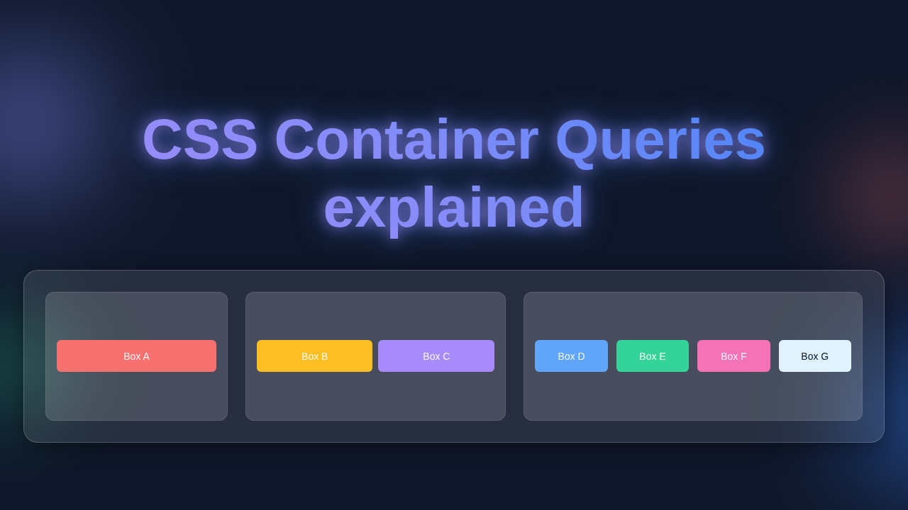
Enter CSS Container Queries. They let you style elements based on the size of their *parent container*. Not the entire browser window. Imagine a flexible picture frame. The picture inside changes its layout depending on how wide *that specific frame* is. It does not care about the size of the wall it hangs on. That’s the core idea here. It makes your components truly adaptable.
Why You Need Component-Level Responsiveness (Like Yesterday)
You’ve likely faced this scenario. You build a beautiful UI component. Let’s say it’s a ‘user profile card.’ It has an image, a name, and a short bio. It looks perfect when it’s in the main content section. There, it has plenty of space.
Then, your boss says, “Hey, can we put that same profile card in the narrow sidebar too?” You try it. Suddenly, the image is too big. The text wraps awkwardly. It just doesn’t quite fit.
What do you do? Traditionally, you might add a new media query. You target the sidebar’s specific breakpoint. Then you write styles just for the card *inside* the sidebar. This means you’re tying your component’s style to a global page layout. This creates a lot of extra CSS. It also makes your component less reusable. If that sidebar’s width ever changes, you have to update everything again.
This is where Container Queries are a lifesaver. You define styles directly on your component. It checks its *own* parent’s size. No more guesswork about global breakpoints. Your ‘user profile card’ just knows: “If my parent is less than 300 pixels wide, I’ll stack my content. If it’s wider, I’ll put the image next to the text.” This kind of self-awareness is powerful. It makes your components incredibly modular. You can drop them anywhere. They just adapt, beautifully.
How CSS Container Queries Explained Actually Works
So, how do you actually make this magic happen? It involves two main steps. First, you need to tell an element, “Hey, you’re a container. I want to query *your* size.” You do this using the container-type property. Most of the time, you’ll use inline-size. This means you care about the container’s width. Sometimes, you might care about height too, with size.
You can also give your container a container-name. This is like giving it a label. For example, you might name a container card-wrapper. This becomes really useful if you have nested containers. It lets you query a specific parent by name.
Once you’ve set up your container, then comes the querying part. You use an @container rule. It looks very similar to an @media rule. Inside this rule, you define your styles. For instance, you could say: @container (min-width: 400px) { /* styles here */ }. This means, “Apply these styles *only* when the designated container is at least 400 pixels wide.”
Think of it like building a smart toy. You tell the toy’s box, “You are a box that measures things.” Then, you tell the toy inside, “If my box is small, shrink my arms. If my box is big, extend them.” The toy itself responds to its immediate surroundings. It doesn’t care if it’s on a huge table or a tiny shelf. This level of self-contained responsiveness is the future of web development.
For more technical details on the properties, you can always check out the MDN documentation on Container Queries.
Clearing Up Common Confusions
You might be thinking, “Is this just a fancy media query?” Or, “Does this replace Flexbox or Grid?” Great questions! Let’s clear them up.
No, it’s not just a fancy media query. Media queries respond to the *viewport*. Container queries respond to a *parent element’s* size. This is a fundamental difference. It means your components are truly independent. You move them around, and they still look great.
Also, Container Queries do not replace Flexbox or Grid. In fact, they work *beautifully* together. Flexbox and Grid are about *how* items are laid out *inside* a container. Container Queries are about *when* those layouts should change based on the container’s size. For example, you might use a container query to switch from a stacked Flexbox layout to a side-by-side one. Or, you could change a Grid’s column count. They complement each other perfectly.
You might even find yourself pairing them with other powerful selectors. For instance, imagine how powerful CSS :has() Selector Practical Uses could be when combined with container queries! You could style a parent based on its children’s state, and those children could respond to the parent’s size. The possibilities are endless.
Key Takeaways for Your Next Project
So, what should you remember about this game-changing feature? First, Container Queries empower truly reusable components. You write the styles once. Your component adapts wherever you place it. This means less debugging for you. It also leads to a more consistent user experience across your site.
Container Queries let your components be truly self-aware, adapting to their surroundings without breaking other parts of your layout.
Second, they significantly reduce the complexity of your CSS. You stop writing many specific media queries. Instead, you encapsulate responsiveness within each component. This makes your stylesheets much cleaner. It also simplifies maintenance down the road.
Think about a complex CSS creation, like the Pure CSS Ramen Bowl: HTML & CSS Noodle Art Tutorial or even our CSS Pie Slice Art Tutorial: HTML & CSS Only (No JS). Imagine making these intricate designs adapt perfectly if they were part of a larger, responsive layout. Container Queries would make that possible with much less headache.
Think of it: No more ‘sidebar card’ vs. ‘main-content card’ specific CSS. Just one versatile card!
Browser support is rapidly improving too. Many modern browsers already support them. This means you can start experimenting today! To learn even more about their practical applications and syntax, a great resource is the CSS-Tricks Complete Guide to Container Queries.
Your Responsive Future Starts Now
You’ve just taken a huge step in understanding the future of responsive web design. CSS Container Queries are not just a new CSS feature. They represent a fundamental shift. They help us think about component design in a much more powerful way. Your components become smarter. They become more independent. And you, as the developer, gain immense flexibility.
Don’t be afraid to try them out. Start with a small component. Experiment with different container types and query conditions. You’ll quickly see how intuitive and effective they are. Your journey to building more robust, maintainable, and truly responsive websites just got a major upgrade. Keep building, keep learning, and keep creating amazing things!