CSS :has() Selector Practical Uses: HTML & CSS Tutorial
Hey there, future UI wizard! If you’ve ever wanted to build incredibly smart and dynamic web interfaces, but felt limited by CSS, you’re in for a treat. Today, we’re diving deep into the amazing CSS :has Selector. This powerful new tool lets you style a parent element based on its children! It’s truly a game-changer. We’ll build a cool interactive product card together. This will really show off its power.
What We Are Building: An Intelligent Product Card
Imagine an online store. You see product cards for all the items. Wouldn’t it be cool if a card *itself* could change appearance when you add that item to your cart or mark it as a favorite? That’s exactly what we’re creating! Our product card will get a special highlight or a badge when you interact with its buttons. This makes your UI much more intuitive. It feels incredibly responsive. No more complex JavaScript just for parent styling!
HTML Structure: Our Product Card Blueprint
First, we need some basic HTML for our product card. This structure is pretty simple. It holds an image, some text, and those crucial action buttons. The buttons are where the magic will start. We’ll add classes to them later. Those classes will signal a state change. Don’t worry about any complex nesting just yet. Here’s our clean HTML:
index.html
<!DOCTYPE html>
<html lang="en">
<head>
    <meta charset="UTF-8">
    <meta name="viewport" content="width=device-width, initial-scale=1.0">
    <title>CSS :has() Selector Practical Uses</title>
    <link rel="stylesheet" href="styles.css">
</head>
<body>
    <header class="tutorial-header">
        <h1>CSS :has() Selector Practical Uses</h1>
        <p>Unlock dynamic parent-based styling with the powerful <code>:has()</code> pseudo-class.</p>
    </header>

    <main class="container">
        <!-- Example 1: Form Validation -->
        <section class="example-section">
            <h2>1. Form Validation based on Child State</h2>
            <p>Style a parent <code>div.form-group</code> when an input field within it is invalid.</p>
            <div class="form-group-wrapper">
                <div class="form-group">
                    <label for="username">Username (required):</label>
                    <input type="text" id="username" name="username" required>
                    <span class="error-message">Username is required!</span>
                </div>
                <div class="form-group">
                    <label for="email">Email (valid format):</label>
                    <input type="email" id="email" name="email" placeholder="example@domain.com">
                    <span class="error-message">Please enter a valid email.</span>
                </div>
                <div class="form-group">
                    <label for="optional">Optional Field:</label>
                    <input type="text" id="optional" name="optional">
                    <span class="error-message">This field is optional.</span>
                </div>
            </div>
        </section>

        <!-- Example 2: Card Layout based on Content -->
        <section class="example-section">
            <h2>2. Dynamic Card Layouts with Optional Content</h2>
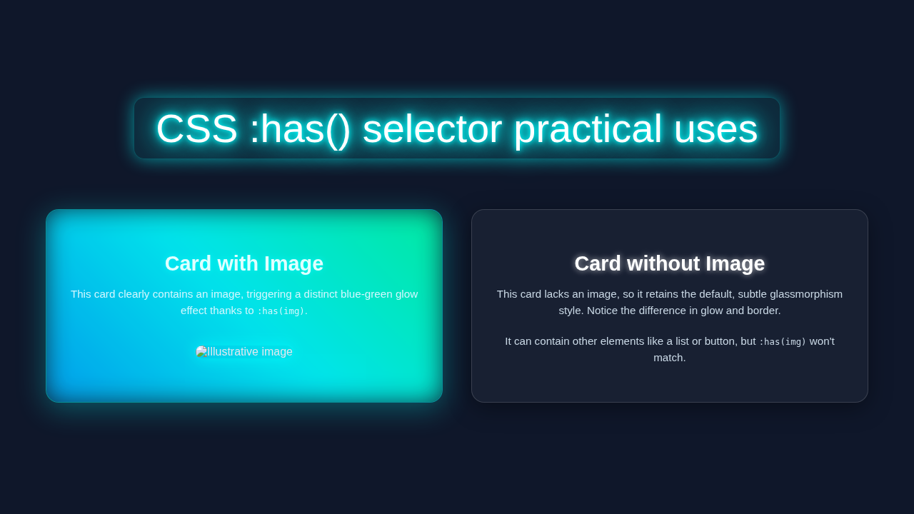
            <p>Adjust card styling (e.g., background, border) based on whether it contains an image.</p>
            <div class="card-grid">
                <div class="card">
                    <h3>Card with Image</h3>
                    <img src="https://via.placeholder.com/150/0000FF/FFFFFF?text=Image" alt="Placeholder image">
                    <p>This card contains an image. Its layout and styling adapt.</p>
                </div>
                <div class="card">
                    <h3>Card without Image</h3>
                    <p>This card does not contain an image, showing a different default styling.</p>
                    <ul>
                        <li>Item 1</li>
                        <li>Item 2</li>
                    </ul>
                </div>
                <div class="card">
                    <h3>Another Card</h3>
                    <p>Just some text content here. No image.</p>
                    <button>Action</button>
                </div>
            </div>
        </section>

        <!-- Example 3: Navigation with Submenus -->
        <section class="example-section">
            <h2>3. Styling Parent Navigation Items with Submenus</h2>
            <p>Highlight a navigation <code><li></code> item that has a nested <code><ul.submenu></code>.</p>
            <nav class="main-nav">
                <ul>
                    <li><a href="#">Home</a></li>
                    <li>
                        <a href="#">Products</a>
                        <ul class="submenu">
                            <li><a href="#">Electronics</a></li>
                            <li><a href="#">Books</a></li>
                            <li><a href="#">Clothing</a></li>
                        </ul>
                    </li>
                    <li>
                        <a href="#">Services</a>
                        <ul class="submenu">
                            <li><a href="#">Consulting</a></li>
                            <li><a href="#">Support</a></li>
                        </ul>
                    </li>
                    <li><a href="#">About Us</a></li>
                    <li><a href="#">Contact</a></li>
                </ul>
            </nav>
        </section>
    </main>

    <footer class="tutorial-footer">
        <p>© 2023 CSS :has() Tutorial. All rights reserved.</p>
    </footer>
</body>
</html>
CSS Styling: Making Our Product Card Shine (and React!)
Now for the fun part: styling! We’ll give our product card a nice base look. Then, we will introduce the star of the show: the CSS :has Selector. This lets the card itself react to what’s happening inside. We’ll add styles for when an item is favorited or added to the cart. Pay close attention to how we target the parent. This is different from what you know. Here’s the CSS magic:
styles.css
/* Global Reset & Box Model */
*, *::before, *::after {
    box-sizing: border-box;
    margin: 0;
    padding: 0;
}

body {
    font-family: Arial, Helvetica, sans-serif;
    line-height: 1.6;
    color: #333;
    background-color: #f4f4f4;
    padding: 20px;
}

.container {
    max-width: 1000px;
    margin: 20px auto;
    background-color: #fff;
    padding: 30px;
    border-radius: 8px;
    box-shadow: 0 4px 12px rgba(0, 0, 0, 0.1);
}

.tutorial-header {
    text-align: center;
    margin-bottom: 40px;
    background-color: #0056b3; /* A nice blue header */
    color: #fff;
    padding: 20px;
    border-radius: 8px;
}

.tutorial-header h1 {
    font-size: 2.5em;
    margin-bottom: 10px;
}

.tutorial-header p {
    font-size: 1.1em;
    opacity: 0.9;
}

.example-section {
    margin-bottom: 40px;
    border-bottom: 1px dashed #ccc;
    padding-bottom: 30px;
}

.example-section:last-of-type {
    border-bottom: none;
    padding-bottom: 0;
}

.example-section h2 {
    color: #0056b3;
    margin-bottom: 15px;
    font-size: 1.8em;
}

.example-section p {
    margin-bottom: 15px;
}

/* --- Example 1: Form Validation --- */
.form-group-wrapper {
    display: flex;
    flex-wrap: wrap;
    gap: 20px;
}

.form-group {
    flex: 1 1 300px; /* Allows flexibility, but minimum width 300px */
    padding: 15px;
    border: 1px solid #ddd;
    border-radius: 5px;
    background-color: #f9f9f9;
    transition: all 0.3s ease-in-out;
    position: relative; /* For error message positioning */
}

.form-group label {
    display: block;
    margin-bottom: 8px;
    font-weight: bold;
    color: #555;
}

.form-group input {
    width: 100%;
    padding: 10px;
    border: 1px solid #ccc;
    border-radius: 4px;
    font-size: 1em;
    transition: border-color 0.3s ease;
}

.form-group input:focus {
    outline: none;
    border-color: #007bff;
    box-shadow: 0 0 0 3px rgba(0, 123, 255, 0.25);
}

.error-message {
    display: none; /* Hidden by default */
    font-size: 0.85em;
    color: #dc3545;
    margin-top: 5px;
    position: absolute;
    bottom: -18px; /* Position below input group */
    left: 15px;
}

/* :has() Selector in action for Form Validation:
   Style the .form-group parent if it contains an :invalid input */
.form-group:has(input:invalid) {
    border-color: #dc3545; /* Red border for invalid group */
    background-color: #fff0f0; /* Light red background */
    box-shadow: 0 0 0 2px rgba(220, 53, 69, 0.2);
}

/* Show error message when input is invalid */
.form-group:has(input:invalid) .error-message {
    display: block;
}

/* Add a green border for valid inputs that are also required (to show a positive state) */
.form-group:has(input:valid[required]) {
    border-color: #28a745;
    background-color: #f0fff0;
}

/* --- Example 2: Dynamic Card Layouts --- */
.card-grid {
    display: grid;
    grid-template-columns: repeat(auto-fit, minmax(280px, 1fr));
    gap: 20px;
}

.card {
    background-color: #ffffff;
    border: 1px solid #e0e0e0;
    border-radius: 8px;
    padding: 20px;
    box-shadow: 0 2px 5px rgba(0, 0, 0, 0.05);
    display: flex;
    flex-direction: column;
    align-items: flex-start;
    transition: transform 0.2s ease-in-out, box-shadow 0.2s ease-in-out;
}

.card:hover {
    transform: translateY(-5px);
    box-shadow: 0 6px 15px rgba(0, 0, 0, 0.1);
}

.card h3 {
    color: #0056b3;
    margin-bottom: 10px;
    font-size: 1.5em;
}

.card img {
    max-width: 100%;
    height: auto;
    border-radius: 4px;
    margin-bottom: 15px;
}

.card p {
    margin-bottom: 10px;
}

.card ul {
    list-style: inside disc;
    margin-left: 20px;
    margin-bottom: 10px;
}

.card button {
    background-color: #007bff;
    color: #fff;
    border: none;
    padding: 10px 15px;
    border-radius: 5px;
    cursor: pointer;
    font-size: 1em;
    transition: background-color 0.3s ease;
    margin-top: auto; /* Push button to bottom */
}

.card button:hover {
    background-color: #0056b3;
}

/* :has() Selector in action for Card Layouts:
   If a card has an image, change its background or border */
.card:has(img) {
    background-color: #e0f7fa; /* Light blue background for cards with images */
    border-color: #00bcd4;
}

/* --- Example 3: Navigation with Submenus --- */
.main-nav {
    background-color: #343a40; /* Darker navigation bar */
    padding: 10px 0;
    border-radius: 5px;
}

.main-nav ul {
    list-style: none;
    display: flex;
    justify-content: center;
}

.main-nav ul li {
    position: relative; /* For submenu positioning */
    margin: 0 15px;
}

.main-nav ul li a {
    color: #f8f9fa;
    text-decoration: none;
    padding: 10px 15px;
    display: block;
    transition: background-color 0.3s ease;
    border-radius: 4px;
}

.main-nav ul li a:hover {
    background-color: #495057;
}

/* Submenu specific styles */
.submenu {
    display: none; /* Hidden by default */
    position: absolute;
    top: 100%;
    left: 0;
    background-color: #495057;
    min-width: 160px;
    box-shadow: 0 8px 16px rgba(0, 0, 0, 0.2);
    z-index: 100;
    border-radius: 4px;
    padding: 5px 0;
}

.submenu li {
    margin: 0;
}

.submenu li a {
    padding: 10px 20px;
    color: #f8f9fa;
    white-space: nowrap; /* Prevent items from wrapping */
}

.submenu li a:hover {
    background-color: #6c757d;
}

/* :has() Selector in action for Navigation:
   Style the parent <li> when it contains a submenu and when hovered */
.main-nav ul li:has(.submenu):hover > a {
    background-color: #007bff; /* Highlight parent link on hover if it has a submenu */
    color: #fff;
}

/* Show submenu when parent li is hovered AND has a submenu */
.main-nav ul li:has(.submenu):hover .submenu {
    display: block;
}

.tutorial-footer {
    text-align: center;
    margin-top: 40px;
    padding-top: 20px;
    border-top: 1px solid #eee;
    color: #777;
    font-size: 0.9em;
}
JavaScript: Toggling the Interaction
While CSS :has() handles the styling, we need a tiny bit of JavaScript. This JS will toggle classes on our buttons. These class changes are what the :has() selector looks for. It’s super minimal, just enough to make our buttons interactive. This is where the user’s action triggers the CSS. It creates a dynamic experience.
How It All Works Together: Unpacking the Magic
Let’s break down how these pieces fit. Each part plays a vital role. You’ll see how simple it is to build powerful UIs. We combine HTML structure, clever CSS, and a dash of JavaScript. It’s all about creating a reactive design.
The HTML Foundation
Our HTML provides the skeleton. We have a .product-card div. Inside it, we find an image, title, price, and a container for actions. The .actions div holds our .add-to-cart-btn and .favorite-btn. Notice how the buttons are children of the card. This parent-child relationship is key. The buttons will gain specific classes. These classes show their current state. For example, .in-cart or .is-favorited. This setup lets the parent react.
Bringing it to Life with Base CSS
The first part of our CSS gives everything its basic look. We style the .product-card itself. We add padding, borders, and a shadow. The buttons also get initial styling. They look clickable and inviting. We use flexbox for layout within the card. This ensures good alignment. You’ve probably used similar techniques before. This sets the stage for our dynamic styling.
The Magic of the CSS :has Selector
Here’s the cool part! The CSS :has Selector lets us target an element. That element is styled based on its descendants. In our case, we target .product-card. We use .product-card:has(.add-to-cart-btn.in-cart). This means: “If a .product-card has a child button with both .add-to-cart-btn and .in-cart classes, apply these styles to the .product-card itself!”
Pro Tip: The CSS :has Selector opens up so many possibilities! You can target parents, previous siblings, or even subsequent siblings based on a child’s state. It’s like a reverse selector. It makes many JS-dependent UI patterns purely CSS.
We do the same for the favorite button. If the .favorite-btn gains the .is-favorited class, the card reacts. We can even combine them! Imagine styling a card differently if it’s both in the cart AND favorited. This is powerful. It truly enables dynamic styling without JavaScript watching every element. You can achieve amazing things.
A Touch of JavaScript
Our JavaScript is straightforward. It listens for clicks on our two action buttons. When a button is clicked, it toggles a class on that specific button. For the “Add to Cart” button, it toggles .in-cart. For the “Favorite” button, it toggles .is-favorited. That’s it! The JS simply updates the DOM. CSS :has() then picks up these class changes instantly. This separation of concerns is clean. It makes your code easier to manage. This is a common pattern for interactive UIs. You can see more UI examples in our HTML CSS Calculator UI Design: Visually Stunning Layout tutorial.
Tips to Customise It: Make It Your Own!
You’ve built a fantastic foundation. Now, let’s make it truly yours:
- Add a Quantity Input: Use
:has(input:focus)to highlight the card when a quantity input inside it is focused. This gives immediate visual feedback. - Different Card States: Expand beyond just “in cart” and “favorited”. Add a
.sold-outclass to a child span. Then, use.product-card:has(.sold-out)to gray out the whole card. Maybe disable the buttons too. - Interactive Navigation: Apply
:has()to a navigation menu item. Highlight the whole menu item if one of its sub-links has a.current-pageclass. This is great for active states. - Complex Form Validation: Imagine a form field. If it has an
.errormessage span as a sibling, highlight the whole input group. Use.input-group:has(.error-message). This improves user experience significantly. You can learn more about dynamic buttons in our CSS Button Animations Tutorial: Enhance UI with HTML & CSS.
Remember: Practice is key! Experiment with different selectors and scenarios. The more you play with :has(), the more creative you’ll get with your UI designs.
Conclusion: You’re a UI Pro!
Wow! You just built a truly dynamic product card. You mastered the incredible CSS :has Selector. You made your UI smarter and more responsive. This selector changes how we think about CSS. It allows for parent selection, which was once a JavaScript-only task. You’ve unlocked a new level of styling power. Keep experimenting with this new tool. Share your creations with us! We can’t wait to see what you build. Perhaps you’ll even integrate it into something like an HTML Email Invoice: Responsive Design with Pure HTML & CSS. The possibilities are endless!