Hey there, fellow coder! If you’ve ever wanted to add a touch of magic to your websites, you’re in the right place. Today, we’re diving deep into CSS Button Animations. We will build some truly stunning animated hover effects. These make your buttons pop and enhance user experience. It’s super fun and surprisingly easy!
Interactive elements are key for a great user interface. So, learning how to create smooth transitions is a must. You will soon master adding dynamic flair to your web projects. This tutorial is perfect for self-taught beginners and early intermediates alike. We will walk through every step together. Let’s get started on this exciting journey!
What We Are Building
Imagine a button that reacts elegantly when your mouse glides over it. We are building just that! Our button will feature a sleek background that slides in from the bottom. It will also gently lift as you hover your cursor. This small detail makes a huge impact on your website’s overall feel. Users will absolutely love this polished and professional touch! It makes your site feel alive and engaging. This simple animation adds significant value. It shows attention to detail.
HTML Structure: Setting Up Our Button
First, let’s lay the foundation for our animated button with some clean HTML. It’s incredibly straightforward. We will use a standard <button> element. This gives us a solid, semantic starting point for our styling. You’ll see how easy it is to attach cool effects to a basic element. We are keeping our HTML minimal and focused.
index.html
<!DOCTYPE html>
<html lang="en">
<head>
    <meta charset="UTF-8">
    <meta name="viewport" content="width=device-width, initial-scale=1.0">
    <title>Animated Buttons Tutorial</title>
    <!-- Link to our stylesheet -->
    <link rel="stylesheet" href="styles.css">
</head>
<body>
    <!-- Main container for all animated buttons -->
    <div class="button-showcase">
        <!-- Button 1: Fade & Scale Effect -->
        <button class="animated-button btn-fade-scale">
            Fade & Scale
        </button>

        <!-- Button 2: Slide In Background Effect -->
        <button class="animated-button btn-slide-bg">
            Slide In Background
        </button>

        <!-- Button 3: Border Glow Effect -->
        <button class="animated-button btn-border-glow">
            Border Glow
        </button>

        <!-- Button 4: Press Effect -->
        <button class="animated-button btn-press">
            Press Effect
        </button>
    </div>
</body>
</html>
That’s all for our HTML! See how simple that was? The real magic will happen with CSS. This streamlined approach keeps your code clean. It also makes it easier to manage later on.
CSS Button Animations: Styling and Effects
Now for the truly exciting part: bringing our button to life with CSS! We will first establish the button’s basic appearance. Then, we will craft the awesome hover animation itself. Get ready to add some serious style to your button! We will use modern CSS properties. These allow for smooth, performance-friendly animations. You will learn to control every visual aspect.
styles.css
/*
 * CSS Button Animations Tutorial
 * A collection of production-ready button animations using only HTML & CSS.
 * Author: UI/UX Developer Persona
 * Date: 2023-10-27
 */

/* --- Global Styles & Reset --- */
body {
    margin: 0;
    padding: 0;
    /* Using safe, widely available web fonts */
    font-family: Arial, Helvetica, sans-serif;
    background-color: #f0f2f5; /* A light, neutral background for the tutorial */
    display: flex;
    justify-content: center;
    align-items: center;
    min-height: 100vh; /* Ensures body takes at least full viewport height */
    box-sizing: border-box; /* Includes padding and border in the element's total width and height */
    overflow: hidden; /* Prevents scrollbars on the body */
}

.button-showcase {
    display: flex;
    flex-wrap: wrap; /* Allows buttons to wrap to the next line on smaller screens */
    gap: 30px; /* Space between individual buttons */
    justify-content: center;
    align-items: center;
    max-width: 100%; /* Ensures the container does not exceed its parent's width */
    padding: 20px; /* Internal padding for the container */
}

/* --- General Animated Button Styling --- */
.animated-button {
    padding: 15px 30px;
    border: none;
    border-radius: 8px; /* Slightly rounded corners for a modern look */
    font-size: 1.1em;
    font-weight: bold;
    cursor: pointer;
    outline: none; /* Removes the default focus outline for a cleaner look */
    position: relative; /* Essential for positioning pseudo-elements and z-index */
    overflow: hidden; /* Critical for containing pseudo-elements within the button's bounds */
    transition: all 0.3s ease; /* Smooth transition for common properties like background, color, transform */
    box-sizing: border-box; /* Ensures consistent sizing */
    text-decoration: none; /* Useful if using <a> tags as buttons */
    display: inline-flex; /* Allows for centering text vertically and horizontally */
    justify-content: center;
    align-items: center;
    min-width: 180px; /* Provides a consistent minimum width for all buttons */
}

/* --- Animation 1: Fade & Scale Effect --- */
/* This button smoothly changes its background and text color, and scales up slightly on hover. */
.btn-fade-scale {
    background-color: #007bff; /* Primary blue color */
    color: #ffffff;
}

.btn-fade-scale:hover {
    background-color: #0056b3; /* Darker blue on hover for visual feedback */
    transform: scale(1.08); /* Scales up to 108% of its original size */
    color: #e0e0e0; /* Slightly off-white text for subtle contrast change */
    box-shadow: 0 5px 15px rgba(0, 0, 0, 0.2); /* Adds a subtle shadow for depth */
}

/* --- Animation 2: Slide In Background Effect --- */
/* A secondary background color slides in from the left, creating a dynamic hover effect. */
.btn-slide-bg {
    background-color: #28a745; /* Success green base color */
    color: #ffffff;
    z-index: 1; /* Ensures the button text stays above the pseudo-element's background */
}

.btn-slide-bg::before {
    content: '';
    position: absolute;
    top: 0;
    left: 0;
    width: 100%;
    height: 100%;
    background-color: #218838; /* Darker green for the sliding background */
    transform: translateX(-100%); /* Starts completely off-screen to the left */
    transition: transform 0.3s ease-out; /* Smooth slide-in transition */
    z-index: -1; /* Places the pseudo-element behind the button's main content */
}

.btn-slide-bg:hover::before {
    transform: translateX(0); /* Slides the background fully into view */
}

.btn-slide-bg:hover {
    color: #f0f0f0; /* Subtle text color change on hover for emphasis */
    /* Note: The primary background-color of the button itself does not change; the pseudo-element provides the new background */
}

/* --- Animation 3: Border Glow Effect --- */
/* The button gets a glowing border and a subtle lift on hover, changing its border color. */
.btn-border-glow {
    background-color: #6c757d; /* Muted gray base color */
    color: #ffffff;
    border: 2px solid #6c757d; /* Initial border matches background for a seamless look */
    box-shadow: 0 0 0 transparent; /* Starts with no visible shadow */
    transition: all 0.3s ease;
}

.btn-border-glow:hover {
    border-color: #007bff; /* Changes border color to primary blue on hover */
    box-shadow:
        0 0 15px rgba(0, 123, 255, 0.7), /* Inner blue glow */
        0 0 25px rgba(0, 123, 255, 0.5); /* Wider, softer outer glow */
    transform: translateY(-3px); /* Lifts the button slightly, giving a hover sensation */
    color: #e0e0e0; /* Subtle text color change */
}

/* --- Animation 4: Press Effect --- */
/* The button appears to be 'pressed' or 'clicked' when in the active state. */
.btn-press {
    background-color: #ffc107; /* Warning yellow base color */
    color: #333333; /* Dark text for contrast */
    /* Quick transitions for an immediate 'press' feel */
    transition: transform 0.1s ease-out, background-color 0.1s ease-out, box-shadow 0.1s ease-out;
    box-shadow: 0 4px 0 #e0a800; /* Creates a '3D' depth effect with a darker shadow */
}

.btn-press:active {
    transform: translateY(2px) scale(0.98); /* Moves down and slightly shrinks on click */
    background-color: #e0a800; /* Darker yellow background on active */
    box-shadow: 0 2px 0 #c79100; /* Reduces shadow depth to simulate the button being pressed down */
}
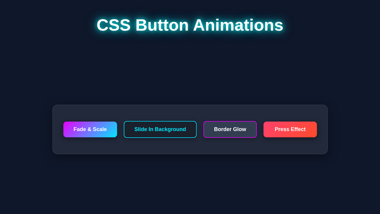
Doesn’t that look amazing? We just created a fully animated button! We leveraged the power of CSS to achieve this. Next, let’s break down exactly how these styles work together. Understanding the ‘why’ behind the code is crucial for true learning. It helps you apply these concepts everywhere.
JavaScript (Not Needed Here!)
You know what’s really cool about this particular animation? We don’t need a single line of JavaScript! This entire dynamic effect works purely with HTML and CSS. It’s a fantastic testament to the power and flexibility of modern CSS. How awesome is that for simplicity and performance? This means fewer files to load. It also results in faster page renders for your users. Pure CSS animations are often more performant. This is especially true for simple UI effects. You get beautiful results without extra complexity.
How It All Works Together: Unpacking the Animation
Let’s break down exactly how our fantastic animated button comes to life. We are using some very clever CSS techniques. You’ll see how each piece contributes to the final, smooth effect. It’s a great way to understand powerful CSS properties. Understanding these building blocks will empower you. You can then create your own unique animations. Let’s dive into the details now.
Setting the Stage (Initial Styling)
First, we give our basic button some foundational styling. We add padding to give the text breathing room. We set a clear text color for readability. A subtle border defines its shape. This creates our button’s initial, static appearance. We also remove default browser button styles. This gives us complete control over its look. Importantly, we apply position: relative; to our button. This is a crucial step! It ensures that our absolutely positioned pseudo-element stays within the button’s bounds. Without it, our animated background might float unexpectedly. It establishes a reference point for child elements.
The Magic of Pseudo-elements (::before)
Here’s where the real magic happens! We use the ::before pseudo-element. This allows us to create a ‘fake’ element directly inside our button. This ‘fake’ element will actually serve as our sliding background layer. We position it absolutely within the button. It starts at bottom: 0; and height: 0;. This makes it completely invisible at first. Then we give it a vibrant background color. This element is initially hidden. However, it will expand beautifully on hover. Pseudo-elements are incredibly versatile. They let you add decorative elements without cluttering your HTML. This keeps your markup clean. It’s a very efficient way to add extra visual flair.
Pro Tip: Pseudo-elements like
::beforeand::afterare incredibly powerful! They let you add content and styling without touching your HTML. Learn more about them on MDN’s Pseudo-elements guide. Mastering these will open up many creative possibilities in your web designs.
Smooth Transitions for Animation
We add transition properties to both our button and its ::before element. A transition tells the browser to animate changes to CSS properties. For instance, transition: all 0.3s ease-in-out; means any property change will take 0.3 seconds. It will have a smooth acceleration and deceleration curve. This makes our hover effect feel incredibly fluid and professional. Without transitions, the visual changes would be instant. This would look very jarring and abrupt. Smooth transitions significantly enhance the user experience. They make interactions feel natural. Consider adding similar transitions to other interactive elements. This creates a consistent feel across your site. Explore more about the transition property on MDN.
The Hover Effect in Action
When you hover your mouse over our button, our carefully crafted CSS kicks in. We target the button using the :hover pseudo-class. First, the ::before element’s height property changes to 100%. This makes it slide smoothly up from the bottom. It then completely fills the button’s background. Second, we apply a transform: translateY(-5px); to the button itself. This makes the button gently lift up. It creates a satisfying visual feedback. The combination of these two effects creates our stunning animation. It truly grabs attention and guides the user’s eye. This visual cue tells the user the button is interactive. It confirms their action. You can easily modify these values. Try different lift amounts or slide directions. This allows for vast customization. Remember, subtle effects often have the biggest impact!
Tips to Customise Your CSS Button Animations
Now you’ve successfully built one amazing animated button! But don’t stop there. The true power lies in customization. Here are some fantastic ideas to make it uniquely yours and really stand out.
- Change the Slide Direction: Instead of sliding from the bottom, adjust the
top,bottom,left, orrightproperties for the::beforeelement. You can easily make the background slide from the left, top, or even diagonally! - Experiment with Colors and Gradients: Try different
background-colorvalues for your::beforeelement. You could even use alinear-gradientorradial-gradientfor a more unique and vibrant look. Think about your brand colors! - Adjust Timing and Easing: Play with the
transition-duration(e.g.,0.5sfor slower,0.2sfor snappier) andtransition-timing-function(e.g.,linear,cubic-bezier(...)) values. This dramatically changes how fast or slow your animation unfolds. - Combine Effects for More Flair: Add a subtle
box-shadowto the button on hover. Or perhaps animate the text color or letter-spacing too! The possibilities for layering effects are truly endless. - Different Animation Types: Instead of a background slide, consider a border expansion, a text glow, or a subtle rotation. Each offers a distinct feel.
- Responsive Button Design: While focusing on animations, always consider responsiveness. You can learn more about creating fluid layouts for elements like buttons in our CSS clamp fluid typography tutorial with HTML & CSS. This ensures your buttons look great on all devices.
- Consider User Experience: Make sure your animations are not too distracting or slow. The goal is to enhance, not hinder, interaction. For a robust button system within an overall UI, think about components. For example, building a responsive email invoice might require such buttons. Check out our guide on HTML Email Invoice: Responsive Design with Pure HTML & CSS for inspiration on complex UIs.
CSS Button Animations: Conclusion
Wow, you just built a fantastic animated button! You’ve successfully harnessed the power of CSS Button Animations. You effectively used pseudo-elements and smooth transitions. Your website will now have a dynamic and engaging element. This skill is invaluable for any aspiring web developer. It showcases a strong understanding of modern web design principles. Share your creations with us! We absolutely love seeing what you build. Keep practicing these exciting techniques. They truly elevate your web projects from good to absolutely stunning. You’re well on your way to becoming an amazing front-end developer! Keep experimenting and push your creative boundaries.
Encouragement: Every line of code you write, every effect you master, brings you closer to building incredible web experiences. Keep that learning momentum going! The web is your canvas!