Hey there, fellow coder! If you’ve ever wanted to create stunning visual elements without leaning on complex tools, you’re in the right place. Today, we’re diving deep into CSS Pie Slice Art. We will build a delicious-looking, photorealistic pie slice. We will use nothing but pure HTML and CSS. Get ready to impress yourself with what CSS can do!
What We Are Building: A Delicious CSS Pie Slice Art Masterpiece
Imagine a golden-brown crust. Picture a rich, gooey filling. Think about a perfect triangle of dessert. That is exactly what we are going to craft! This isn’t just a simple shape. Instead, it is a detailed, layered representation of a mouth-watering pie slice.
We will use CSS gradients and shadows. These help us achieve incredible depth. This project shows the true power of CSS. It is perfect for portfolio pieces or just for fun. And it’s pure CSS Noodle Art in a dessert form! You will be amazed at the realistic effect we can achieve.
HTML Structure: Setting the Stage for Our Pie
Our HTML is straightforward and clean. We will use a main container. This holds all parts of our pie slice. Inside that, we will have specific elements for the crust and the filling. Each part gets its own div element. This keeps our structure organized and easy to understand.
Here’s the cool part: with minimal HTML, we can create so much visual richness. Let’s look at the basic setup:
index.html
<!DOCTYPE html>
<html lang="en">
<head>
    <meta charset="UTF-8">
    <meta name="viewport" content="width=device-width, initial-scale=1.0">
    <title>CSS Art Pie Slice</title>
    <link rel="stylesheet" href="styles.css">
</head>
<body>
    <!-- Main container for the pie slice, representing the full circle -->
    <div class="pie-slice-container">
        <!-- The actual colored pie slice element -->
        <div class="pie-slice"></div>
    </div>
</body>
</html>
CSS Styling: Baking Our Photorealistic Pie Slice
This is where the magic truly happens! We will meticulously style each HTML element. We use powerful CSS properties to create shapes, colors, and textures. Gradients will give our pie its rich, baked look. Box shadows will add amazing depth and realism. We will also use pseudo-elements for even more detail. Get ready to transform simple boxes into a dessert dream!
styles.css
/* === Base Styles & Reset === */
html {
    box-sizing: border-box;
}

*, *::before, *::after {
    box-sizing: inherit;
    margin: 0;
    padding: 0;
}

body {
    font-family: Arial, Helvetica, sans-serif;
    display: flex;
    justify-content: center;
    align-items: center;
    min-height: 100vh;
    background-color: #f0f0f0; /* A light background for readability */
    overflow: hidden; /* Prevent scrollbars if content slightly exceeds viewport */
}

/* === Pie Slice Component Styles === */
.pie-slice-container {
    /* --- Custom Properties for Easy Configuration --- */
    --slice-diameter: 200px; /* The diameter of the full circle */
    --slice-color: #ff6347;  /* The main color of the pie slice (Tomato Red) */
    --base-color: #e0e0e0;   /* Color for the 'empty' part of the circle (light grey) */

    /* --- Structural Properties --- */
    width: var(--slice-diameter);
    height: var(--slice-diameter);
    border-radius: 50%; /* Makes the base shape a perfect circle */
    background-color: var(--base-color); /* The background color for the 'full' circle */
    position: relative; /* Essential for clip-path to reference percentages relative to this element */
    /* A subtle shadow for depth */
    box-shadow: 0 4px 8px rgba(0, 0, 0, 0.1);
}

.pie-slice {
    width: 100%; /* The slice element takes the full size of its container */
    height: 100%;
    background-color: var(--slice-color); /* Apply the slice color */
    border-radius: 50%; /* Ensures the clipped part is still perfectly round */

    /* --- The Magic: Defining the Pie Slice Shape with clip-path --- */
    /* clip-path: polygon(point1, point2, point3, ...); */
    /* Points are defined as percentages (x y) relative to the element's top-left corner. */

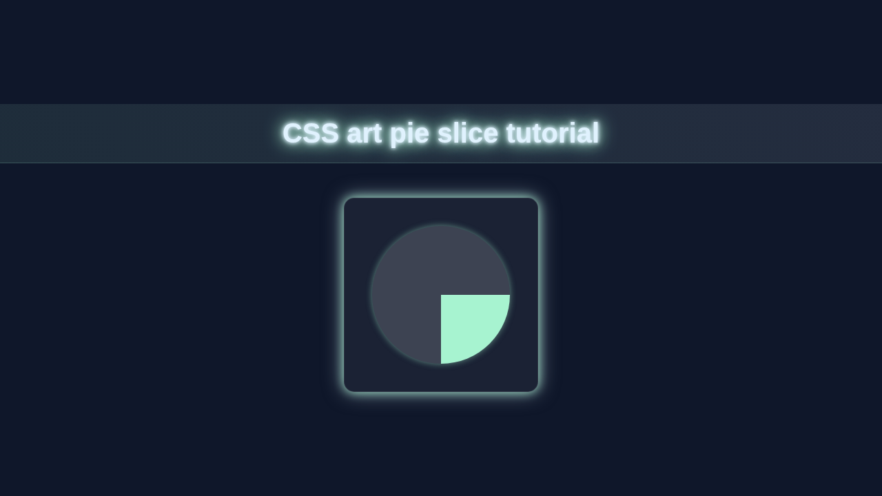
    /* This example creates a 90-degree (quarter) slice in the bottom-right quadrant: */
    clip-path: polygon(
        50% 50%,    /* 1. Center of the circle */
        100% 50%,   /* 2. Middle-right edge (start of the segment) */
        100% 100%,  /* 3. Bottom-right corner (end of the segment) */
        50% 100%    /* 4. Middle-bottom edge (to close the segment back to center) */
    );

    /* How to adjust for different angles/positions: */
    /* All slices start from the 50% 50% center point. */
    /* The other points define the arc and edges. */

    /* Example for a 45-degree slice, starting from 12 o'clock, going clockwise: */
    /* (Note: Calculating precise coordinates for arbitrary angles might require a tool or SASS/JS)
       clip-path: polygon(
           50% 50%,     // 1. Center
           50% 0%,      // 2. 12 o'clock position (top-center)
           85.35% 14.65% // 3. Approximately 45 degrees clockwise from 12 o'clock
                        //    (Calculated as: x = 50 + R*cos(315deg), y = 50 + R*sin(315deg) for R=50, 315deg relative to positive X-axis)
       );
    */

    /* For a full half-circle (180 degrees) on the right: */
    /*
       clip-path: polygon(
           50% 50%,    // Center
           100% 0%,   // Top-right corner
           100% 100%, // Bottom-right corner
           50% 100%   // Middle-bottom edge
       );
    */
}
How It All Works Together: Unpacking the Layers of Our CSS Pie Slice Art
Let’s break down each piece of our delicious pie. Each CSS property plays a vital role. They all work in harmony. This creates our stunning photorealistic effect. We are building this slice layer by layer.
The Main Pie Container: Our Canvas
First, we have our main .pie-slice container. This element acts as our overall canvas. We set its dimensions and positioning. This ensures everything inside stays neatly arranged. Think of it as the plate our pie sits on. We also use overflow: hidden; here. This is important. It clips any parts of our slice that extend beyond its boundaries. This creates a sharp, clean edge. We establish a base perspective for 3D transforms too.
Crafting the Crust: The Golden Edge
The crust is made using several elements. The .crust-top and .crust-side divs form the visible crust. We give them specific widths and heights. Then, we use background-image with linear gradients. This creates that perfect golden-brown, baked appearance. We also apply border-radius for a slightly rounded, organic feel. The transform: rotateX() and transform: skewX() properties are crucial here. They give the crust its angled, three-dimensional look. Without these, it would look flat. We apply subtle box-shadow effects too. These add texture and depth. They make the crust appear solid and crisp. You can learn more about MDN Web Docs on border-radius if you want to dive deeper.
Pro Tip: Always experiment! CSS is all about trial and error. Don’t be afraid to change values. See what new effects you can create. That’s how real learning happens!
Filling the Slice: The Gooey Center
The .filling element is the heart of our pie. We shape it using clip-path. This property lets us create complex shapes. We define a polygon that forms a perfect triangle. This is the classic pie slice shape. Similar to the crust, we use a background-image with gradients. These mimic a rich, cooked filling. The colors can be adjusted for any pie flavor! We also use transform properties. These angle the filling, matching the crust’s perspective. It nestles perfectly inside the crust. This creates a cohesive, single slice.
Adding Delicious Details: The Crumbs and Textures
This is where the photorealistic magic really shines. We use pseudo-elements, ::before and ::after. These add fine details like small crumbs or subtle textures. We create tiny shapes with varying opacities. They are positioned carefully with absolute positioning. These small elements might seem insignificant. However, they add so much to the overall realism. They break up the smooth surfaces. This makes the pie look more handmade and authentic. We also use small box-shadow values here. These give the crumbs a slight lift. It makes them look like they are sitting on the crust. Check out a CSS-Tricks guide to box-shadow for more creative uses!
Tips to Customise It: Make Your Pie Uniquely Yours
You’ve built a fantastic foundation. Now it’s time to play! Personalizing your CSS Pie Slice Art is super fun. Here are some ideas:
- Change the Filling: Experiment with different
backgroundcolors or gradients. Make it apple pie, cherry pie, or even a chocolate cream pie! Just adjust the gradient stops. - Adjust the Crust: Try different
border-radiusvalues. Give it a crimped edge effect. Vary thebox-shadowfor a lighter or darker bake. You can even try adding a subtlefilter: sepia(). - Add a Topping: Maybe a dollop of whipped cream? Use another pseudo-element or
div. Place it on top with moreborder-radiusandbox-shadow. You could even add some sprinkles! - Make It Interactive: Use CSS
transformproperties. Make the slice slightly “lift” onhover. This adds a nice touch of interactivity. You can learn more about selectors for this in our CSS :has() selector tutorial. - Create a Full Pie: Duplicate your slice. Rotate and position multiple slices together. This builds a complete, delicious pie!
- Design a Calculator UI: While not a pie, this project gave you great skills for building complex UIs like our HTML CSS Calculator UI Design.
Conclusion: You Just Baked a Masterpiece!
Wow, you did it! You just built an amazing piece of CSS Pie Slice Art. You used nothing but HTML and CSS. This project truly showcases your front-end skills. You learned about gradients, shadows, and precise positioning. These are vital for intricate web designs. Now you can easily see what a powerful tool CSS is. You created something beautiful from scratch!
Keep going! Every line of code brings you closer to mastery. Celebrate these small wins. You are becoming an incredible developer!
Share your delicious creation online! Tag us @procoder09 on your favorite platform. We love seeing your work. Keep coding, keep creating!