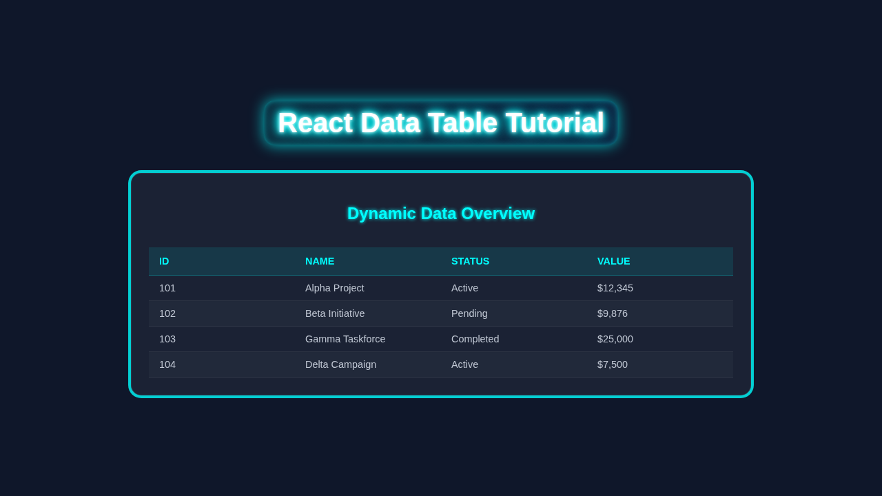
Hey there, awesome coder! Ever wanted to build a super interactive React Data Table? You know, one that sorts and filters data like a dream? Well, you’re in exactly the right place! We’re diving deep today. We will craft a dynamic table that makes data navigation a breeze. Get ready to impress yourself with your new skills! Let’s build something amazing together.
What We Are Building: Your Next Dynamic React Data Table
Imagine a table that isn’t just static rows and columns. Our project will be a powerful, interactive table component. It lets users sort columns with a simple click. They can also filter data instantly using a search input. This makes finding specific information incredibly easy and fast. Think of practical uses like user lists, product catalogs, or even financial reports. This dynamic HTML <table> element will fundamentally change how you display information in your React apps!
Pro Tip: Building interactive components like this is a fundamental skill. It really levels up your frontend development game. You’ll gain a deeper understanding of React’s powerful capabilities for data manipulation.
HTML Structure: The Foundation of Our Table
First, we need the basic skeleton for our table component. This will live inside a functional React component using JSX. We will leverage standard HTML table elements. These include <table>, <thead>, <tbody>, <tr>, <th>, and <td>. We will also add an input field for filtering data. These elements provide the clear, semantic visual structure for our interactive data.
index.html
<!DOCTYPE html>
<html lang="en">
<head>
    <meta charset="UTF-8">
    <meta name="viewport" content="width=device-width, initial-scale=1.0">
    <title>React Data Table</title>
    <!-- Link to the global stylesheet -->
    <link rel="stylesheet" href="styles.css">
</head>
<body>
    <!-- Message for users with JavaScript disabled -->
    <noscript>You need to enable JavaScript to run this app.</noscript>
    <!-- The root div where our React application will be mounted -->
    <div id="root"></div>
    <!-- The main JavaScript file for our React application -->
    <!-- This assumes a build process (e.g., Create React App, Vite) that bundles your JS. -->
    <script type="module" src="index.js"></script>
</body>
</html>
CSS Styling: Making Our React Data Table Shine
Next, let’s make our table look fantastic and user-friendly. Good styling is crucial for a positive user experience. We will use CSS to create a clean, modern design. This includes distinct column headers and subtle hover effects on rows. These styles ensure our table is both highly functional and aesthetically pleasing. You’ll see how simple yet effective CSS can make a huge visual impact on your data presentation.
styles.css
/* Global Box Model Reset */
* {
    box-sizing: border-box;
}

/* General Body Styles */
body {
    margin: 0;
    padding: 0;
    font-family: Arial, Helvetica, sans-serif; /* Safe sans-serif font stack */
    background-color: #1a202c; /* Dark background for the app */
    color: #e2e8f0; /* Light text color */
    line-height: 1.6;
    display: flex;
    justify-content: center;
    align-items: flex-start; /* Align to top for longer content, instead of center */
    min-height: 100vh;
    padding: 20px; /* Add some padding around the app content */
}

/* Root container for the React app */
#root {
    width: 100%;
    max-width: 1000px; /* Maximum width for the entire application */
    margin: 0 auto; /* Center the root container */
}

/* Data Table Container Styling */
.data-table-container {
    background-color: #2d3748; /* Slightly lighter background than body for contrast */
    border-radius: 8px;
    box-shadow: 0 4px 6px rgba(0, 0, 0, 0.1); /* Subtle shadow for depth */
    padding: 25px;
    margin-top: 20px;
    /* Ensure table is horizontally scrollable on small screens if it overflows */
    overflow-x: auto;
    box-sizing: border-box;
}

/* Heading for the table */
h1 {
    color: #4299e1; /* A distinct blue color for headings */
    text-align: center;
    margin-bottom: 30px;
    font-size: 2.2em;
}

/* Table Specific Styles */
.data-table {
    width: 100%;
    border-collapse: collapse; /* Remove space between cell borders */
    margin-top: 20px;
    min-width: 600px; /* Ensure table has a minimum width before triggering scroll */
}

/* Table header cells */
.data-table thead th {
    background-color: #4a5568; /* Header background */
    color: #cbd5e0; /* Header text color */
    padding: 12px 15px;
    text-align: left;
    border-bottom: 2px solid #636b77; /* Stronger bottom border for header */
    text-transform: uppercase;
    font-size: 0.9em;
}

/* Table body cells */
.data-table tbody td {
    padding: 10px 15px;
    border-bottom: 1px solid #4a5568; /* Lighter bottom border for body rows */
    color: #e2e8f0;
    vertical-align: middle;
}

/* Alternate row background for better readability */
.data-table tbody tr:nth-child(even) {
    background-color: #2c3444;
}

/* Hover effect for table rows */
.data-table tbody tr:hover {
    background-color: #3f4a5f;
    cursor: pointer;
}

/* Search input field styling */
.search-input {
    width: calc(100% - 20px); /* Adjust width to account for padding */
    padding: 10px;
    margin-bottom: 20px;
    border: 1px solid #4a5568;
    border-radius: 5px;
    background-color: #1a202c; /* Dark background for the input */
    color: #e2e8f0;
    font-size: 1em;
    box-sizing: border-box; /* Include padding and border in the element's total width and height */
}

.search-input::placeholder {
    color: #a0aec0; /* Lighter placeholder text */
}
React Logic: Bringing Interactivity to Our Table
Now, for the core of our dynamic table! We will use React’s powerful built-in hooks. These include useState for managing component state and useEffect for handling side effects. We need useState to hold our data, filter terms, and sort settings. We will also use useEffect for handling things like initial data loading or applying sorting changes. This JavaScript code powers all the sorting and filtering magic behind the scenes.
App.js
// App.js
import React, { useState, useEffect } from 'react';

// --- Dummy Data ---
// This array represents the data that would typically be fetched from an API.
const initialData = [
    { id: 1, firstName: 'Alice', lastName: 'Smith', email: 'alice@example.com', role: 'Admin', status: 'Active' },
    { id: 2, firstName: 'Bob', lastName: 'Johnson', email: 'bob@example.com', role: 'Editor', status: 'Inactive' },
    { id: 3, firstName: 'Charlie', lastName: 'Brown', email: 'charlie@example.com', role: 'Viewer', status: 'Active' },
    { id: 4, firstName: 'Diana', lastName: 'Prince', email: 'diana@example.com', role: 'Admin', status: 'Active' },
    { id: 5, firstName: 'Eve', lastName: 'Adams', email: 'eve@example.com', role: 'Editor', status: 'Pending' },
    { id: 6, firstName: 'Frank', lastName: 'White', email: 'frank@example.com', role: 'Viewer', status: 'Active' },
    { id: 7, firstName: 'Grace', lastName: 'Taylor', email: 'grace@example.com', role: 'Admin', status: 'Inactive' },
    { id: 8, firstName: 'Henry', lastName: 'Miller', email: 'henry@example.com', role: 'Viewer', status: 'Active' },
];

// --- App Component ---
// This is the main functional component for our React Data Table.
function App() {
    // State to hold the data for the table
    const [data, setData] = useState([]);
    // State to hold the current search term from the input field
    const [searchTerm, setSearchTerm] = useState('');
    // State to manage loading status, useful for showing spinners or messages
    const [loading, setLoading] = useState(true);

    // --- useEffect Hook for Data Fetching ---
    // This hook runs once after the initial render (due to empty dependency array []).
    // It simulates an asynchronous data fetch from an API.
    useEffect(() => {
        // Simulate a network request delay
        const timer = setTimeout(() => {
            setData(initialData); // Set the dummy data to the state
            setLoading(false);    // Set loading to false once data is "fetched"
        }, 1000); // 1-second delay

        // Cleanup function: clears the timeout if the component unmounts early
        return () => clearTimeout(timer);
    }, []); // Empty dependency array means this effect runs only once on mount

    // --- Filtered Data Logic ---
    // Filters the data based on the current search term.
    // It checks if any value in a row (converted to string) includes the search term.
    const filteredData = data.filter(item =>
        Object.values(item).some(val =>
            String(val).toLowerCase().includes(searchTerm.toLowerCase())
        )
    );

    // --- Dynamic Table Headers ---
    // Extracts column headers from the first data item.
    // This makes the table dynamic to different data structures.
    const headers = data.length > 0 ? Object.keys(data[0]) : [];

    return (
        <div className="data-table-container">
            <h1>Dynamic React Data Table</h1>

            {/* Search Input Field */}
            <input
                type="text"
                placeholder="Search all columns..."
                className="search-input"
                value={searchTerm}
                onChange={(e) => setSearchTerm(e.target.value)} // Update search term on input change
            />

            {/* Conditional Rendering based on Loading State and Filtered Data */}
            {loading ? (
                <p style={{ textAlign: 'center', color: '#cbd5e0' }}>Loading data...</p>
            ) : filteredData.length === 0 ? (
                <p style={{ textAlign: 'center', color: '#cbd5e0' }}>No matching records found.</p>
            ) : (
                // Table Wrapper for Horizontal Scrolling
                <div style={{ maxWidth: '100%', overflowX: 'auto' }}>
                    <table className="data-table">
                        <thead>
                            <tr>
                                {/* Render table headers dynamically */}
                                {headers.map(header => (
                                    <th key={header}>
                                        {/* Capitalize first letter of header */}
                                        {header.charAt(0).toUpperCase() + header.slice(1)}
                                    </th>
                                ))}
                            </tr>
                        </thead>
                        <tbody>
                            {/* Render table rows from filtered data */}
                            {filteredData.map(row => (
                                <tr key={row.id}> {/* Use a unique key for each row */}
                                    {/* Render table cells dynamically for each row */}
                                    {headers.map(header => (
                                        <td key={`${row.id}-${header}`}>{row[header]}</td>
                                    ))}
                                </tr>
                            ))}
                        </tbody>
                    </table>
                </div>
            )}
        </div>
    );
}

export default App;
index.js
// index.js
import React from 'react';
import ReactDOM from 'react-dom/client';
import App from './App';       // Import the main App component
import './styles.css';      // Import global styles

// Get the root DOM element where the React app will be mounted
const rootElement = document.getElementById('root');

// Create a React root
const root = ReactDOM.createRoot(rootElement);

// Render the App component into the root
// React.StrictMode is a tool for highlighting potential problems in an application.
// It does not render any visible UI. It activates additional checks and warnings
// for its descendants.
root.render(
    <React.StrictMode>
        <App />
    </React.StrictMode>
);
How It All Works Together: The React Data Table Magic
Let’s break down how our interactive table comes to life step by step. Each part plays a vital role in creating a smooth user experience. We will combine our structured HTML, beautiful CSS, and smart React code. This creates a seamless and powerful way to interact with your data. You’ll truly see the power of React in action!
Fetching and Managing Data
At the very start, our table needs data to display. In a real-world scenario, you would fetch this from an API. For this tutorial, we will simulate fetching data. This typically happens when our component first mounts. We store this initial dataset in a state variable using useState. It holds the original, unsorted data. We also keep a separate state for the currently displayed data. This ensures we can always reset or re-sort from the fresh data. Think of it as having a master list and a dynamic working copy. This robust setup is flexible and prevents accidental data loss. Therefore, your table always has fresh data to work with.
Implementing Data Sorting
Sorting is a key feature of any useful dynamic data table. We will add click handlers to our table header cells. When a user clicks a header, it triggers our custom sort function. This function intelligently determines which column to sort by. It also checks the current sort direction, whether ascending or descending. We then update our displayed data state based on this sort logic. This causes React to efficiently re-render the entire table. The result is instant visual feedback for the user. They see their data perfectly ordered based on their selection. It’s truly satisfying to watch your data organize itself!
Did you know? Effective state management is absolutely crucial here. Using
useStatecorrectly for both original and displayed data prevents complex bugs. It keeps your component’s behavior predictable and easy to debug.
Adding Data Filtering
Filtering makes your data even more accessible and searchable. We will include an input field prominently above our table for this purpose. As the user types their search query, our filter function runs in real-time. It takes the search term and compares it against our dataset. We can configure it to check specific columns or all columns for a match. Any rows containing the search term are kept for display. Non-matching rows are temporarily hidden from view. This dynamic filtering updates instantly. It provides immediate results to the user. This feature is fantastic for quickly navigating large datasets! You might even integrate something like this into a React Streaming Chat UI to filter messages in real-time!
Combining Sort and Filter
The true power of this component comes from combining these two features seamlessly. Our display logic first filters the data based on the user’s input. Then, it applies the current sort order to these filtered results. This ensures both operations work together smoothly and intuitively. For example, a user can filter by ‘active’ status. Then, they can sort those active users by their ‘name’ in alphabetical order. This layered approach provides maximum control over data presentation. It gives users a powerful way to explore their information efficiently. Consequently, your table becomes incredibly versatile and user-centric. Furthermore, optimizing these combined operations is key for React Animation Performance, ensuring a fluid user experience without any lag.
Tips to Customise It
You’ve built a solid foundation for your React Data Table. Now, let’s think about how you can expand and personalize it!
- Add Pagination: For really large datasets, implement pagination. Break your data into smaller, more manageable pages. This significantly improves performance and the overall user experience by reducing load times.
- Column Visibility Toggle: Give users the power to choose which columns to show or hide. This gives them greater control over the table’s layout and what information is most important to them at a glance.
- Advanced Filtering Options: Move beyond simple text searches. Implement multiple filter inputs. Allow filtering by number ranges, date pickers, or dropdowns. Check out resources like CSS-Tricks for advanced UI ideas and inspiration for complex filters.
- Persist State with Local Storage: Store the user’s last sort and filter settings in local storage. Users will absolutely love that their preferences are remembered across sessions, making your app even more convenient.
Conclusion
Fantastic work, you’ve done it! You just built a dynamic, interactive React Data Table. It features both powerful sorting and efficient filtering capabilities. You skillfully used React hooks, clean HTML, and effective CSS like a pro. This project truly showcases your growing skills in modern web development. Now you can present data beautifully and functionally in all your React applications. Share your creation with fellow coders! Show off what you’ve learned today. Keep building, keep learning, and keep creating amazing things!