Hey there, fellow coders! If you’ve ever wanted to add a slick Tailwind Dark Mode toggle to your website, but weren’t sure where to begin, you’ve landed in the perfect spot. We’re going to build a dynamic dark mode switcher today. It’s a fantastic feature that enhances user experience. Plus, it makes your site feel super modern! Let’s dive in and create something awesome.
What We Are Building: A Smart Dark Mode Switch!
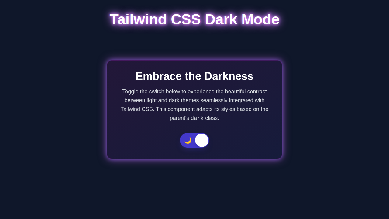
Today, we’re crafting a beautiful and functional dark mode toggle. Imagine a simple switch on your page. When you click it, your entire website instantly transforms. Light backgrounds become dark. Dark text becomes light. This project makes your site much more comfortable to use, especially at night. It’s a key feature for modern web applications. We will ensure the user’s preference is remembered. So, they don’t have to switch every time they visit. How cool is that?
HTML Structure: The Foundation of Our Toggle
First, we’ll lay down the basic HTML. This structure will hold our main content area. It also includes the button to toggle the dark mode. We’re keeping it simple and semantic. This makes our code easy to understand. It ensures everything is accessible too. Here’s the main setup:
index.html
<!-- index.html -->
<!DOCTYPE html>
<html lang="en">
<head>
    <meta charset="UTF-8">
    <meta name="viewport" content="width=device-width, initial-scale=1.0">
    <title>Tailwind CSS Dark Mode</title>
    <!-- Link to your compiled Tailwind CSS file -->
    <link href="./styles.css" rel="stylesheet">
    <style>
        /* Ensure a safe fallback font family */
        body { font-family: 'Arial', 'Helvetica', sans-serif; }

        /*
         Ensure box-sizing is border-box for consistent layouts.
         Tailwind's base styles already apply this, but it's good practice.
        */
        *, *::before, *::after {
            box-sizing: border-box;
        }

        /* Hide scrollbars for a cleaner demo if content overflows */
        html {
            overflow-x: hidden;
        }
    </style>
</head>
<body class="bg-gray-100 dark:bg-gray-900 text-gray-900 dark:text-gray-100 transition-colors duration-300">

    <div class="min-h-screen flex items-center justify-center p-4">
        <div class="bg-white dark:bg-gray-800 rounded-lg shadow-xl p-8 max-w-md w-full
                    transition-colors duration-300 border border-gray-200 dark:border-gray-700 max-w-[100%] overflow-hidden">
            <h1 class="text-3xl font-bold mb-4 text-center">Dark Mode Demo</h1>
            <p class="text-lg mb-6 text-center">
                This content changes its appearance based on the theme.
                Toggle the switch below to see it in action!
            </p>

            <div class="flex items-center justify-center mb-6">
                <span class="mr-3 text-gray-700 dark:text-gray-300">Light</span>
                <label for="darkModeToggle" class="relative inline-flex items-center cursor-pointer">
                    <input type="checkbox" id="darkModeToggle" class="sr-only peer">
                    <div class="w-14 h-8 bg-gray-200 peer-focus:outline-none peer-focus:ring-4 peer-focus:ring-blue-300 dark:peer-focus:ring-blue-800 rounded-full peer dark:bg-gray-700 peer-checked:after:translate-x-full peer-checked:after:border-white after:content-[''] after:absolute after:top-[4px] after:left-[4px] after:bg-white after:border-gray-300 after:border after:rounded-full after:h-6 after:w-6 after:transition-all dark:border-gray-600 peer-checked:bg-blue-600"></div>
                </label>
                <span class="ml-3 text-gray-700 dark:text-gray-300">Dark</span>
            </div>

            <button class="w-full py-3 px-6 rounded-md bg-blue-600 hover:bg-blue-700 text-white font-semibold
                           transition-colors duration-300 focus:outline-none focus:ring-2 focus:ring-blue-500 focus:ring-offset-2 dark:focus:ring-offset-gray-900">
                Learn More
            </button>
        </div>
    </div>

    <script>
        const toggle = document.getElementById('darkModeToggle');
        const htmlElement = document.documentElement; // This refers to the <html> tag

        // Function to apply a theme and update the toggle switch
        function setTheme(theme) {
            if (theme === 'dark') {
                htmlElement.classList.add('dark');
                toggle.checked = true;
            } else {
                htmlElement.classList.remove('dark');
                toggle.checked = false;
            }
            // Save the user's preference to local storage
            localStorage.setItem('theme', theme);
        }

        // Load theme from localStorage or detect system preference on page load
        function loadTheme() {
            const savedTheme = localStorage.getItem('theme');
            if (savedTheme) {
                // Use the saved theme if available
                setTheme(savedTheme);
            } else if (window.matchMedia('(prefers-color-scheme: dark)').matches) {
                // Otherwise, check for system-level dark mode preference
                setTheme('dark');
            } else {
                // Default to light mode
                setTheme('light');
            }
        }

        // Add event listener to the toggle switch
        toggle.addEventListener('change', () => {
            if (toggle.checked) {
                setTheme('dark');
            } else {
                setTheme('light');
            }
        });

        // Initialize theme when the script loads
        loadTheme();
    </script>
</body>
</html>
CSS Styling: Bringing the Dark Mode Magic with Tailwind
Next, we’ll sprinkle some Tailwind CSS magic. We won’t write a single line of traditional CSS! Tailwind’s utility-first approach makes styling super fast. We will use classes like bg-white, text-gray-900, and dark:bg-gray-900. These classes instantly apply styles. They even handle the dark mode variations. This is where the Tailwind Dark Mode really shines. You’ll see how easy it is. Remember, you already have Tailwind installed. Here’s what our styling looks like:
styles.css
/* styles.css */
/*
This file is the main entry point for your Tailwind CSS styles.
It includes Tailwind's base styles, components, and utilities.

IMPORTANT: This file needs to be compiled by Tailwind CLI or PostCSS
to generate the actual CSS that your browser will use.

Example command for compilation:
  npx tailwindcss -i ./styles.css -o ./dist/output.css --watch
(assuming your output file is dist/output.css, adjust as needed)
*/

@tailwind base;
@tailwind components;
@tailwind utilities;

/*
You can add your own custom CSS here if necessary,
but for a pure Tailwind experience, try to stick to utility classes.
*/
JavaScript: Making Our Toggle Dynamic
Now for the exciting part – the JavaScript! This script will handle all the logic. It listens for clicks on our toggle button. When clicked, it adds or removes a ‘dark’ class from the html element. This class triggers Tailwind’s dark mode styles. It also saves the user’s preference in their browser. This means their choice persists across sessions. Let me explain what’s happening here. This makes your user experience smooth. For a deeper dive into how localStorage works, you can check out its documentation on MDN Web Docs. Here’s the code:
tailwind.config.js
// tailwind.config.js
/** @type {import('tailwindcss').Config} */
module.exports = {
  // 1. Configure dark mode strategy
  // We use 'class' strategy, which means dark mode is activated by adding the 'dark' class
  // to the root HTML element (e.g., <html class="dark">).
  // The alternative is 'media', which uses the user's system preference (prefers-color-scheme).
  darkMode: 'class',

  // 2. Specify files to scan for Tailwind classes
  // Tailwind will look into these files to find and process utility classes.
  content: [
    "./index.html", // Path to your main HTML file
    // Add other files where you use Tailwind classes (e.g., for frameworks like React, Vue, Svelte):
    // "./src/**/*.{js,ts,jsx,tsx}",
  ],

  // 3. Customize Tailwind's default theme
  theme: {
    extend: {
      // Extend or override default font families.
      // Always use safe fallback fonts like 'Arial', 'Helvetica', sans-serif.
      fontFamily: {
        sans: ['Arial', 'Helvetica', 'sans-serif'],
      },
      // You can extend other theme properties here, such as colors, spacing, etc.
      // Example: Adding a custom brand color
      // colors: {
      //   'primary-blue': '#3490dc',
      // },
    },
  },

  // 4. Add Tailwind plugins
  // Plugins allow for more advanced functionalities, like custom utility classes or components.
  plugins: [],
}
How It All Works Together: The Dark Mode Symphony
Let’s meticulously break down how these individual pieces create our dynamic dark mode experience. Each part plays a profoundly crucial role in this system. Understanding this comprehensive flow is vital for you. You’ll grasp the entire system much better this way. Think of it as a beautifully well-orchestrated symphony, performing seamlessly for your users.
The HTML Blueprint: Your Content Canvas
Our HTML always sets up the initial stage. It’s the skeleton of your web page. We begin with a simple div element. This element acts as our main content container. Inside it, you’ll find a straightforward button. This specific button will serve as our primary dark mode toggle switch. It absolutely needs a distinct id. This helps our JavaScript find it easily and efficiently. We also include some sample text and elements. These visible components help to clearly demonstrate the immediate changes between light and dark styles. Remember, it’s essential to link your main tailwind.css file in your document’s <head> section. This critical step ensures that all the powerful utility classes are readily available. It forms your foundational structure.
Tailwind CSS: The Style Whisperer for Tailwind Dark Mode
This section is truly where the real visual transformation magic happens. Tailwind CSS leverages a very special dark: prefix. For instance, dark:bg-gray-800 inherently means “when the dark class is explicitly present on the html element, then apply bg-gray-800.” This intelligent prefixing is an incredibly powerful feature. By default, Tailwind intelligently scans for a dark class applied to the root html element. If it successfully locates this class, then all your dark: prefixed styles instantly take effect. Conversely, if the dark class is absent, then your default, non-prefixed styles are applied. You effectively just define both states directly within your HTML. There’s no need for complex or messy traditional CSS overrides. This approach is super efficient and incredibly clean. This is the heart of our Tailwind Dark Mode implementation. To explore more advanced layout techniques with Tailwind, consider our guide on building a Responsive Landing Page with Tailwind CSS: A Complete Guide.
JavaScript: The Brains Behind the Operation
Our JavaScript code acts as the intelligent orchestrator, managing everything seamlessly.
First and foremost, it checks for a previously saved user preference. This uses the browser’s localStorage API. If a preference for ‘dark’ mode is found, it applies that theme immediately. This ensures consistency for returning visitors.
Then, it sets up an event listener. This listener actively monitors our designated toggle button for clicks.
When you click the button, the script efficiently flips the dark class on the html element. Furthermore, it updates the localStorage entry. This crucial step ensures that your chosen theme persists across multiple browsing sessions. The browser then efficiently re-renders the page. It applies all the newly activated Tailwind styles instantly. It’s a wonderfully smooth and immediate transition. You get a seamless user experience every time. Don’t worry too much about the specific window.matchMedia part for now; it simply helps set a sensible default based on the user’s operating system preference. This subtle addition truly is a nice touch for a polished application.
Pro Tip: Always prioritize web accessibility. Implementing a dark mode is a fantastic step forward. However, it’s crucial to ensure excellent color contrast in both your light and dark themes. Tools like WebAIM Contrast Checker can be invaluable here. They help you verify that your text remains readable for everyone.
Putting It All Together: A Cohesive Experience
When your web page initially loads, our JavaScript springs into action. It diligently checks localStorage for any existing theme preference. Based on this, it accurately sets the initial theme. If you then decide to click the toggle button, the JavaScript precisely changes the presence of the dark class on the html tag. This action instantly prompts Tailwind to switch its defined styles. Specifically, dark:bg-gray-900 becomes active, while bg-white (or any default light-mode background) gracefully deactivates. The visual effect is immediate and satisfying. Your users gain full, intuitive control over their viewing environment. This simple yet powerful setup creates a professional and highly polished look. It significantly enhances user comfort, especially during extended browsing sessions. This entire integrated process ensures a delightful and personalized experience. You now possess a truly dynamic website. You can explore even more interactive elements with this foundational structure. For example, you could easily build a robust Responsive Navbar with Tailwind CSS using similar JavaScript principles you’ve just mastered.
You just built a fantastic and practical feature! This dynamic dark mode toggle beautifully showcases your growing frontend development skills. Keep experimenting with the incredible power of Tailwind CSS; you’re truly doing great work!
Tips to Customise It: Make It Your Own!
You’ve built a solid dark mode toggle. Now, let’s make it truly unique! Here are some ideas. You can extend this project further.
- Add a smooth transition: Currently, the mode switches instantly. You could add
transition-colors duration-500to elements. This creates a smooth fade between light and dark themes. It adds a polished touch. - More sophisticated icon: Instead of just text, use an SVG icon for the toggle. A sun for light mode, a moon for dark mode. This improves the visual appeal. Font Awesome or heroicons offer great options.
- Multiple themes: Go beyond just dark and light. Implement a “sepia” mode or a “high contrast” mode. This involves more JavaScript logic. It would use different classes for different themes.
- User settings page: Integrate the toggle into a user profile or settings page. This gives users more control. It’s a common pattern in web apps.
- Animate the toggle itself: Use Tailwind’s animation utilities. Make the toggle button itself animate when clicked. This adds a fun, interactive element.
Conclusion: You Just Built a Powerful Feature!
Wow, you did it! You successfully implemented a dynamic Tailwind Dark Mode toggle. Give yourself a huge pat on the back. This is more than just a visual trick. You learned about HTML structure. You mastered Tailwind’s utility classes. You also grasped client-side JavaScript. This project gives you practical experience. It helps you understand how frontend elements interact. You can now proudly add this to your portfolio. Share what you’ve created! We’d love to see it. Keep coding, keep building, and keep learning!