Hey there, fellow coder! If you’ve ever wanted to build truly dynamic web applications, mastering React Forms Handling is a super important step. It’s the primary way your users interact with your app, sending data and making things happen! Today, we’re going to build a simple but incredibly powerful user feedback form. You’ll learn essential techniques for capturing user input and managing component state like a seasoned professional. Get ready to make your React applications not just beautiful, but also wonderfully interactive and responsive!
What We Are Building: A Smart User Feedback Form
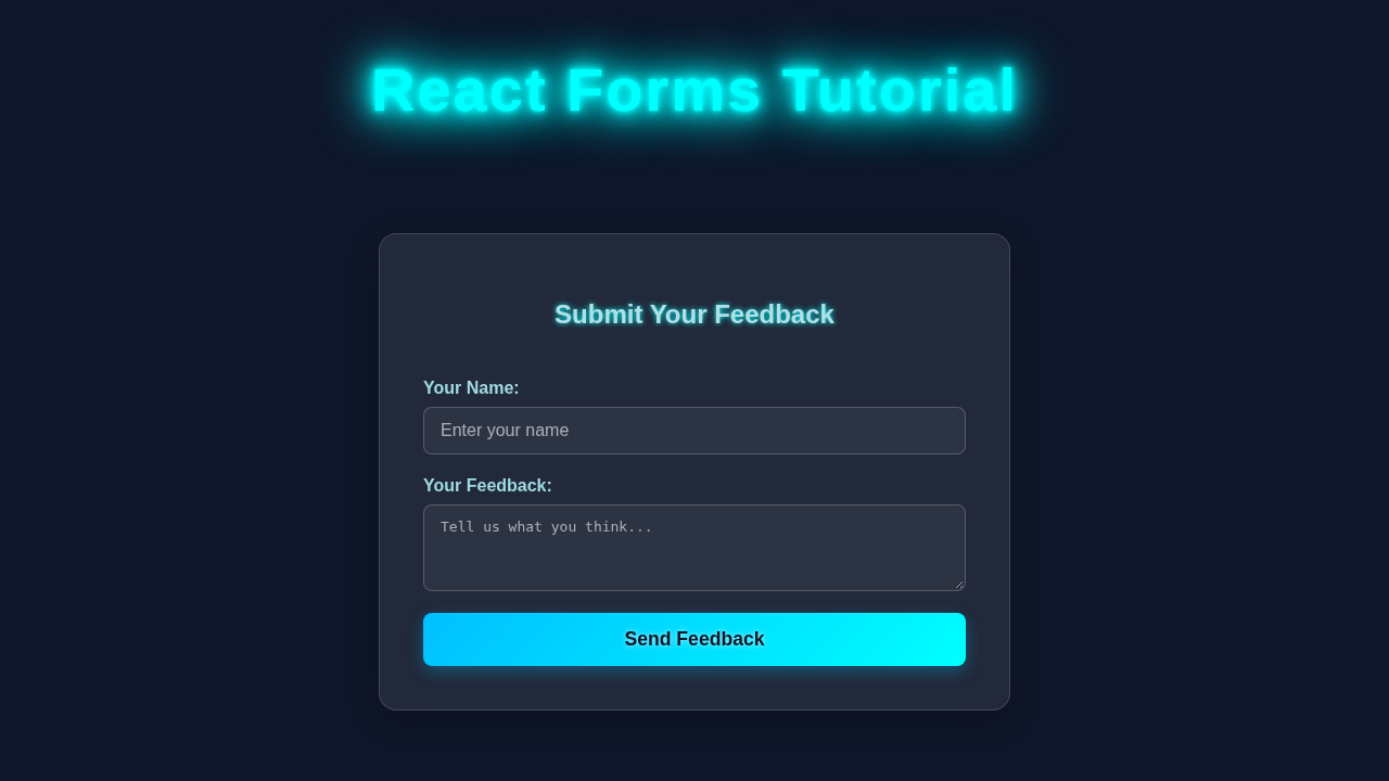
We are going to create a sleek and functional user feedback form. Imagine giving your users a direct voice in your application! This form will let them submit their name, email address, and a detailed message. It’s a fundamental building block for almost any web application you’ll ever encounter. Think about contact forms, newsletter sign-up pages, or even comment sections on a blog. You’ll love seeing how straightforward it is to bring these interactive elements to life using React’s powerful features. We’ll focus on a clean design and clear functionality.
The Basic HTML Structure for Our Form
First things first, let’s lay down the foundational HTML for our form. We’ll use familiar standard HTML form elements. This provides a robust and accessible base for React to later work its magic. We are setting up the labels and input fields. Don’t worry, we’ll connect everything to React’s dynamic state very soon, making it fully interactive!
index.html
<!DOCTYPE html>
<html lang="en">
<head>
    <meta charset="UTF-8">
    <meta name="viewport" content="width=device-width, initial-scale=1.0">
    <title>React Forms Tutorial</title>
    <link rel="stylesheet" href="styles.css">
    <!-- No CDN for fonts or external libraries in copy_paste_codes, just basic setup -->
</head>
<body>
    <noscript>You need to enable JavaScript to run this app.</noscript>
    <div id="root"></div>
    <script src="https://unpkg.com/react@18/umd/react.development.js"></script>
    <script src="https://unpkg.com/react-dom@18/umd/react-dom.development.js"></script>
    <script src="https://unpkg.com/@babel/standalone/babel.min.js"></script>
    <script type="text/babel" src="script.js"></script>
</body>
</html>
Styling Our Form with CSS for a Modern Look
Next up, let’s make our form visually appealing! A great user experience always begins with a pleasant and intuitive design. We will add some straightforward CSS to give our form a clean, modern, and easy-to-read appearance. This styling will be simple yet effective. It ensures you can focus your energy primarily on understanding the core React logic without getting bogged down in complex visual details.
styles.css
/* Basic Reset & Body Styles */
body {
    margin: 0;
    font-family: Arial, Helvetica, sans-serif;
    background-color: #f4f7f6; /* Light background for the tutorial */
    color: #333;
    line-height: 1.6;
    display: flex;
    justify-content: center;
    align-items: flex-start; /* Align to top for scrollability if content is long */
    min-height: 100vh;
    padding: 20px;
    box-sizing: border-box;
    overflow-x: hidden; /* Prevent horizontal scroll */
}

/* Main Form Container */
.form-container {
    background-color: #ffffff;
    padding: 30px;
    border-radius: 8px;
    box-shadow: 0 4px 15px rgba(0, 0, 0, 0.1);
    max-width: 700px;
    width: 100%;
    box-sizing: border-box;
}

.form-container h1 {
    text-align: center;
    color: #2c3e50;
    margin-bottom: 30px;
    font-size: 2em;
}

/* React Form Specific Styles */
.react-form {
    display: flex;
    flex-direction: column;
    gap: 20px;
}

.react-form fieldset {
    border: 1px solid #ddd;
    border-radius: 6px;
    padding: 20px;
    margin-bottom: 20px;
    background-color: #fcfcfc;
}

.react-form legend {
    font-size: 1.2em;
    font-weight: bold;
    color: #34495e;
    padding: 0 10px;
}

.form-group {
    margin-bottom: 15px;
    display: flex;
    flex-direction: column;
}

.form-group label,
.form-group .label-like { /* For radio button groups */
    margin-bottom: 8px;
    font-weight: bold;
    color: #555;
    display: block; /* Ensure labels take full width */
}

/* Input, Textarea, Select Base Styles */
.form-group input[type="text"],
.form-group input[type="email"],
.form-group textarea,
.form-group select {
    width: 100%;
    padding: 10px 12px;
    border: 1px solid #ccc;
    border-radius: 5px;
    font-size: 1em;
    box-sizing: border-box; /* Include padding and border in the element's total width and height */
    transition: border-color 0.2s ease-in-out, box-shadow 0.2s ease-in-out;
}

.form-group input[type="text"]:focus,
.form-group input[type="email"]:focus,
.form-group textarea:focus,
.form-group select:focus {
    border-color: #007bff;
    box-shadow: 0 0 0 3px rgba(0, 123, 255, 0.25);
    outline: none;
}

.form-group textarea {
    resize: vertical; /* Allow vertical resizing */
    min-height: 80px;
}

/* Checkbox & Radio Button Specifics */
.checkbox-group, .radio-group {
    display: flex;
    align-items: center;
    flex-wrap: wrap; /* Allow wrapping for multiple radios/checkboxes */
    gap: 15px; /* Spacing between radio/checkbox items */
}

.checkbox-group input[type="checkbox"],
.radio-group input[type="radio"] {
    margin-right: 8px; /* Space between input and its label */
    transform: scale(1.1); /* Slightly enlarge for better visibility */
    cursor: pointer;
}

.radio-group label {
    margin-bottom: 0; /* Override default label margin for inline display */
    font-weight: normal; /* Make labels for radio/checkbox less bold */
}

/* Error Messages */
.error-message {
    color: #dc3545; /* Red color for errors */
    font-size: 0.875em;
    margin-top: 5px;
    margin-bottom: 0;
}

.input-error {
    border-color: #dc3545 !important; /* Red border for erroneous inputs */
    box-shadow: 0 0 0 3px rgba(220, 53, 69, 0.25) !important;
}

/* Submit Button */
.react-form button[type="submit"] {
    background-color: #28a745; /* Green submit button */
    color: white;
    padding: 12px 20px;
    border: none;
    border-radius: 5px;
    font-size: 1.1em;
    cursor: pointer;
    transition: background-color 0.2s ease-in-out;
    align-self: flex-start; /* Align button to the left */
    margin-top: 10px;
}

.react-form button[type="submit"]:hover {
    background-color: #218838;
}

/* Submission Success Message */
.submission-success {
    background-color: #e6ffed;
    border: 1px solid #c3e6cb;
    color: #155724;
    padding: 15px;
    border-radius: 5px;
    margin-top: 20px;
    text-align: center;
}

.submission-success p {
    margin: 0 0 10px 0;
    font-weight: bold;
}

.submission-success pre {
    text-align: left;
    background-color: #f8f9fa;
    padding: 10px;
    border-radius: 4px;
    overflow-x: auto; /* For long JSON strings */
    white-space: pre-wrap; /* Wrap long lines */
    word-break: break-all; /* Break words for long lines */
}
Bringing It to Life with React (JavaScript): The Brains of Our Form
Now, prepare for the truly exciting part: implementing the React logic! This is where we will manage our form’s dynamic state. We will actively handle every piece of user input. This makes our form truly interactive and responsive to user actions. You’ll quickly see how intuitive React Hooks, like useState, make this entire process incredibly efficient and straightforward for developers.
script.js
const { useState } = React;
const { createRoot } = ReactDOM;

/**
 * App Component - Demonstrates various React form inputs and handling.
 */
function App() {
  // State to hold all form data. Using a single object simplifies passing to handlers.
  const [formData, setFormData] = useState({
    username: '',
    email: '',
    message: '',
    country: 'USA', // Default value for select dropdown
    subscribe: true, // Default value for checkbox
    gender: '', // Default value for radio buttons
  });

  // State to hold validation errors for form fields.
  const [errors, setErrors] = useState({});
  // State to track if the form was successfully submitted.
  const [isSubmitted, setIsSubmitted] = useState(false);

  /**
   * Generic change handler for all form inputs.
   * It updates the `formData` state based on the input's `name` attribute.
   * Handles different input types (text, checkbox) appropriately.
   * Also clears associated error messages on change.
   * @param {Object} e - The event object from the input's onChange.
   */
  const handleChange = (e) => {
    const { name, value, type, checked } = e.target;
    setFormData((prevData) => ({
      ...prevData,
      [name]: type === 'checkbox' ? checked : value, // Use 'checked' for checkboxes, 'value' for others
    }));

    // Basic real-time validation: clear error when the user starts typing/changing
    if (errors[name]) {
      setErrors((prevErrors) => ({
        ...prevErrors,
        [name]: '', // Clear the error for this field
      }));
    }
  };

  /**
   * Basic client-side form validation function.
   * Checks for required fields and basic email format.
   * @returns {Object} An object containing error messages, keyed by field name.
   */
  const validateForm = () => {
    let newErrors = {};

    // Username validation
    if (!formData.username.trim()) {
      newErrors.username = 'Username is required';
    } else if (formData.username.length < 3) {
      newErrors.username = 'Username must be at least 3 characters';
    }

    // Email validation
    if (!formData.email.trim()) {
      newErrors.email = 'Email is required';
    } else if (!/\S+@\S+\.\S+/.test(formData.email)) {
      newErrors.email = 'Email is invalid';
    }

    // Gender (radio) validation
    if (!formData.gender) {
      newErrors.gender = 'Please select a gender';
    }

    return newErrors;
  };

  /**
   * Form submission handler.
   * Prevents default form submission, performs validation, and logs data or errors.
   * @param {Object} e - The event object from the form's onSubmit.
   */
  const handleSubmit = (e) => {
    e.preventDefault(); // Prevent default browser form submission (page reload)

    const validationErrors = validateForm();
    if (Object.keys(validationErrors).length > 0) {
      // If there are errors, update the errors state and reset submission status
      setErrors(validationErrors);
      setIsSubmitted(false);
      console.log('Form has validation errors:', validationErrors);
    } else {
      // If validation passes, set submitted status and log form data
      setIsSubmitted(true);
      console.log('Form submitted successfully!', formData);
      // In a real application, you would send `formData` to a server here
      // e.g., fetch('/api/submit-form', { method: 'POST', body: JSON.stringify(formData) });
    }
  };

  return (
    <div className="form-container">
      <h1>React Forms Tutorial</h1>
      <form onSubmit={handleSubmit} className="react-form">
        <fieldset>
          <legend>User Information</legend>

          {/* Text Input - Controlled Component Example */}
          <div className="form-group">
            <label htmlFor="username">Username:</label>
            <input
              type="text"
              id="username"
              name="username" // `name` attribute is crucial for generic handleChange
              value={formData.username} // `value` is controlled by React state
              onChange={handleChange} // `onChange` updates the state
              className={errors.username ? 'input-error' : ''} // Apply error class if needed
              aria-describedby="username-error" // Accessibility for error messages
            />
            {errors.username && <p id="username-error" className="error-message">{errors.username}</p>}
          </div>

          {/* Email Input - Similar to text input, but with type="email" */}
          <div className="form-group">
            <label htmlFor="email">Email:</label>
            <input
              type="email"
              id="email"
              name="email"
              value={formData.email}
              onChange={handleChange}
              className={errors.email ? 'input-error' : ''}
              aria-describedby="email-error"
            />
            {errors.email && <p id="email-error" className="error-message">{errors.email}</p>}
          </div>

          {/* Textarea - Controlled Component Example */}
          <div className="form-group">
            <label htmlFor="message">Message:</label>
            <textarea
              id="message"
              name="message"
              value={formData.message}
              onChange={handleChange}
            />
          </div>

          {/* Select Dropdown - Controlled Component Example */}
          <div className="form-group">
            <label htmlFor="country">Country:</label>
            <select
              id="country"
              name="country"
              value={formData.country} // `value` prop sets the selected option
              onChange={handleChange}
            >
              <option value="USA">United States</option>
              <option value="CAN">Canada</option>
              <option value="MEX">Mexico</option>
              <option value="UK">United Kingdom</option>
            </select>
          </div>

          {/* Checkbox - Controlled Component Example */}
          <div className="form-group checkbox-group">
            <input
              type="checkbox"
              id="subscribe"
              name="subscribe"
              checked={formData.subscribe} // `checked` prop for checkboxes
              onChange={handleChange}
            />
            <label htmlFor="subscribe">Subscribe to newsletter</label>
          </div>

          {/* Radio Buttons - Controlled Component Example */}
          <div className="form-group">
            <p className="label-like">Gender:</p>
            <div className="radio-group">
              <input
                type="radio"
                id="male"
                name="gender" // All radio buttons in a group must have the same `name`
                value="male"
                checked={formData.gender === 'male'} // `checked` determined by state
                onChange={handleChange}
              />
              <label htmlFor="male">Male</label>

              <input
                type="radio"
                id="female"
                name="gender"
                value="female"
                checked={formData.gender === 'female'}
                onChange={handleChange}
              />
              <label htmlFor="female">Female</label>

              <input
                type="radio"
                id="other"
                name="gender"
                value="other"
                checked={formData.gender === 'other'}
                onChange={handleChange}
              />
              <label htmlFor="other">Other</label>
            </div>
            {errors.gender && <p className="error-message">{errors.gender}</p>}
          </div>
        </fieldset>

        <button type="submit">Submit Form</button>

        {/* Conditional rendering for submission success message */}
        {isSubmitted && (
          <div className="submission-success">
            <p>Form submitted successfully!</p>
            <pre>{JSON.stringify(formData, null, 2)}</pre>
          </div>
        )}
      </form>
    </div>
  );
}

// Render the App component into the root div
const root = createRoot(document.getElementById('root'));
root.render(
  <React.StrictMode>
    <App />
  </React.StrictMode>
);
Deep Dive: Understanding React Forms Handling Step-by-Step
You’ve successfully seen all the code, but let’s take a moment to meticulously break down how every piece works harmoniously together. This section will carefully explain each crucial aspect of our interactive form. We’ll explore core concepts like state management, efficiently handling input changes, and the vital process of form submission. It’s all about seamlessly connecting your plain HTML elements to your React component’s intelligent “brain”!
Managing Form State with useState Hook
In the world of React, we absolutely need an effective way to store whatever the user types into our input fields. That, my friends, is precisely where the amazing useState Hook comes in! We declare individual state variables for each and every input field in our form. For example, you’ll see a line like const [name, setName] = useState('');. This particular line intelligently creates a state variable named name. Its initial value is thoughtfully set as an empty string. The corresponding setName function then gives us the power to update that variable whenever needed. When this state updates, React intelligently re-renders your component. This effectively displays the new, updated value directly inside the input field. It’s a remarkably powerful pattern for building highly interactive user interfaces efficiently.
Pro Tip for Scaling: Using a single state object, like
const [formData, setFormData] = useState({ name: '', email: '', message: '' });, can significantly simplify your code. This approach is especially beneficial for forms that have many different input fields, keeping your state management neat and tidy!
Handling Input Changes: The onChange Event Listener
So, how exactly do we update our component’s state the moment a user starts typing into an input field? Each input element needs a special onChange event handler attached to it. This handler actively “listens” for any changes happening within that specific input field. When a user types even a single character, this event instantly fires! Our custom handleChange function then gracefully updates the corresponding state variable. We precisely grab the current value using event.target.value. This entire mechanism creates what we call a “controlled component.” A controlled component means React completely manages the input’s value. This makes your forms incredibly predictable, easier to validate, and more reliable. You are now truly controlling your form inputs directly with React’s powerful state management!
For even more advanced form submissions, especially when dealing with complex server-side interactions, you might want to explore modern patterns. Check out our detailed guide on React Form Actions: useActionState & useFormStatus Hooks Tutorial. It introduces powerful new ways to manage form submissions effectively in newer React versions.
Form Submission: The onSubmit Event Handler
When your user finally clicks the “Submit” button, the form’s onSubmit event immediately fires. We then strategically attach a dedicated function, like our handleSubmit function, to this critical event. The very first thing we typically do inside handleSubmit is call event.preventDefault(). Why is this so crucial? This command heroically stops the browser from executing its default form submission behavior. The default browser behavior would, surprisingly, cause a full page reload. We absolutely want to handle form submission gracefully with React, thus keeping our application a smooth single-page experience. After preventing the default, you can easily access all your gathered form data directly from your state variables. You are then free to send this data to an API, process it, or simply display it for confirmation. This moment is truly the grand finale of your successful React Forms Handling!
Did you know? Understanding browser events is fundamental! You can find many more comprehensive details about the
preventDefault()method and various other event properties on the excellent MDN Web Docs. It’s a fantastic resource for all web developers!
Providing User Feedback and Resetting the Form
After a user successfully submits a form, it is always a good practice to provide them with clear and immediate feedback. Our current example simply logs the submitted data directly to the console for demonstration purposes. In a real-world application, however, you would typically display a friendly success message to the user. You might also consider redirecting them to a different page. Importantly, we also intelligently clear all the form inputs after a successful submission. This small but significant step dramatically improves the overall user experience. You could very easily extend this functionality to show a dynamic loading spinner during submission. Or, you could display a helpful error message if the submission unfortunately fails. Always think about how to give your users clear, actionable feedback at every stage of their interaction!
Tips to Customise Your Interactive Form and Take It Further
Congratulations! You have successfully built a robust and interactive form. You’ve laid down a solid foundation. Now, how about making it even more powerful and uniquely yours? Here are some exciting ideas to extend and personalize your project:
- Implement Client-Side Validation: Make your form smarter! Implement simple client-side validation logic. Check if required fields are empty before submission. You could also validate email formats using regular expressions. This makes your form much more robust and user-friendly by catching errors early!
- Integrate with a Backend API: Move beyond just logging data! Instead, send the collected form data to a real backend API. You could use modern JavaScript features like
fetchor a popular library likeaxiosfor making HTTP requests. This truly connects your front-end to a persistent data store. - Add Theming Options: What about offering a dark mode for your feedback form? Providing theme options enhances user experience. Check out our comprehensive guide on React Dark Mode Local Storage Tutorial with Hooks. Or, for a more global application-wide approach, explore our tutorial on React Dark Mode with Context API: A Complete Tutorial.
- Upgrade to a Rich Text Editor: For the message area, why stick to a basic textarea? Replace it with a powerful rich text editor! This allows users to format their messages with bold text, italics, lists, and more. Consider integrating well-known libraries such as TinyMCE or Quill for this advanced functionality.
Conclusion: You Mastered React Forms Handling Like a Pro!
Wow, you absolutely crushed it! You just built an interactive user feedback form in React from the ground up. You expertly learned crucial concepts like effective state management, gracefully handling input changes, and intelligently processing form submission. This is an immense and incredibly valuable step in your ongoing web development journey. Forms are truly ubiquitous across the internet, and now you possess the essential skills to build them effectively and confidently. Keep experimenting with different input types, try adding even more complex validation rules, and integrate with various APIs. Most importantly, share what you’ve brilliantly built with the welcoming procoder09.com community! Happy and productive coding!