Hey! If you’ve ever wanted to build a stylish and functional website navigation, but felt a bit lost, you are in the perfect spot. Today, we’re going to build a Responsive Navbar Tailwind CSS component. This tutorial will show you exactly how to make a menu that looks great on any screen size. It’s going to be super fun and incredibly useful for your projects! Let’s dive in.
What We Are Building
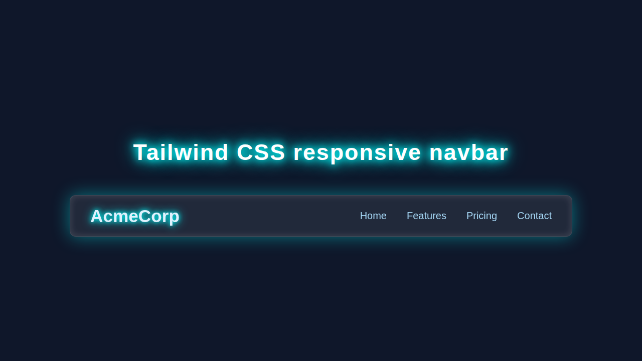
We are crafting a sleek, modern navigation bar. It will sit proudly at the very top of your web pages. On larger screens, you’ll see a clean, horizontal list of links. This provides easy access to all your site’s sections. Then, when you shrink your browser, a cool “hamburger” icon appears. Tapping that icon will gracefully reveal your navigation links. It’s an essential feature for any professional website. This approach makes your site easy to use for everyone, no matter their device!
HTML Structure: The Foundation of Our Responsive Navbar Tailwind
First, we’ll set up the basic skeleton of our navbar. We’ll use semantic HTML tags where appropriate. These tags give clear meaning to our content. This is crucial for accessibility and search engine optimization. Don’t worry, we’ll keep it simple and clean. Moreover, it creates a robust base for our Tailwind styles. Here’s what our HTML will look like:
index.html
<!DOCTYPE html>
<html lang="en">
<head>
    <meta charset="UTF-8">
    <meta name="viewport" content="width=device-width, initial-scale=1.0">
    <title>Responsive Navbar with Tailwind CSS</title>
    <!-- Link to your compiled Tailwind CSS -->
    <link href="./styles.css" rel="stylesheet">
    <!-- Safe fonts for broad compatibility -->
    <style>
        body {
            font-family: Arial, Helvetica, sans-serif;
            /* Tailwind's Preflight handles box-sizing and basic resets */
        }
    </style>
</head>
<body class="bg-gray-900 text-white min-h-screen">

    <!-- Responsive Navbar -->
    <nav class="bg-gray-800 p-4 shadow-lg">
        <div class="container mx-auto flex justify-between items-center">
            <!-- Logo -->
            <div>
                <a href="#" class="text-white text-2xl font-bold">AcmeCorp</a>
            </div>

            <!-- Desktop Navigation Links -->
            <div class="hidden md:flex space-x-6">
                <a href="#" class="text-gray-300 hover:text-white px-3 py-2 rounded-md transition duration-300 ease-in-out">Home</a>
                <a href="#" class="text-gray-300 hover:text-white px-3 py-2 rounded-md transition duration-300 ease-in-out">Features</a>
                <a href="#" class="text-gray-300 hover:text-white px-3 py-2 rounded-md transition duration-300 ease-in-out">Pricing</a>
                <a href="#" class="text-gray-300 hover:text-white px-3 py-2 rounded-md transition duration-300 ease-in-out">Contact</a>
            </div>

            <!-- Mobile Menu Button (Hamburger) -->
            <div class="md:hidden">
                <button id="nav-toggle" class="text-gray-300 hover:text-white focus:outline-none focus:ring-2 focus:ring-offset-2 focus:ring-offset-gray-800 focus:ring-white p-2 rounded-md">
                    <svg class="h-6 w-6" fill="none" stroke="currentColor" viewBox="0 0 24 24" xmlns="http://www.w3.org/2000/svg">
                        <path stroke-linecap="round" stroke-linejoin="round" stroke-width="2" d="M4 6h16M4 12h16M4 18h16"></path>
                    </svg>
                </button>
            </div>
        </div>

        <!-- Mobile Navigation Menu (Hidden by default) -->
        <!-- This menu will be toggled visible/hidden by JavaScript on smaller screens -->
        <div id="mobile-menu" class="md:hidden hidden bg-gray-700 mt-2 rounded-md shadow-inner">
            <a href="#" class="block text-gray-300 hover:bg-gray-600 hover:text-white px-3 py-2 rounded-md transition duration-300 ease-in-out">Home</a>
            <a href="#" class="block text-gray-300 hover:bg-gray-600 hover:text-white px-3 py-2 rounded-md transition duration-300 ease-in-out">Features</a>
            <a href="#" class="block text-gray-300 hover:bg-gray-600 hover:text-white px-3 py-2 rounded-md transition duration-300 ease-in-out">Pricing</a>
            <a href="#" class="block text-gray-300 hover:bg-gray-600 hover:text-white px-3 py-2 rounded-md transition duration-300 ease-in-out">Contact</a>
        </div>
    </nav>

    <!-- Page Content Example -->
    <div class="container mx-auto mt-8 p-4">
        <h2 class="text-3xl font-semibold mb-4">Welcome to AcmeCorp!</h2>
        <p class="text-gray-400">This is a responsive navbar example built with Tailwind CSS and a little JavaScript.</p>
        <p class="text-gray-400 mt-2">Resize your browser window to see the responsive behavior (at `md` breakpoint, ~768px).</p>
    </div>

    <script src="./script.js" defer></script>
</body>
</html>
CSS Styling with Tailwind CSS
This project truly shines with Tailwind CSS! We will primarily use utility classes directly within our HTML. This is the core philosophy of Tailwind. It means you write almost no traditional CSS files. Your styling lives right where your elements are defined. Therefore, it’s super efficient and incredibly fast for development. We will manage layout, colors, padding, spacing, and more. This keeps our styles organized and highly performant. Furthermore, it makes implementing a responsive design incredibly straightforward. We’ll leverage Tailwind’s responsive prefixes for different screen sizes.
styles.css
/*
  This file is for importing Tailwind CSS directives.
  To use these utility classes, you need to set up Tailwind CSS in your project.
  Typically, you would process this file with Tailwind CLI or PostCSS to generate
  the actual utility classes into an output.css file (e.g., dist/output.css).

  Example Tailwind CLI command:
  npx tailwindcss -i ./styles.css -o ./dist/output.css --watch

  Then, link to the output.css file in your index.html.
*/

@tailwind base;
@tailwind components;
@tailwind utilities;
JavaScript for Interactivity
Finally, we add some essential interactivity with JavaScript. This code will bring our “hamburger” menu icon to life. When you click it, the navigation links will elegantly appear or disappear. It’s a small but powerful piece of code. However, it completely transforms our static menu into a dynamic, responsive one. We will explain each line carefully. This ensures you understand exactly what’s happening behind the scenes.
script.js
document.addEventListener('DOMContentLoaded', () => {
    // Get references to the navigation toggle button and the mobile menu
    const navButton = document.getElementById('nav-toggle');
    const mobileMenu = document.getElementById('mobile-menu');

    // Ensure both elements exist before adding event listener
    if (navButton && mobileMenu) {
        // Add a click event listener to the navigation toggle button
        navButton.addEventListener('click', () => {
            // Toggle the 'hidden' Tailwind CSS class on the mobile menu.
            // This will show the menu if it's hidden, and hide it if it's visible.
            mobileMenu.classList.toggle('hidden');
        });
    }
});
How It All Works Together
Let’s break down how these individual pieces form our awesome Responsive Navbar Tailwind component. Each part plays a vital role. Understanding this synergy is key to building great web applications.
The Navbar Container: Our Main Wrapper
Our `<nav>` element serves as the main wrapper for the entire navigation bar. We make it stick to the top of the page. Tailwind classes like `fixed`, `top-0`, `left-0`, and `right-0` achieve this effortlessly. These ensure it always stays visible. We also add some padding for breathing room. A background color makes it stand out. The `z-50` class is important. It ensures our navbar always sits on top of other page content. This main container holds everything together beautifully and reliably.
The Brand Logo/Name
Inside the navbar, we have our brand’s logo or name. This is often an `<a>` tag. It typically links back to your website’s homepage. We give it some basic styling. Classes like `text-xl` and `font-bold` make the text prominent. This ensures your brand is always visible and easily clickable. It establishes your site’s identity right from the start.
The Hamburger Icon: Mobile’s Best Friend
This icon is crucial for mobile views. We use a `<button>` element for it. It usually contains simple SVG paths. This button only appears on smaller screens. Tailwind’s `md:hidden` class is magical here. It hides the button on medium screens and up. Consequently, it only shows when needed. When clicked, it toggles the visibility of our navigation menu. We’ll use simple SVG icons for the “open” (three lines) and “close” (X mark) states. It’s a common pattern for accessible buttons. This provides clear visual feedback to the user.
The Navigation Links: Your Menu Items
These are your primary menu items. They are usually wrapped inside a `<div>` or `<ul>` element. On large screens, they display horizontally in a neat row. However, on small screens, they are hidden by default. When the hamburger is clicked, our JavaScript makes them visible. We style them using Tailwind’s `flex` and `space-x` utilities for desktop views. For mobile, we might use `flex-col` for a vertical stack. We’ll also add padding and margins. This makes each link easy to tap. Check out this guide on Flexbox for more details on powerful layouts. It’s an indispensable tool.
JavaScript’s Role: Bringing it to Life
Our JavaScript code targets two main elements. It looks for the hamburger button and the navigation links container. It then adds an event listener to the button. When the button is clicked, a specific function runs. This function toggles a CSS class on the navigation links. This class might, for instance, switch between `hidden` and `flex` or `block`. It effectively shows or hides them. Simultaneously, it also changes the hamburger icon itself. We switch between the “open” (hamburger) and “close” (X) icons. This provides clear visual feedback to the user. This simple script makes the entire responsive experience fluid and intuitive.
Pro Tip: Always consider keyboard navigation when building interactive components! Ensure your menu links are accessible. Users should be able to tab through them easily. This improves usability for everyone.
This complete setup ensures a smooth and professional user experience. Your site will look fantastic and function perfectly on any device. Therefore, you are building a truly robust navigation system.
Tips to Customise It
You’ve successfully built a solid foundation! Now, let’s explore some exciting ways to make this navbar uniquely yours. Personalization is key to great web design.
- Add Dropdowns: Extend your main menu with sub-menus or dropdowns. This is perfect for complex navigation structures. You might need a little more JavaScript for this. It helps organize a lot of content effectively.
- Dark Mode Toggle: Integrate a dark mode switch directly into your navbar. This enhances user preference and can reduce eye strain. You could even combine it with a Tailwind Dark Mode Toggle: HTML & CSS Tutorial! This adds a modern, desirable feature.
- Search Bar Integration: Include a search input field directly within your navbar. This helps users find specific content quickly. It’s a common feature for content-heavy websites.
- User Profile/Authentication Links: If your site has user accounts, add “Login,” “Register,” or a user avatar icon. This provides immediate access to account functions. It makes your application feel more complete and personal.
- Different Animations: Experiment with CSS transitions for your menu toggle. Make it slide in from the side or fade smoothly into view. This adds a polished and engaging touch to the user interface.
Another Pro Tip: Practice makes perfect! Try rebuilding this component from scratch. Challenge yourself to change colors, fonts, and even the layout. This hands-on approach helps solidify your understanding significantly.
Conclusion
Wow, you just built a fully Responsive Navbar Tailwind component! Give yourself a huge pat on the back. That’s a fantastic achievement. You now possess a key building block for almost any website you’ll ever create. This menu adapts beautifully to any screen size. You’ve learned about HTML structure, powerful Tailwind utilities, and essential JavaScript interactivity. Keep experimenting and building amazing things! We can’t wait to see what you create next. Perhaps you could use this on your next Tailwind Article Card: Responsive HTML & CSS Tutorial project? Or maybe enhance a previous project like the Responsive Navbar Tailwind CSS: Build a Modern HTML Menu. Share your work with us online! Happy coding, pro coder!