Tailwind Dark Mode Toggle: HTML & CSS Tutorial
Hey there, fellow coders! Have you ever wanted to build a sleek Tailwind Dark Mode Toggle for your website? If so, you are in the perfect spot right now. Adding a dark mode option is super cool. It truly elevates the user experience on any platform. Today, we’re going to build one from scratch. We will craft a polished, functional component together. Get ready to make your projects shine, day or night! It’s going to be a fun journey.
What We Are Building: A Custom Tailwind Dark Mode Toggle
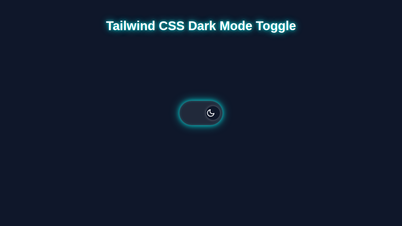
We are going to craft a truly stylish and interactive dark mode switch today. This isn’t just any ordinary toggle. Importantly, it will remember your user’s preference too. Imagine a subtle, elegant button that seamlessly transforms your entire website. It shifts from bright and airy to dark and cozy, with just one satisfying click. This feature is incredibly useful for any modern web application. It significantly improves readability in low light. Plus, it will look absolutely amazing. All thanks to the power and flexibility of Tailwind CSS! This project will definitely impress both you and your users.
HTML Structure: Building the Foundation of Our Toggle
First things first, we need some solid HTML to begin. This structure will serve as the essential blueprint for our entire toggle component. We’ll use a simple checkbox input element. Don’t worry, we will visually hide this checkbox. Then, a label element will become our fancy, clickable visual switch. It’s clean, semantic, and perfectly ready for all our Tailwind CSS styling. This approach also ensures that our toggle is accessible right from the start. Here’s what our basic HTML setup looks like:
index.html
<!DOCTYPE html>
<html lang="en" class="scroll-smooth">
<head>
    <meta charset="UTF-8">
    <meta name="viewport" content="width=device-width, initial-scale=1.0">
    <title>Tailwind CSS Dark Mode Toggle</title>
    <!-- Tailwind CSS CDN - For quick development. In production, use a build process. -->
    <script src="https://cdn.tailwindcss.com"></script>
    <!-- Configure Tailwind CSS for 'class' based dark mode -->
    <script>
        tailwind.config = {
            darkMode: 'class',
            theme: {
                extend: {
                    // You can extend your theme here if needed
                    colors: {
                        primary: '#3b82f6', // Example primary color
                        secondary: '#6366f1', // Example secondary color
                    }
                }
            }
        }
    </script>
    <!-- Link to custom styles (e.g., global resets, custom fonts if not using Tailwind's defaults) -->
    <link rel="stylesheet" href="./styles.css">
</head>

<body class="bg-gray-100 text-gray-900 transition-colors duration-300 dark:bg-gray-900 dark:text-gray-100 font-[Arial,Helvetica,sans-serif]">
    <div class="min-h-screen flex flex-col items-center justify-center p-4">
        <header class="w-full max-w-2xl text-center mb-10">
            <h1 class="text-4xl font-extrabold mb-4 text-gray-800 dark:text-gray-100">
                Hello from the Matrix!
            </h1>
            <p class="text-lg text-gray-600 dark:text-gray-300">
                Toggle the switch below to experience the light and dark sides.
            </p>
        </header>

        <!-- Dark Mode Toggle Component -->
        <div class="mb-8 p-4 bg-white rounded-xl shadow-lg dark:bg-gray-800 transition-all duration-300 transform hover:scale-105">
            <label for="theme-toggle" class="flex items-center space-x-3 cursor-pointer select-none">
                <span class="text-gray-700 dark:text-gray-300 text-lg font-medium">Switch Theme</span>
                <button id="theme-toggle" type="button" class="relative inline-flex items-center h-10 w-20 rounded-full cursor-pointer transition-colors duration-300 ease-in-out bg-gray-300 dark:bg-gray-700 focus:outline-none focus:ring-4 focus:ring-blue-500/50 dark:focus:ring-indigo-400/50">
                    <!-- Light mode icon -->
                    <span class="absolute left-2 flex items-center justify-center w-6 h-6 text-yellow-500 transition-opacity duration-300 opacity-100 dark:opacity-0">
                        <svg xmlns="http://www.w3.org/2000/svg" fill="none" viewBox="0 0 24 24" stroke-width="2" stroke="currentColor" class="w-6 h-6"><path stroke-linecap="round" stroke-linejoin="round" d="M12 3v2.25m6.364.386l-1.591 1.591M21 12h-2.25m-.386 6.364l-1.591-1.591M12 18.75V21m-4.243-1.897l-1.591 1.591M3 12H5.25m-.386-6.364l1.591 1.591M12 12a3 3 0 110-6 3 3 0 010 6z"></path></svg>
                    </span>
                    <!-- Dark mode icon -->
                    <span class="absolute right-2 flex items-center justify-center w-6 h-6 text-indigo-300 transition-opacity duration-300 opacity-0 dark:opacity-100">
                        <svg xmlns="http://www.w3.org/2000/svg" fill="none" viewBox="0 0 24 24" stroke-width="2" stroke="currentColor" class="w-6 h-6"><path stroke-linecap="round" stroke-linejoin="round" d="M21.752 15.002A9.718 9.718 0 0118 15.75c-5.385 0-9.75-4.365-9.75-9.75 0-1.33.266-2.607.748-3.752A9.753 9.753 0 003 11.25C3 16.635 7.365 21 12.75 21a9.753 9.753 0 009.002-5.998z"></path></svg>
                    </span>
                    <!-- Toggle ball -->
                    <span aria-hidden="true" class="pointer-events-none absolute h-8 w-8 rounded-full bg-white dark:bg-gray-900 shadow transform ring-0 transition ease-in-out duration-300 translate-x-1 dark:translate-x-11"></span>
                </button>
            </label>
        </div>

        <div class="w-full max-w-2xl bg-white p-8 rounded-lg shadow-md dark:bg-gray-800 transition-colors duration-300">
            <h2 class="text-2xl font-semibold mb-4 text-gray-800 dark:text-gray-100">Understanding Dark Mode</h2>
            <p class="text-gray-700 dark:text-gray-300 mb-4">
                Dark mode, also known as night mode, is a setting that changes the color palette of an application or website to display light-colored text on a dark background. This can reduce eye strain in low-light conditions and save battery life on devices with OLED screens.
            </p>
            <p class="text-gray-700 dark:text-gray-300">
                Tailwind CSS makes implementing dark mode incredibly easy with its <code>dark:</code> variant. By adding the <code>dark</code> class to your <code>html</code> element, all utility classes prefixed with <code>dark:</code> will automatically apply, providing a seamless theme switch.
            </p>
        </div>
    </div>

    <!-- Link to your JavaScript for toggle logic -->
    <script src="./script.js"></script>
</body>
</html>
CSS Styling: Making Our Toggle Look Great with Tailwind CSS
Now for the truly fun part: styling! Most of our design magic will come directly from Tailwind CSS. We will use its powerful utility classes extensively. These classes will effortlessly handle layout, colors, and all those smooth transitions. There will be a tiny, specific bit of custom CSS too. This custom CSS helps us perfectly position the inner “thumb.” It creates that unique, satisfying switch animation. Let me explain exactly what’s happening here. We will transform our plain label into an elegant, interactive toggle component. It’s truly amazing what you can achieve with just a few classes!
styles.css
/*
 * styles.css
 *
 * This file contains basic global styles and resets.
 * For a Tailwind CSS project, most styling is done directly in HTML
 * using Tailwind's utility classes.
 *
 * For production, Tailwind is typically built from source,
 * generating a complete CSS file based on your configuration and usage.
 */

/* Global Box Sizing Reset */
html {
    box-sizing: border-box;
    -webkit-text-size-adjust: 100%; /* Prevent font scaling in landscape */
}

*, *::before, *::after {
    box-sizing: inherit;
}

/* Ensure no horizontal scrollbars from unexpected elements */
body {
    overflow-x: hidden;
}

/* Set a safe fallback font family */
body {
    font-family: Arial, Helvetica, sans-serif;
}

/*
 * You can add any custom CSS here that cannot be achieved with Tailwind
 * utility classes or that you want to apply globally outside of Tailwind's scope.
 * For this tutorial, Tailwind handles almost everything.
 */
JavaScript: Bringing Our Custom Dark Mode Toggle to Life
Finally, JavaScript is what truly ties everything together. This is where the real interaction happens. Our script will actively listen for any clicks on the toggle switch. Then, it will dynamically add or remove the crucial dark class on the html element. Furthermore, we’ll wisely save the user’s chosen theme preference. This way, their preference loads automatically every single time they visit. It’s a small piece of code. Yet, it is incredibly powerful, significantly enhancing the user experience. You’ll love its simplicity and effectiveness!
script.js
/**
 * script.js
 *
 * Handles the dark mode toggle logic for the Tailwind CSS Dark Mode Toggle tutorial.
 * It manages theme state in localStorage and applies/removes the 'dark' class
 * on the document's root element (<html>).
 */

document.addEventListener('DOMContentLoaded', () => {
    const themeToggle = document.getElementById('theme-toggle');
    const htmlElement = document.documentElement;

    // Function to set the theme
    const setTheme = (theme) => {
        if (theme === 'dark') {
            htmlElement.classList.add('dark');
            localStorage.setItem('theme', 'dark');
        } else {
            htmlElement.classList.remove('dark');
            localStorage.setItem('theme', 'light');
        }
    };

    // Initial theme check on page load
    const storedTheme = localStorage.getItem('theme');
    const prefersDark = window.matchMedia('(prefers-color-scheme: dark)').matches;

    if (storedTheme) {
        // If a theme is stored in localStorage, use it
        setTheme(storedTheme);
    } else if (prefersDark) {
        // If no theme is stored, but user prefers dark mode, set to dark
        setTheme('dark');
    } else {
        // Default to light mode if no preference is found
        setTheme('light');
    }

    // Event listener for the toggle button
    themeToggle.addEventListener('click', () => {
        if (htmlElement.classList.contains('dark')) {
            setTheme('light');
        } else {
            setTheme('dark');
        }
    });
});
How It All Works Together: The Dark Mode Symphony
Let’s break down each piece in thorough detail. You will see precisely how HTML, CSS, and JavaScript flawlessly cooperate. Together, they create our fully functional and persistent dark mode toggle. Understanding this powerful synergy is absolutely key to building robust web components.
The HTML Blueprint: A Solid, Accessible Start
Our HTML sets up the basic, essential elements for our toggle. We begin with a container div. This neatly holds our entire component. It provides a clean, self-contained boundary for styling. Inside, an <input type="checkbox" id="darkModeToggle"> is crucially important. This hidden input handles the actual “on” or “off” state of our switch. We then link a <label for="darkModeToggle"> to it. This label is what users will physically see and click or tap. It acts as our visual switch, thanks to clever CSS styling. Its id and for attributes ensure excellent accessibility. This makes it usable for everyone. It’s a simple, yet incredibly effective, structure that forms the core of our interactivity.
Tailwind’s Styling Power: Visual Transformation & Responsiveness
Tailwind CSS truly does most of the heavy lifting for our visual design. We apply fundamental classes like flex and items-center to the label. These expertly position our toggle perfectly within its defined space. The relative class is absolutely essential for correctly positioning the inner span element. Key to dark mode functionality are classes like bg-gray-200 and dark:bg-gray-700. These intelligently change the toggle’s background color. They respond directly to the presence or absence of the dark class on the html tag. The inner span represents the “thumb” of our switch. We style it beautifully with bg-white and rounded-full. Its position shifts dynamically using translate-x-0 and translate-x-full. These small details, combined with transition-transform and duration-300, create a smooth, visually appealing sliding animation. It transforms a simple checkbox into an elegant and responsive UI component.
CSS transitions are a fantastic way to add subtle, professional animations to your UI. They make user interfaces feel much more responsive and modern. You can animate properties like color, position, and opacity with ease!
These utility classes are exactly what make Tailwind CSS so powerful and efficient. You can quickly prototype and build stunning designs. Thinking about learning more about utility-first CSS? Be sure to check out our Tailwind CSS vs Plain CSS: The Ultimate Comparison for even deeper insights!
The JavaScript Magic: Remembering User Preferences and State
Our JavaScript code acts as the intelligent brain of the entire operation. First, it carefully finds our toggle checkbox element. It also targets the crucial html element. This element is precisely where the dark class will be dynamically added or removed. When the page first loads, the script performs a vital initial check. It meticulously looks into localStorage for a previously saved theme preference. If a preference like ‘dark’ or ‘light’ exists, it applies it immediately. This ensures a consistent experience across all user sessions. When the checkbox state changes (i.e., the user clicks it), the script springs into action. It updates the html class accordingly, either adding or removing dark. Then, it reliably saves this new preference back to localStorage. This way, the dark mode state persists across all future visits. It provides a truly smooth, highly user-friendly experience without constant re-toggling.
Always use
localStorage.setItem()andlocalStorage.getItem()responsibly. Be mindful of the data you store. It should not contain sensitive user information. Local Storage is perfectly ideal for user preferences like themes or simple UI states.
Tips to Customise Your Tailwind Dark Mode Toggle
You’ve just built an awesome custom dark mode toggle! That’s a huge achievement. You should feel incredibly proud. But why stop there? The true beauty of building components lies in their customisation. Here are some fantastic ideas to make your toggle uniquely yours and even more impressive:
- Different Icons for Modes: Instead of a simple circular thumb, consider using elegant SVG icons. A cheerful sun icon for light mode and a serene moon icon for dark mode would be visually stunning. You could swap these icons out dynamically with JavaScript. Imagine them smoothly fading in and out!
- Custom Color Palettes: Experiment widely with Tailwind’s extensive and flexible color palette. Change the background color of the switch track itself. Or alter the thumb’s color entirely. Make it perfectly match your brand’s specific aesthetic or your website’s mood. You could even use a subtle gradient for extra flair!
- Animation Tweaks for Added Flair: Adjust the
transition-durationorease-in-outclasses. This alters precisely how quickly and smoothly the toggle animates. Perhaps you prefer a slightly slower, more elegant transition? Or maybe a quick, snappy bounce effect could add more personality? - Accessibility Improvements are Always Key: Actively enhance your toggle’s accessibility. Add
aria-labelattributes to your checkbox for screen readers. Also, consider addingrole="switch"to the label element. This greatly improves usability for all users, especially those using assistive technologies. Accessibility is always a win for everyone! - Integrate into Larger Components: Think creatively about where else this fantastic toggle could live on your site. For instance, imagine adding it seamlessly into a fully responsive navbar at the very top of your page. Or perhaps as part of a sleek settings panel within a Tailwind article card. The possibilities are truly endless, limited only by your imagination!
Conclusion: Celebrate Your New Tailwind Dark Mode Toggle!
Wow, you did it! You just built a fantastic, custom dark mode toggle from the ground up. You masterfully combined HTML, the powerful utility-first Tailwind CSS, and a dash of intelligent JavaScript. This impressive component adds a touch of professionalism and thoughtfulness to any website. Moreover, it beautifully showcases your growing frontend development skills! Give yourself a huge pat on the back for this accomplishment. You have taken a significant step in enhancing user experience and interactivity. Now, go ahead and integrate this into your existing projects. Experiment freely with all the customisation tips we discussed. Share what you’ve created with the vibrant procoder09.com community! We truly can’t wait to see your amazing dark mode implementations in action. Keep coding, keep creating, and keep learning new things!