Tailwind CSS vs Plain CSS: The Ultimate Comparison
Hey there, fellow self-taught coder! Ever stared at your screen, code editor open, wondering why your carefully crafted CSS just isn’t doing what you want? You write a little div, add a class, then jump to your stylesheet. You define width, height, background-color… and then it’s still not quite right. Or worse, you change one thing, and something else entirely breaks!
That’s the classic web styling struggle. Managing all those separate CSS rules can feel like herding cats. You’re trying to build something cool, but the styling process often bogs you down.
It’s the age-old dilemma when building websites: Tailwind CSS vs Plain CSS. Both get the job done. However, their approaches are wildly different. Don’t worry, we’ll break it all down. Let’s dive in!
Plain CSS: The Traditional Workhorse
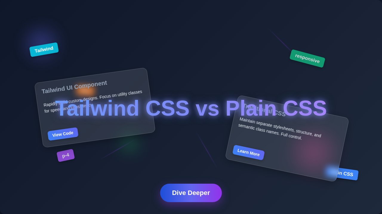
First, let’s talk about Plain CSS. Think of it as crafting every single detail from scratch. You write custom rules for every class you create in a separate .css file. This file then tells your HTML elements how to look.
You get ultimate control over everything. For example, if you want a button with specific padding and a unique gradient, you write those exact styles. You define styles globally, meaning one change in your CSS file can affect many elements across your entire website. This can be powerful for consistency.
The downside? You constantly switch between your HTML and your stylesheet. This context switching can break your flow. Furthermore, you face the dreaded ‘naming things’ problem. What do you call that button class? btn-primary? main-action-button? This gets tough as your project grows larger.
Imagine building a house. Plain CSS is like designing and forging every nail, every brick, and every window frame yourself. It offers immense customization. However, it can also be incredibly time-consuming and prone to inconsistencies if not organized meticulously.
Tailwind CSS: Utility-First Magic
Now, let’s talk about Tailwind CSS. This isn’t a framework in the traditional sense. It’s often called a ‘utility-first’ CSS framework. What does ‘utility-first’ mean?
It means instead of writing custom CSS, you apply pre-defined, single-purpose CSS classes directly in your HTML. These are called utility classes. Each class does just one thing, like setting a margin or a background color. For instance, if you want a red background, you just add bg-red-500 to your HTML element. Need some padding? Use p-4.
It’s like having a toolkit full of tiny, powerful style adjustments. The cool part is how fast you can build user interfaces. You rarely leave your HTML file. Plus, design consistency is built-in because you’re using a finite set of pre-defined styles. No more thinking up clever class names!
The common critique? Your HTML can look ‘bloated’ with many classes. There’s also a bit of a learning curve to memorize common utility classes. However, once you get the hang of it, the speed is undeniable.
Think of Tailwind as building a house with LEGOs. Each LEGO piece (utility class) has a specific, single purpose. You snap them together quickly to form your structure. You can rapidly build a Glassmorphism card or a responsive navbar using these modular components.
Tailwind CSS vs Plain CSS: Workflow Differences
How do you actually work with each? The workflow is where you’ll feel the biggest contrast between Tailwind CSS vs Plain CSS.
With Plain CSS, you typically design in a tool or sketchpad. Then, you translate those designs into your style.css file. You make an HTML element, like a div, and give it a class such as card. Next, you define all the visual properties of that card class in your separate CSS file.
You’ll often open developer tools in your browser. This lets you inspect and tweak styles live. Then, you copy those precise changes back to your CSS file. It’s a cycle of switching tabs and files.
Tailwind CSS changes this significantly. You mostly stay within your HTML file. Need a margin on the top? Add mt-4. Want a different font size? Apply text-lg. It’s like styling on the fly, directly where your content is.
You build up components right there in your markup. This approach can feel incredibly productive once you’re used to it. You see your changes instantly without leaving the HTML context. It’s a much more atomic way of styling.
Plain CSS offers ultimate freedom, but with great freedom comes great responsibility for consistency and organization. Tailwind gives you guardrails for faster, more consistent styling.
To really grasp the fundamental building blocks, check out CSS values and units on MDN. Understanding these core concepts helps no matter which path you choose.
When to Choose Which One
So, which one is right for your project? Let’s think about it.
Choose Plain CSS if… You’re building a very small, simple site. Or maybe you’re deeply passionate about controlling every single pixel. When you need highly custom, truly unique designs without any pre-defined system, Plain CSS truly shines. It allows for absolute creative freedom.
It’s also great for learning the absolute fundamentals of how styling works. You truly understand concepts like the cascade, specificity, and inheritance. Learn more about the CSS Cascade and Specificity on CSS-Tricks to deepen your understanding.
Choose Tailwind CSS if… You’re working on larger projects. Or if you want to ship features quickly and efficiently. It’s excellent for teams who need design consistency. Tailwind pushes you towards a ‘component-based’ way of thinking, even if you’re not using a JavaScript framework. This encourages reusable design patterns.
If you love speed and don’t mind a slightly more verbose HTML, Tailwind could be your new best friend. It dramatically reduces the time spent writing boilerplate CSS. Plus, it helps avoid common styling pitfalls.
Don’t see Tailwind CSS vs Plain CSS as an either/or choice for life. Many developers master both, choosing the right tool for the right project.
What to Do Next: Your First Steps
Okay, so you’ve weighed the pros and cons. What’s your next move? The best advice is simple: Experiment!
The best way to truly understand Tailwind CSS vs Plain CSS is to try both. Build a small component, like a card or a button, using Plain CSS. Then, try building the exact same thing using Tailwind. You’ll quickly feel the differences in workflow and thought process. This hands-on experience is invaluable.
Don’t worry if it doesn’t click immediately. Every new tool takes a little getting used to. Remember, you’re a self-taught beginner – this is exactly how you grow and expand your skills!
Try building a simple layout. Notice how you approach responsiveness with each method. How easy is it to make changes? These practical questions will guide your understanding.