Glassmorphism Card CSS Tutorial: HTML & CSS Design Guide
Hey! If you have wanted to build a Glassmorphism Card but had no idea where to start, you are in the right place. This trend is super popular right now. It makes your designs look modern and sleek. We will build an awesome component today. You will be so proud to show it off!
What We Are Building: A Stunning Glassmorphism Card
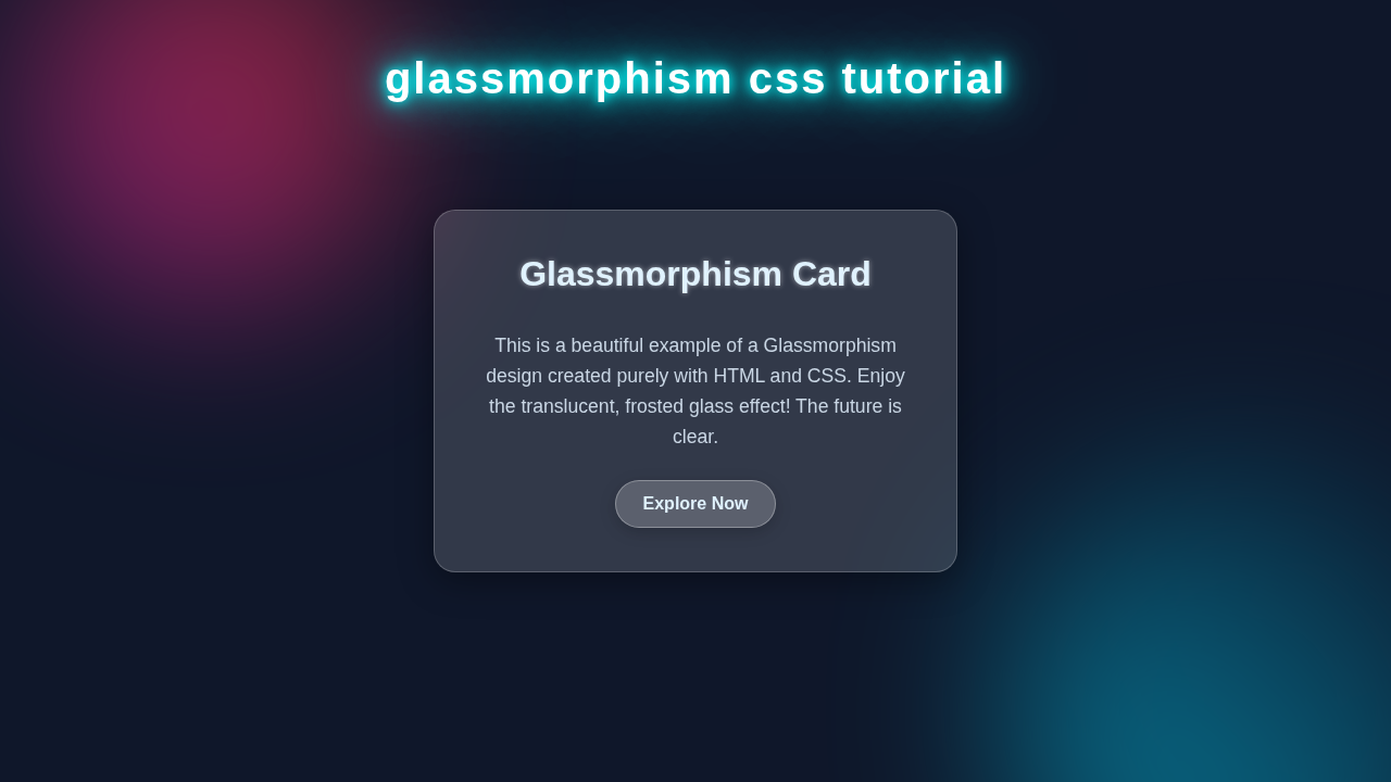
We are going to create a beautiful Glassmorphism Card component. Think of it like frosted glass. It has a blurred background, a subtle border, and a bit of transparency. This effect gives your website a premium, sophisticated feel. It adds depth to your designs. You often see it in dashboards or portfolio sites. It makes content pop while showing a hint of what’s behind it. We will make sure our card is visually appealing. Plus, it will be easy to understand!
HTML Structure: Setting Up Your Glassmorphism Card
First, we need some basic HTML. This structure will hold our card’s content. It will be simple yet powerful. We will use a main container for the card. Inside, we’ll place elements for a title and some text. It’s super straightforward, I promise!
index.html
<!DOCTYPE html>
<html lang="en">
<head>
    <meta charset="UTF-8">
    <meta name="viewport" content="width=device-width, initial-scale=1.0">
    <title>Glassmorphism Card Design</title>
    <!-- Link to our external CSS file for styling -->
    <link rel="stylesheet" href="styles.css">
</head>
<body>
    <!-- Main container for the glassmorphism card.
         This div helps with centering and can hold background elements. -->
    <div class="glass-card-container">
        <!-- The actual Glassmorphism Card component -->
        <div class="glass-card">
            <h2>Glassmorphism Effect</h2>
            <p>
                Discover the elegant world of Glassmorphism, a design trend characterized by frosted transparency,
                subtle borders, and a touch of light. This card demonstrates the effect using pure HTML and CSS.
            </p>
            <button class="card-button">Explore More</button>
        </div>
    </div>
</body>
</html>
CSS Styling: Bringing Your Glassmorphism Card to Life
Now for the really exciting part: CSS! This is where all the magic happens. We will apply styles to create that iconic frosted glass look. We will use special properties like backdrop-filter. Don’t worry, I’ll explain everything clearly. Get ready to transform plain HTML into a stunning visual!
styles.css
/*
 * Glassmorphism CSS Tutorial - styles.css
 *
 * This file contains the CSS styles for creating a stunning Glassmorphism card effect.
 * It's designed to be clean, production-ready, and uses safe web fonts.
 */

/* 1. Global Reset & Base Styles */
body {
    margin: 0;
    padding: 0;
    font-family: Arial, Helvetica, sans-serif; /* Safe web fonts for broad compatibility */
    background: linear-gradient(to right bottom, #0a1128, #120a28); /* Deep dark background for contrast */
    display: flex;
    justify-content: center;
    align-items: center;
    min-height: 100vh; /* Ensure body takes full viewport height */
    overflow: hidden; /* Prevent scrollbars, useful for full-page designs with background elements */
    box-sizing: border-box; /* Ensure padding and border are included in the element's total width and height */
    color: #e2e8f0; /* Light text color for optimal readability on dark backgrounds */
}

/* Apply box-sizing globally for consistent layout behavior */
*, *::before, *::after {
    box-sizing: inherit;
}

/* 2. Glassmorphism Card Container (for positioning and background aesthetics) */
.glass-card-container {
    position: relative; /* Essential for absolutely positioning pseudo-elements inside it */
    width: 100%;
    max-width: 450px; /* Limit card's overall width for better design */
    height: auto;
    display: flex; /* Use flex to center the card within its container */
    justify-content: center;
    align-items: center;
    padding: 20px; /* Add internal padding for responsiveness on smaller screens */
    z-index: 10; /* Ensure the card and its container are above any background elements */
}

/* Optional: Add some glowing background blobs for enhanced aesthetic using pseudo-elements */
.glass-card-container::before,
.glass-card-container::after {
    content: '';
    position: absolute;
    border-radius: 50%; /* Make them circular */
    filter: blur(70px); /* Heavy blur to create a soft, diffused glow */
    opacity: 0.6; /* Slight transparency */
    z-index: -1; /* Place them behind the card */
}

.glass-card-container::before {
    width: 250px;
    height: 250px;
    background: linear-gradient(45deg, #ff007f, #00f0ff); /* Pink-cyan gradient glow */
    top: -50px;
    left: -50px;
    transform: translate(-50%, -50%); /* Adjust to truly center the glow relative to its top-left corner */
}

.glass-card-container::after {
    width: 350px;
    height: 350px;
    background: linear-gradient(45deg, #00ff7f, #ffff00); /* Green-yellow gradient glow */
    bottom: -70px;
    right: -70px;
    transform: translate(50%, 50%); /* Adjust to truly center the glow relative to its bottom-right corner */
}


/* 3. The Glassmorphism Card Styling */
.glass-card {
    background: rgba(255, 255, 255, 0.15); /* Key property: Translucent white background */
    border-radius: 20px; /* Rounded corners for a softer look */
    border: 1px solid rgba(255, 255, 255, 0.2); /* Subtle light border to define edges */
    box-shadow: 0 8px 32px 0 rgba(0, 0, 0, 0.3); /* Shadow for depth and separation from background */
    backdrop-filter: blur(12px); /* The magic ingredient: frosted glass effect */
    -webkit-backdrop-filter: blur(12px); /* Safari support for backdrop-filter */
    padding: 40px;
    text-align: center;
    display: flex;
    flex-direction: column;
    gap: 15px; /* Spacing between elements inside the card */
    max-width: 100%; /* Ensure responsiveness within its container */
}

.glass-card h2 {
    font-size: 2.2em;
    margin-top: 0; /* Remove default top margin */
    margin-bottom: 10px;
    color: #e0f2fe; /* Light blueish white for headings */
    text-shadow: 0 0 8px rgba(255,255,255,0.4); /* Subtle glow for text */
}

.glass-card p {
    font-size: 1.1em;
    line-height: 1.7;
    margin-bottom: 20px;
    color: #c9d6e4;
}

.glass-card .card-button {
    display: inline-block; /* Allows padding and width adjustments */
    padding: 12px 30px;
    background: rgba(255, 255, 255, 0.25); /* Slightly more opaque background for the button */
    border: 1px solid rgba(255, 255, 255, 0.35); /* Button border for definition */
    border-radius: 30px; /* Pill-shaped button */
    color: #e0f2fe;
    text-decoration: none; /* Remove underline for links */
    font-weight: bold;
    font-size: 1em;
    cursor: pointer; /* Indicate it's clickable */
    transition: all 0.3s ease; /* Smooth transitions for hover effects */
    box-shadow: 0 4px 15px rgba(0, 0, 0, 0.2);
    align-self: center; /* Centers the button horizontally within the flex column */
    -webkit-appearance: none; /* Reset default button styles for cross-browser consistency */
    -moz-appearance: none;
    appearance: none;
}

.glass-card .card-button:hover {
    background: rgba(255, 255, 255, 0.4); /* Make button slightly more opaque on hover */
    border: 1px solid rgba(255, 255, 255, 0.5);
    box-shadow: 0 6px 20px rgba(0, 0, 0, 0.35); /* Enhance shadow on hover */
    transform: translateY(-3px); /* Slight lift effect on hover */
}

/* 4. Responsive Adjustments */
@media (max-width: 500px) {
    .glass-card {
        padding: 30px;
    }
    .glass-card h2 {
        font-size: 1.8em;
    }
    .glass-card p {
        font-size: 1em;
    }
    .glass-card-container::before,
    .glass-card-container::after {
        filter: blur(50px); /* Less blur for smaller screens */
        opacity: 0.4;
    }
    .glass-card-container::before {
        width: 180px;
        height: 180px;
    }
    .glass-card-container::after {
        width: 250px;
        height: 250px;
    }
}
How Your Glassmorphism Card Comes Alive
Let’s break down exactly what each piece of code does. We’ll go step-by-step. You will understand the purpose of every line. This will help you customise your Glassmorphism Card later. Understanding is key to becoming a great developer!
Setting the Stage: Body & Background
First, we give our body a full height. This makes sure our card has room to breathe. We also use a captivating background image. Why? Because the glassmorphism effect needs something to blur! If there’s no background, there’s nothing to filter. We use background-size: cover; to ensure our image always fills the space. Then background-position: center; keeps it looking good. A simple display: flex; and place-items: center; help us center our card effortlessly. Isn’t that a neat trick?
Crafting the Base Glassmorphism Card
Our .card element is the heart of our Glassmorphism Card. We give it a fixed width and height. This provides a consistent appearance. Then, position: relative; is important for any absolute positioned child elements. We add border-radius: 15px; for those nice, soft rounded corners. This makes the card feel friendly and modern. A subtle box-shadow adds a bit of lift and dimension. This makes the card appear to float slightly above the background. It’s all about creating visual interest and depth!
The Frosted Effect: backdrop-filter Explained
This is where the ‘glass’ in Glassmorphism Card comes from! We apply a background: rgba(255, 255, 255, 0.1);. This is a very light, almost invisible white. The low alpha value (0.1) makes it very transparent. Then, the real star is backdrop-filter: blur(10px);. This property blurs whatever is behind the element. It creates that beautiful frosted-glass look. You can adjust the blur() value to make it more or less blurry. Just be aware of browser support for backdrop-filter on MDN. It’s widely supported now, but older browsers might not show the effect.
Pro Tip: For older browser compatibility, you might use a slightly blurred background image fallback for the
.cardelement itself, thoughbackdrop-filterhas excellent support across modern browsers now!
Adding Visual Flair: Borders, Shadows, and Gradients
To enhance the glass effect, we add a delicate border. This border uses a linear gradient, giving it a subtle shimmer. border: 1px solid rgba(255, 255, 255, 0.4); provides a light outline. Then border-left: 1px solid rgba(255, 255, 255, 0.2); and border-top: 1px solid rgba(255, 255, 255, 0.2); make it look like light is hitting from the top-left. This creates a realistic highlight. We also use -webkit-box-reflect for a cool reflection effect. This isn’t strictly glassmorphism but adds extra flair! It uses a gradient mask to fade the reflection. Learn more about box-reflect on CSS-Tricks. It’s a fun property to play with!
Ensuring Content Readability
Inside our card, the text needs to be clear. We set the color to a light shade, like white. This contrasts well against the blurred background. A small text-shadow helps the text stand out even more. We use a dark shadow for light text. This increases readability significantly. Remember, design is not just about looking good. It’s also about being functional. We use padding to give the content some breathing room. This prevents it from touching the edges of the card. Proper spacing makes the card feel polished. We also center the text for a clean look.
Tips to Customise Your Glassmorphism Card
You’ve built your first Glassmorphism Card! That’s amazing! But don’t stop here. The real fun is in making it your own. Here are some ideas to help you customise and extend your project:
- Change the Background: Try different background images or even dynamic gradients for your
body. The glass effect looks unique with various backgrounds. Experiment with vibrant colors! - Hover Effects: Add some interactivity! Use CSS
transformto scale the card slightly on hover. You could also change thebox-shadow. This makes the card feel more alive. - Multiple Cards: Create a grid of these cards. Showcase different pieces of content. This is great for a portfolio layout. You can even explore different CSS layouts like RTL/LTR for diverse arrangements.
- Dynamic Theming: Integrate CSS Custom Properties for easier theming. You could define variables for blur intensity, border color, or transparency. This lets you change the whole look with just a few lines!
- Add More Elements: What else could you put inside? Maybe some icons or buttons. Imagine extending this card idea. You could even embed custom UI elements like a custom select dropdown right inside your card, giving it more functionality.
- Accessibility: Ensure your text has enough contrast against the blurred background. Always think about all users.
Keep Experimenting! The best way to learn is by doing. Don’t be afraid to change values and see what happens. That’s how you truly master CSS!
Conclusion: You Did It!
You have successfully built a stunning Glassmorphism Card component! Give yourself a pat on the back. You now understand how to create this popular effect. It combines HTML structure with powerful CSS properties. This skill is super valuable in modern web design. Share your creation on social media! Tag us at @procoder09. We can’t wait to see what you build next!