Introduction: Build Your Own Image Carousel!
Hey there, fellow coders! Have you ever wanted to build a slick Image Carousel JavaScript component? If you felt a bit lost, you are in for a treat! Today, we’re diving deep. We will craft a fully functional image slider. It will be built entirely from scratch. You will use HTML, CSS, and plain old JavaScript. Get ready to impress yourself with your new skills!
What We Are Building
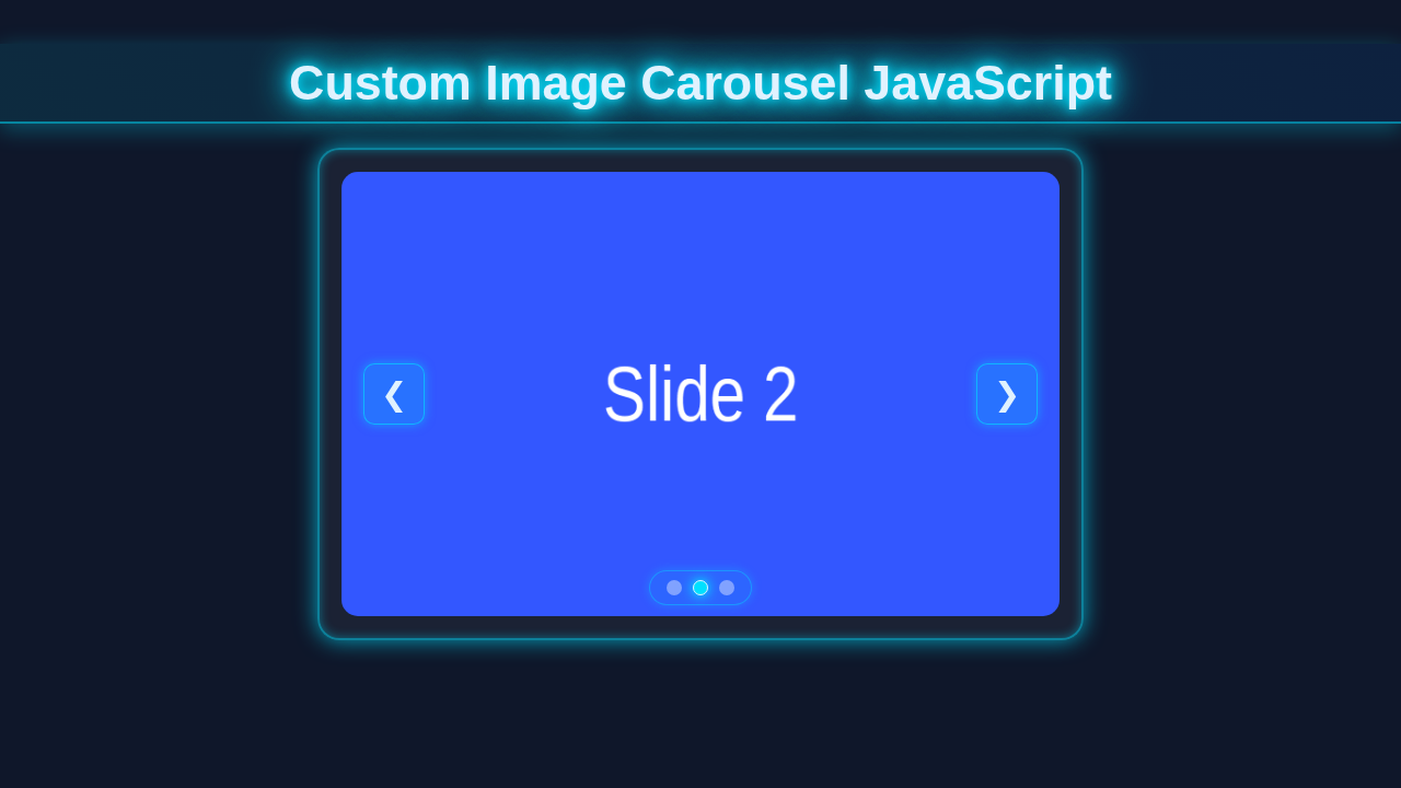
What exactly are we building today? We are going to construct a dynamic image carousel. This is often called an image slider. It will beautifully display a series of images, one at a time. Users can click clear navigation buttons. They will move forward or backward through the images. This project is incredibly useful. It significantly enhances user experience on any website. Think about showcasing products or highlighting portfolio sections. A custom carousel gives you full control. You won’t rely on heavy, third-party libraries. It’s pure web development power right in your hands!
HTML Structure
First things first: we lay down the HTML foundation. This is the essential skeleton of our carousel. We need a main container to hold everything. Inside, we will carefully place our images. Also, we will thoughtfully add navigation buttons. This structure is deliberately simple. It makes styling with CSS much, much easier later on. You will love how clean it is.
index.html
<!DOCTYPE html>
<html lang="en">
<head>
    <meta charset="UTF-8">
    <meta name="viewport" content="width=device-width, initial-scale=1.0">
    <title>Custom Image Carousel</title>
    <!-- Link to your external stylesheet -->
    <link rel="stylesheet" href="styles.css">
</head>
<body>
    <div class="carousel-container">
        <div class="carousel-track">
            <!-- Replace with your own images. Ensure all images have the same aspect ratio for best results. -->
            <img src="https://via.placeholder.com/800x500/FF5733/FFFFFF?text=Image+1" alt="Image 1">
            <img src="https://via.placeholder.com/800x500/33FF57/FFFFFF?text=Image+2" alt="Image 2">
            <img src="https://via.placeholder.com/800x500/3357FF/FFFFFF?text=Image+3" alt="Image 3">
            <img src="https://via.placeholder.com/800x500/FFFF33/000000?text=Image+4" alt="Image 4">
            <img src="https://via.placeholder.com/800x500/8A2BE2/FFFFFF?text=Image+5" alt="Image 5">
        </div>
        <!-- Navigation buttons -->
        <button class="carousel-button prev">❮</button> <!-- Left arrow Unicode character -->
        <button class="carousel-button next">❯</button> <!-- Right arrow Unicode character -->

        <!-- Dot indicators (adjust number of dots to match your images) -->
        <div class="carousel-dots">
            <span class="dot active" data-index="0"></span>
            <span class="dot" data-index="1"></span>
            <span class="dot" data-index="2"></span>
            <span class="dot" data-index="3"></span>
            <span class="dot" data-index="4"></span>
        </div>
    </div>

    <!-- Link to your external JavaScript file -->
    <script src="script.js"></script>
</body>
</html>
CSS Styling
Now for the visual magic! CSS brings our carousel to vibrant life. We will style the main container. Then, we will ensure all images fit perfectly within it. We also design the navigation buttons. They need to look good and be highly clickable. We’ll use some clever CSS properties. These will effectively hide images that are not active. This makes our carousel transitions smooth and professional. Don’t worry about complex animations just yet. We are focusing on core, robust functionality.
styles.css
/* Basic reset and box-sizing for consistent layout */
* {
    box-sizing: border-box;
    margin: 0;
    padding: 0;
}

/* Body styling for centering the carousel and default font */
body {
    font-family: Arial, Helvetica, sans-serif; /* Safe font stack */
    display: flex;
    justify-content: center;
    align-items: center;
    min-height: 100vh;
    background-color: #f4f7f6; /* Light background for the tutorial */
    color: #333;
}

/* Main carousel container */
.carousel-container {
    position: relative;
    width: 800px; /* Define the width of your carousel */
    height: 500px; /* Define the height of your carousel */
    overflow: hidden; /* Hide parts of images not in view */
    border-radius: 12px;
    box-shadow: 0 10px 30px rgba(0, 0, 0, 0.15);
    background-color: #fff;
    max-width: 100%; /* Ensure responsiveness within its parent */
}

/* Container for all images, which will slide horizontally */
.carousel-track {
    display: flex; /* Arrange images in a row */
    height: 100%;
    transition: transform 0.6s ease-in-out; /* Smooth sliding animation */
}

/* Individual image styling within the carousel */
.carousel-track img {
    width: 100%; /* Each image takes full width of the container when active */
    height: 100%;
    object-fit: cover; /* Cover the area, cropping if necessary */
    flex-shrink: 0; /* Prevent images from shrinking */
    display: block; /* Remove extra space below image */
}

/* Styling for navigation buttons (Previous/Next) */
.carousel-button {
    position: absolute;
    top: 50%;
    transform: translateY(-50%);
    background-color: rgba(0, 0, 0, 0.5); /* Semi-transparent background */
    color: white;
    border: none;
    padding: 12px 18px;
    cursor: pointer;
    font-size: 1.8em;
    border-radius: 8px;
    transition: background-color 0.3s ease, transform 0.3s ease;
    z-index: 2; /* Ensure buttons are above images */
}

.carousel-button:hover {
    background-color: rgba(0, 0, 0, 0.8);
    transform: translateY(-50%) scale(1.05); /* Slight scale effect on hover */
}

.carousel-button.prev {
    left: 15px;
}

.carousel-button.next {
    right: 15px;
}

/* Container for dot indicators */
.carousel-dots {
    position: absolute;
    bottom: 20px;
    left: 50%;
    transform: translateX(-50%);
    display: flex;
    gap: 10px;
    z-index: 2; /* Ensure dots are above images */
}

/* Individual dot styling */
.dot {
    width: 12px;
    height: 12px;
    background-color: rgba(255, 255, 255, 0.6); /* Semi-transparent white dots */
    border-radius: 50%;
    cursor: pointer;
    transition: background-color 0.3s ease, transform 0.3s ease;
    border: 1px solid rgba(0, 0, 0, 0.1);
}

.dot:hover {
    transform: scale(1.1);
}

/* Styling for the active dot */
.dot.active {
    background-color: #007bff; /* Active dot color */
    transform: scale(1.2); /* Active dot slightly larger */
    border-color: #0056b3;
}
Image Carousel JavaScript
This is where the real fun truly begins! Our JavaScript code will make the carousel fully interactive. It elegantly handles showing and hiding images. Moreover, it actively listens for button clicks. We will write pure vanilla JavaScript. That means absolutely no extra libraries are needed. This keeps our project lightweight and fast. It also helps you understand every single line. You will grasp exactly how everything works together. This is a powerful learning experience!
script.js
document.addEventListener('DOMContentLoaded', () => {
    // Select necessary DOM elements
    const carouselTrack = document.querySelector('.carousel-track');
    const images = document.querySelectorAll('.carousel-track img');
    const prevBtn = document.querySelector('.carousel-button.prev');
    const nextBtn = document.querySelector('.carousel-button.next');
    const dotsContainer = document.querySelector('.carousel-dots');
    const dots = document.querySelectorAll('.carousel-dots .dot');

    let currentIndex = 0; // Tracks the currently active image
    const totalImages = images.length; // Total number of images in the carousel

    /**
     * Updates the carousel's position and active dot indicator.
     * It calculates the `transform: translateX()` value based on `currentIndex`
     * and the width of a single image.
     */
    const updateCarousel = () => {
        // Ensure images exist before trying to get their width
        if (images.length === 0) return;

        // Get the actual width of a single image. This is crucial for responsive carousels.
        // We assume all images have the same width as the first one.
        const imageWidth = images[0].clientWidth;

        // Apply the transform to slide the track. Each slide moves by `imageWidth`.
        carouselTrack.style.transform = `translateX(-${currentIndex * imageWidth}px)`;

        // Update active dot class to highlight the current image's dot
        dots.forEach((dot, index) => {
            dot.classList.toggle('active', index === currentIndex);
        });
    };

    // Event listener for the 'Next' button
    nextBtn.addEventListener('click', () => {
        // Increment index, looping back to 0 if it exceeds totalImages
        currentIndex = (currentIndex + 1) % totalImages;
        updateCarousel(); // Update carousel display
    });

    // Event listener for the 'Previous' button
    prevBtn.addEventListener('click', () => {
        // Decrement index, looping to the last image if it goes below 0
        currentIndex = (currentIndex - 1 + totalImages) % totalImages;
        updateCarousel(); // Update carousel display
    });

    // Event listeners for dot indicators
    dots.forEach(dot => {
        dot.addEventListener('click', (event) => {
            // Get the index from the data-index attribute of the clicked dot
            currentIndex = parseInt(event.target.dataset.index);
            updateCarousel(); // Update carousel display
        });
    });

    // Initialize carousel position and active dot when the page loads
    updateCarousel();

    /**
     * Optional: Auto-play feature
     * Uncomment the section below to enable automatic image cycling.
     */
    // let autoPlayInterval = setInterval(() => {
    //     currentIndex = (currentIndex + 1) % totalImages;
    //     updateCarousel();
    // }, 3000); // Change image every 3 seconds

    // /**
    //  * Optional: Pause auto-play on hover
    //  * Uncomment this to stop the carousel from cycling when the user hovers over it.
    //  */
    // carouselTrack.parentElement.addEventListener('mouseenter', () => {
    //     clearInterval(autoPlayInterval);
    // });
    // carouselTrack.parentElement.addEventListener('mouseleave', () => {
    //     autoPlayInterval = setInterval(() => {
    //         currentIndex = (currentIndex + 1) % totalImages;
    //         updateCarousel();
    //     }, 3000);
    // });

    /**
     * Handle window resize event to adjust carousel position.
     * This ensures the carousel remains correctly positioned if the browser window changes size.
     * It's important because imageWidth might change on resize.
     */
    window.addEventListener('resize', updateCarousel);
});
How It All Works Together
Initial Setup and Variables
Let me explain what’s happening here. When our webpage loads, JavaScript springs into action immediately. First, it grabs all the important elements. We use document.querySelector and document.querySelectorAll for this task. These methods help us select specific parts of our HTML structure. We get the main carousel container itself. We also meticulously select all the individual image slides. These are typically div elements holding our img tags. Furthermore, we locate our navigation buttons. These are absolutely crucial for user interaction. Each of these elements is a key player in our carousel’s functionality. We store them in variables. This makes them easy to reference and manipulate later in our code. We also create a special currentIndex variable. This simple number tracks exactly which image is currently visible on the screen. It starts at 0, because programming lists often start counting from zero. So, 0 refers to the very first image in our sequence.
Showing the Right Image
Here’s the cool part. We have a dedicated function, let’s call it showSlide(). This function is solely responsible for displaying the correct image. It takes our currentIndex as its main input. Inside this function, we iterate through all the image elements we selected earlier. For every image, it performs a quick check. Is its unique index number equal to our current currentIndex? If the answer is yes, then that specific image becomes visible to the user. Otherwise, it needs to stay hidden from view. We achieve this with clever CSS classes. Adding a class like active can change an image’s display property from none to block. Removing that class hides the image again. This clever system ensures that only one image is ever shown at any given moment. This makes our carousel look professional and sleek. It also avoids awkward overlaps or empty spaces.
Navigation Logic
Our navigation buttons are incredibly crucial. They provide the primary way for users to control the carousel. We attach an “event listener” to each button. An event listener is like a digital lookout. It simply waits for a specific action to occur. In this case, it waits patiently for a click event. When the “next” button is clicked, our currentIndex needs to increase by one. This moves us to the subsequent image. But what if we’re already viewing the very last image? No problem at all! We use a simple conditional check. If we’re at the end, we smoothly loop back to the first image (index 0). Similarly, clicking the “previous” button decreases the currentIndex. If we’re at the first image, we loop back to the very last one. After correctly adjusting the index, we immediately call our showSlide() function. This instantly updates the display. It provides a seamless user experience. You can even learn more about JavaScript event listeners and their many uses on MDN Web Docs. They are fundamental to interactive web pages!
Enhancing with Keyboard Navigation
For an even better user experience, we can easily add keyboard controls. Imagine your users browsing through images effortlessly, without touching their mouse. We can achieve this by listening for keydown events. We attach this listener to the entire document object. This means it will capture key presses anywhere on the page. If the user presses the left arrow key, our code will interpret this. It will then trigger the same logic as clicking the “previous” button. Likewise, if they press the right arrow key, it simulates clicking the “next” button. This small addition makes your carousel much more accessible. It shows attention to detail in your development. This is a common pattern in web development. You might find similar event handling useful in projects like a Tailwind Multi-Step Form where user input needs robust handling.
Adding an Auto-Play Feature
Want your carousel to advance automatically? We can use JavaScript’s setInterval() function for this. This powerful function repeatedly calls another specified function after a set delay. We can tell it to automatically “click” the “next” button logic every few seconds. This creates a smooth, continuous slide show. It’s great for showcasing content passively. However, a good auto-play feature also needs “pause on hover” functionality. This is a great user experience touch. It stops the auto-play when a user’s mouse is positioned over the carousel area. This gives them ample time to view an image they find interesting. Otherwise, the carousel might feel rushed and frustrating. This smart feature makes your carousel feel dynamic yet user-friendly.
Pro Tip: When working with
setInterval, always remember to clear it withclearInterval()when the component is removed or paused. This prevents memory leaks and ensures your code runs efficiently.
Tips to Customise It
You’ve built a solid foundation! Now, let’s make it truly yours with some exciting customisations.
- Add Pagination Dots: Imagine small circles at the bottom of the carousel. Each circle represents an image. Clicking a circle takes you directly to that image. This is a common carousel feature. It gives users another intuitive way to navigate.
- Slide Animations: Right now, images just appear instantly. You could add smooth transitions! Use CSS
transitionproperty for fading effects. Or try thetransformproperty for sliding animations. This makes the image changes much more visually appealing and dynamic. Learn more about CSS transitions on CSS-Tricks. - Dynamic Content Loading: Instead of hardcoding images, fetch them dynamically! You could pull image URLs from an API. Or load them conveniently from a JSON file. This makes your carousel incredibly reusable. You could even integrate it with a Python Web Scraping Tutorial to get image URLs automatically.
- Accessibility Improvements: Always think about users with screen readers. Add descriptive
aria-labelattributes to your buttons. Make sure focus management is correctly implemented. Accessible components are always better for everyone. This is especially important for vital UI elements.
Pro Tip: Always test your customisations across different browsers and devices. Responsive design is key for a great user experience, no matter how someone views your site. This is like understanding CORS Explained for network requests — knowing the rules makes everything smoother and more predictable.
Conclusion
Wow, you did it! You just successfully built a custom image carousel. You used HTML, CSS, and pure JavaScript from the ground up. That’s a huge achievement in your web development journey! You now deeply understand the core concepts. You can control every aspect of it yourself. This project significantly strengthens your web development skills. It gives you confidence to build even more complex things. Now go forth and create amazing things! Share your cool, new carousel with the world. We can’t wait to see what you build next!