RTL LTR CSS Layouts: A Visual Guide
Hey there, pro web developer in the making! Ever designed a beautiful layout, only to realize it might not work for everyone in the world? It’s a common moment of realization. You see, the web is global. That means your awesome designs need to adapt. This is where understanding RTL LTR layouts CSS becomes super important.
It sounds complex, but trust me. Mastering directionality in your web projects is incredibly empowering. You’ll be building websites that truly speak to everyone. Let’s dive in and demystify this critical topic together.
What Are RTL and LTR Layouts, Anyway?
Let’s get this straight in plain English. LTR stands for Left-To-Right. Think about how you’re reading this very sentence. Your eyes naturally move from the left side of the page to the right. Most languages you encounter every day, like English, Spanish, or French, are LTR.
Your web browser defaults to this direction. Text aligns to the left. Navigation usually starts on the left. Sidebars often sit on the left. It feels natural because it’s what you’re used to.
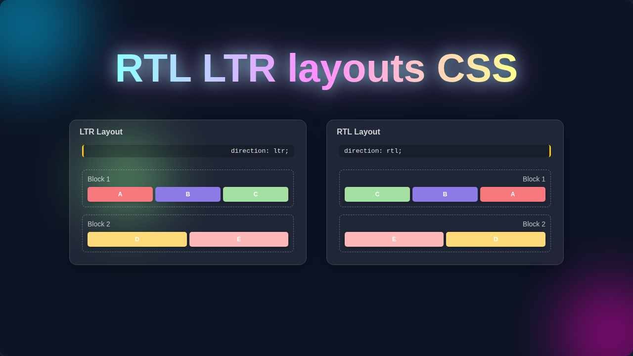
But here’s the cool part: not all languages work that way! RTL stands for Right-To-Left. Languages like Arabic, Hebrew, Persian, and Urdu read from the right side of the page to the left. This isn’t just about text. It means the entire visual flow of your website needs to flip. Imagine a book opening from the other side, with pages turning from left to right instead of right to left. That’s essentially the shift.
Suddenly, your navigation might need to start on the right. Your sidebar could move to the right. Even icons and progress bars might need to be mirrored. It’s like looking at your design in a mirror. Everything shifts horizontally. Make sense so far?
Why You Need to Master RTL LTR Layouts with CSS
So, why should you care about this as a budding web developer? The answer is simple: your audience is bigger than you think. The internet connects billions of people worldwide. A significant portion of these people use RTL languages. If your website only supports LTR, you’re effectively putting up a barrier. You’re telling a large group of potential users, “This site isn’t really for you.”
This isn’t just good manners. It’s smart business and ethical design. Providing a localized experience makes users feel respected. It significantly improves their overall experience. When a website feels natural, users stay longer. They engage more. They trust your content more. It truly impacts your reach and impact.
You want your web applications to be universal. You want them to be accessible to everyone, everywhere. This skill immediately elevates your capabilities as a developer. It shows you think broadly. Also, with modern CSS techniques, handling directionality is easier than ever. You might even find that learning about CSS Custom Properties makes managing these layout differences even smoother. It’s a powerful tool in your design toolkit, allowing you to create flexible, global-ready layouts.
How Directionality Works with HTML and RTL LTR Layouts CSS
Okay, let’s get into the nitty-gritty. How do you actually implement this? It all starts with HTML. The fundamental way to tell a browser a document’s direction is the dir attribute. You can place dir="ltr" or dir="rtl" on the <html> tag itself. This is the best practice for the entire page. It cascades down to all elements. You can also set it on individual elements if only a specific part of your page needs a different direction.
Once HTML sets the direction, CSS steps in. The real magic happens with CSS Logical Properties. These are the modern, superior way to handle layout. Instead of physical properties like margin-left or padding-right, you use logical ones. Think margin-inline-start or padding-inline-end. What do these mean? They adapt to the writing mode. margin-inline-start will be margin-left in LTR and margin-right in RTL. It’s brilliant, right? You declare it once, and the browser handles the flip.
For text alignment, you use text-align: start instead of text-align: left. Similarly, text-align: end replaces text-align: right. When you’re dealing with flexbox, properties like justify-content: flex-start naturally respect the document’s direction. The same applies to CSS Grid. Your grid items will flow from start to end based on the declared direction.
The beauty is that many modern CSS layout methods inherently support this. This significantly reduces the need for extensive conditional CSS. Designing a custom dropdown, like in this CSS Custom Select Dropdown tutorial, would benefit greatly from thinking with logical properties from the start. They ensure your component looks right, no matter the language direction.
Pro Tip: Always prioritize CSS Logical Properties (like
margin-inline-startandtext-align: start) over their physical counterparts. They make your stylesheets adaptable and future-proof for RTL LTR layouts CSS with minimal extra effort.
Sometimes, you’ll still need to explicitly flip things. For example, if you have an icon that visually points to the right in LTR, it should point to the left in RTL. You might use CSS transforms like transform: scaleX(-1) in an RTL context to mirror it. However, always check if your icon library already provides RTL variants.
Common Confusions & Pitfalls with RTL LTR Layouts CSS
Even with logical properties, you might hit some snags. One common confusion is mixing logical properties with physical ones. You might set margin-inline-start, but then accidentally override it with margin-left later in your CSS. This creates unpredictable results. Stick to one system. Choose logical properties and use them consistently throughout your stylesheet.
Another pitfall is relying too heavily on JavaScript for layout adjustments. While JS might be needed for very dynamic components, CSS should handle the primary layout. Over-reliance on JavaScript can introduce performance issues. It also creates a less robust design. Keep your layout logic in CSS whenever possible.
Don’t forget about user-generated content! If users can add text to your site, their input might include mixed directions. Browsers typically handle this well with Unicode Bidirectional Algorithm (Bidi). However, always test how your layout accommodates this. Also, be mindful of any fixed-width elements. They might not adapt gracefully to varying text lengths in different languages.
Images and background images are another area to watch. If a background image shows an arrow pointing right, it probably needs to point left in RTL. You might use specific background positions or even different image assets. This is crucial for maintaining clear user guidance. Remember, even seemingly small details contribute to the overall user experience.
Testing is Key: You absolutely must test your RTL layouts with real RTL content. What looks good with placeholder text might break with actual Arabic or Hebrew. Don’t skip this vital step in your development process.
Finally, remember to consider the overall flow and harmony. Sometimes, you need to revisit core design decisions. For example, a left-aligned hero section in LTR might look better right-aligned in RTL. It’s about creating a harmonious experience, not just flipping elements. Thinking about global design from the start, perhaps even when considering a mobile CSS fix, sets you apart.
Key Takeaways for Designing with Directionality
You’ve covered a lot of ground today! Here are the big points to remember as you build your global web projects:
- Always specify document direction using the HTML
dirattribute. - Embrace CSS Logical Properties for adaptable styling.
- Avoid mixing logical and physical CSS properties.
- Don’t forget to address visual elements like icons and images.
- Test, test, and then test again with actual RTL content.
- Think globally from the very beginning of your design process.
You’re Ready to Build for a World of Users!
See? RTL LTR layouts CSS aren’t some dark art after all! You now have a solid understanding of why directionality matters. More importantly, you know how to tackle it with HTML and modern CSS. This skill will set you apart. It will make your websites accessible and welcoming to a much wider audience. It’s about building an inclusive web.
So, go forth and experiment! Apply these principles to your next project. You’ll be amazed at how much more robust and user-friendly your designs become. You’ve got this. Keep learning, keep building, and keep making the web a better place for everyone. Happy coding!