100vh Mobile CSS Fix: A Visual Thumbnail Guide
Ever tried to make something perfectly fill your phone screen? You set its height to what you think is 100% of the viewport. Then you scroll. Suddenly, boom! Your layout gets all wonky. That bottom bar or address bar on mobile devices just sneaks in. It messes everything up. You’re not alone if you’ve faced this peculiar puzzle. Today, we’re diving deep into the infamous “100vh mobile css fix” to bring order back to your mobile designs.
The Frustration of 100vh on Mobile
So, what is vh anyway? Think of it like this: vh stands for ‘viewport height’. It’s a CSS unit. It means “a percentage of the browser window’s height.” If you say something should have a height of 100vh, you’re telling that element to take up 100% of the visible browser window’s height. Sounds simple, right? It really should just work. For desktop users, it often does without a hitch. But mobiles are a different beast entirely.
You’re building awesome websites. You want them to look amazing everywhere. A wonky layout on a phone? That’s not a good look for your users. It frustrates them. It makes your site feel unprofessional. And it’s particularly annoying when you spend ages crafting perfect navigation menus or sleek popovers. Then you see them behave strangely on mobile. You might be wrestling with CSS Multi-Level Dropdowns or CSS Dropdown Menus, aiming for that perfect full-screen look. Or perhaps you’re creating Pure CSS Popovers that need to stay perfectly centered. This 100vh glitch can ruin all that hard work. So, understanding this fix is crucial for any modern web developer like you.
What’s Really Happening with 100vh on Your Phone?
Here’s the thing about mobile browsers. They often have dynamic toolbars. These are the address bars at the top. Or navigation bars at the bottom. They appear and disappear as you scroll down a page. On a desktop, the browser window height is pretty static. It rarely changes on the fly. On mobile, however, the ‘visible viewport’ changes constantly.
When those toolbars are fully visible, the space available for your content shrinks. Makes sense, right? When they slide away, your content area suddenly grows. The old 100vh unit did not account for this dynamic nature. It would often calculate its height based on the largest possible viewport. This means it would ignore those pesky toolbars. Your 100vh element would then overflow the screen. It would hide content or create unwanted scrollbars. It was a classic web development headache. Many developers pulled their hair out over this!
Remember: On mobile, 100vh historically measured the viewport assuming toolbars were hidden, leading to overflow when they reappeared.
Introducing the dvh to Fix Your 100vh Mobile CSS Problem
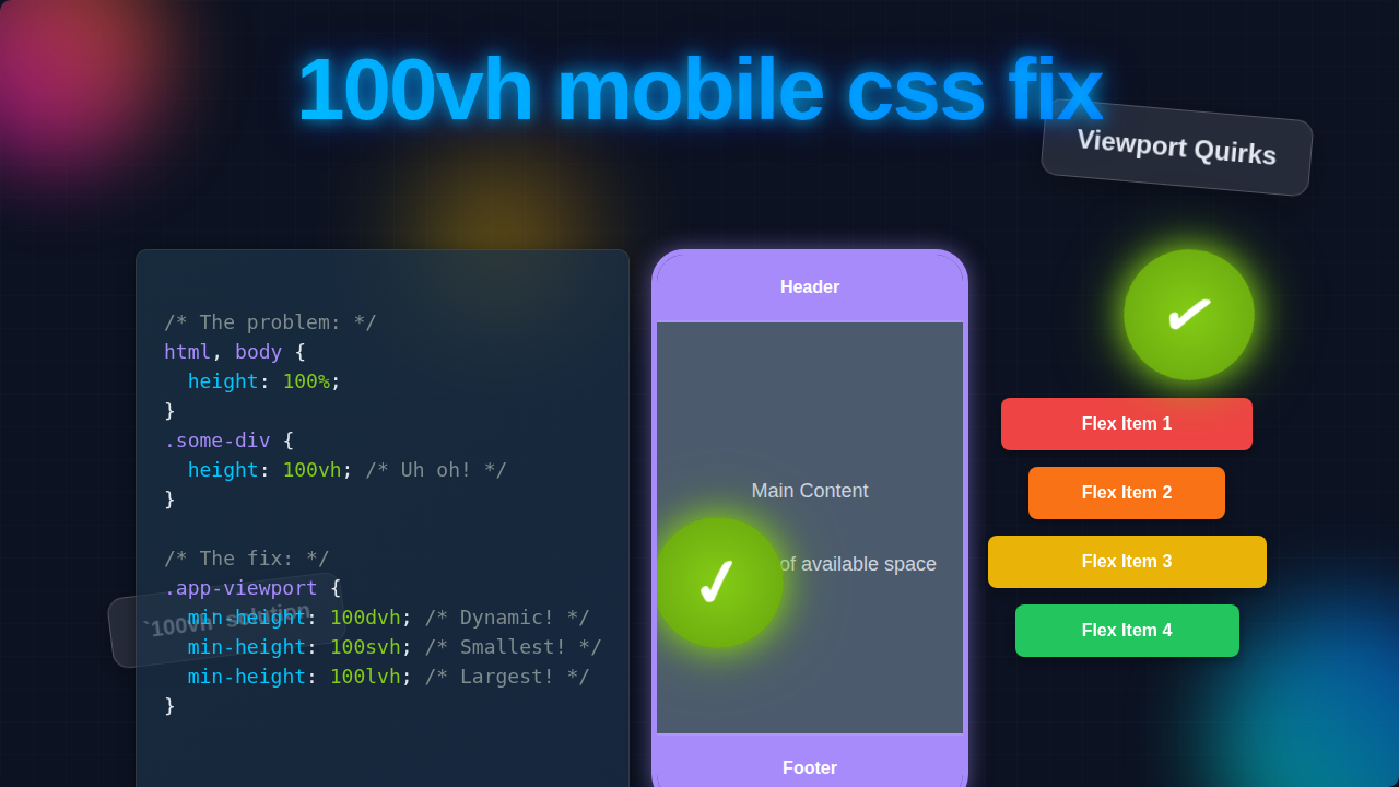
Good news! Modern CSS has given us new tools. These tools directly address the mobile viewport problem. The first one is dvh. This stands for “dynamic viewport height.” Imagine a smart tape measure. This tape measure constantly adjusts itself. It reflects the actual visible space available at any given moment. That’s what dvh does.
When the browser toolbars are showing, 100dvh will precisely match the smaller visible height. When they disappear, 100dvh will expand to the larger height. This ensures your content always fits perfectly. It prevents those annoying overflows or hidden sections. You get a much smoother user experience. No more content jumping around! It automatically adapts. This is a big step towards a true 100vh mobile css fix.
The svh and lvh Power-Up for a Robust 100vh Mobile CSS Fix
But wait, there’s more! Sometimes you want more control. You might not always want a dynamic height. What if you want your element to always fit within the smallest possible space? Or perhaps always take up the largest possible space? That’s where svh and lvh come in.
-
svh(Small Viewport Height): Think of this as the “always safe” option.svhcalculates height based on the viewport when all dynamic toolbars are visible. This gives you the smallest possible viewport height. If you use100svh, your element will always fit. It will never overflow, even when those toolbars are taking up space. It’s great for critical content. This content must absolutely stay within view. You might use it for a fixed header or footer. -
lvh(Large Viewport Height): This is the opposite.lvhcalculates height based on the viewport when all dynamic toolbars are hidden. This gives you the largest possible viewport height. If you use100lvh, your element will always try to fill that maximum space. This might cause some overflow when toolbars are visible. But it means your content stretches further when they are gone. It’s useful for backgrounds or sections that can afford to scroll a little.
These new units give you precise control. You can choose exactly how your content behaves. You no longer have to guess what the browser will do. You are now the master of your mobile layouts! To learn even more about these exciting new viewport units, you can check out this detailed guide on MDN Web Docs. It explains all the nuances you could ever want!
Common 100vh Headaches (and How to Avoid Them)
Even with the new units, you might run into a few tricky spots. Here are some common pitfalls. And here’s how you can expertly sidestep them.
-
Forgetting Browser Support: These new units (
dvh,svh,lvh) are quite modern. Most new browsers support them. However, older browsers might not. Always consider your target audience. You might need a fallback. You could specify100vhfirst. Then follow it with100dvh. This way, older browsers get the old behavior. Newer browsers get the fix. This layering is a smart move. -
Mixing Units Carelessly: Be mindful when you mix `dvh` with fixed pixel heights. If you have a section of
100dvhand then add a fixed-height footer, it could still cause issues. Try to keep your height calculations consistent. Use percentages or other viewport units when possible. - Testing on Real Devices: Emulators in your browser are helpful. But nothing beats testing on an actual phone. Grab your device. Check how your site looks. See how it behaves when you scroll. Experience the dynamic toolbars yourself. This real-world testing is invaluable.
Pro Tip: For maximum compatibility, define 100vh first, then override with 100dvh for modern browsers:
height: 100vh; height: 100dvh;
Always think about the user’s journey. What will they see? How will they interact? This mindset will guide you to better solutions. Another great resource for understanding modern CSS techniques is CSS-Tricks, a fantastic site for all things styling!
Your Toolkit for a Perfect Mobile Layout
So, you now have a powerful new toolkit. The “100vh mobile css fix” is no longer a mystery to you. You understand why 100vh caused problems. You also know how dvh, svh, and lvh offer precise solutions.
Here’s a quick recap of when to use which:
-
dvh: Use this when you want your content to always perfectly fill the currently visible screen space. This includes dynamically adjusting for browser toolbars. It’s your go-to for most full-height sections. -
svh: Choose this when you need content to always fit, even when all browser toolbars are showing. This ensures no overflow. It’s perfect for crucial elements like primary navigation or “call to action” areas. -
lvh: Pick this when you want your content to stretch to the maximum possible viewport height. This is the height when toolbars are hidden. Use it for decorative backgrounds or content that can handle a bit of initial overflow.
Remember that web development is an evolving field. New solutions constantly emerge. Staying updated helps you create better experiences for everyone.
You’ve got this! Mobile layout challenges can feel daunting. But with these modern CSS units, you’re equipped to build truly responsive and beautiful web experiences. Go forth and tame those viewports! Happy coding!