React Context API Tutorial: State Management with HTML, CSS, JS
Hey there, fellow coders! If you’ve ever wanted to build a simple shopping cart but felt lost with state management, you are in the right place. Today, we’re diving deep into the React Context API. This powerful tool lets us share state across our components without “prop drilling”. We’ll also combine it with useReducer for robust, scalable state updates. Get ready to build something awesome!
What We Are Building
Imagine a sleek, simple shopping cart for an e-commerce site. That’s exactly what we will build! Our cart will display products beautifully. You can easily add items to it with a click. Users can also adjust item quantities or remove them entirely. This project helps you see the power of React hooks in action. It’s practical and super useful for many web applications. You’ll love the interactivity!
HTML Structure
First, we lay down the foundational HTML. This gives our application its basic shape. We will structure our main div elements carefully. These will hold our product list and the cart display area. Don’t worry, it’s quite straightforward to set up! We just define the containers for our dynamic React components.
index.html
<!DOCTYPE html>
<html lang="en">
<head>
    <meta charset="UTF-8">
    <meta name="viewport" content="width=device-width, initial-scale=1.0">
    <title>React Context API Tutorial</title>
    <!-- Link to your CSS file -->
    <link rel="stylesheet" href="styles.css">
</head>
<body>
    <div id="root">
        <!-- React will render our application here -->
    </div>

    <!-- React and ReactDOM CDN for simplicity in tutorial.
         In a real project, you'd use npm/yarn and a build tool like Webpack. -->
    <script crossorigin src="https://unpkg.com/react@18/umd/react.development.js"></script>
    <script crossorigin src="https://unpkg.com/react-dom@18/umd/react-dom.development.js"></script>
    <!-- Babel for JSX transformation in the browser. Not for production. -->
    <script src="https://unpkg.com/@babel/standalone/babel.min.js"></script>

    <!-- Link to your JavaScript file, type="text/babel" to enable JSX transformation -->
    <script type="text/babel" src="script.js"></script>
</body>
</html>
CSS Styling
Next, we bring our cart to life with some beautiful CSS. We’ll use modern styling techniques. Think flexbox for easy layout and subtle shadows for depth. Our goal is a user-friendly interface. It must be pleasing to the eye. You can even experiment with customizing your CSS theme later! This personalizes the look of your shopping cart.
styles.css
/* General Styling */
body {
    font-family: Arial, Helvetica, sans-serif; /* Safe fonts */
    margin: 0;
    padding: 0;
    background-color: #f4f7f6; /* Light background */
    color: #333;
    display: flex;
    justify-content: center;
    align-items: flex-start; /* Align to top to give space for title */
    min-height: 100vh;
    box-sizing: border-box; /* Include padding and border in the element's total width and height */
    overflow-x: hidden; /* Prevent horizontal scrollbar */
}

#root {
    width: 100%;
    max-width: 960px; /* Constrain overall width */
    padding: 20px;
    margin-top: 40px; /* Space from top */
    box-sizing: border-box;
}

/* App Container */
.app-container {
    background-color: #ffffff;
    border-radius: 8px;
    box-shadow: 0 4px 12px rgba(0, 0, 0, 0.1);
    padding: 30px;
    max-width: 100%;
    box-sizing: border-box;
    text-align: center;
}

h1 {
    color: #2c3e50;
    margin-bottom: 25px;
    font-size: 2.2em;
}

/* Theme Toggle Button */
.theme-button {
    padding: 12px 25px;
    font-size: 1em;
    border: none;
    border-radius: 5px;
    cursor: pointer;
    transition: background-color 0.3s ease, color 0.3s ease, box-shadow 0.3s ease;
    margin-top: 20px;
    font-weight: bold;
    box-sizing: border-box;
    max-width: 100%;
}

.theme-button.light {
    background-color: #3498db; /* Blue */
    color: #fff;
}

.theme-button.light:hover {
    background-color: #2980b9;
    box-shadow: 0 2px 8px rgba(52, 152, 219, 0.4);
}

.theme-button.dark {
    background-color: #2c3e50; /* Darker blue/gray */
    color: #fff;
}

.theme-button.dark:hover {
    background-color: #1a242f;
    box-shadow: 0 2px 8px rgba(44, 62, 80, 0.4);
}

/* Toolbar Component */
.toolbar {
    background-color: #ecf0f1; /* Light gray */
    padding: 20px;
    margin-top: 30px;
    border-radius: 6px;
    border: 1px solid #dcdcdc;
    max-width: 100%;
    box-sizing: border-box;
}

.toolbar.dark-theme {
    background-color: #34495e; /* Darker gray */
    color: #ecf0f1;
    border-color: #2c3e50;
}

.toolbar h2 {
    color: inherit; /* Inherit from parent toolbar theme */
    margin-bottom: 15px;
    font-size: 1.5em;
}

/* Themed Button in Toolbar */
.themed-button-in-toolbar {
    margin: 15px auto 0; /* Center button */
    padding: 10px 20px;
    font-size: 0.9em;
    border: none;
    border-radius: 4px;
    cursor: pointer;
    transition: background-color 0.3s ease, color 0.3s ease;
    box-sizing: border-box;
    max-width: 100%;
}

.themed-button-in-toolbar.light {
    background-color: #2ecc71; /* Green */
    color: #fff;
}

.themed-button-in-toolbar.light:hover {
    background-color: #27ae60;
}

.themed-button-in-toolbar.dark {
    background-color: #e74c3c; /* Red */
    color: #fff;
}

.themed-button-in-toolbar.dark:hover {
    background-color: #c0392b;
}

/* Utility classes for text color based on theme */
.text-light {
    color: #333;
}

.text-dark {
    color: #ecf0f1;
}

/* Basic paragraphs */
p {
    line-height: 1.6;
    margin-bottom: 15px;
}

/* Code Snippet Styles */
pre {
    background-color: #e8e8e8;
    border-radius: 5px;
    padding: 15px;
    overflow-x: auto;
    font-size: 0.9em;
    margin-top: 20px;
    text-align: left;
    max-width: 100%;
    box-sizing: border-box;
}

code {
    font-family: "Courier New", Courier, monospace;
    color: #c0392b;
}

.dark-theme pre {
    background-color: #2d2d2d;
    color: #f8f8f2;
}
.dark-theme code {
    color: #66d9ef;
}
JavaScript: Bringing the Cart to Life
Now for the exciting part: the JavaScript! This is truly where all the magic happens for our interactive cart. We will set up our React components piece by piece. We’ll define our state logic using the powerful useReducer hook. Then we’ll integrate the React Context API to share this state globally. This makes our cart interactive and super responsive. You will be amazed by its seamless power! It brings everything together dynamically.
script.js
// script.js
// This file demonstrates the React Context API for managing a global theme (light/dark).

// 1. Create a Context
// ThemeContext will hold our theme value and a function to toggle it.
const ThemeContext = React.createContext(null); // Initial value set to null, will be updated by Provider.

// 2. Create a Provider Component
// This component will manage the actual theme state and provide it to consumers.
function ThemeProvider({ children }) {
    // Use React's useState hook to manage the current theme state.
    const [theme, setTheme] = React.useState('light'); // Default theme is 'light'.

    // Function to toggle the theme between 'light' and 'dark'.
    const toggleTheme = () => {
        setTheme(prevTheme => (prevTheme === 'light' ? 'dark' : 'light'));
    };

    // The value prop of the Provider is where we pass the actual context data.
    // It's an object containing the current theme and the toggle function.
    return (
        <ThemeContext.Provider value={{ theme, toggleTheme }}>
            {children} {/* Renders all child components wrapped by this Provider */}
        </ThemeContext.Provider>
    );
}

// 3. Create Consumer Components (using useContext Hook)

// ThemedButton: A button that displays the current theme and allows toggling it.
// This component consumes the ThemeContext directly.
function ThemedButton() {
    // Use the useContext hook to access the value provided by ThemeContext.Provider.
    const { theme, toggleTheme } = React.useContext(ThemeContext);

    return (
        <button
            className={`themed-button-in-toolbar ${theme}`} // Apply theme-specific CSS class
            onClick={toggleTheme} // Call the toggleTheme function when clicked
        >
            Switch to {theme === 'light' ? 'Dark' : 'Light'} Mode
        </button>
    );
}

// Toolbar: A component that might contain other components that need the theme.
// It doesn't directly use the theme for its own rendering, but passes it down implicitly to children.
function Toolbar() {
    // We can also consume the theme here to apply styles to the toolbar itself.
    const { theme } = React.useContext(ThemeContext);

    return (
        <div className={`toolbar ${theme === 'dark' ? 'dark-theme' : ''}`}>
            <h2 className={theme === 'dark' ? 'text-dark' : 'text-light'}>Toolbar ({theme} theme)</h2>
            <p className={theme === 'dark' ? 'text-dark' : 'text-light'}>
                This toolbar showcases how deeply nested components can access the theme without prop drilling.
            </p>
            {/* ThemedButton is a child of Toolbar and will automatically receive the theme context */}
            <ThemedButton />
        </div>
    );
}

// App: The main application component that orchestrates everything.
function App() {
    // Use ThemeProvider to wrap the components that need access to the theme context.
    // All components within ThemeProvider's children prop can access the context.
    return (
        <ThemeProvider>
            <div className="app-container">
                <h1>React Context API Tutorial</h1>
                <p>
                    This example demonstrates how to use React's Context API for global state management,
                    specifically for a theme (light/dark) throughout the application.
                </p>
                <p>
                    The <code>ThemeProvider</code> wraps the entire application (or a part of it) and holds the theme state.
                    Components like <code>ThemedButton</code> can then consume this context directly,
                    no matter how deep they are in the component tree, avoiding "prop drilling".
                </p>

                {/* The main button that toggles the theme, could be anywhere */}
                <ThemeContext.Consumer>
                    {/* ThemeContext.Consumer is an older way to consume context.
                        It takes a function as a child which receives the context value. */}
                    {({ theme, toggleTheme }) => (
                        <button
                            className={`theme-button ${theme}`}
                            onClick={toggleTheme}
                        >
                            Toggle Global Theme to {theme === 'light' ? 'Dark' : 'Light'}
                        </button>
                    )}
                </ThemeContext.Consumer>

                {/* The Toolbar component, which internally uses ThemedButton */}
                <Toolbar />

                <hr style={{margin: '40px 0', borderColor: '#eee'}} />

                <h2 style={{color: '#2c3e50'}}>How it works:</h2>
                <p>
                    1.  <b><code>React.createContext()</code></b>: Creates a Context object. This object comes with a Provider and a Consumer.
                </p>
                <pre><code className="language-javascript">const ThemeContext = React.createContext(null);</code></pre>
                <p>
                    2.  <b><code>ThemeProvider</code> (Context.Provider)</b>: This component wraps the part of your component tree where you want the context to be available. It accepts a <code>value</code> prop, which will be the data accessible to all its descendants. In our case, it provides the current <code>theme</code> and a <code>toggleTheme</code> function.
                </p>
                <pre><code className="language-javascript">function ThemeProvider({ children }) {
    const [theme, setTheme] = React.useState('light');
    const toggleTheme = () => { /* ... */ };
    return (
        <ThemeContext.Provider value={{ theme, toggleTheme }}>
            {children}
        </ThemeContext.Provider>
    );
}</code></pre>
                <p>
                    3.  <b><code>useContext(Context)</code> (Hook Consumer)</b>: The modern and recommended way to consume context in functional components. It takes the Context object and returns the current context <code>value</code> for that context.
                </p>
                <pre><code className="language-javascript">function ThemedButton() {
    const { theme, toggleTheme } = React.useContext(ThemeContext);
    return (
        // ... button with theme and onClick handler
    );
}</code></pre>
                <p>
                    4.  <b><code>Context.Consumer</code> (Legacy Consumer)</b>: An older method (still valid) for class components or when <code>useContext</code> cannot be used. It uses a render prop pattern, where its child is a function that receives the context value.
                </p>
                <pre><code className="language-javascript"><ThemeContext.Consumer>
    {({ theme, toggleTheme }) => (
        <button onClick={toggleTheme}>...</button>
    )}
</ThemeContext.Consumer></code></pre>

                <p style={{marginTop: '30px', fontWeight: 'bold'}}>
                    This setup allows any component within the <code>ThemeProvider</code> to access and update the theme
                    without passing props explicitly through every intermediate component.
                </p>
            </div>
        </ThemeProvider>
    );
}

// 4. Render the App
const root = ReactDOM.createRoot(document.getElementById('root'));
root.render(<App />);
How It All Works Together: Mastering React Context API and useReducer
Let’s break down our amazing shopping cart project step-by-step. We will see how each piece contributes to the overall functionality. Understanding this flow is super key. It helps you build much more complex React applications confidently. This combination of useReducer and the React Context API is truly powerful for state management. You’ll gain valuable insights into modern React patterns here. Pay close attention to these vital concepts.
Setting Up Our React Project
We always start with a standard React project setup. This typically means using create-react-app or Vite for a quick start. It provides us with a clean boilerplate structure. Our index.js file usually renders the main App component. All of our cart logic and components will reside within App and its children. This initial setup is crucial for organizing your code. It ensures a solid foundation for your interactive application. This method helps maintain clarity from the beginning.
The useReducer Hook Explained
The useReducer hook is like an advanced, more structured useState. It really helps manage more complex state logic. You give it a reducer function as its first argument. This reducer function takes the current state and an action object. It then thoughtfully returns a brand new state based on the action. It’s ideal for situations with multiple related state changes. For instance, think about adding, removing, or updating cart item quantities. This approach keeps your state logic organized and incredibly predictable. It ensures a reliable user experience.
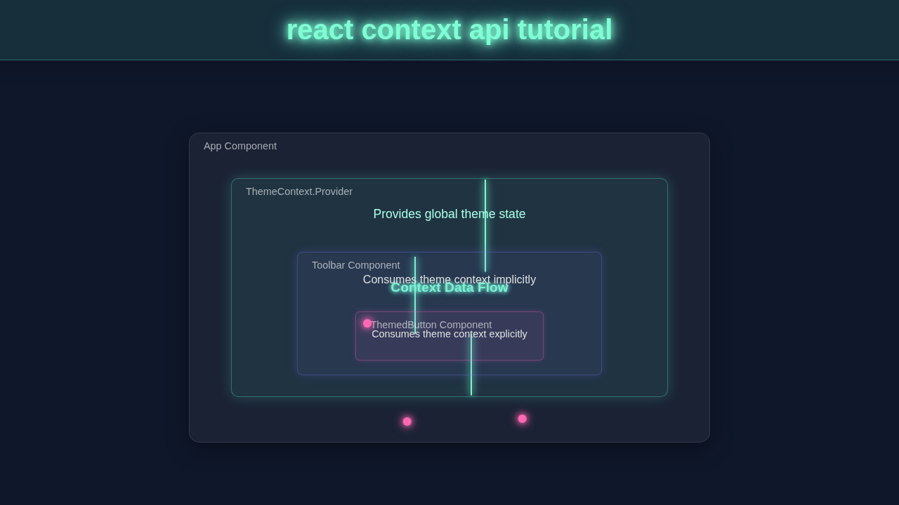
Creating Our Cart Context with React Context API
Here’s the cool part: the React Context API itself! We create a new context using React.createContext(). This powerful function gives us two key components: a Provider and a Consumer. The Provider component makes our cart’s state and actions available. Any component wrapped by this Provider can easily access the shared state. This magically avoids passing props down many, many levels of components. This technique really cleans up your component tree dramatically. It’s a complete game-changer for sharing global state efficiently.
Providing Cart State to Components
Our CartProvider component acts as a wrapper. It carefully wraps our entire application or a significant part of it. Inside CartProvider, it expertly holds the useReducer hook. This hook manages all of our cart’s state and the dispatch function for actions. The CartProvider then makes cartState and dispatch readily available. It passes them efficiently as a value prop to the CartContext.Provider. Now, any nested component can easily grab these essential values. This setup centrally manages our entire cart logic. It ensures all components consistently have access to the latest cart data, promoting data consistency.
Consuming Our Cart Context
To easily access the cart state and actions, components simply use the useContext hook. You just call useContext(CartContext) within your functional component. This elegant hook instantly gives you both the cartState and the dispatch function. Components like our ProductList and CartDisplay will utilize this. They display items, update quantities, or perform other cart operations. It’s super easy to connect to this global state without extra effort. This approach effectively eliminates messy ‘prop drilling’. Your React code stays clean, readable, and highly maintainable, which is fantastic.
Dispatching Actions
When a user interacts, like clicking ‘Add to Cart’, an action is triggered. Specifically, an ‘ADD_ITEM’ action is thoughtfully dispatched. The dispatch function sends this action object directly to our reducer. The reducer then diligently processes the action. It computes a brand new state based on this action’s instructions. For example, it might add a new product to the items array. Or it could update an existing item’s quantity. Finally, the new state is returned by the reducer. This then triggers a re-render of any components using the context. It’s a clear, predictable way to manage all state changes. Learn more about switch statements, which are often used for reducer logic.
Pro Tip: Keep your reducer functions pure! They should always return a new state object. Avoid directly mutating the old state. This practice prevents unexpected side effects. It makes your application more predictable.
Tips to Customise It
You just built an amazing shopping cart from scratch! That’s a huge achievement. But why stop there? Here are some fantastic ideas to make it even better and truly your own:
- Add product images: Enhance the visual display with actual product visuals. Users absolutely love a rich visual experience! It makes your cart much more engaging and realistic. Imagine seeing your items in the cart.
- Implement a checkout process: Add a simulated checkout button. This could clear the cart entirely. Or it could show a confirmation message to the user. This feature brings your cart much closer to a real-world e-commerce solution. It adds realism.
- Save cart to local storage: Persist the cart items even after a page refresh. This provides a much better and more seamless user experience. It’s a super common and expected feature for most online stores today. Users appreciate their cart staying put.
- Fetch products from an API: Instead of hardcoded products, learn to fetch them dynamically. This involves making HTTP requests. You could even explore mastering HTTP requests with Python for server-side APIs later. This makes your cart much more flexible and real-world ready.
Remember: Practice is key to mastery. Experiment with these ideas. Break things and fix them. That’s how you truly learn!
Conclusion
Wow, you absolutely did it! You built a fully functional shopping cart, piece by piece. You expertly mastered the React Context API and the useReducer hook. This project is a huge, pivotal step in your React development journey. You successfully tackled complex state management challenges. You used powerful and modern React hooks like a pro. Feel incredibly proud of your accomplishment today! Keep building, keep learning new things, and keep sharing your amazing work with the world. Consider web accessibility in your next exciting projects, too. Happy coding, future React master!