Hey there, fellow coders! If you’ve ever wanted to build dynamic content sections, then mastering React useState Tabs is your next big win. We’re going to create an interactive tab component today. It will make your user interfaces much cleaner and more professional. You’ll love seeing your React skills grow!
What We Are Building
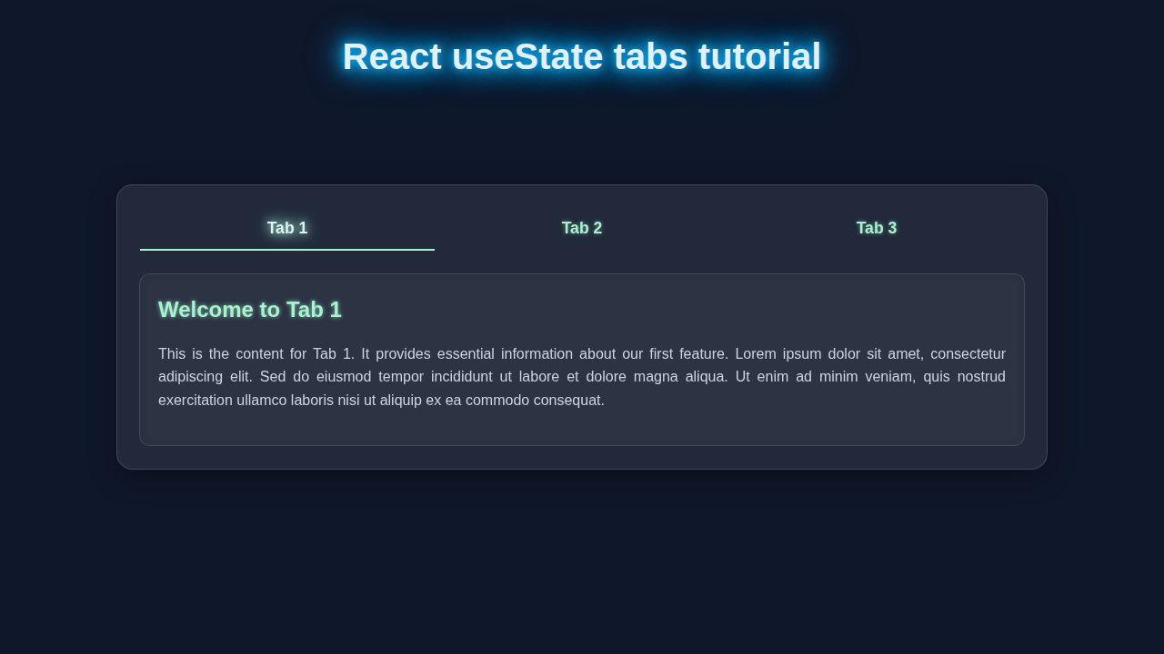
Today, we are building a super cool, dynamic tab component. Imagine a sleek navigation bar at the top of a content area. When you click a tab, new content appears below it. No page reloads! This is incredibly useful for showcasing different categories of information. Think about product descriptions, user profiles, or documentation. It saves screen space. It also makes your app feel super responsive. We will leverage React’s useState hook for all the magic.
HTML Structure
Our component’s basic HTML structure is quite straightforward. We’ll need a container for our tabs. Then, individual buttons will serve as the actual tabs. Finally, we need a single area to display the content associated with the active tab. This simple setup creates a clean foundation.
index.html
<!DOCTYPE html>
<html lang="en">
<head>
    <meta charset="UTF-8">
    <meta name="viewport" content="width=device-width, initial-scale=1.0">
    <title>React useState Tabs Tutorial</title>
    <!-- Link to the main CSS file for the application -->
    <link rel="stylesheet" href="./App.css">
</head>
<body>
    <noscript>You need to enable JavaScript to run this app.</noscript>
    <div id="root">
        <!-- Your React app will be rendered here -->
    </div>
    <!-- The bundled JavaScript will typically be injected here by your build tool (e.g., Webpack/Vite) -->
    <!-- For local development without a build tool, you would include your React and ReactDOM scripts here,
         and then your compiled App.js. For a production-ready setup, a build system is assumed. -->
    <script type="module" src="./index.js"></script>
</body>
</html>
CSS Styling
Now for the fun part: making it look good! Our CSS will make the tabs appear clickable. We will also style the active tab differently. This gives clear visual feedback to the user. We’ll use Flexbox to arrange our tabs neatly side-by-side. It will look polished and professional.
Pro Tip: Flexbox is your best friend for layout. It simplifies alignment and distribution of items within a container. If you haven’t yet, really dive into Flexbox on MDN. It’s a game-changer for responsive design!
App.css
/* App.css */

/* Global Styles */
body {
    margin: 0;
    padding: 0;
    background-color: #0f172a; /* Dark slate background */
    font-family: Arial, Helvetica, sans-serif; /* Safe font */
    color: #e2e8f0; /* Light text color for contrast */
    display: flex;
    justify-content: center;
    align-items: center;
    min-height: 100vh; /* Full viewport height */
    box-sizing: border-box; /* Ensures padding and border are included in element's total width and height */
    overflow: hidden; /* Prevents scrollbars on body */
}

#root {
    width: 100%; /* Make root take full width */
    display: flex; /* Use flexbox to center content vertically/horizontally */
    justify-content: center;
    align-items: center;
    min-height: inherit; /* Inherit min-height from body to center app content */
    padding: 20px; /* Add some padding around the main app content */
    box-sizing: border-box;
}

/* Tabs Container Styles */
.tabs-container {
    width: 100%; /* Take full width of its parent (#root) */
    max-width: 700px; /* Max width for the tabs component */
    background: rgba(255, 255, 255, 0.08); /* Semi-transparent white for glassmorphism */
    backdrop-filter: blur(10px); /* Blur effect for glassmorphism */
    border: 1px solid rgba(255, 255, 255, 0.15); /* Light border */
    border-radius: 18px; /* Rounded corners */
    box-shadow: 0 8px 32px 0 rgba(0, 0, 0, 0.3); /* Soft shadow for depth */
    padding: 25px;
    display: flex;
    flex-direction: column;
    align-items: center;
    box-sizing: border-box;
    overflow: hidden; /* Ensure content within doesn't spill out */
}

/* Tab Navigation Styles */
.tabs-nav {
    display: flex;
    justify-content: space-around;
    width: 100%;
    margin-bottom: 25px; /* Space below navigation buttons */
    border-bottom: 1px solid rgba(255, 255, 255, 0.1); /* Subtle separator */
}

/* Individual Tab Button Styles */
.tab-button {
    flex-grow: 1; /* Distribute available space evenly among buttons */
    background: transparent; /* No background fill */
    border: none; /* Remove default button border */
    padding: 12px 20px;
    color: #a7f3d0; /* Neon green text */
    font-size: 1.1em;
    font-weight: 600;
    cursor: pointer;
    border-bottom: 2px solid transparent; /* Highlight border at bottom */
    transition: all 0.3s ease-in-out; /* Smooth transitions for hover/active states */
    outline: none; /* Remove focus outline for cleaner look */
    text-shadow: 0 0 5px rgba(167, 243, 208, 0.5); /* Subtle glow */
    white-space: nowrap; /* Prevent text wrapping inside buttons */
}

/* Tab Button Hover State */
.tab-button:hover {
    color: #d1fae5; /* Lighter neon green on hover */
    border-bottom-color: #34d399; /* Brighter green highlight on hover */
    text-shadow: 0 0 8px #d1fae5;
}

/* Active Tab Button State */
.tab-button.active {
    border-bottom-color: #a7f3d0; /* Stronger neon green highlight for active tab */
    color: #e0f2f7; /* Lighter, almost white color for active text */
    text-shadow: 0 0 10px #a7f3d0, 0 0 20px #a7f3d0; /* Stronger glow for active tab */
    font-weight: bold;
}

/* Tab Content Styles */
.tab-content {
    width: 100%; /* Take full width of its parent */
    background: rgba(255, 255, 255, 0.05); /* Slightly darker glassmorphism background */
    border-radius: 12px;
    padding: 20px;
    border: 1px solid rgba(255, 255, 255, 0.1);
    color: #cbd5e1; /* Light grey text */
    box-shadow: inset 0 0 10px rgba(0, 0, 0, 0.1); /* Inner shadow for depth */
    line-height: 1.6; /* Improved readability */
    box-sizing: border-box;
}

/* Tab Content Heading Styles */
.tab-content h2 {
    color: #a7f3d0; /* Neon green heading */
    margin-top: 0; /* Remove default top margin */
    margin-bottom: 15px; /* Space below heading */
    text-shadow: 0 0 5px rgba(167, 243, 208, 0.7); /* Glow for heading */
}

/* Tab Content Paragraph and List Styles */
.tab-content p,
.tab-content ul {
    margin-bottom: 15px;
}

.tab-content ul {
    list-style: none; /* Remove default bullet points */
    padding-left: 0; /* Remove default left padding */
}

.tab-content ul li {
    position: relative;
    padding-left: 25px; /* Space for custom bullet */
    margin-bottom: 8px;
}

.tab-content ul li::before {
    content: '•'; /* Custom bullet point */
    color: #34d399; /* Neon green bullet */
    position: absolute;
    left: 0;
    top: 0;
    font-size: 1.2em;
    font-weight: bold;
    text-shadow: 0 0 5px #34d399;
}

/* Responsive adjustments */
@media (max-width: 600px) {
    .tabs-nav {
        flex-direction: column; /* Stack buttons vertically on small screens */
    }

    .tab-button {
        border-bottom: none; /* Remove bottom border for stacked buttons */
        border-left: 2px solid transparent; /* Use left border for highlight */
        margin-bottom: 5px; /* Space between stacked buttons */
        text-align: left; /* Align text to left */
    }

    .tab-button.active {
        border-bottom-color: transparent; /* Override bottom border */
        border-left-color: #a7f3d0; /* Active state uses left border */
        text-shadow: 0 0 10px #a7f3d0, 0 0 20px #a7f3d0;
    }

    .tab-button:hover {
        border-bottom-color: transparent; /* Override bottom border */
        border-left-color: #34d399; /* Hover state uses left border */
    }

    .tabs-container {
        padding: 15px; /* Reduce padding on smaller screens */
    }

    .tab-content {
        padding: 15px;
    }
}
JavaScript
This is where React takes center stage! We will use the useState hook to manage which tab is currently active. A simple click handler will update this state. Then, based on the active tab’s state, we’ll conditionally render the correct content. It’s an elegant way to handle dynamic UI.
index.js
// index.js
import React from 'react';
import ReactDOM from 'react-dom/client'; // Use createRoot for React 18+
import App from './App'; // Import the main App component
import './App.css'; // Import global styles

// Get the root element from index.html
const rootElement = document.getElementById('root');

// Create a root and render the App component
if (rootElement) {
    ReactDOM.createRoot(rootElement).render(
        <React.StrictMode>
            <App />
        </React.StrictMode>
    );
} else {
    console.error("Root element with ID 'root' not found in the document.");
}
App.js
// App.js
import React, { useState } from 'react';
// The CSS is imported in index.js for global application scope, but individual component CSS could be imported here if using CSS Modules or similar.
// For this tutorial, we assume a single App.css linked in index.html and imported in index.js.

/**
 * React Tabs Component using `useState` for state management.
 * This component demonstrates how to create a simple tabbed interface
 * where content changes based on the active tab selected by the user.
 */
function App() {
  // Define an array of tab data: id, title, and content.
  // This makes the tabs highly configurable and easy to extend.
  const tabData = [
    {
      id: 'tab1',
      title: 'Products',
      content: (
        <>
          <h2>Our Latest Products</h2>
          <p>Explore our cutting-edge range of products designed to simplify your life. From smart devices to innovative software, we've got you covered.</p>
          <ul>
            <li>Smart Home Hub</li>
            <li>AI Assistant Pro</li>
            <li>Secure Cloud Storage</li>
          </ul>
        </>
      ),
    },
    {
      id: 'tab2',
      title: 'Services',
      content: (
        <>
          <h2>Premium Services</h2>
          <p>We offer a variety of services tailored to meet your unique needs. Our expert team is ready to assist you with setup, support, and custom solutions.</p>
          <ul>
            <li>24/7 Technical Support</li>
            <li>Custom Software Development</li>
            <li>Data Migration & Setup</li>
          </ul>
        </>
      ),
    },
    {
      id: 'tab3',
      title: 'About Us',
      content: (
        <>
          <h2>Learn About Our Mission</h2>
          <p>We are a passionate team dedicated to creating innovative and user-friendly technology. Our mission is to empower individuals and businesses through reliable and accessible solutions.</p>
          <p>Founded in 2023, we strive for excellence and customer satisfaction.</p>
        </>
      ),
    },
  ];

  // Initialize the active tab state using `useState`.
  // The first tab (tabData[0].id) is set as the default active tab.
  const [activeTab, setActiveTab] = useState(tabData[0].id);

  /**
   * Handles the click event for tab buttons.
   * @param {string} tabId - The ID of the tab that was clicked.
   */
  const handleTabClick = (tabId) => {
    setActiveTab(tabId); // Update the active tab state
  };

  return (
    <div className="tabs-container">
      {/* Tab Navigation */}
      <div className="tabs-nav">
        {tabData.map((tab) => (
          <button
            key={tab.id} // Unique key for list rendering
            className={`tab-button ${activeTab === tab.id ? 'active' : ''}`} // Apply 'active' class if this is the current tab
            onClick={() => handleTabClick(tab.id)} // Attach click handler
          >
            {tab.title}
          </button>
        ))}
      </div>

      {/* Tab Content */}
      <div className="tab-content">
        {/* Render content only for the active tab */}
        {tabData.find((tab) => tab.id === activeTab)?.content}
      </div>
    </div>
  );
}

export default App; // Export the App component for use in index.js
How It All Works Together
Let’s break down the different pieces of our React useState Tabs component. Understanding each part helps you customize it later. We combine state management with conditional rendering. This creates a smooth user experience.
Setting Up Our State
The core of our dynamic tabs is the useState hook. We declare a state variable, say activeTab. This variable will hold the index or ID of the currently selected tab. We also get a setter function, setActiveTab. When you click a tab, we call setActiveTab. This updates our component’s state. React then knows to re-render. We start with a default active tab, often the first one.
Rendering Our Tabs
We usually have an array of tab data. This data might include the tab title and its corresponding content. We then use the map() method to loop through this array. For each item, we create a tab button. Each button gets a unique key. This helps React efficiently update the list. We also add a conditional CSS class. If a tab’s index matches activeTab, we apply an ‘active’ class. This changes its appearance. It tells the user which tab is open.
If you’re interested in building other interactive components, check out our React Debounced Search Component with Hooks – Tutorial. It also uses hooks effectively!
Handling Clicks and Content
Each tab button needs an onClick event handler. When a user clicks a tab, this handler fires. Inside the handler, we call setActiveTab with the index of the clicked tab. This updates our state. Next, comes the content area. We conditionally render the content based on the activeTab state. We check which tab is active. Then, we display only its associated content. All other content remains hidden. This keeps our UI clean. It also prevents unnecessary rendering. It’s efficient and snappy!
Heads Up: Conditional rendering is a powerful React pattern. It allows you to show or hide elements based on state or props. For more advanced scenarios, you might even consider different rendering strategies, like those discussed in our article on React Server vs Client Components: Understanding the Differences.
Tips to Customise It
You’ve built a solid foundation! Now, how can you make these React useState Tabs even better? Here are some ideas:
- Animations: Add some smooth transitions when switching tabs. CSS transitions or libraries like Framer Motion can make content fade in. Check out this CSS-Tricks guide on transitions.
- Dynamic Content Loading: Instead of having all content loaded at once, fetch content for a tab only when it becomes active. This improves initial load times. It’s especially useful for heavy tabs.
- Keyboard Navigation: Implement keyboard accessibility. Allow users to navigate tabs using arrow keys. Let them activate tabs with the Enter key.
- URL Params for Tabs: Integrate the active tab into the URL. This lets users share direct links to specific tabs. It also enables browser back/forward button support.
For more inspiration on practical React applications, why not explore our React Weather App Tutorial: Build with Functional Components? It shows another great use of hooks!
Conclusion
You did it! You’ve successfully built a dynamic tab component using React’s useState hook. This is a fundamental skill. It will truly enhance your React projects. You now understand how to manage state for interactive UI elements. This makes your applications more user-friendly. Go ahead and integrate this into your next project! Share what you build with us on social media. Happy coding!