Hey there, future web wizard! If you’ve ever wanted to create a stunning CSS Custom Select dropdown that perfectly matches your website’s unique design, then you are definitely in the right spot. We all know that default <select> elements can often feel a bit… well, plain. They certainly don’t always fit our carefully crafted aesthetics. Today, we’re going to build a completely custom, incredibly accessible, and visually beautiful select dropdown. Get ready to truly level up your form game with a powerful combination of HTML, CSS, and a crucial touch of JavaScript! It’s going to be an exciting journey.
What We Are Building: Beyond the Default Select
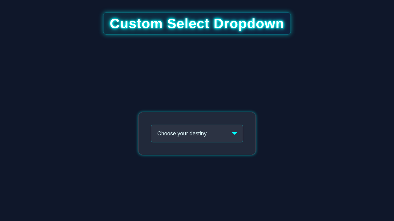
Imagine a select dropdown that doesn’t just function flawlessly. Instead, it also looks absolutely fantastic, perfectly blending with your site’s brand. That’s exactly the kind of component we’re going to craft together in this tutorial! Our custom dropdown will be fully styled and animated with CSS. It will open and close smoothly, providing a delightful user experience. Crucially, it will be super accessible for all users. This means comprehensive keyboard navigation and robust screen reader support are built right into its core. No more settling for boring browser defaults! We are building a truly modern, interactive, and inclusive component. It’s the perfect addition for any stylish web project you’re currently bringing to life.
HTML Structure: Laying the Groundwork for Our Custom Select
First things first, every great build needs a rock-solid foundation. Our HTML will provide precisely that for our custom select. It carefully sets up the main container. This container then expertly houses the visible button and the list of options. This thoughtful structure allows us to apply our intricate custom styles and all our JavaScript logic. We will ensure our HTML is semantic and accessible from the start. Take a close look at the simple yet powerful markup below. It’s the skeleton of our amazing component.
index.html
<!DOCTYPE html>
<html lang="en">
<head>
    <meta charset="UTF-8">
    <meta name="viewport" content="width=device-width, initial-scale=1.0">
    <title>Custom Select Dropdown</title>
    <link rel="stylesheet" href="styles.css">
</head>
<body>
    <div class="select-wrapper">
        <select class="custom-select" id="mySelect">
            <option value="" disabled selected>Select an option</option>
            <option value="option1">Option One</option>
            <option value="option2">Option Two</option>
            <option value="option3">Option Three</option>
            <option value="option4">Option Four</option>
            <option value="option5">Option Five</option>
        </select>
    </div>
</body>
</html>
CSS Styling: Making Our CSS Custom Select Shine
Now for the truly creative part: making our CSS Custom Select look absolutely amazing! We will extensively use CSS to transform our basic HTML elements. This process will turn them into a sleek, highly interactive, and visually appealing dropdown. We’ll meticulously style every single detail. This includes everything from the main button itself to each individual option. Furthermore, we’ll add hover states and focus indicators for a polished feel. Get ready to unleash your design creativity and watch your component come to life with these powerful styles.
styles.css
/* styles.css */

/*
    Base Styles:
    - box-sizing: border-box ensures consistent sizing.
    - Safe font stack.
*/
*, *::before, *::after {
    box-sizing: border-box;
}

body {
    font-family: Arial, Helvetica, sans-serif;
    margin: 0;
    padding: 20px; /* Add some padding around the component */
    background-color: #f8f9fa; /* Light background */
    color: #333;
    display: flex;
    justify-content: center;
    align-items: center;
    min-height: 100vh; /* Full viewport height */
    overflow: hidden; /* Prevent scrollbars if component is large */
}

/*
    Custom Select Dropdown Component:
    This section styles the <select> element to look custom.
    Note: Full customization of the *opened* options list with CSS-only is
    not universally supported across browsers. This primarily styles the
    closed state and the visible 'button' part of the select.
*/

.select-wrapper {
    position: relative;
    display: inline-block;
    width: 280px; /* Fixed width for demonstration */
    max-width: 100%; /* Ensure responsiveness */
}

.custom-select {
    /* 1. Reset default browser appearance */
    -webkit-appearance: none; /* Safari, Chrome, Android */
    -moz-appearance: none;    /* Firefox */
    appearance: none;         /* Standard */

    /* 2. Basic styling for the select box */
    width: 100%;
    padding: 12px 40px 12px 15px; /* Ample right padding for custom arrow */
    border: 1px solid #ced4da;
    border-radius: 6px;
    background-color: #ffffff;
    color: #495057;
    font-size: 1rem; /* 16px */
    line-height: 1.5;
    cursor: pointer;
    outline: none; /* Remove default focus outline */
    transition: border-color 0.2s ease, box-shadow 0.2s ease;

    /* 3. Style placeholder option */
    option[disabled] {
        color: #6c757d; /* Lighter color for disabled/placeholder text */
    }

    /* 4. Ensure text doesn't overflow */
    white-space: nowrap;
    overflow: hidden;
    text-overflow: ellipsis;
}

/* 5. Focus and Hover states */
.custom-select:hover {
    border-color: #a2adb8;
}

.custom-select:focus {
    border-color: #007bff;
    box-shadow: 0 0 0 0.2rem rgba(0, 123, 255, 0.25);
}

/* 6. Custom dropdown arrow */
.select-wrapper::after {
    content: ''; /* Required for pseudo-elements */
    position: absolute;
    top: 50%;
    right: 15px; /* Position the arrow */
    transform: translateY(-50%); /* Vertically center */
    pointer-events: none; /* Allow clicks to pass through to the select */

    /* Create a down arrow using borders */
    width: 0;
    height: 0;
    border-left: 6px solid transparent;
    border-right: 6px solid transparent;
    border-top: 6px solid #6c757d; /* Arrow color */
}

/*
    Accessibility Considerations (CSS-only limitations):
    - While the native <select> is accessible, visually hiding its default
      appearance and overlaying custom styles can sometimes confuse screen readers
      or assistive technologies if not done carefully.
    - Full keyboard navigation and opening/closing of the custom dropdown
      menu (options list) generally require JavaScript to achieve a truly
      custom and accessible experience.
    - The styling of individual <option> elements within the dropdown list
      when it's open is largely dictated by the browser and cannot be
      reliably customized with CSS-only.
*/
JavaScript: Adding Interactivity to Our Custom Dropdown
Finally, we’ll introduce some clever JavaScript magic. This essential script will gracefully handle all the intricate interactivity of our custom select. It makes the dropdown open and close with smooth precision. It also expertly manages crucial keyboard navigation and the selection of options. This ensures a truly seamless and intuitive user experience for everyone. We’ll manage focus and ARIA attributes too. Let’s enthusiastically dive into the code that brings our static elements to dynamic life!
How It All Works Together: Unpacking the Logic
Let’s really dive into how all these individual components work in harmony. We’ll explore each part of our custom dropdown in detail. Understanding this intricate connection is absolutely critical. It gives you the power to debug and customize it later on. This deep dive will solidify your learning.
The HTML Foundation: More Than Just Tags
We begin with a wrapper div. It has the class custom-select. This container expertly holds everything together. Inside, you’ll find a native <select> element. It is purposefully hidden from view with CSS. Yet, it remains an absolutely vital part of our structure. This hidden select handles the actual form submission value. It also provides essential accessibility. Screen readers interact directly with it. Therefore, our custom solution always respects the user’s browser settings. It offers robust fallback mechanisms too.
Below that, a div element with role="button" steps forward. This is our visible dropdown trigger. Users will click or tap this element. It mimics the appearance and behavior of a standard select box. Importantly, it displays the currently chosen option’s text. This div also sports aria-haspopup="listbox" and aria-expanded="false". These attributes inform assistive technologies about its interactive role.
Then comes an unordered list (<ul>) with the class select-options. This list dynamically holds all our custom choices. Each <li> element within this list represents a single selectable option. Each <li> is also enhanced with role="option". This tells screen readers that these are selectable items. We add tabindex="0" to each option. This ensures they are fully keyboard navigable. They can receive focus directly. This thoughtful setup ensures a great user experience for everyone.
Styling Our Custom Select: A Visual Transformation
Our CSS plays the role of a master artist. It starts by completely hiding the default browser select box. We achieve this with properties like appearance: none; and position: absolute;. This keeps it out of sight but functionally present. Then, we meticulously style our custom dropdown button. This button is crafted to look precisely like a typical select field. We give it elegant borders, comfortable padding, and a clear background. We also add a subtle caret icon. This icon visually indicates that it’s a dropdown. When the dropdown is activated, our CSS applies a distinct active state. This could be a different border color or a subtle shadow. This visual feedback is important. It immediately tells users the dropdown is open.
The options list, select-options, is hidden by default. We use display: none; for this. When JavaScript opens it, we smoothly change this to display: block; or flex. This makes the options elegantly appear. Each individual option (<li>) also receives its own distinct styling. This includes hover effects for a delightful interactive feel. We ensure these <li> elements are clearly focusable. This is absolutely crucial for keyboard navigation. This allows users to move through options using arrow keys. You might find similar styling challenges when creating complex menus. For example, our guide on CSS Dropdown Menu: Pure HTML & CSS Navigation Tutorial shares useful styling foundations. For more insights on custom form element styling, consider checking out this excellent article on CSS-Tricks about custom select boxes.
Bringing It to Life with JavaScript: Dynamic Interactions
JavaScript is where the magic truly happens. It orchestrates all the dynamic behavior. When a user clicks the custom button, our script springs into action. It toggles the visibility of the options list. This makes the dropdown either appear or disappear. We also implement a common, user-friendly pattern. If a user clicks anywhere outside the open dropdown, it automatically closes itself. This prevents unexpected open menus.
Crucially, when an option is clicked, its corresponding value is updated. This update occurs in our hidden native <select> element. Simultaneously, the visible custom button updates its text. It now shows the newly chosen option. This synchronization is key for both visual feedback and form submission.
Our script also diligently manages keyboard navigation. Pressing the Space or Enter key on a focused option will select it. Arrow keys (Up/Down) allow seamless movement between the options. The script expertly handles focus management. It ensures that the currently active option is always visually highlighted. This makes the component fully usable without a mouse. For even more advanced navigation scenarios, like deeply nested menus, you could explore concepts from our CSS Multi-Level Dropdown: Pure HTML/CSS Navigation Menu tutorial. While different, the principles of keyboard interaction are similar.
“Accessibility is paramount! Remember that
aria-liveregions can announce dynamic changes to screen reader users. This ensures they are always aware of updates, like when a selection is made or the list opens. Learn more about their power on MDN Web Docs to truly elevate your accessible components.”
And if you ever build dropdowns or modals near the bottom of a page, viewport issues on mobile can be tricky. Our 100vh Mobile CSS Fix: A Visual Thumbnail Guide can help solve those frustrating mobile Safari height problems. This ensures your custom select always looks perfect.
Tips to Customise It: Push Your CSS Custom Select Further
You’ve successfully built the core custom select component! That’s a fantastic achievement. Now, let’s think bigger. How can you make this component uniquely yours, truly reflecting your brand or expanding its functionality? Here are some exciting ideas to push your CSS Custom Select further, making it even more powerful and versatile:
- Integrate Icons or Images: Imagine enhancing your options! You could display small country flags next to language options. Or perhaps brand logos alongside service choices. You can easily place
<img>tags or SVG icons right inside your<li>elements. Then, you can meticulously style them with CSS to align perfectly. This adds a rich visual dimension to your dropdown. - Add Robust Search Functionality: For dropdowns with a very large number of options, a search input becomes invaluable. It significantly improves usability. You could implement a small
<input type="text">field at the very top of your dropdown list. Then, with a bit of JavaScript, you can dynamically filter the visible options in real-time as the user types. This makes finding specific choices much quicker and easier. - Advanced Keyboard Shortcuts: Enhance the default JavaScript keyboard navigation. You could add support for
HomeandEndkeys. These would instantly jump to the first or last option in the list. Furthermore, implementing theEscapekey to gracefully close the dropdown is a common and expected user behavior. These small additions vastly improve the component’s usability for keyboard users. - Flexible Theming with CSS Variables: Make your dropdown easily adaptable to different design themes. Embrace the power of CSS variables (custom properties)! You could define variables like
--custom-select-primary-color,--custom-select-border-radius, or--custom-select-font-size. Then, use these variables throughout your CSS. This approach makes changing the entire look and feel of your dropdown incredibly simple. You only adjust a few variable values. It’s perfect for scalable design systems!
“Keep experimenting and pushing your boundaries! Every new feature you try to implement, even if it feels challenging, is a golden opportunity to learn something new. Don’t ever be afraid to break things and then figure out how to fix them. That hands-on troubleshooting is precisely how we truly grow and evolve as confident web developers!”
Conclusion: Your New Custom Select Awaits!
Wow, you did it! You just built a fantastic, accessible, and fully custom select dropdown. This is a huge step in building better user interfaces. You now have the skills to move beyond default browser styles. You can create truly integrated designs. This project uses fundamental web technologies. It shows how HTML, CSS, and JavaScript work together. Share your creations online! Show off your new CSS Custom Select skills. Keep building, keep learning, and happy coding!