Accessible HTML Accordion: Pure CSS Details Element Design
Hey there, fellow coders! If you’ve ever wanted to build an Accessible HTML Accordion but felt unsure where to start, you are in exactly the right place. We are going to create a fantastic, fully functional accordion today. It uses only native HTML and some clever CSS. You will love how simple and powerful it is! This approach skips JavaScript entirely. It keeps our component super lightweight and fast. Plus, it’s a joy for all users, regardless of how they browse. Let’s dive in and build something awesome together!
What We Are Building: A Supercharged Pure CSS Accordion
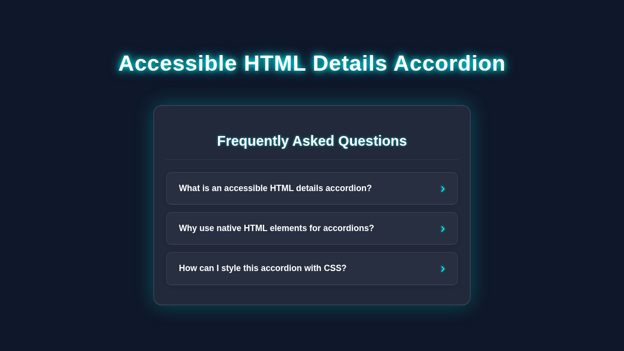
We are going to build a sleek, responsive accordion component. It will let users expand and collapse sections of content. Think FAQs, product features, or detailed information panels. This design is incredibly useful for saving space on your page. It presents complex information in an organized way. The cool part? No JavaScript is required for its core functionality. This means faster loading times and fewer potential bugs. We are leveraging the browser’s built-in power. You will create a truly robust solution. This component will be easy to maintain too.
HTML Structure: The Magical <details> Element
For our Accessible HTML Accordion, we’re embracing a fantastic native HTML element. It’s called <details>. This element is a disclosure widget. You can learn even more about the HTML <details> element on MDN. It holds content that the user can show or hide. The <summary> element works hand-in-hand with it. <summary> acts as the visible heading or title for our collapsible section. Clicking on the <summary> element toggles the visibility of its parent <details> content. This makes accessibility a breeze right out of the box! Screen readers understand it automatically. You get powerful functionality with minimal effort.
“Pro Tip: Using native HTML elements like
<details>is a huge win for accessibility. Browsers handle keyboard navigation and ARIA attributes for you. This saves you a ton of work!”
index.html
<!DOCTYPE html>
<html lang="en">
<head>
    <meta charset="UTF-8">
    <meta name="viewport" content="width=device-width, initial-scale=1.0">
    <title>Accessible HTML Details Accordion</title>
    <link rel="stylesheet" href="styles.css">
</head>
<body>
    <div class="accordion-container">
        <h1>Frequently Asked Questions</h1>

        <!-- Accordion Item 1 -->
        <details>
            <summary>What is an accessible HTML details accordion?</summary>
            <div class="details-content">
                <p>An accessible HTML details accordion uses the native <code><details></code> and <code><summary></code> elements to create a collapsible content section. These elements inherently provide crucial accessibility features like keyboard navigation and proper semantic structure, without needing JavaScript.</p>
                <p>When the <code><summary></code> element is clicked or activated, the content within the <code><details></code> element expands or collapses, revealing or hiding the associated information.</p>
            </div>
        </details>

        <!-- Accordion Item 2 -->
        <details>
            <summary>Why use native HTML elements for accordions?</summary>
            <div class="details-content">
                <p>Using native <code><details></code> and <code><summary></code> elements offers several benefits:</p>
                <ul>
                    <li><strong>Built-in Accessibility:</strong> They provide default ARIA attributes, keyboard interaction (Tab, Enter/Space), and screen reader support out-of-the-box.</li>
                    <li><strong>No JavaScript Required:</strong> This reduces complexity, improves page load times, and makes the component more robust.</li>
                    <li><strong>Semantic HTML:</strong> Clearly conveys the purpose of the content to browsers and assistive technologies.</li>
                    <li><strong>Browser Support:</strong> Widely supported across modern browsers.</li>
                </ul>
            </div>
        </details>

        <!-- Accordion Item 3 -->
        <details>
            <summary>How can I style this accordion with CSS?</summary>
            <div class="details-content">
                <p>Styling is straightforward with CSS:</p>
                <ol>
                    <li>Target the <code><details></code> and <code><summary></code> elements directly.</li>
                    <li>Hide the default disclosure triangle using <code>list-style: none;</code> and <code>::-webkit-details-marker</code>.</li>
                    <li>Create your own custom disclosure icon using pseudo-elements (e.g., <code>::after</code>).</li>
                    <li>Use <code>details[open]</code> to apply specific styles when the accordion is expanded.</li>
                    <li>Add transitions for a smooth open/close animation.</li>
                    <li>Ensure sufficient padding, margins, and good color contrast for readability.</li>
                </ol>
                <p>Remember to test with keyboard navigation and screen readers to verify accessibility.</p>
            </div>
        </details>

        <!-- Accordion Item 4 -->
        <details>
            <summary>Is this solution suitable for complex accordions?</summary>
            <div class="details-content">
                <p>For simple to moderately complex accordions, this HTML/CSS approach is excellent. It handles basic expand/collapse functionality perfectly.</p>
                <p>However, if you require features like:</p>
                <ul>
                    <li>Only one item open at a time (true "exclusive" accordion behavior)</li>
                    <li>Dynamic content loading</li>
                    <li>Complex interactions with other page elements</li>
                </ul>
                <p>...you might need a small amount of JavaScript to enhance the native behavior. But for most FAQ sections or collapsible content blocks, pure HTML/CSS is the preferred and most accessible solution.</p>
            </div>
        </details>
    </div>
</body>
</html>
CSS Styling: Making Our Accordion Sparkle
Now comes the fun part: making our accordion look amazing! Our CSS will transform the basic <details> and <summary> elements. We will add custom styles to them. For more advanced styling ideas, you can check out resources like CSS-Tricks on building accordions. You’ll create a polished, interactive design. We will also hide the default arrow that browsers provide. Then, we will replace it with our own custom indicator. This gives us full control over the visual presentation. It ensures a consistent look across different browsers too. Let’s define the colors, spacing, and transitions.
styles.css
/*
 * styles.css
 * Accessible HTML Details Accordion with Pure CSS
 *
 * This stylesheet provides the styling for a fully accessible accordion
 * built using the native <details> and <summary> HTML elements.
 * No JavaScript is required for its core functionality.
 */

/* Universal box-sizing for consistent layout */
*, *::before, *::after {
    box-sizing: border-box;
}

/* Basic body styling and safe font stack */
body {
    font-family: Arial, Helvetica, sans-serif;
    margin: 0;
    padding: 20px; /* Add some padding around the component */
    background-color: #f4f7f6; /* Light background for general usage */
    color: #333; /* Dark text for readability */
    line-height: 1.6;
    display: flex; /* For centering the container in the general tutorial */
    justify-content: center;
    align-items: flex-start; /* Align to start, not center vertically, for longer content */
    min-height: 100vh; /* Ensure body takes full viewport height */
}

/* Accordion Container Styling */
.accordion-container {
    max-width: 700px;
    width: 100%; /* Ensure it's responsive */
    background-color: #ffffff;
    border-radius: 8px;
    box-shadow: 0 4px 15px rgba(0, 0, 0, 0.1);
    padding: 25px;
    margin-top: 20px; /* Space from top */
}

/* Heading inside the accordion container */
.accordion-container h1 {
    font-size: 1.8em;
    color: #2c3e50;
    margin-bottom: 25px;
    text-align: center;
    border-bottom: 2px solid #e0e0e0;
    padding-bottom: 15px;
}

/* Details element (accordion item) styling */
details {
    background-color: #fdfdfd;
    border: 1px solid #e0e0e0;
    border-radius: 6px;
    margin-bottom: 12px;
    overflow: hidden; /* Ensures border-radius applies cleanly */
    transition: all 0.3s ease;
}

details[open] {
    background-color: #eaf7fc; /* Light blue when open */
    border-color: #a7d9f7; /* Matching border color */
    box-shadow: 0 2px 8px rgba(0, 0, 0, 0.08);
}

/* Summary element (accordion title/header) styling */
summary {
    cursor: pointer;
    padding: 15px 20px;
    display: flex; /* Use flexbox for custom arrow positioning */
    align-items: center;
    font-weight: bold;
    color: #34495e;
    outline: none; /* Remove default focus outline */
    list-style: none; /* Hide default browser disclosure triangle */
    position: relative; /* For custom arrow positioning */
    user-select: none; /* Prevent text selection on summary */
    transition: background-color 0.3s ease, color 0.3s ease;
}

/* Hide default marker for Firefox and Webkit browsers */
summary::-webkit-details-marker,
summary::marker {
    display: none;
}

/* Custom disclosure arrow using pseudo-element */
summary::after {
    content: '>'; /* Right-pointing arrow initially */
    margin-left: auto; /* Push arrow to the right */
    font-size: 1.2em;
    font-weight: normal;
    transition: transform 0.3s ease;
    color: #2980b9;
    line-height: 1; /* Ensure consistent vertical alignment */
}

details[open] summary::after {
    transform: rotate(90deg); /* Rotate to point down when open */
    color: #007bff;
}

/* Hover and Focus states for accessibility and UX */
summary:hover {
    background-color: #eef7fb;
    color: #2980b9;
}

summary:focus {
    box-shadow: 0 0 0 3px rgba(0, 123, 255, 0.3); /* Blue focus ring */
    border-radius: 6px; /* Apply focus ring with radius */
}

/* Content area styling */
.details-content {
    padding: 10px 20px 20px; /* Adjusted padding */
    border-top: 1px solid #eee; /* Separator for content */
    color: #555;
}

.details-content p:last-child {
    margin-bottom: 0; /* Remove bottom margin for last paragraph */
}

.details-content ul,
.details-content ol {
    margin-left: 20px;
    padding-left: 0;
}

.details-content li {
    margin-bottom: 5px;
}

/* Responsive adjustments */
@media (max-width: 768px) {
    body {
        padding: 15px;
    }
    .accordion-container {
        padding: 15px;
        margin-top: 10px;
    }
    summary {
        padding: 12px 15px;
        font-size: 0.95em;
    }
    .details-content {
        padding: 8px 15px 15px;
        font-size: 0.9em;
    }
}
How It All Works Together: Unpacking Our Accessible HTML Accordion
Let me explain what’s happening here. Our pure CSS accordion is a marvel of simplicity. It leverages the browser’s native capabilities. Each part plays a key role in creating a smooth user experience.
The Power of <details> and <summary>
Firstly, the <details> element itself is brilliant. It’s like a mini-component built into HTML. It manages the open and closed states internally. The <summary> element then acts as the interactive header. When you click <summary>, the browser toggles the open attribute on the <details> element. This open attribute is our key. It’s what we target with CSS to change styles. It instantly makes your content accessible without extra effort. Users with screen readers benefit immediately. This is truly powerful and efficient.
Styling the Default State and Hiding the Arrow
Next, we start with the basic appearance. We apply foundational styles to <summary>. This includes padding, background-color, and border. These steps establish a clean, inviting look for each accordion header. More importantly, we use list-style: none; on <summary>. This crucial line removes the browser’s default disclosure triangle or arrow. We want full control over our visual cues. This allows us to design our own custom indicator for opening and closing. You can easily adjust these styles. Make them fit your website’s unique theme.
Crafting Our Custom Open/Close Indicator
Since we removed the default arrow, we need our own. We use the ::after pseudo-element on <summary>. This creates a small indicator icon. You could use a plus/minus sign, an arrow, or any character. We position it carefully, typically on the right side. When the <details> element is open, we target details[open] summary::after. This lets us change the indicator’s appearance. For instance, we can rotate an arrow. This provides clear visual feedback to the user. They instantly know if the section is open or closed.
Open State Styling for Clarity
When a <details> panel is open, we want it to stand out. So, we add specific styles to details[open]. For example, we might add a different background color to the <summary>. We also give the content area inside <details> distinct styling. This ensures clear visual separation between sections. It helps users quickly scan and understand the content. Remember to keep contrast in mind for accessibility. Furthermore, we can update the bottom border of the summary. This shows the active state effectively.
Adding Smooth Transitions for a Polished Feel
Finally, transitions enhance the user experience significantly. We apply transition properties to our CSS. This smooths out changes in properties like transform for our indicator. It also helps with background color changes. Instead of instant jumps, the elements animate gracefully. This makes your accordion feel much more responsive and modern. It’s a small detail that makes a big impact. A smooth transition guides the user’s eye. It makes the interaction feel natural and enjoyable.
“Quick Tip: Consistency in design makes components feel professional. Ensure your padding, colors, and font sizes are consistent. This creates a cohesive look across your site.”
Tips to Customise Your Accessible HTML Accordion
You’ve built a solid foundation. Now let’s explore ways to make it truly your own! Customization is where your creativity shines.
- Colors and Fonts: Change the
background-color,color, andfont-familyproperties. Make them align perfectly with your brand’s style guide. Perhaps a vibrant brand color for the active state? - Different Icons: Get creative with your
::afterpseudo-element! You can swap out the plus/minus signs. Try using an SVG icon, an entirely different Unicode character, or even Pure CSS Illustration: Create Scenic Art with HTML & CSS Only techniques for a unique visual flair. - Responsive Adjustments: Ensure your accordion looks great on all devices. Use media queries to adjust padding, font sizes, or even icon placement for smaller screens. For dynamic adjustments based on the parent container, not just the viewport, explore our CSS Container Queries Explained: Visual Guide. It’s a game-changer! You can also check out our CSS Container Queries Tutorial: Responsive Design with HTML & CSS for practical examples.
- Animated Height (Advanced): Getting a smooth height animation with
<details>can be tricky with pure CSS. By default, theheightproperty jumps. You can experiment withmax-heightandoverflow: hiddenfor a “fake” height animation. This creates a more dynamic unfolding effect. This is a bit more advanced, but it’s totally achievable! - Expand and Collapse All Button: If you need a single button to open or close all accordion items at once, you would need a tiny bit of JavaScript. But for this tutorial, we celebrate the pure CSS approach!
Conclusion: You Just Built an Amazing Accessible HTML Accordion!
Wow, you did it! You just built an incredible Accessible HTML Accordion component. It’s fully functional, beautiful, and uses only native HTML and CSS. You leveraged the power of the <details> element. This approach ensures top-notch accessibility and lightning-fast performance. You created something useful and beautiful. You are truly mastering web development, one component at a time. This project proves how powerful modern HTML and CSS truly are.
Now, go forth and implement this fantastic accordion on your own projects! Don’t forget to share what you’ve created. We’d love to see your unique designs. Keep coding and keep building!