Responsive Navbar with Tailwind CSS: HTML & Utility Classes Tutorial
Hey there, awesome pro-coder! If you’ve been wanting to build a sleek, fully Responsive Navbar for your website but weren’t sure where to start, you are in the perfect spot. Today, we’re diving into creating a fantastic navigation bar. It will adapt to any screen size. Plus, it will feature a cool dark mode toggle and silky-smooth scrolling. Get ready to level up your front-end skills!
What We Are Building
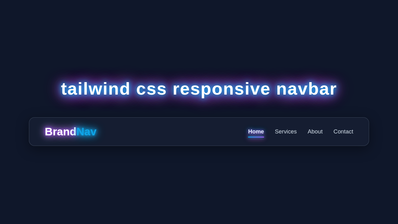
Imagine a navigation bar that looks perfect on a huge monitor. Then it magically transforms into a neat, toggleable menu on a phone. That’s exactly what we’re creating! Our navbar will use Tailwind CSS for lightning-fast styling. It will include a functional dark mode switch. This means your users can pick their preferred theme. We’re also adding smooth scrolling. This makes jumping to sections of your page feel super polished. It’s practical, modern, and really fun to build!
HTML Structure: The Foundation of Our Navbar
First, we need solid HTML. This provides the structure for our navigation bar. We’ll set up containers for our logo, navigation links, and the dark mode/menu toggle buttons. Don’t worry, Tailwind CSS will make styling these elements a breeze! Here’s the basic HTML:
index.html
<!DOCTYPE html>
<html lang="en">
<head>
    <meta charset="UTF-8">
    <meta name="viewport" content="width=device-width, initial-scale=1.0">
    <title>Responsive Navbar with Tailwind CSS</title>
    <!-- Link to Tailwind CSS CDN (for development/demo purposes) -->
    <!-- For production, it's recommended to install and build Tailwind CSS locally. -->
    <script src="https://cdn.tailwindcss.com"></script>
    <!-- Link to your custom styles.css (optional, mostly empty for Tailwind-only projects) -->
    <link rel="stylesheet" href="styles.css">
</head>
<body class="font-sans bg-gray-100 min-h-screen">
    <!-- Navbar component -->
    <nav class="bg-gray-900 shadow-lg">
        <div class="max-w-7xl mx-auto px-4 sm:px-6 lg:px-8">
            <div class="flex justify-between h-16">
                <!-- Logo/Brand Section -->
                <div class="flex-shrink-0 flex items-center">
                    <a href="#" class="text-white text-2xl font-bold tracking-wider">
                        Brand<span class="text-blue-400">Nav</span>
                    </a>
                </div>

                <!-- Desktop Navigation Links (Hidden on small screens) -->
                <div class="hidden sm:ml-6 sm:flex sm:space-x-8">
                    <a href="#" class="text-gray-300 hover:bg-gray-700 hover:text-white px-3 py-2 rounded-md text-sm font-medium transition-colors duration-200">
                        Home
                    </a>
                    <a href="#" class="text-gray-300 hover:bg-gray-700 hover:text-white px-3 py-2 rounded-md text-sm font-medium transition-colors duration-200">
                        Services
                    </a>
                    <a href="#" class="text-gray-300 hover:bg-gray-700 hover:text-white px-3 py-2 rounded-md text-sm font-medium transition-colors duration-200">
                        About
                    </a>
                    <a href="#" class="text-gray-300 hover:bg-gray-700 hover:text-white px-3 py-2 rounded-md text-sm font-medium transition-colors duration-200">
                        Contact
                    </a>
                </div>

                <!-- Mobile Menu Button (Hamburger Icon) -->
                <div class="-mr-2 flex items-center sm:hidden">
                    <button type="button" id="mobile-menu-button" class="inline-flex items-center justify-center p-2 rounded-md text-gray-400 hover:text-white hover:bg-gray-700 focus:outline-none focus:ring-2 focus:ring-inset focus:ring-white transition-colors duration-200" aria-controls="mobile-menu" aria-expanded="false">
                        <span class="sr-only">Open main menu</span>
                        <!-- Hamburger icon -->
                        <svg class="block h-6 w-6" xmlns="http://www.w3.org/2000/svg" fill="none" viewBox="0 0 24 24" stroke="currentColor" aria-hidden="true">
                            <path stroke-linecap="round" stroke-linejoin="round" stroke-width="2" d="M4 6h16M4 12h16M4 18h16" />
                        </svg>
                        <!-- Close icon (hidden by default, shown when menu is open) -->
                        <svg class="hidden h-6 w-6" xmlns="http://www.w3.org/2000/svg" fill="none" viewBox="0 0 24 24" stroke="currentColor" aria-hidden="true">
                            <path stroke-linecap="round" stroke-linejoin="round" stroke-width="2" d="M6 18L18 6M6 6l12 12" />
                        </svg>
                    </button>
                </div>
            </div>
        </div>

        <!-- Mobile Menu (Hidden by default, toggled by JavaScript) -->
        <div class="hidden sm:hidden" id="mobile-menu">
            <div class="px-2 pt-2 pb-3 space-y-1">
                <a href="#" class="block text-gray-300 hover:bg-gray-700 hover:text-white px-3 py-2 rounded-md text-base font-medium transition-colors duration-200">
                    Home
                </a>
                <a href="#" class="block text-gray-300 hover:bg-gray-700 hover:text-white px-3 py-2 rounded-md text-base font-medium transition-colors duration-200">
                    Services
                </a>
                <a href="#" class="block text-gray-300 hover:bg-gray-700 hover:text-white px-3 py-2 rounded-md text-base font-medium transition-colors duration-200">
                    About
                </a>
                <a href="#" class="block text-gray-300 hover:bg-gray-700 hover:text-white px-3 py-2 rounded-md text-base font-medium transition-colors duration-200">
                    Contact
                </a>
            </div>
        </div>
    </nav>

    <!-- Main content area (for demonstration) -->
    <main class="container mx-auto mt-8 p-4 text-center text-gray-800">
        <h1 class="text-3xl font-bold mb-4">Welcome to Our Site</h1>
        <p class="text-lg">This is a responsive navigation bar built with Tailwind CSS.</p>
        <p class="text-lg">Resize your browser window to see the responsive behavior.</p>
    </main>

    <!-- Link to your JavaScript file -->
    <script src="script.js"></script>
</body>
</html>
CSS Styling: Tailwind’s Magic Touch
This tutorial heavily relies on Tailwind CSS utility classes. These classes apply styles directly in your HTML. This keeps your CSS file incredibly lean. We will use them for spacing, colors, responsive behaviors, and more. For smooth scrolling, we might add a tiny bit of custom CSS. This ensures a great user experience. Otherwise, Tailwind handles almost everything!
styles.css
/*
  This styles.css file is intentionally minimal as this tutorial focuses on Tailwind CSS utility classes.
  Most styling is handled directly in the HTML using Tailwind's classes.
*/

/* Basic reset for consistent box-model across browsers */
html {
    box-sizing: border-box;
}
*,
*::before,
*::after {
    box-sizing: inherit;
}

/* Set a safe fallback font family */
body {
    font-family: Arial, Helvetica, sans-serif;
}

/*
  You can add any global base styles or custom component styles here that aren't easily achieved
  or desirable to do with Tailwind utility classes in the HTML directly.
  For example, custom animations, very specific pseudo-elements, or base typography adjustments.
*/
JavaScript: Bringing Interactivity to Life
Our navbar needs some dynamic flair! JavaScript will handle three key interactions. It will toggle the mobile menu open and closed. It will manage the dark mode switch. Lastly, it will ensure our smooth scrolling works beautifully. Let me explain what’s happening here:
script.js
// Ensure the DOM is fully loaded before running the script
document.addEventListener('DOMContentLoaded', () => {
    // Get references to the mobile menu button and the mobile menu itself
    const mobileMenuButton = document.getElementById('mobile-menu-button');
    const mobileMenu = document.getElementById('mobile-menu');

    // Add a click event listener to the mobile menu button
    if (mobileMenuButton && mobileMenu) {
        mobileMenuButton.addEventListener('click', () => {
            // Toggle the 'hidden' class on the mobile menu to show/hide it
            mobileMenu.classList.toggle('hidden');

            // Optional: Toggle hamburger/close icons (requires specific SVG structure in HTML)
            const hamburgerIcon = mobileMenuButton.querySelector('svg:first-child');
            const closeIcon = mobileMenuButton.querySelector('svg:last-child');

            if (mobileMenu.classList.contains('hidden')) {
                // Menu is hidden, show hamburger icon, hide close icon
                hamburgerIcon.classList.remove('hidden');
                closeIcon.classList.add('hidden');
                mobileMenuButton.setAttribute('aria-expanded', 'false');
            } else {
                // Menu is visible, hide hamburger icon, show close icon
                hamburgerIcon.classList.add('hidden');
                closeIcon.classList.remove('hidden');
                mobileMenuButton.setAttribute('aria-expanded', 'true');
            }
        });
    }
});
How It All Works Together
Now, let’s break down how these pieces connect. Understanding the workflow helps you customize it later. We’re using a blend of HTML, Tailwind CSS, and plain JavaScript. This creates a powerful and dynamic component. It’s pretty exciting!
The Navbar’s Foundation (HTML)
Our HTML sets up the main <nav> element. Inside, we have our brand/logo. We also include a container for our navigation links. Crucially, we add buttons for the mobile menu toggle and the dark mode switch. These buttons have specific IDs. JavaScript uses these IDs to interact with them. We also link each navigation item to an ID on the page. This prepares us for smooth scrolling!
Making it Beautiful (Tailwind CSS)
Tailwind CSS is our styling superpower here. We apply classes like flex, justify-between, and items-center for perfect layout. For responsiveness, we use prefixes like md: and lg:. For example, md:flex means an element becomes a flex container only on medium screens and up. The mobile menu is initially hidden with hidden. We then show it on larger screens using md:flex. This is how we achieve our Responsive Navbar design so easily!
Pro Tip: Tailwind CSS makes responsive design incredibly intuitive. Think mobile-first, then layer on larger screen styles with prefixes like
sm:,md:, andlg:. It’s a game-changer!
Toggling the Menu (JavaScript)
When someone clicks our hamburger icon on mobile, we need the menu to appear. Our JavaScript listens for a click on the menu button. It then toggles a class like hidden on the menu container. This either shows or hides the menu. We also add an aria-expanded attribute. This improves accessibility for screen readers. Check out how easy it is to manage Tailwind SVG Icons: Style SVG Icons with HTML & Tailwind CSS for your toggle.
Dark Mode Magic
The dark mode toggle is super popular. Our JavaScript checks if the user prefers dark mode (using window.matchMedia). It then stores this preference in localStorage. When the toggle button is clicked, we simply add or remove the dark class from the <html> element. Tailwind then applies different styles based on this class, using dark: prefixes. You can learn even more about this in our Tailwind CSS Dark Mode Toggle Tutorial with HTML & JS.
This allows all your dark:bg-gray-800 or dark:text-white classes to kick in automatically. It’s a clean and efficient way to handle themes. Plus, it remembers the user’s choice.
Smooth Scrolling Goodness
We want our navigation links to jump to sections smoothly. First, we add scroll-behavior: smooth; to our CSS. This is a neat CSS property. It makes all scroll jumps animated. Then, our JavaScript makes sure clicks on our navigation links trigger this smooth scroll. We prevent the default jump. Instead, we manually scroll to the target section. This is done using element.scrollIntoView({ behavior: 'smooth' }). You can read more about CSS `scroll-behavior` on MDN.
Remember: Every line of code serves a purpose. From the HTML structure to the smallest JavaScript function, each part contributes to a seamless user experience. You’re building something amazing!
Tips to Customise It
You’ve built a fantastic foundation! Now, let’s make it uniquely yours. Here are some ideas to extend your new Responsive Navbar:
- Add More Links: Easily expand your navigation. Just duplicate an existing
<a>tag and update its text andhref. - Change Colors & Fonts: Experiment with Tailwind’s extensive color palette. Modify font sizes and families. Just tweak the utility classes directly in your HTML.
- Animate the Toggle: Make the hamburger icon transform into an ‘X’ when opened. This adds a delightful touch.
- Integrate a Search Bar: Add a functional search input. This can be hidden on mobile, then revealed with the menu toggle.
- Add Sub-menus: For more complex sites, consider nested navigation. This might require a bit more JavaScript.
- Link to New Sections: Create new page sections. You could even design some cool Tailwind Dashboard Cards: Build Responsive UI with HTML & CSS for those sections! Just make sure your navbar links point to their IDs.
The possibilities are endless. Keep experimenting and building!
Conclusion
Wow, you did it! You just built a fully functional, beautiful, and Responsive Navbar. It includes dark mode and smooth scrolling. This is a huge accomplishment for any web developer. You’ve mastered core concepts of modern front-end development. Tailwind CSS, JavaScript for interactivity, and responsive design principles are now in your toolkit.
Go ahead and implement this on your next project. Share your creations with the procoder09.com community! We love seeing what you build. Keep coding, keep learning, and keep creating amazing web experiences!