Hey there, fellow coder! Have you wanted to add a sleek Tailwind Dark Mode Toggle to your website? Were you unsure where to start? Then you are absolutely in the right place! Today, we’re diving into an exciting project. We’ll build a super cool, functional dark mode switch. It will be interactive. It will also remember user preferences. This is a fantastic way to elevate your site’s user experience. Offering choice is always a win, don’t you think?
What We Are Building
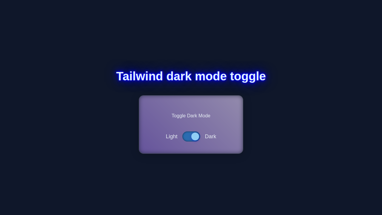
We are going to craft a truly beautiful, custom Tailwind Dark Mode Toggle switch. It will feel modern and be perfectly responsive. Integrating it into any of your projects will be a breeze. Imagine users effortlessly switching between light and dark themes! This adds professionalism. It also brings great accessibility. Learning to build this is incredibly rewarding. Let’s make something awesome together!
HTML Structure
First, let’s lay down the foundational HTML. This defines essential elements for our toggle. We’ll use a simple div as our main container. Inside, we’ll place an input checkbox. This checkbox is the real brains behind the toggle. We’ll also add a span element. This span visually represents the sliding ‘thumb’. Our structure keeps code clean and semantic. Here’s what our basic HTML looks like. It’s surprisingly straightforward!
index.html
<!DOCTYPE html>
<html lang="en">
<head>
    <meta charset="UTF-8">
    <meta name="viewport" content="width=device-width, initial-scale=1.0">
    <title>Tailwind Dark Mode Toggle</title>
    <!-- Include Tailwind CSS Play CDN for quick setup -->
    <script src="https://cdn.tailwindcss.com"></script>
    <!-- Configure Tailwind for JIT mode and 'class' dark mode strategy -->
    <script>
        tailwind.config = {
            darkMode: 'class', // Enable dark mode based on 'dark' class on <html>
            theme: {
                extend: {},
            }
        }
    </script>
    <!-- Link to your custom styles (optional, for base styles or overrides) -->
    <link rel="stylesheet" href="styles.css">
    <!-- Link to your JavaScript file -->
    <script src="script.js" defer></script>
</head>
<!--
    The 'dark' class on the <html> element (managed by script.js)
    will trigger Tailwind's dark mode styles.
    Transition colors for a smoother dark/light mode change.
-->
<body class="bg-white text-gray-900 transition-colors duration-300 dark:bg-gray-900 dark:text-gray-100 min-h-screen flex items-center justify-center p-4">

    <!-- Component Container: A styled card -->
    <div class="bg-white dark:bg-gray-800 shadow-xl rounded-2xl p-8 transform hover:scale-105 transition-transform duration-300 w-full max-w-md border border-gray-200 dark:border-gray-700">
        <h1 class="text-3xl font-bold text-center mb-6 text-gray-800 dark:text-gray-100">Dark Mode Toggle</h1>

        <!-- Toggle Switch Section -->
        <div class="flex items-center justify-center space-x-4">
            <span class="text-gray-600 dark:text-gray-300 text-lg font-medium">Light</span>
            <label for="darkModeToggle" class="relative inline-flex items-center cursor-pointer">
                <!-- Hidden checkbox is the actual control -->
                <input type="checkbox" id="darkModeToggle" class="sr-only peer">

                <!-- The visual track of the toggle switch -->
                <div class="w-16 h-9 bg-gray-600 rounded-full peer-checked:bg-blue-700 peer-focus:outline-none peer-focus:ring-4 peer-focus:ring-blue-300 dark:peer-focus:ring-blue-800 transition-all duration-300 ease-in-out flex items-center justify-between px-2">
                    <!-- Sun Icon (visible in light mode, hidden in dark mode) -->
                    <svg class="h-5 w-5 text-yellow-300 peer-checked:text-gray-600 opacity-100 peer-checked:opacity-0 transition-opacity duration-300" xmlns="http://www.w3.org/2000/svg" fill="none" viewBox="0 0 24 24" stroke-width="2" stroke="currentColor">
                        <path stroke-linecap="round" stroke-linejoin="round" d="M12 3v2.25m6.364.386l-1.591 1.591M21 12h-2.25m-.386 6.364l-1.591-1.591M12 18v2.25m-6.364-.386l1.591-1.591M3 12H5.25m-.386-6.364l1.591-1.591M12 12a3 3 0 110-6 3 3 0 010 6zm0 6a9 9 0 100-18 9 9 0 000 18z" />
                    </svg>
                    <!-- Moon Icon (hidden in light mode, visible in dark mode) -->
                    <svg class="h-5 w-5 text-gray-300 peer-checked:text-blue-300 opacity-0 peer-checked:opacity-100 transition-opacity duration-300" xmlns="http://www.w3.org/2000/svg" fill="none" viewBox="0 0 24 24" stroke-width="2" stroke="currentColor">
                        <path stroke-linecap="round" stroke-linejoin="round" d="M21.752 15.002A9.718 9.718 0 0112 21.75c-1.631 0-3.232-.414-4.664-1.196L10.5 12 8.136 4.793A9.754 9.754 0 0112 2.25c5.385 0 9.75 4.365 9.75 9.75 0 1.066-.192 2.091-.55 3.002z" />
                    </svg>
                    <!-- The sliding thumb of the toggle switch -->
                    <span class="absolute left-1 top-1 bg-white w-7 h-7 rounded-full transition-transform duration-300 ease-in-out peer-checked:translate-x-7 shadow-md dark:bg-gray-200"></span>
                </div>
            </label>
            <span class="text-blue-700 dark:text-blue-300 text-lg font-medium peer-checked:font-bold">Dark</span>
        </div>
        <p class="mt-8 text-center text-sm text-gray-500 dark:text-gray-400">Your preference is saved locally.</p>
    </div>

</body>
</html>
CSS Styling
Now for the incredible power of Tailwind CSS! We won’t write traditional CSS. Instead, we’ll leverage Tailwind’s brilliant utility classes. We’ll apply these directly within our HTML. These classes handle everything. Think spacing, vibrant colors, smooth transitions, and subtle shadows. Tailwind makes styling unbelievably fast. It’s incredibly efficient. It streamlines your design process. Let’s make our custom toggle switch look absolutely stunning. You’ll see how quickly it comes to life!
styles.css
/*
 * Custom Styles for Tailwind Dark Mode Toggle Tutorial
 *
 * This file is for any custom CSS you might want to add that isn't
 * handled by Tailwind's utility classes, or for overriding default
 * browser styles. For this tutorial, we're primarily leveraging Tailwind's
 * utility classes in index.html.
 *
 */

/* Basic reset and font settings */
html {
    box-sizing: border-box;
    font-family: Arial, Helvetica, sans-serif; /* Safe font stack */
}
*,
*::before,
*::after {
    box-sizing: inherit;
}

body {
    -webkit-font-smoothing: antialiased;
    -moz-osx-font-smoothing: grayscale;
}

/*
 * Note: Tailwind CSS will generate and apply many styles directly
 * from your utility classes. The styles above are general defaults
 * for good practice, but for the actual component styling, refer
 * to the utility classes in index.html.
 */
JavaScript
Next, we’ll bring our beautiful toggle switch to life. We’ll use elegant JavaScript. This crucial code handles all switching logic. It detects every user click on our checkbox. Then, it intelligently updates the page theme. Importantly, it will remember the user’s preferred theme. This ensures a consistent experience every time! Don’t worry if JavaScript feels new. We’ll break down each part step-by-step. Here’s the JavaScript magic that makes our toggle truly tick:
script.js
/**
 * Dark Mode Toggle Script
 * Manages the dark mode state using localStorage and applies/removes
 * the 'dark' class to the <html> element.
 */

document.addEventListener('DOMContentLoaded', () => {
    const toggle = document.getElementById('darkModeToggle');
    const html = document.documentElement; // Target the <html> element for the 'dark' class

    /**
     * Applies the dark mode class to the HTML element and updates the toggle state.
     * @param {boolean} isDark - True to enable dark mode, false for light mode.
     */
    function applyDarkMode(isDark) {
        if (isDark) {
            html.classList.add('dark');
        } else {
            html.classList.remove('dark');
        }
        if (toggle) {
            toggle.checked = isDark; // Update toggle's visual state
        }
    }

    /**
     * Saves the dark mode preference to localStorage.
     * @param {boolean} isDark - The current dark mode state.
     */
    function savePreference(isDark) {
        localStorage.setItem('darkMode', isDark ? 'true' : 'false');
    }

    // 1. Check for a saved preference in localStorage on page load
    const savedPreference = localStorage.getItem('darkMode');
    if (savedPreference === 'true') {
        applyDarkMode(true);
    } else if (savedPreference === 'false') {
        applyDarkMode(false);
    } else if (window.matchMedia('(prefers-color-scheme: dark)').matches) {
        // 2. If no saved preference, check the system's preferred color scheme
        applyDarkMode(true);
    } else {
        // 3. Default to light mode if no preference found anywhere
        applyDarkMode(false);
    }

    // Add event listener to the toggle switch if it exists
    if (toggle) {
        toggle.addEventListener('change', (event) => {
            const isChecked = event.target.checked;
            applyDarkMode(isChecked);
            savePreference(isChecked);
        });
    }

    // Optional: Listen for system preference changes (e.g., user changes OS theme)
    // This will only react if the user hasn't explicitly set a preference in the app
    window.matchMedia('(prefers-color-scheme: dark)').addEventListener('change', (event) => {
        if (localStorage.getItem('darkMode') === null) {
             applyDarkMode(event.matches);
             // We don't save to localStorage here to allow system preference to flow through freely
        }
    });
});
How It All Works Together
Alright, you’ve meticulously pieced together the HTML. You’ve applied gorgeous Tailwind CSS. You’ve added smart JavaScript. Now, let’s connect all the dots! We’ll explore how these three core technologies collaborate seamlessly. Each part plays a crucial role. Together, they create our dynamic and user-friendly dark mode toggle. You’re going to be amazed at the smooth integration.
Setting Up the Visuals with HTML and Tailwind
Our HTML provides the structure. It’s a label element, acting as a container. Inside, it holds our hidden input checkbox. There’s also a span for the visual switch. Tailwind CSS then applies the visual flair. We use classes like relative, w-14, h-8, and rounded-full on the main container. This gives our toggle its perfect shape. bg-gray-200 sets the light mode background. Crucially, peer-checked:bg-purple-600 changes the background when active. It switches to our dark mode color. We even add shadow-md for depth. Building elements with such precision is a Tailwind strength. Remember how effortlessly we styled that gorgeous Glassmorphism Card? Tailwind utility classes truly make complex styling a breeze. All without custom CSS!
The Intelligent JavaScript Toggle Logic
Here’s where interactivity happens. Our JavaScript listens for change events on our hidden checkbox. When you click the toggle, that event fires. The script quickly checks if the checkbox is checked. If it is, we dynamically add the dark class. This goes to the document.documentElement element (your <html> tag). If unchecked, we remove that dark class. Tailwind CSS then automatically applies its dark: variant styles. This happens when that dark class is present. It’s a beautifully integrated system!
Persisting User Preferences with LocalStorage
A fantastic user experience means remembering choices. We achieve this using localStorage. This browser feature saves small bits of information. It stores them directly in the user’s browser. When the page loads, our JavaScript checks localStorage for a theme preference. If it finds ‘dark’, it instantly applies the dark class. This ensures your website always loads with the user’s last chosen theme. No more frustrating resets every visit!
Enhancing Interaction with Tailwind’s Peers and Transitions
You noticed peer and peer-checked classes in Tailwind. These are incredibly clever! They style a sibling element. This styling is based on the state of another element. Think our hidden checkbox! This creates that wonderful visual sliding effect of the toggle’s ‘thumb’. We also add transition classes. These provide a smooth and elegant animation. This makes the interaction feel responsive and professional. For more granular control over responsive designs, explore Tailwind Custom Breakpoints. They can give you even more design power!
Pro Tip: While
localStorageis fantastic for persisting simple user preferences like theme choices, always remember it’s client-side storage. Never store sensitive or critical user data here!
To truly master localStorage, I highly recommend the official MDN Web Docs on localStorage. It’s a powerful browser API. For a deeper understanding of smooth UI movements, explore the comprehensive CSS Transitions on CSS-Tricks guide. You’ll unlock a world of animation possibilities!
Tips to Customise It
You’ve built a fantastic dark mode toggle! That’s a huge achievement. Now, let’s think about ways to make it uniquely yours:
- Personalize the Colors: Tailwind makes color customization incredibly straightforward. Swap out
bg-purple-600orbg-gray-200with any other color utility. Perhaps a calmingblue-500for dark mode? Or a vibrantteal-400? - Incorporate Fun Icons: Instead of a plain switch, embed delightful icons! Use a bright sun for light mode. Add a serene moon for dark mode. SVG images work wonderfully. Or an icon library like Font Awesome.
- Experiment with More Animations: Don’t stop at simple transitions! Explore more advanced Tailwind
transition,transform, andanimationutility classes. Make the toggle’s ‘thumb’ ‘pop’ out. Or make it ‘slide’ with a custom easing. Get creative! - Integrate with a Full Layout: Consider how this beautiful toggle fits into a larger design. Maybe it finds its perfect home in your navigation bar? Or perhaps nestled within a user settings panel? Thinking about layout is crucial. This is similar to planning elements for a Tailwind Dashboard Layout. Placement truly impacts user experience.
Conclusion
Wow, you’ve done it! You just built a fully functional, incredibly sleek Tailwind Dark Mode Toggle from scratch. That’s something to be incredibly proud of! You’ve expertly learned how to combine HTML, Tailwind CSS utilities, and JavaScript. You created a truly dynamic and user-friendly feature. This is a huge, valuable step. It makes your web projects more modern, accessible, and engaging. Celebrate this fantastic achievement! Now, go forth and confidently add this awesome toggle to your next project. We absolutely can’t wait to see the amazing things you’ll create. Don’t forget to share your work with us!