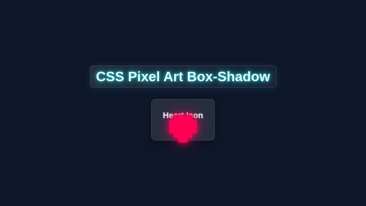
CSS Pixel Art Box-Shadow: Master HTML & CSS Techniques
Hey there, fellow coders! Have you ever wanted to build some charming retro graphics but felt lost? Today, we will dive into the awesome world of CSS Pixel Art. We’ll create cool pixel characters using just HTML and CSS. It is a fantastic way to sharpen your CSS skills. You will be amazed at what box-shadow can do!
What We Are Building: Your First CSS Pixel Art Character
We are going to craft a delightful pixel art character. Think classic 8-bit game sprites. This project uses the clever box-shadow property. It helps us draw each pixel with pure CSS. You will learn to make intricate designs easily. Plus, it is super fun and visually rewarding! This technique is also great for understanding CSS positioning.
HTML Structure
Our HTML will be wonderfully simple. We need a single div element. This div acts as our canvas for the pixel art. It will hold all the magic. The CSS will then take over to create our character. Don’t worry, we are keeping it clean and minimal.
index.html
<!DOCTYPE html>
<html lang="en">
<head>
    <meta charset="UTF-8">
    <meta name="viewport" content="width=device-width, initial-scale=1.0">
    <title>CSS Pixel Art Box-Shadow Tutorial</title>
    <link rel="stylesheet" href="styles.css">
</head>
<body>
    <div class="pixel-art-container">
        <h1>CSS Pixel Art Heart</h1>
        <div class="pixel-art-canvas"></div>
    </div>
</body>
</html>
CSS Styling
Now for the exciting part: the CSS! This is where our pixel character comes to life. We will style our main div to be a small square. Then, we will use box-shadow repeatedly. Each shadow creates a new “pixel”. It’s like painting with code! This method is powerful and surprisingly flexible.
styles.css
/* Base styles for the page */
body {
    margin: 0;
    padding: 0;
    font-family: Arial, Helvetica, sans-serif; /* Using a safe, widely available font */
    background-color: #1a1a2e; /* A dark, calm background */
    display: flex;
    justify-content: center;
    align-items: center;
    min-height: 100vh;
    box-sizing: border-box; /* Ensures padding and border are included in the element's total width and height */
    overflow: hidden; /* Prevent scrollbars */
    color: #f0f0f0; /* Light text color for contrast */
}

/* Container for the pixel art, helps with centering and general layout */
.pixel-art-container {
    display: flex;
    flex-direction: column;
    align-items: center;
    background-color: #2c2c4a; /* Slightly lighter dark background for the container */
    padding: 30px;
    border-radius: 10px;
    box-shadow: 0 5px 15px rgba(0, 0, 0, 0.4);
    max-width: 100%; /* Ensure it fits smaller screens */
    width: fit-content; /* Adjust width to content */
}

.pixel-art-container h1 {
    margin-top: 0;
    margin-bottom: 30px;
    color: #b3e0ff; /* Light blue heading */
    text-align: center;
    font-size: 2em;
}

/* The core element for our pixel art */
.pixel-art-canvas {
    --pixel-size: 10px; /* Define the size of each individual pixel */
    --pixel-color: #FF4081; /* A vibrant pink/red for the pixel art */

    width: 0; /* The element itself has no visible size */
    height: 0; /* All pixels are created via box-shadow */
    position: relative; /* Useful for precise positioning or transforms if needed */

    /* Each box-shadow layer creates one "pixel" */
    /* Format: h-offset v-offset blur-radius spread-radius color */
    /* For pixel art, blur-radius is 0, and spread-radius is --pixel-size */

    /* HEART SHAPE (5x5 grid, centered) */
    /*
      . X . X .
      X X X X X
      X X X X X
      . X X X .
      . . X . .
    */

    box-shadow:
        /* Row Y = -2 (top row, 2 pixels) */
        calc(var(--pixel-size) * -1) calc(var(--pixel-size) * -2) 0 var(--pixel-size) var(--pixel-color), /* Pixel at (-1, -2) */
        calc(var(--pixel-size) * 1) calc(var(--pixel-size) * -2) 0 var(--pixel-size) var(--pixel-color),  /* Pixel at (1, -2) */

        /* Row Y = -1 (second row, 5 pixels) */
        calc(var(--pixel-size) * -2) calc(var(--pixel-size) * -1) 0 var(--pixel-size) var(--pixel-color), /* Pixel at (-2, -1) */
        calc(var(--pixel-size) * -1) calc(var(--pixel-size) * -1) 0 var(--pixel-size) var(--pixel-color), /* Pixel at (-1, -1) */
        0 calc(var(--pixel-size) * -1) 0 var(--pixel-size) var(--pixel-color),                           /* Pixel at (0, -1) */
        calc(var(--pixel-size) * 1) calc(var(--pixel-size) * -1) 0 var(--pixel-size) var(--pixel-color), /* Pixel at (1, -1) */
        calc(var(--pixel-size) * 2) calc(var(--pixel-size) * -1) 0 var(--pixel-size) var(--pixel-color), /* Pixel at (2, -1) */

        /* Row Y = 0 (middle row, 5 pixels) */
        calc(var(--pixel-size) * -2) 0 0 var(--pixel-size) var(--pixel-color),                           /* Pixel at (-2, 0) */
        calc(var(--pixel-size) * -1) 0 0 var(--pixel-size) var(--pixel-color),                           /* Pixel at (-1, 0) */
        0 0 0 var(--pixel-size) var(--pixel-color),                                                      /* Pixel at (0, 0) - This is the central pixel */
        calc(var(--pixel-size) * 1) 0 0 var(--pixel-size) var(--pixel-color),                           /* Pixel at (1, 0) */
        calc(var(--pixel-size) * 2) 0 0 var(--pixel-size) var(--pixel-color),                           /* Pixel at (2, 0) */

        /* Row Y = 1 (fourth row, 3 pixels) */
        calc(var(--pixel-size) * -1) calc(var(--pixel-size) * 1) 0 var(--pixel-size) var(--pixel-color), /* Pixel at (-1, 1) */
        0 calc(var(--pixel-size) * 1) 0 var(--pixel-size) var(--pixel-color),                           /* Pixel at (0, 1) */
        calc(var(--pixel-size) * 1) calc(var(--pixel-size) * 1) 0 var(--pixel-size) var(--pixel-color), /* Pixel at (1, 1) */

        /* Row Y = 2 (bottom row, 1 pixel) */
        0 calc(var(--pixel-size) * 2) 0 var(--pixel-size) var(--pixel-color);                           /* Pixel at (0, 2) */

    /* Optional: Add a subtle glow effect to the entire pixel art */
    filter: drop-shadow(0 0 5px var(--pixel-color)) drop-shadow(0 0 15px rgba(255, 64, 129, 0.4));
}
How It All Works Together: Mastering CSS Pixel Art with Box-Shadow
Let’s now unravel the delightful mechanics behind our character. Understanding these pieces empowers you to craft any pixel design you imagine. We are truly flexing our CSS muscles here. This entire process is a brilliant demonstration of CSS creativity.
The Foundation: Your Single Pixel div
Every pixel art creation needs a starting point. For us, it is a single div element. We define this div with a very small width and height. Think of 2px or 4px as good starting dimensions. This tiny square is our “origin pixel”. It’s the central point from which all other pixels extend. We then give this div a specific background-color. This sets the color of our very first pixel. This base div is simple, yet it holds all the power for what’s next. It acts as the anchor for our elaborate design.
Crafting Pixels with the Mighty box-shadow
Here is where the magic truly unfolds! The box-shadow property is usually for making subtle shadows. But we are using it to draw individual pixels. Each value in box-shadow creates a new pixel. It needs three main things: an X offset, a Y offset, and a color. For example, 2px 0px 0 red means a red pixel. It is located 2px to the right of our base element.
You can chain multiple box-shadow values. Just separate them with a comma. This allows you to build complex shapes. Every single pixel in our character is a box-shadow layer. It’s like having a grid and coloring each square. This method generates the entire CSS Pixel Art character. It is an incredibly versatile and powerful technique. This approach keeps your HTML minimal and clean.
Pro Tip: Visualize your design on a grid first. Each square on your grid corresponds to a
box-shadowentry. Positive X values move your pixel right. Positive Y values move it down. Negative values do the opposite. This systematic approach simplifies complex designs.
Strategic Positioning for Your Artwork
Proper placement on the page is important. We can make sure our pixel art looks great. We often use position: relative on the main container. This helps if we need to adjust child elements later. A common practice is centering our artwork. We can use display: flex on the body or a wrapper element. Then add justify-content: center and align-items: center. This places our character perfectly in the middle.
Sometimes you need even more control. You might combine these with margin: auto on the character itself. These methods give you precise control. They ensure your pixel masterpiece is always visible. If you’re keen on exploring more advanced layout techniques, you might enjoy this guide: CSS Grid Masonry Gallery: Pure HTML & CSS Layout Tutorial. It covers many ways to arrange content effectively.
Scaling for Clarity and Impact
Your initial 2px pixels might seem too small. They can get lost on larger screens. This is an easy fix! We can scale our entire character. Apply the transform: scale() property. Use it on the container element. For instance, transform: scale(10) makes everything ten times larger. This keeps your pixel art sharp and clear. It avoids blurry images that come from traditional scaling. Your retro designs will look fantastic. They will shine on any device, from mobile to desktop. This scaling maintains true pixel fidelity.
The Synergy: How It All Comes Together
So, how does it all interact? We start with that tiny div. It is our canvas’s initial pixel. Then, we meticulously define every other pixel. We use a long list of box-shadow entries. Each entry tells CSS exactly where a pixel should go. It also tells CSS what color it should be. Imagine drawing a picture one dot at a time. This is exactly what we are doing! But we are doing it all with pure CSS code. This process is surprisingly powerful. It’s also very efficient, requiring almost no HTML markup.
Friendly Reminder: Don’t let the long string of
box-shadowvalues intimidate you. Each comma-separated entry is simply one more pixel. Break down your design into these individual points. You’ll soon find a rhythm in mapping out your artwork.
Tips to Customise Your CSS Pixel Art
You have built an awesome pixel character! Now, let’s make it truly yours. These ideas will help you extend your creativity. They will also deepen your CSS knowledge.
- Unleash New Color Palettes: The easiest way to change your character’s mood is with color. Try a warm, earthy palette for a natural look. Or go for neon colors for a futuristic vibe. Simply update the
box-shadowcolors in your CSS. You can even create color variables. This makes changing palettes much faster. Experiment to find your perfect scheme. - Design Even More Characters: Your imagination is the limit! Try drawing a simple ghost figure. Or perhaps a tiny alien spaceship. Start by sketching your design on graph paper. Each square represents a
box-shadowpixel. Then translate those coordinates into CSS. This systematic approach makes complex designs manageable. You will quickly build a gallery of pixel friends. - Animate Your Pixel Creation: Bring your character to life with CSS animations! Make its eyes blink. Or give it a subtle idle sway. Use the
animationproperty. Then define your movements with@keyframes. Imagine a small jump or a little dance. Animation adds so much personality to your art. It’s a fantastic next step in your CSS journey. If you want to dive deeper into animations, CSS-Tricks has an excellent guide on theanimationproperty. - Make It Truly Responsive: Ensure your pixel art looks fantastic on all screen sizes. Use
transform: scale()within media queries. You could also explorevworvhunits for your pixel sizes. This ensures your design scales gracefully. It stays crisp on tiny phone screens and huge desktop monitors. For more advanced responsive techniques, explore our guide on building a Tailwind Responsive Navbar: Build with HTML & CSS Only. - Interactive Elements: Add some JavaScript for simple interactions. Maybe clicking the character changes its color. Or hovering over it makes it “wake up.” This adds a layer of engagement. It turns your static art into a dynamic experience. If you are curious about more dynamic UI options, check out: CSS Dynamic UI: Mastering :has() & :is() Selectors (HTML/CSS).
Conclusion
You just built some amazing CSS Pixel Art! How cool is that? You learned to harness the power of box-shadow. It creates intricate designs with minimal HTML. This skill opens up a world of creative possibilities. Keep practicing and creating your own pixel masterpieces. Share your awesome creations with us! We would love to see what you build. Happy coding!