Hey there, awesome coder! If you have wanted to build a Tailwind Dark Mode Toggle but had no idea where to start, you are absolutely in the right place. We are going to build a super robust and good-looking dark mode switcher today. Plus, we’ll use Tailwind CSS v4 to make styling a breeze. Imagine giving your users complete control over their visual experience. That is pretty cool, right?
This tutorial will guide you step-by-step through the process. You will create a functional, persistent toggle. Therefore, your websites will look amazing in both light and dark themes. Let’s get coding!
What We Are Building: A Sleek Tailwind Dark Mode Toggle
We are crafting a beautiful, interactive dark mode switch. It will remember your user’s preference across visits. This means a consistent experience for everyone. Our toggle will be a simple yet elegant switch. It changes smoothly between sun and moon icons. This design is clean and intuitive. Moreover, it enhances user experience without distraction. We’ll ensure it looks great and works perfectly.
Why is this feature so useful? Many users strongly prefer dark mode. It significantly reduces eye strain, especially at night. Furthermore, it helps save battery life on devices with OLED screens. Offering this choice is a big win for user satisfaction. It clearly shows you care about your users’ comfort. Indeed, it’s also a fantastic project to boost your frontend development skills.
HTML Structure: Setting Up Our Toggle’s Foundation
First things first, we need some basic HTML. This structure will create the foundation for our toggle switch. It is a simple `div` acting as a container. Inside, we’ll place an `input` checkbox. We also need a `label` element. The label will serve as the actual visual part of our switch. Don’t worry, it’s quite simple to understand! We’ll style it with Tailwind CSS. Then, we’ll bring it to life with a bit of custom CSS.
index.html
<!DOCTYPE html>
<html lang="en">
<head>
<meta charset="UTF-8">
<meta name="viewport" content="width=device-width, initial-scale=1.0">
<title>Tailwind CSS v4 Dark Mode Toggle</title>
<!--
Link to your compiled Tailwind CSS.
This file (e.g., dist/output.css) is generated by the Tailwind CLI.
Make sure to run the compilation command (e.g., `npx tailwindcss -i ./styles.css -o ./dist/output.css --watch`).
-->
<link rel="stylesheet" href="./dist/output.css">
<style>
/*
Optional: Basic global styles for safe fonts and layout consistency.
These ensure cross-browser compatibility and adherence to rules (e.g., no scrollbars).
Tailwind's base styles already handle much of this, but explicit definition is robust.
*/
body {
font-family: Arial, Helvetica, sans-serif;
box-sizing: border-box;
max-width: 100%;
overflow-x: hidden; /* Prevent horizontal scrollbars */
}
/* Ensure max-width: 100% and box-sizing for all elements */
* {
box-sizing: border-box;
max-width: 100%;
}
</style>
</head>
<body class="bg-gray-50 text-gray-900 dark:bg-gray-900 dark:text-gray-100 min-h-screen flex flex-col items-center justify-center p-4 transition-colors duration-300">
<!-- Dark Mode Toggle Button -->
<button id="themeToggle" class="absolute top-4 right-4 bg-gray-200 dark:bg-gray-700 text-gray-800 dark:text-gray-200 py-2 px-4 rounded-full shadow-lg transition-colors duration-300 hover:bg-gray-300 dark:hover:bg-gray-600 focus:outline-none focus:ring-2 focus:ring-gray-400 dark:focus:ring-gray-500">
Toggle Dark Mode
</button>
<!-- Main Content Card -->
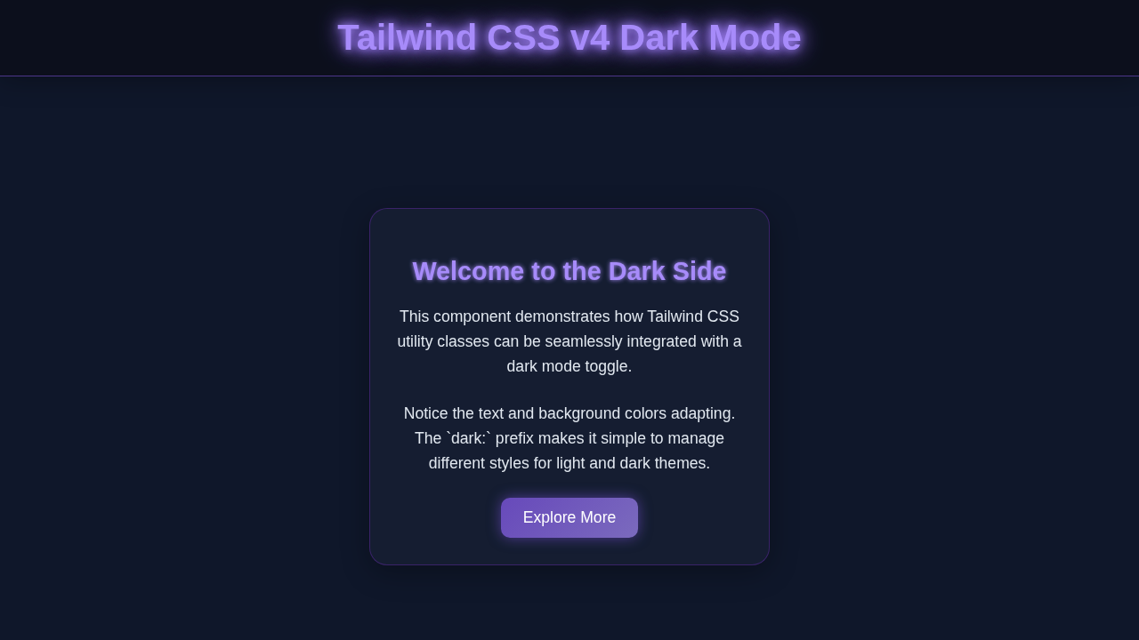
<div class="bg-white dark:bg-gray-800 p-8 rounded-lg shadow-xl max-w-md w-full text-center transition-colors duration-300">
<h1 class="text-3xl font-bold mb-4 text-indigo-700 dark:text-indigo-400">
Welcome to Tailwind Dark Mode
</h1>
<p class="mb-6 text-gray-700 dark:text-gray-300">
This is a simple demonstration of how to implement dark mode using Tailwind CSS utility classes and a JavaScript toggle.
Notice how the background, text, and card colors change.
</p>
<div class="flex flex-col gap-4">
<input type="text" placeholder="Your Name" class="p-3 rounded-md border border-gray-300 dark:border-gray-600 bg-gray-100 dark:bg-gray-700 text-gray-900 dark:text-gray-100 focus:outline-none focus:ring-2 focus:ring-indigo-500 dark:focus:ring-indigo-400 transition-colors duration-300">
<button class="bg-indigo-600 dark:bg-indigo-500 text-white font-semibold py-3 px-6 rounded-md hover:bg-indigo-700 dark:hover:bg-indigo-600 focus:outline-none focus:ring-2 focus:ring-indigo-500 dark:focus:ring-indigo-400 transition-colors duration-300">
Submit
</button>
</div>
</div>
<script src="./script.js"></script>
</body>
</html>CSS Styling: Making Our Toggle Shine with Tailwind CSS v4
Next, we will apply some important styles. We’re primarily using Tailwind CSS utility classes for the general layout. These classes handle most of the positioning and base colors. However, for the intricate animation of the switch itself, we’ll add a tiny bit of custom CSS. This ensures a polished, smooth transition effect. It will truly make our toggle stand out.
We will harness Tailwind’s powerful `dark:` variant for theme-specific styles. This feature is super robust. It allows us to define different styles based on whether the `dark` class is present on the `html` tag. It’s a game-changer for responsive and dynamic themes. For instance, `dark:bg-gray-800` will only apply in dark mode. If you want to dive deeper into how Tailwind handles styling compared to traditional methods, be sure to check out our article on Tailwind CSS vs Plain CSS: The Ultimate Comparison Thumbnail. It offers great insights.
styles.css
/* styles.css */
/*
   This file is your input CSS for Tailwind CSS.
   It imports Tailwind's base, components, and utility styles.

   To compile this into an output file (e.g., dist/output.css),
   run the Tailwind CLI command:
   `npx tailwindcss -i ./styles.css -o ./dist/output.css --watch`
   (Make sure you have Tailwind CSS installed: `npm install -D tailwindcss`)
*/

/* Import Tailwind's base styles, which include normalization and default styles. */
@tailwind base;

/* Import Tailwind's component-specific styles (e.g., for buttons, cards, etc. if you use @apply). */
@tailwind components;

/* Import Tailwind's utility classes (e.g., `text-blue-500`, `flex`, `p-4`). */
@tailwind utilities;

/*
   Add any custom global styles here that cannot be achieved with Tailwind utilities,
   or which you prefer to keep as global CSS.
*/

/* Ensure `box-sizing: border-box` is applied globally for consistent layout. */
html {
  box-sizing: border-box;
}
*,
*::before,
*::after {
  box-sizing: inherit;
}

/*
   Ensure safe fonts are used for consistency with the component rules.
   Tailwind's `font-sans` default includes these, but explicit definition here is good.
*/
body {
  font-family: Arial, Helvetica, sans-serif;
}
JavaScript: Bringing Interactivity to Life
Now for the fun part: JavaScript! This is where our toggle becomes truly interactive. We will add an event listener to our checkbox. It will detect when the user flips the switch. Crucially, we also need to save the user’s preference. This ensures their chosen theme persists across visits to your site. We will use `localStorage` for this. It is a simple, effective, and client-side method. Consequently, their dark mode choice will be remembered. This creates a seamless user experience.
tailwind.config.js
// tailwind.config.js
/** @type {import('tailwindcss').Config} */
module.exports = {
  // Configure dark mode to be controlled by a 'dark' class on the HTML element.
  // This allows manual toggling using JavaScript.
  darkMode: 'class',
  content: [
    "./index.html",
    // Add other paths to your template files here, e.g.,
    // "./src/**/*.{js,ts,jsx,tsx}",
  ],
  theme: {
    extend: {
      // You can extend Tailwind's default theme here.
      // For example, adding custom colors, fonts, etc.
      fontFamily: {
        sans: ['Arial', 'Helvetica', 'sans-serif'], // Ensure safe fonts
      },
      colors: {
        // Example custom colors if needed
        // 'primary': '#6366f1', // Indigo-500
        // 'dark-primary': '#4f46e5', // Indigo-600
      }
    },
  },
  plugins: [
    // Add any Tailwind CSS plugins here.
    // require('@tailwindcss/forms'),
    // require('@tailwindcss/typography'),
  ],
}
script.js
// script.js
document.addEventListener('DOMContentLoaded', () => {
    const themeToggle = document.getElementById('themeToggle');
    const htmlElement = document.documentElement; // This refers to the <html> tag

    // 1. Check for user's system preference on initial load
    // This is optional if you always want to start with a specific theme or localStorage
    const prefersDarkScheme = window.matchMedia("(prefers-color-scheme: dark)");

    // 2. Check localStorage for a saved theme preference
    // 'dark' | 'light' | null (if not set)
    const currentTheme = localStorage.getItem('theme');

    // Function to apply the theme to the HTML element
    function applyTheme(theme) {
        if (theme === 'dark') {
            htmlElement.classList.add('dark');
            themeToggle.textContent = 'Light Mode'; // Update button text
        } else {
            htmlElement.classList.remove('dark');
            themeToggle.textContent = 'Dark Mode'; // Update button text
        }
    }

    // Initialize theme:
    // - If localStorage has a theme, use that.
    // - Otherwise, check system preference and apply/save.
    // - Default to 'light' if no preference is found.
    if (currentTheme) {
        applyTheme(currentTheme);
    } else if (prefersDarkScheme.matches) {
        applyTheme('dark');
        localStorage.setItem('theme', 'dark'); // Save system preference as default
    } else {
        applyTheme('light');
        localStorage.setItem('theme', 'light'); // Save default as light
    }

    // Add event listener to the toggle button
    themeToggle.addEventListener('click', () => {
        if (htmlElement.classList.contains('dark')) {
            // Currently dark, switch to light
            applyTheme('light');
            localStorage.setItem('theme', 'light');
        } else {
            // Currently light, switch to dark
            applyTheme('dark');
            localStorage.setItem('theme', 'dark');
        }
    });

    // Optional: Listen for changes in system preference if no explicit user preference is set
    // This makes the site react to OS theme changes if the user hasn't manually toggled the theme.
    prefersDarkScheme.addEventListener('change', (e) => {
        // Only react to system changes if the user hasn't explicitly set a theme via the toggle
        if (!localStorage.getItem('theme')) {
            applyTheme(e.matches ? 'dark' : 'light');
        }
    });
});
How It All Works Together: A Harmonious Dance of Technologies
Let’s break down the magic behind our dark mode switcher. Every piece of our project plays a vital and interconnected role. They work together seamlessly. This creates a fully functional and delightful user experience. Understanding each part helps solidify your knowledge.
The HTML Foundation: Our Toggle’s Semantic Structure
Our HTML provides the essential building blocks. The `` is the fundamental component of our switch. It has an underlying boolean state (checked or unchecked). The `
Pro Tip: Always associate your `label` elements with their corresponding form controls. This vastly improves accessibility for all users, especially those navigating with keyboards or using assistive technologies like screen readers.
Furthermore, the `aria-label` attribute on our input is important. It provides a descriptive name for the toggle. This is vital for screen reader users. It ensures everyone understands its purpose.
Tailwind’s Magic & Custom CSS: The Visual Transformation
Tailwind CSS v4 handles our overall page theme beautifully. It also styles the container for our toggle with great efficiency. The `dark:` prefix is absolutely key here. For example, a class like `dark:bg-gray-800` means a different background color will apply only in dark mode. We achieve this by adding or removing the `dark` class from the `html` element. This class addition activates Tailwind’s dark mode specific styles. It’s truly powerful!
Our custom CSS, which is intentionally minimal, takes care of the intricate switch animation. It elegantly hides the actual checkbox input. Then, it transforms the label into a stylish, interactive toggle. It handles the smooth transitions for the background and icon positions. This creates that satisfying, professional-looking flip effect. The `position: relative` and `absolute` properties are essential here. They allow us to place the sun and moon icons precisely within the toggle’s track. This gives our toggle its distinct visual appeal. If you’re curious about different ways to use Tailwind for UI components, dive into our guide on building a Product Card Tailwind CSS: Build Responsive UI with HTML. It showcases Tailwind’s versatility.
JavaScript Brings It to Life: Remembering User Preferences
Our JavaScript acts as the clever brain of the entire operation. First, it performs an initial check of `localStorage`. It looks for any previously saved theme preference. This smart step ensures your site remembers if you prefer light or dark mode. Therefore, it applies the correct theme immediately upon page load. This provides a consistent experience right from the start. Next, it attaches a crucial event listener to our checkbox input. When the checkbox changes its state (from checked to unchecked, or vice-versa), our carefully crafted function runs.
This function performs two critical actions. It toggles the `dark` class on the `html` element (`document.documentElement`). This action visually switches the theme. Simultaneously, it updates `localStorage` with the new preference. This saves your choice for your next visit! We use `document.documentElement` to target the `html` tag directly. This is a common and highly efficient way to manipulate the root element of your document. The `classList.toggle(‘dark’)` method is super handy. It adds the `dark` class if it’s not present. Conversely, it removes it if it already exists. It’s both concise and incredibly powerful for managing classes.
Encouragement: Don’t be afraid to experiment with the JavaScript! Changing how preferences are stored, or adding animations based on the theme, can lead to exciting new features and a deeper understanding of web development.
Tips to Customise Your Robust Tailwind Dark Mode Toggle
You have just built a great dark mode toggle! That’s fantastic. Now, let’s explore ways to make it uniquely yours and fit your project’s aesthetic. Here are some inspiring ideas:
- Different Icons: Swap out the simple sun and moon `div`s for SVG icons. You could easily use a library like Heroicons or Font Awesome. This offers more professional, detailed, and varied icon choices. It can significantly elevate the toggle’s look.
- Custom Animations & Transitions: Play extensively with the CSS transitions. Make the toggle slide, bounce, or fade between states. Experiment with different `transition-duration` and `transition-timing-function` values. This allows for a truly unique and engaging feel.
- Implement System Preference: Integrate `window.matchMedia(‘(prefers-color-scheme: dark)’)`. This powerful feature automatically sets the initial theme based on the user’s operating system preference. It offers an incredibly seamless initial user experience. CSS-Tricks has an excellent article on `prefers-color-scheme` that provides more details.
- Multiple Theming Options: Instead of just `dark`, consider introducing `sepia`, `blue`, or other custom themes. You would then toggle different classes on the `html` element, perhaps using radio buttons instead of a single checkbox. This gives users even more options and control!
- Alternative Theme Persistence: While `localStorage` is great for client-side storage, you could explore other options. Instead, you could store the preference in cookies for broader browser support. Or, if you have a backend, store it in a user’s database profile. This ensures preferences follow them across different devices. For a deeper look at general Tailwind application and comparison, consider reading our article on Tailwind CSS vs Plain CSS: A Visual Comparison.
Conclusion: You Did It! Celebrate Your New Tailwind Dark Mode Toggle!
Wow, you just built a fully functional and stylish Tailwind Dark Mode Toggle! Give yourself a huge pat on the back. You have mastered a crucial and highly sought-after frontend feature. This skill will undoubtedly make your web projects stand out. Furthermore, it significantly improves the overall user experience.
You successfully tackled HTML structure, slick Tailwind CSS styling, and smart JavaScript logic. That’s a triple win for your development journey! Now go ahead. Show off your fantastic new creation. Deploy it on your next project. Share it with the amazing procoder09.com community. We absolutely can’t wait to see what incredible things you build next!