Implement Dark Mode in Your Website with Tailwind CSS: A Step-by-Step Guide
Hey there, fellow coder! If you’ve ever wanted to add a sleek Tailwind Dark Mode to your website but felt a bit lost, you are absolutely in the right place. Dark mode is a super popular feature today. It offers better eye comfort, especially in low-light conditions. Plus, it just looks incredibly modern!
We are going to build a simple page. This page will let users switch between light and dark themes. It’s easier than you might think with Tailwind CSS. We will use powerful utility classes to get this done fast. Let’s make your website shine (or dim, beautifully!).
What We Are Building: Your First Tailwind Dark Mode Toggle
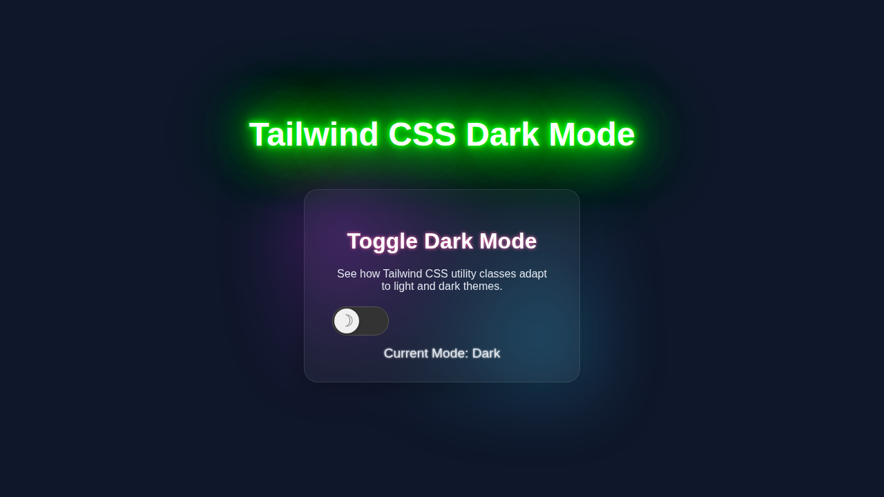
Today, we’re crafting a minimalist web page. This page will have a fantastic dark mode toggle. Imagine a clean interface that users can personalize. They can switch from a bright, airy design to a sophisticated, dark aesthetic with a single click. This isn’t just a visual trick. It’s about enhancing user experience. It’s also a cool skill to add to your developer toolkit!
We will implement Tailwind CSS’s built-in ‘class’ strategy for dark mode. This means we’ll add a ‘dark’ class to our HTML element. Tailwind then magically applies special dark mode styles. You will love how simple this process is. We are making a useful and beautiful feature.
HTML Structure: The Foundation of Our Page
Our HTML is the backbone of this entire project. It’s straightforward and easy to understand. We will set up a basic page. This page will include a header, some content, and our all-important dark mode toggle button. Don’t worry, we’ll keep it clean.
This structure helps us apply our Tailwind styles later. It also ensures accessibility for everyone. Pay close attention to the button. It’s the key to our interactive dark mode. Here is the HTML code for our page:
index.html
<!DOCTYPE html>
<html lang="en">
<head>
    <meta charset="UTF-8">
    <meta name="viewport" content="width=device-width, initial-scale=1.0">
    <title>Tailwind CSS Dark Mode Tutorial</title>
    <!-- Link to the compiled Tailwind CSS output -->
    <link rel="stylesheet" href="./output.css">
    <style>
        /* Ensure a safe system font is used and global box-sizing */
        body { font-family: Arial, Helvetica, sans-serif; box-sizing: border-box; }
        /* Prevent horizontal scrollbars, ensure full content visibility on small screens */
        html, body { margin: 0; padding: 0; overflow-x: hidden; }
        /* Limit max-width for image/media content */
        img, video, iframe { max-width: 100%; height: auto; }
    </style>
</head>
<!--
    The 'dark' class will be added/removed from the <html> element by script.js.
    Tailwind CSS then uses this class to apply dark mode styles defined with the 'dark:' prefix.
-->
<body class="bg-gray-100 dark:bg-gray-900 text-gray-900 dark:text-gray-100 transition-colors duration-300 min-h-screen flex items-center justify-center p-4">

    <div class="w-full max-w-md bg-white dark:bg-gray-800 rounded-lg shadow-xl p-8 transition-colors duration-300">
        <h1 class="text-3xl font-bold mb-6 text-center">Tailwind Dark Mode</h1>

        <div class="mb-6 flex justify-between items-center">
            <span class="text-lg font-medium">Toggle Dark Mode:</span>
            <!--
                The dark mode toggle button.
                - `bg-gray-200` is the default background for light mode.
                - `dark:bg-blue-600` is applied when the `html` element has the `dark` class.
                - The inner span controls the slider's position:
                  - `translate-x-1` for light mode (left).
                  - `dark:translate-x-6` for dark mode (right).
            -->
            <button id="darkModeToggle" class="relative inline-flex h-6 w-11 items-center rounded-full transition-colors focus:outline-none focus:ring-2 focus:ring-offset-2 focus:ring-blue-500 bg-gray-200 dark:bg-blue-600">
                <span class="sr-only">Enable dark mode</span>
                <span class="inline-block h-4 w-4 transform rounded-full bg-white transition-transform ease-in-out duration-200 translate-x-1 dark:translate-x-6"></span>
            </button>
        </div>

        <p class="mb-4 text-gray-700 dark:text-gray-300">
            This card and its content will dynamically adapt its theme based on whether dark mode is active.
            Notice how utility classes like <code class="bg-gray-200 dark:bg-gray-700 p-1 rounded text-sm">bg-white</code>,
            <code class="bg-gray-200 dark:bg-gray-700 p-1 rounded text-sm">dark:bg-gray-800</code>,
            <code class="bg-gray-200 dark:bg-gray-700 p-1 rounded text-sm">text-gray-900</code>, and
            <code class="bg-gray-200 dark:bg-gray-700 p-1 rounded text-sm">dark:text-gray-100</code> are used.
        </p>

        <div class="border-t border-gray-200 dark:border-gray-700 pt-4 mt-4">
            <h2 class="text-xl font-semibold mb-2">Example Content</h2>
            <ul class="list-disc list-inside text-gray-600 dark:text-gray-400">
                <li>List item 1 adjusts its color.</li>
                <li>List item 2 shows text in current theme.</li>
                <li>List item 3 for demonstration.</li>
            </ul>
        </div>
    </div>

    <!-- Script to handle dark mode toggle logic and persistence -->
    <script src="./script.js"></script>
</body>
</html>
CSS Styling: Harnessing Tailwind CSS Power
Here’s the cool part about using Tailwind CSS! We barely need to write any custom CSS. Tailwind does most of the heavy lifting for us. Its utility classes are incredibly powerful. They handle all the styling, including our dark mode variations. We will configure Tailwind, then let its ‘dark:’ prefix do its magic. This approach keeps our stylesheet tiny. It also makes our code super readable.
We are essentially just importing Tailwind. Then, we let it generate all the necessary styles. This is a huge benefit of using a utility-first framework. Let’s see how minimal our `style.css` file needs to be:
input.css
@tailwind base;
@tailwind components;
@tailwind utilities;
Pro Tip: Tailwind CSS’s ‘dark:’ variant automatically applies styles when the parent `html` element has the
darkclass. This is the ‘class’ strategy in action, making theme switching incredibly efficient!
JavaScript: Bringing Our Toggle to Life
Our JavaScript will handle the interactivity. It listens for clicks on our toggle button. Then, it applies or removes the ‘dark’ class from the `` element. This script also saves the user’s preference. It uses `localStorage` for this. So, their choice remembers for next time. It’s a small script, but it does big things!
We’ll ensure the page loads with the correct theme. This depends on what the user last picked. It makes for a smooth user experience. Here is the JavaScript code:
package.json
{
  "name": "tailwind-dark-mode-tutorial",
  "version": "1.0.0",
  "description": "A complete tutorial for implementing dark mode with Tailwind CSS utility classes.",
  "main": "index.html",
  "scripts": {
    "dev": "npx tailwindcss -i ./input.css -o ./output.css --watch",
    "build": "npx tailwindcss -i ./input.css -o ./output.css --minify"
  },
  "keywords": [
    "tailwind",
    "dark-mode",
    "css",
    "html",
    "tutorial"
  ],
  "author": "CodeEducator",
  "license": "MIT",
  "devDependencies": {
    "autoprefixer": "^10.4.19",
    "postcss": "^8.4.38",
    "tailwindcss": "^3.4.3"
  }
}
tailwind.config.js
/** @type {import('tailwindcss').Config} */
module.exports = {
  // Configure dark mode to use a class, specifically 'dark' on the html element.
  darkMode: 'class',
  content: [
    "./index.html",
    "./script.js",
  ],
  theme: {
    extend: {},
  },
  plugins: [],
}
script.js
document.addEventListener('DOMContentLoaded', () => {
    const darkModeToggle = document.getElementById('darkModeToggle');
    const htmlElement = document.documentElement; // Represents the <html> tag

    // Function to apply the chosen theme to the HTML element
    function applyTheme(theme) {
        if (theme === 'dark') {
            htmlElement.classList.add('dark');
        } else {
            htmlElement.classList.remove('dark');
        }
    }

    // 1. Determine the initial theme when the page loads:
    const savedTheme = localStorage.getItem('theme');
    if (savedTheme) {
        // If a theme is saved in localStorage, use it
        applyTheme(savedTheme);
    } else {
        // If no preference is saved, check the user's system preference
        if (window.matchMedia && window.matchMedia('(prefers-color-scheme: dark)').matches) {
            applyTheme('dark');
        } else {
            applyTheme('light'); // Default to light mode if system preference is not dark or not available
        }
    }

    // 2. Add an event listener to the toggle button
    darkModeToggle.addEventListener('click', () => {
        const isCurrentlyDark = htmlElement.classList.contains('dark');
        if (isCurrentlyDark) {
            // If currently dark, switch to light
            applyTheme('light');
            localStorage.setItem('theme', 'light'); // Save preference
        } else {
            // If currently light, switch to dark
            applyTheme('dark');
            localStorage.setItem('theme', 'dark'); // Save preference
        }
    });

    // 3. Optional: Listen for system theme changes (e.g., user changes OS theme)
    window.matchMedia('(prefers-color-scheme: dark)').addEventListener('change', (e) => {
        // Only react to system changes if the user hasn't explicitly set a preference
        if (!localStorage.getItem('theme')) {
            applyTheme(e.matches ? 'dark' : 'light');
        }
    });
});
How It All Works Together: Decoding the Magic
You’ve seen the code, but how does it truly create that smooth dark mode experience? Let’s break it down piece by piece. Understanding the workflow helps you customize it later. This process combines HTML, Tailwind, and a dash of JavaScript. It’s a perfect example of modern web development working together.
The HTML Structure and Tailwind’s `dark:` Prefix
First, our `` tag is super important. We set its default background and text colors. For example, bg-white text-gray-800. This is our light theme base. However, we also add specific `dark:` utility classes. An example is dark:bg-gray-900 dark:text-gray-100. These are the styles for dark mode. Tailwind CSS intelligently watches the `` element. If it detects the `dark` class there, it switches to these `dark:` prefixed styles. This system is efficient. It saves a lot of manual CSS writing. It’s also easy to manage. You define both states in one place.
Toggling the `dark` Class with JavaScript
Our JavaScript is the brain behind the switch. When you click the moon/sun icon, the `toggleDarkMode()` function runs. This function grabs the `` element. It checks if the `dark` class is currently present. If it is, JavaScript removes `dark`. This sends us back to the light theme. If `dark` is not there, JavaScript adds it. This activates the dark theme. It also updates the icon to reflect the new state. This simple toggle creates a powerful visual change. It’s an instant update for your users.
You might be interested in a more detailed look at the JavaScript. For that, check out our guide on Tailwind Dark Mode Toggle with HTML & JS: A Complete Tutorial. It dives deeper into the toggle logic.
Persisting User Preference with `localStorage`
What if a user switches to dark mode, then leaves your site? We want their preference to stick! That’s where `localStorage` comes in handy. Each time `toggleDarkMode()` runs, we update an item in `localStorage`. We’ll call it `theme`. We set its value to either `’dark’` or `’light’`. When the page first loads, our script checks this `localStorage` value. If it finds `’dark’`, it immediately adds the `dark` class to ``. If it’s `’light’` or nothing, it ensures the `dark` class is absent. This creates a seamless experience. Your users always return to their chosen theme. It’s a small detail that makes a big difference.
Remember: Consistent naming for your
localStoragekeys is vital. It prevents conflicts and keeps your data organized. A simple key like ‘theme’ works perfectly for this purpose!
Tips to Customise It: Make It Your Own!
You’ve built a solid foundation. Now, let’s explore how you can take this Tailwind Dark Mode implementation even further. Personalization makes your projects stand out. We’ve just scratched the surface of what’s possible. Get ready to unleash your creativity!
Add More Complex UI Elements
Think about forms, cards, or even navigation bars. Apply the `dark:` prefix to their specific styles. You can make an entire responsive landing page with HTML and Tailwind CSS Utility Classes fully dark mode compatible. Just follow the same pattern we used today. This ensures every part of your site looks cohesive. It provides a complete themed experience. Try making your navigation bar dynamically change colors, just like our Responsive Navbar Tailwind CSS: HTML & Utility Classes Tutorial shows, but add dark mode variants!
Implement System Preference Detection
Many operating systems have a global dark mode setting. You can detect this preference! Use `window.matchMedia(‘(prefers-color-scheme: dark)’)`. This JavaScript snippet checks the user’s system setting. Then, you can apply dark mode by default if their system prefers it. It’s a thoughtful touch. This respects the user’s broader system choices. You can even listen for changes in system preference. MDN Web Docs explains prefers-color-scheme in detail.
Smooth Transition Animations
Want a truly polished look? Add smooth transitions! Apply `transition-colors` to elements. This makes color changes animate gently. Instead of an abrupt switch, colors will fade. It creates a more fluid and professional feel. Small animations elevate the entire user experience. It shows attention to detail.
Offer Multiple Theme Options
Beyond light and dark, why not add more themes? Think ‘sepia’ or ‘high contrast’. You could use different classes on the `` element. Or, you could store different theme names in `localStorage`. This gives users even more control. It makes your site truly customizable. Just remember to manage the class names carefully. CSS-Tricks has an excellent guide on various dark mode techniques, including advanced theming.
Conclusion: You Did It!
Wow, you’ve done an amazing job! You’ve successfully implemented Tailwind Dark Mode into your website. You learned about Tailwind’s powerful `dark:` variant. You also mastered using JavaScript for toggling. Plus, you used `localStorage` for persisting user preferences. That’s a huge step!
This skill is super valuable for any web developer. You’ve made your site more user-friendly. You’ve also given it a modern edge. Feel proud of what you’ve accomplished today. Go ahead and show off your new dark mode-enabled project. Share it with your friends! Keep building, keep learning, and happy coding!