CSS Dynamic UI: Mastering :has() & :is() Selectors (HTML/CSS)
Hey there, fellow coders! If you’ve wanted to create genuinely engaging web elements, but felt limited by basic CSS, you are in the right place. Today, we’re diving deep into CSS Dynamic UI. We will build a super cool interactive card. It responds to your actions in awesome ways. Get ready to master the powerful :has() and :is() pseudo-classes! These tools will truly transform your front-end skills.
What We Are Building: An Amazing Interactive Card
Imagine a card that completely changes its look. It reacts when you hover your mouse over it. Perhaps a ‘read more’ button smoothly appears. Maybe an image description fades gracefully into view. That’s exactly what we’re creating today! This project showcases the incredible power of advanced CSS. It adds a touch of magic and professionalism to your user interfaces. You will build a card with dynamic content. It uses only HTML and CSS for its core interaction. No complex JavaScript is needed for the main effects. This means faster loading and simpler code. How cool is that?
HTML Structure: The Foundation of Our Card
First, we need a strong, semantic base for our card. Our HTML sets up all the essential content. It includes a captivating image, a clear title, and some descriptive text. We also strategically place an interactive element. This element will trigger our dynamic CSS changes. The structure is clean and easy to follow. It provides a solid foundation. Don’t worry, we keep the markup simple. This allows us to focus on the exciting CSS magic.
index.html
<!DOCTYPE html>
<html lang="en">
<head>
<meta charset="UTF-8">
<meta name="viewport" content="width=device-width, initial-scale=1.0">
<title>CSS :has() & :is() Tutorial</title>
<link rel="stylesheet" href="styles.css">
</head>
<body>
<div class="container">
<h1>Mastering CSS :has() & :is() for Dynamic UI</h1>
<p class="intro-text">Explore how these powerful new CSS selectors enable complex, JavaScript-free dynamic user interfaces.</p>
<!-- Example 1: The Interactive Feature Card -->
<section class="card-section">
<h2>The Interactive Feature Card</h2>
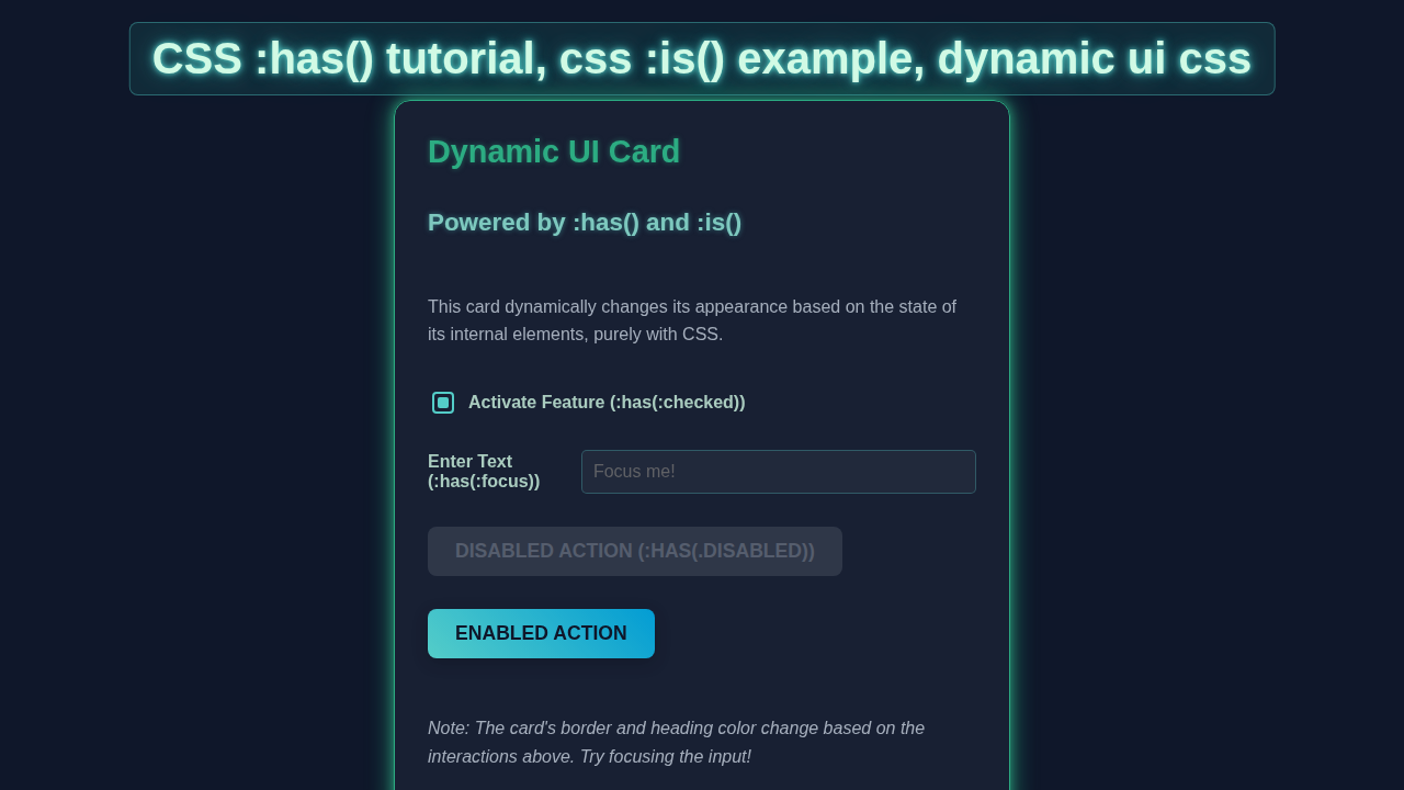
<p>This card demonstrates how its own appearance can change based on the state of its child elements using <code>:has()</code>. It also uses <code>:is()</code> for efficient styling of multiple elements.</p>
<div class="feature-card">
<h3>Feature Set</h3>
<p>Manage your feature options below. See how the card reacts!</p>
<div class="form-group">
<input type="checkbox" id="activate-pro" name="pro-feature">
<label for="activate-pro">Activate Pro Features (:has(:checked))</label>
</div>
<div class="form-group">
<label for="username-input">Enter Username (:has(:focus))</label>
<input type="text" id="username-input" placeholder="Your username...">
</div>
<div class="form-group">
<button class="action-btn primary">Submit (Default)</button>
<button class="action-btn secondary disabled">Archive (:has(.disabled))</button>
</div>
<p class="status-message">
<em>Try checking the checkbox, focusing the input, or observing the disabled button to see the card's dynamic styling.</em>
</p>
</div> <!-- .feature-card -->
</section>
<!-- Example 2: Simple List with :is() -->
<section class="list-section">
<h2>Efficient Styling with :is()</h2>
<p>The <code>:is()</code> pseudo-class simplifies grouping multiple selectors that share common styles. Here, it styles different list item types.</p>
<ul class="styled-list">
<li class="item-primary">Primary Item</li>
<li class="item-secondary">Secondary Item</li>
<li class="item-warning">Warning Item</li>
<li>Normal Item</li>
</ul>
</section>
<!-- Example 3: Layout Change with :has() -->
<section class="layout-section">
<h2>Layout Shifts with :has()</h2>
<p>This section demonstrates how a parent container can adjust its layout if it contains specific children. No JavaScript needed!</p>
<div class="layout-container default-layout">
<div class="layout-item">Item 1</div>
<div class="layout-item">Item 2</div>
<!-- Uncomment the line below to see layout change with :has(.extra-item) -->
<!-- <div class="layout-item extra-item">Extra Item</div> -->
</div>
<p><em>Uncomment the "Extra Item" in the HTML to see the layout change.</em></p>
</section>
</div> <!-- .container -->
</body>
</html>CSS Styling: Bringing Our Card to Life with CSS Dynamic UI
Now for the truly exciting part: styling our creation! We will make our card look absolutely fantastic. We’ll use modern CSS techniques to control its layout and appearance. More importantly, we’ll implement all the dynamic interactions. This is where the :has() and :is() pseudo-classes truly shine. They allow us to craft sophisticated responses. You’ll see the true potential of CSS Dynamic UI in action. Prepare to be amazed by what pure CSS can achieve!
styles.css
/* General Resets and Base Styles */
*, *::before, *::after {
    box-sizing: border-box;
    margin: 0;
    padding: 0;
}

body {
    font-family: Arial, Helvetica, sans-serif; /* Safe system fonts */
    line-height: 1.6;
    color: #333;
    background-color: #f4f7f6; /* Light background */
    padding: 20px;
}

.container {
    max-width: 900px;
    margin: 0 auto;
    padding: 20px;
    background-color: #ffffff;
    border-radius: 8px;
    box-shadow: 0 4px 10px rgba(0, 0, 0, 0.05);
}

h1 {
    color: #2c3e50;
    margin-bottom: 20px;
    text-align: center;
}

h2 {
    color: #3498db;
    margin-top: 30px;
    margin-bottom: 15px;
    border-bottom: 2px solid #ecf0f1;
    padding-bottom: 5px;
}

h3 {
    color: #27ae60;
    margin-bottom: 10px;
}

p {
    margin-bottom: 10px;
}

code {
    background-color: #e8e8e8;
    padding: 2px 4px;
    border-radius: 4px;
    font-family: 'Courier New', Courier, monospace;
    color: #c0392b;
}

/* --- Section: Interactive Feature Card --- */
.card-section {
    margin-bottom: 40px;
}

.feature-card {
    background: #fdfdfd;
    border: 1px solid #ddd;
    border-radius: 10px;
    padding: 25px;
    box-shadow: 0 5px 15px rgba(0, 0, 0, 0.08);
    transition: all 0.3s ease-out; /* Smooth transitions for dynamic changes */
    overflow: hidden; /* Ensure content stays within card boundaries */
}

/* :is() Example: Grouping common styles for different elements */
/* This rule applies styles to h3 and p.status-message within .feature-card */
.feature-card :is(h3, .status-message) {
    color: #2c3e50;
    margin-bottom: 15px;
}
.feature-card h3 {
    font-size: 1.5em;
}
.feature-card .status-message {
    font-size: 0.9em;
    color: #7f8c8d;
    margin-top: 20px;
}


/* Form Group Styling */
.form-group {
    display: flex;
    align-items: center;
    gap: 10px;
    margin-bottom: 15px;
}

label {
    font-weight: bold;
    color: #555;
    cursor: pointer;
}

/* Custom Checkbox Styling */
input[type="checkbox"] {
    /* Hide default checkbox */
    appearance: none;
    -webkit-appearance: none;
    width: 20px;
    height: 20px;
    border: 2px solid #3498db;
    border-radius: 4px;
    cursor: pointer;
    display: grid;
    place-content: center;
    transition: all 0.2s ease-in-out;
}

input[type="checkbox"]::before {
    content: "";
    width: 10px;
    height: 10px;
    transform: scale(0);
    transition: transform 0.2s ease-in-out;
    box-shadow: inset 1em 1em #3498db; /* Fill color */
    border-radius: 2px;
}

input[type="checkbox"]:checked::before {
    transform: scale(1);
}

/* Input Field Styling */
input[type="text"] {
    flex-grow: 1; /* Take remaining space */
    padding: 10px 12px;
    border: 1px solid #ccc;
    border-radius: 5px;
    font-size: 1em;
    transition: border-color 0.3s ease, box-shadow 0.3s ease;
    max-width: 100%; /* Ensure input is responsive */
}

input[type="text"]:focus {
    outline: none;
    border-color: #3498db;
    box-shadow: 0 0 0 3px rgba(52, 152, 219, 0.3);
}

/* Button Styling */
.action-btn {
    padding: 10px 20px;
    border: none;
    border-radius: 5px;
    font-size: 1em;
    font-weight: bold;
    cursor: pointer;
    transition: background-color 0.3s ease, transform 0.2s ease;
}

.action-btn.primary {
    background-color: #3498db;
    color: white;
}

.action-btn.primary:hover:not(.disabled) {
    background-color: #2980b9;
    transform: translateY(-1px);
}

.action-btn.secondary {
    background-color: #95a5a6;
    color: white;
}

.action-btn.secondary:hover:not(.disabled) {
    background-color: #7f8c8d;
    transform: translateY(-1px);
}

.action-btn.disabled {
    background-color: #bdc3c7;
    color: #ecf0f1;
    cursor: not-allowed;
    opacity: 0.7;
}


/* :has() Examples for .feature-card */

/* 1. Card changes when it has a checked checkbox */
.feature-card:has(input[type="checkbox"]:checked) {
    border-color: #27ae60; /* Green border */
    box-shadow: 0 5px 20px rgba(39, 174, 96, 0.2); /* Greenish shadow */
}

.feature-card:has(input[type="checkbox"]:checked) h3 {
    color: #27ae60; /* Green heading */
}

/* 2. Card changes when it has a focused input field */
.feature-card:has(input[type="text"]:focus) {
    border-color: #e67e22; /* Orange border */
    box-shadow: 0 5px 20px rgba(230, 126, 34, 0.2); /* Orangish shadow */
    transform: translateY(-5px); /* Lift the card slightly */
}

.feature-card:has(input[type="text"]:focus) label[for="username-input"] {
    color: #e67e22; /* Orange label */
}

/* 3. Card changes when it has a disabled button */
.feature-card:has(.action-btn.disabled) {
    background-color: #fef5f5; /* Light reddish background */
    border-color: #e74c3c; /* Red border */
    box-shadow: 0 5px 20px rgba(231, 76, 60, 0.2); /* Reddish shadow */
    opacity: 0.95;
}

.feature-card:has(.action-btn.disabled) .status-message {
    color: #e74c3c; /* Red status message */
    font-weight: bold;
}


/* --- Section: Efficient Styling with :is() --- */
.list-section {
    margin-bottom: 40px;
}

.styled-list {
    list-style: none; /* Remove default list style */
    padding-left: 0;
}

.styled-list li {
    padding: 8px 15px;
    margin-bottom: 5px;
    border-radius: 5px;
    transition: background-color 0.2s ease;
}

/* :is() Example: Styling multiple types of list items efficiently */
.styled-list :is(.item-primary, .item-secondary, .item-warning) {
    font-weight: bold;
}

.styled-list .item-primary {
    background-color: #e8f4fa;
    color: #3498db;
    border-left: 5px solid #3498db;
}

.styled-list .item-secondary {
    background-color: #f0f4f4;
    color: #7f8c8d;
    border-left: 5px solid #7f8c8d;
}

.styled-list .item-warning {
    background-color: #fef0e7;
    color: #e67e22;
    border-left: 5px solid #e67e22;
}

.styled-list li:not(:is(.item-primary, .item-secondary, .item-warning)) {
    background-color: #f7f9f9;
    color: #555;
    border-left: 5px solid #ccc;
}


/* --- Section: Layout Shifts with :has() --- */
.layout-section {
    margin-bottom: 40px;
}

.layout-container {
    display: flex;
    gap: 15px;
    padding: 20px;
    border: 2px dashed #9b59b6; /* Purple dashed border for default */
    border-radius: 8px;
    background-color: #f8f0fc;
    transition: all 0.3s ease;
}

.layout-item {
    flex: 1; /* Distribute items equally */
    background-color: #d8bfd8;
    color: #4b0082;
    padding: 15px;
    text-align: center;
    border-radius: 5px;
    font-weight: bold;
    min-width: 0; /* Allow items to shrink */
}

/* :has() Example: Change layout if container has an .extra-item */
.layout-container:has(.extra-item) {
    flex-direction: column; /* Stack items vertically */
    border-color: #2ecc71; /* Green border */
    background-color: #e8fcf0;
}

.layout-container:has(.extra-item) .layout-item {
    background-color: #a8e6cf; /* Lighter green for items */
    color: #27ae60;
}
How It All Works Together: Unpacking the Magic
Let’s break down the magic behind our interactive card. We will explore how HTML, CSS, and especially those powerful new pseudo-classes, collaborate perfectly. You will understand each piece of this puzzle. This knowledge empowers you to build even more amazing and responsive designs.
The :has() Pseudo-class in Action
Here’s the cool part about :has(): it’s a game-changer! This pseudo-class radically changes how we approach CSS Dynamic UI. Simply put, :has() selects an element if any of its descendants match a specific selector. Think of it as a ‘parent selector’ with superpowers. For our interactive card, we apply :has() to the main .card element. It checks if an internal element, like a .card-button, is currently being hovered. If :hover is active on that button, :has() tells the parent card to respond. This allows us to target a parent element based entirely on a child’s state.
Pro Tip: The
:has()pseudo-class is often called the “parent selector” because it lets you style a parent based on its children’s state. This was a long-awaited feature in CSS!
This capability was previously only achievable with JavaScript. It’s incredibly powerful and opens up so many design options. You can build complex, state-driven interactions purely with CSS now. This makes your code cleaner and more performant. Learn more about :has() and its wide applications on MDN Web Docs. It’s truly revolutionary!
Leveraging the :is() Pseudo-class for Clean Code
Next, we look at the versatile :is() pseudo-class. It is perfect for simplifying your CSS code. :is() allows you to group multiple selectors efficiently and logically. Instead of repeating common selector parts, you just list them inside :is(). For instance, section:is(.featured, .popular) targets both featured and popular sections without redundancy. In our interactive card, we might use :is() to apply identical styles to several elements. We could base this on a single, shared condition. This keeps our CSS incredibly clean, readable, and concise. It also makes your stylesheets much easier to maintain over time. This reduces the chances of errors and speeds up development. It helps keep your stylesheets incredibly organized. Check out more examples and practical uses of :is() on CSS-Tricks. You will love how much cleaner your code becomes!
Smooth Interactions with CSS Transitions
We also use elegant CSS transitions to make our card’s changes buttery smooth. When the card state changes, properties like opacity, transform, or background-color animate gently. This creates a visually pleasing and engaging experience. Instead of abrupt, jarring changes, elements gracefully appear, move, or transform. This greatly enhances the overall user experience. Nobody likes a clunky interface! Smooth transitions make your UI feel polished and professional. We apply transitions to the specific elements that respond to our :has() conditions. This ensures a fluid and truly engaging interaction. It makes the entire card come alive right before your eyes. You’ll notice the difference immediately.
Tips to Customise It: Make It Your Own!
You’ve successfully built a great interactive card! That’s fantastic. Now, how can you take it even further? Here are a few exciting ideas to extend or personalize your project. Let your creativity soar!
Challenge Yourself: Don’t just copy-paste! Try to implement at least one customization idea on your own. Experimentation is key to learning!
- Change the Hover Effect: Be bold with your designs! Instead of just revealing text, try dynamically changing the main image. You could also make the card’s background shift to a vibrant color. Experiment with different
transformproperties likescaleorrotate. This adds a unique flair to your card. - Add More Interactive Elements: Think beyond just one button! What if your card had multiple areas that triggered different responses? Use
:has()to react to various internal element hovers. You could reveal different content or styles based on which part is active. This adds amazing depth and complexity to your design. - Integrate Internal Links: Make your card a gateway to other valuable content on your site. You could have a prominent “learn more” link within the card details. This naturally guides users to explore further. Perhaps link to our post on Sparkly Spoiler Text Effect with Pure HTML & CSS. Or maybe to an article about Loading Animations with HTML and CSS. This keeps users engaged on your platform.
- Create a Card Grid with
:has(): Apply these innovative concepts to multiple cards! Build an impressive grid layout that interacts beautifully. You can even use:has()to dim or highlight other cards when one is hovered. This creates a really cohesive feel. For more inspiration on interactive grids, check out our post on Dim Cards Hover CSS. It’s a fantastic way to elevate your layouts. - Add Toggle Functionality: Instead of just hover, make the content appear/disappear on click. This would likely require a small amount of JavaScript, but it’s a great next step. You could use a hidden checkbox input and the
:checkedpseudo-class with:has()for a pure CSS toggle!
Conclusion: You’re a CSS Dynamic UI Master!
Wow, you absolutely crushed it! You just built a truly dynamic, interactive card using cutting-edge CSS. You’ve mastered the incredibly powerful :has() and :is() pseudo-classes. This is a huge, game-changing step in your web development journey. You can now confidently create far more engaging and responsive user experiences. Your interfaces will feel alive and intuitive. Share your awesome creation with us using #procoder09. We truly love seeing what amazing things you build. Keep coding, keep experimenting, and always keep learning! The world of CSS Dynamic UI is now at your fingertips.