Hey there, fellow coders! Have you ever wanted to add a super cool Theme Switcher to your website? It lets users pick their favorite look, light or dark. This small feature makes a big difference in user experience. Also, it shows off your coding skills. Today, we will build one from scratch. You will learn important concepts. These include HTML, CSS, and JavaScript. We will even save user preferences using local storage. Get ready for some fun!
What We Are Building: A Dynamic Theme Switcher
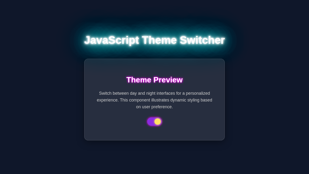
We are going to build an awesome dynamic Theme Switcher. It will toggle between a bright light mode and a sleek dark mode. Imagine a stylish button or a smooth toggle switch. When you click it, the entire page transforms. Your visitors will absolutely love this personalization feature. Furthermore, our switcher remembers their last choice. This means it loads automatically next time they visit. It’s super useful for many web projects. You’ll gain a valuable skill!
HTML Structure: Setting Up Our Page
First, we will set up our basic HTML page. This is the skeleton of our project. This structure will hold all our content and the main interactive elements. We need a core container for our page. Also, we will strategically place a simple button for our Theme Switcher. It’s quite straightforward, as you will soon see. Then, we link our essential CSS and JavaScript files. This connects everything together.
index.html
<!DOCTYPE html>
<html lang="en">
<head>
    <meta charset="UTF-8">
    <meta name="viewport" content="width=device-width, initial-scale=1.0">
    <title>JavaScript Theme Switcher</title>
    <link rel="stylesheet" href="styles.css">
</head>
<body>
    <div class="container">
        <h1>Dynamic Theme Switcher</h1>
        <p>Effortlessly toggle between light and dark modes to enhance your browsing comfort.</p>

        <label class="theme-switch">
            <input type="checkbox" id="themeToggle">
            <span class="slider round"></span>
        </label>

        <div class="content-card">
            <h2>Welcome to our website!</h2>
            <p>This is an example content section. Notice how the colors of the background, text, and card dynamically change when you flip the theme switch above. We use vanilla JavaScript to manage the state and CSS variables for a smooth transition.</p>
            <p>Your preference is saved locally, so the site remembers your choice even after you close and reopen your browser.</p>
            <button class="action-button">Learn More</button>
        </div>
    </div>

    <script src="script.js"></script>
</body>
</html>
CSS Styling: Bringing Our Theme to Life
Next, we will make our page truly shine! CSS is what brings our project to life, visually. We will meticulously define styles for both our light and dark themes. This uses a powerful technique: CSS custom properties. These are like variables in your stylesheet. They make switching themes incredibly easy and efficient. Don’t worry, we’ll go through every step. You’ll quickly grasp how neat this approach is. Prepare to be amazed!
styles.css
/* Global Box Model & Font Settings */
*, *::before, *::after {
    box-sizing: border-box; /* Standardize box model */
}

body {
    font-family: Arial, Helvetica, sans-serif; /* Safe system fonts */
    margin: 0;
    padding: 20px;
    min-height: 100vh;
    display: flex;
    justify-content: center;
    align-items: center; /* Center content vertically and horizontally */
    transition: background-color 0.3s ease, color 0.3s ease; /* Smooth theme transitions */
}

/* CSS Variables for Theme Management */
:root {
    /* Light Theme Defaults */
    --bg-color: #f0f2f5;
    --text-color: #333333;
    --heading-color: #2c3e50;
    --card-bg: #ffffff;
    --card-border: #e0e0e0;
    --button-bg: #007bff;
    --button-text: #ffffff;
    --switch-bg-off: #ccc;
    --switch-bg-on: #66bb6a;
    --switch-handle: #ffffff;
}

body.dark-theme {
    /* Dark Theme Overrides */
    --bg-color: #1a202c;
    --text-color: #e2e8f0;
    --heading-color: #edf2f7;
    --card-bg: #2d3748;
    --card-border: #4a5568;
    --button-bg: #667eea;
    --button-text: #ffffff;
    --switch-bg-off: #718096;
    --switch-bg-on: #9f7aea;
    --switch-handle: #ffffff;
}

/* Main Container Styling */
.container {
    background-color: var(--bg-color);
    color: var(--text-color);
    padding: 40px;
    border-radius: 12px;
    box-shadow: 0 8px 16px rgba(0, 0, 0, 0.1);
    max-width: 700px;
    width: 100%;
    text-align: center;
    transition: background-color 0.3s ease, color 0.3s ease, box-shadow 0.3s ease;
}

h1 {
    color: var(--heading-color);
    margin-bottom: 15px;
    font-size: 2.5em;
}

p {
    font-size: 1.1em;
    line-height: 1.6;
    margin-bottom: 30px;
}

/* Theme Switch Styles */
.theme-switch {
    position: relative;
    display: inline-block;
    width: 60px;
    height: 34px;
    margin: 20px auto 40px;
}

.theme-switch input {
    opacity: 0;
    width: 0;
    height: 0;
}

.slider {
    position: absolute;
    cursor: pointer;
    top: 0;
    left: 0;
    right: 0;
    bottom: 0;
    background-color: var(--switch-bg-off);
    -webkit-transition: .4s;
    transition: .4s;
}

.slider:before {
    position: absolute;
    content: "";
    height: 26px;
    width: 26px;
    left: 4px;
    bottom: 4px;
    background-color: var(--switch-handle);
    -webkit-transition: .4s;
    transition: .4s;
}

input:checked + .slider {
    background-color: var(--switch-bg-on);
}

input:focus + .slider {
    box-shadow: 0 0 1px var(--switch-bg-on);
}

input:checked + .slider:before {
    -webkit-transform: translateX(26px);
    -ms-transform: translateX(26px);
    transform: translateX(26px);
}

/* Rounded sliders */
.slider.round {
    border-radius: 34px;
}

.slider.round:before {
    border-radius: 50%;
}

/* Content Card Styling */
.content-card {
    background-color: var(--card-bg);
    border: 1px solid var(--card-border);
    border-radius: 8px;
    padding: 30px;
    margin-top: 30px;
    text-align: left;
    box-shadow: 0 2px 8px rgba(0, 0, 0, 0.05);
    transition: background-color 0.3s ease, border-color 0.3s ease, box-shadow 0.3s ease;
}

.content-card h2 {
    color: var(--heading-color);
    font-size: 1.8em;
    margin-top: 0;
    margin-bottom: 15px;
}

.content-card p {
    font-size: 1em;
    line-height: 1.7;
    margin-bottom: 20px;
}

/* Action Button Styling */
.action-button {
    background-color: var(--button-bg);
    color: var(--button-text);
    border: none;
    padding: 12px 25px;
    border-radius: 6px;
    cursor: pointer;
    font-size: 1.0em;
    font-weight: bold;
    transition: background-color 0.3s ease, transform 0.2s ease;
}

.action-button:hover {
    background-color: var(--button-bg);
    filter: brightness(110%);
    transform: translateY(-2px);
}

.action-button:active {
    transform: translateY(0);
}
JavaScript: Adding Interactivity and Persistence
Now for the real brain of our operation: JavaScript! This is truly where the magic happens and our site becomes interactive. We will make our button respond to user clicks. It will dynamically change the theme class on our body element. Even better, we will leverage local storage. This brilliant feature remembers the user’s last chosen theme. So, their preference loads instantly and automatically next time they visit. This creates a seamless experience. It’s very exciting to implement!
script.js
document.addEventListener('DOMContentLoaded', () => {
    // Get references to the theme toggle checkbox and the body element
    const themeToggle = document.getElementById('themeToggle');
    const body = document.body;

    /**
     * Sets the theme based on the `isDark` boolean.
     * Adds or removes the 'dark-theme' class on the body and updates the toggle state.
     * @param {boolean} isDark - True for dark theme, false for light theme.
     */
    const setTheme = (isDark) => {
        if (isDark) {
            body.classList.add('dark-theme');
            themeToggle.checked = true;
        } else {
            body.classList.remove('dark-theme');
            themeToggle.checked = false;
        }
    };

    // --- Initial Theme Load --- //

    // 1. Check for a saved theme preference in localStorage
    const savedTheme = localStorage.getItem('theme');

    if (savedTheme === 'dark') {
        // If 'dark' preference is found, apply dark theme
        setTheme(true);
    } else if (savedTheme === 'light') {
        // If 'light' preference is found, apply light theme
        setTheme(false);
    } else {
        // 2. If no saved preference, check user's system preference
        const prefersDark = window.matchMedia && window.matchMedia('(prefers-color-scheme: dark)').matches;
        setTheme(prefersDark); // Apply system preference
    }

    // --- Event Listener for Theme Toggle --- //

    // Add a 'change' event listener to the theme toggle checkbox
    themeToggle.addEventListener('change', () => {
        if (themeToggle.checked) {
            // If the toggle is checked (user wants dark theme)
            setTheme(true);
            localStorage.setItem('theme', 'dark'); // Save preference
        } else {
            // If the toggle is unchecked (user wants light theme)
            setTheme(false);
            localStorage.setItem('theme', 'light'); // Save preference
        }
    });
});
How It All Works Together
Setting Up CSS Variables for Flexible Theming
We start by using CSS custom properties. Think of them as intelligent variables for your styles. We meticulously define distinct color values for both our light and dark modes. For instance, --background-color or --text-color. These variables make our stylesheet remarkably clean and organized. They also allow for super easy theme switching. You simply update a few variable values within a specific class. Then, your entire site’s appearance instantly updates. This is a wonderfully powerful CSS feature. It keeps your code dry!
Toggling Themes with JavaScript Events
Our JavaScript actively listens for clicks on our dedicated toggle button. This is our event handler. When a click event fires, we first check the current theme applied to the page. Is it currently set to light? Then we smoothly transition to dark. If it’s dark, we gracefully switch back to light. We accomplish this by simply adding or removing a specific class, like dark-theme, to the <body> element. This class then overrides our default CSS variables. It’s a very elegant way to manage themes. This method ingeniously avoids lots of repetitive code and keeps things efficient. Plus, it’s easy to understand!
Remembering Choices with Local Storage for Our Theme Switcher
Here’s the really cool part that elevates our Theme Switcher! We definitely want the user’s theme choice to ‘stick’ around. That’s exactly where the browser’s local storage comes in incredibly handy. It acts like a small, persistent database directly within your user’s browser. When a user happily picks a theme, we save either light or dark as a simple string there. Next time they excitedly open the page, our JavaScript checks local storage first. Then, it applies the saved theme instantly. This offers an incredibly seamless and personalized user experience. It remembers their preferences, just like a professional application should. Learning about local storage is super useful for many dynamic projects. For instance, when you build a React Todo App Tutorial: Build with Functional Components & Hooks, you might want to save tasks between sessions.
Pro Tip: Local storage is fantastic for storing non-sensitive user data, like theme preferences. It persists even after the browser closes. However, always remember it’s not encrypted, so never use it for passwords or any private information!
Initial Load Logic: Respecting User Preferences
When your web page first loads up, we need a smart way to determine the initial theme. Our JavaScript script thoughtfully checks local storage right away. Did the user conveniently save a preference during a previous visit? If they did, we immediately use that saved preference. If no preference is found, we can then set a sensible default. A really common and user-friendly practice is to check the user’s system preference. You can effortlessly do this using window.matchMedia('(prefers-color-scheme: dark)'). This ensures your site politely respects their operating system’s settings. It’s a wonderful touch for overall user experience. This also significantly helps with web accessibility, making your site more inclusive. It makes your site feel very intelligent!
Tips to Customise It: Make Your Theme Switcher Unique
You’ve absolutely crushed it! You just built a functional and dynamic Theme Switcher! How incredibly cool is that? Now, let’s brainstorm some fantastic ideas to make it even more uniquely yours and impressive.
- More Themes, Why Not?: Go wild! Add a third theme, perhaps a “high-contrast” option or a “sepia” mode. You just need to add more CSS variables and slightly update your JavaScript logic to handle the new option.
- Sophisticated Selector: Instead of a simple on/off toggle, consider using a dropdown menu or radio buttons. This lets users pick from multiple themes more explicitly. It offers greater control and choice.
- Smooth Animated Transitions: Add elegant CSS transitions when switching between themes. This makes the change feel incredibly polished and professional. A simple
transition: all 0.3s ease-in-out;on your body elements forbackground-colorandcolorvariables can work wonders! You can delve deeper into CSS transitions and their properties on MDN Web Docs. It’s a key to great UI. - Visual Toggles with Icons: Replace the ‘Light/Dark’ text with beautiful sun and moon icons. Libraries like Font Awesome or custom SVG icons are perfect for this. This makes your UI more intuitive and visually appealing. You could also integrate this kind of dynamic styling into other fun projects, such as a Chrome Extension JavaScript Tutorial: Build with HTML, CSS, JS, to give users more control over their browsing experience.
Keep Experimenting: The very best way to truly learn and master web development is by constantly trying new things. Don’t ever be afraid to make mistakes, break something, and then figure out how to fix it! That’s where the real growth happens.
Conclusion
Wow, you absolutely did it! You successfully built a robust and dynamic Theme Switcher from the ground up. You tackled HTML structure, mastered CSS custom properties, and powered through JavaScript logic. Even better, you brilliantly incorporated local storage for theme persistence. This is truly a fantastic skill to add to your ever-growing web development toolkit. Now you can easily empower your users by giving them control over their browsing experience. Feel completely free to use this awesome technique in your next exciting project. Share your amazing creations with us on social media! We absolutely love seeing what you build and accomplish. Keep coding, keep innovating, and keep creating incredible web experiences for everyone!