React Todo App Tutorial: Build with Functional Components & Hooks
Hey there, fellow coders! If you’ve ever wanted to build a simple React Todo App Tutorial: useState & useEffect Example but weren’t sure where to start, you are absolutely in the right place. Today, we’re going to create a fantastic, functional todo application using React. We’ll use modern functional components and powerful React Hooks. This project is a perfect way to solidify your React skills. It also adds a cool app to your portfolio. Let’s get building!
What We Are Building: Your First React Todo App!
We are going to craft a sleek and responsive todo list application. Imagine being able to add new tasks, mark them as completed, and even delete them forever. Our app will offer a clean user interface. It will also demonstrate core React concepts. You will see how components interact. Furthermore, you will learn about managing application state. This project is incredibly practical. It gives you a solid foundation for more complex React applications. Ready to dive in?
HTML Structure (Our React Components’ JSX)
In React, we don’t write traditional HTML files directly for our components. Instead, we use JSX. JSX looks a lot like HTML. It lets us describe our UI within JavaScript. For our React Todo App, this structure will define our input form. It will also outline how our individual todo items look. This foundational structure gives our application its visual backbone. We are simply setting up the visual elements. The logic comes next.
public/index.html
<!DOCTYPE html>
<html lang="en">
<head>
    <meta charset="UTF-8">
    <meta name="viewport" content="width=device-width, initial-scale=1.0">
    <meta name="theme-color" content="#000000" />
    <meta
      name="description"
      content="Simple React Todo App built with functional components and hooks."
    />
    <link rel="icon" href="%PUBLIC_URL%/favicon.ico" />
    <link rel="apple-touch-icon" href="%PUBLIC_URL%/logo192.png" />
    <link rel="manifest" href="%PUBLIC_URL%/manifest.json" />
    <title>React Todo App</title>
</head>
<body>
    <noscript>You need to enable JavaScript to run this app.</noscript>
    <div id="root">
        <!-- Your React app will be rendered into this div. -->
    </div>
    <!--
      This HTML file is a template.
      If you open it directly in the browser, you will see an empty page.
      You can add webfonts, meta tags, or analytics to this file.
      The build step will place the bundled scripts into the <body> tag.
      To begin the development, run `npm start` or `yarn start`.
      To create a production bundle, use `npm run build` or `yarn build`.
    -->
</body>
</html>
Styling Our React Todo App with CSS
Every great application needs great styling. Our CSS will make our React Todo App look neat and user-friendly. We want a clear design. This ensures a pleasant user experience. We’ll use some clever CSS techniques to arrange our elements. Think about things like spacing and alignment. We aim for a clean, modern aesthetic. This makes our app delightful to use. Good styling is very important. It transforms our functional app into something polished.
Pro Tip: When styling React components, consider using CSS Modules or Styled Components for better organization. This keeps your styles scoped to individual components. It prevents unexpected style conflicts.
src/styles.css
/* General body styling */
body {
    margin: 0;
    font-family: Arial, Helvetica, sans-serif; /* Safe fonts */
    -webkit-font-smoothing: antialiased;
    -moz-osx-font-smoothing: grayscale;
    background-color: #2c3e50; /* Darker background */
    color: #ecf0f1; /* Light text color */
    display: flex;
    justify-content: center;
    align-items: center;
    min-height: 100vh;
    box-sizing: border-box; /* Crucial for consistent sizing */
    overflow-x: hidden; /* Prevent horizontal scroll */
}

/* Main Todo App Container */
.todo-app-container {
    background-color: #34495e; /* Slightly lighter than body for contrast */
    padding: 30px;
    border-radius: 10px;
    box-shadow: 0 4px 15px rgba(0, 0, 0, 0.4);
    max-width: 500px;
    width: 100%;
    text-align: center;
    box-sizing: border-box;
    overflow: hidden; /* Ensure content doesn't overflow container */
}

h1 {
    color: #ecf0f1;
    margin-bottom: 25px;
    font-size: 2.2em;
}

/* Input section styling */
.todo-input-section {
    display: flex;
    gap: 10px;
    margin-bottom: 25px;
}

.todo-input-section input[type="text"] {
    flex-grow: 1;
    padding: 12px 15px;
    border: 1px solid #7f8c8d;
    border-radius: 5px;
    font-size: 1em;
    background-color: #2c3e50;
    color: #ecf0f1;
    outline: none;
    box-sizing: border-box;
    max-width: 100%;
}

.todo-input-section input[type="text"]::placeholder {
    color: #bdc3c7;
}

.todo-input-section button {
    padding: 12px 20px;
    background-color: #27ae60; /* Green add button */
    color: white;
    border: none;
    border-radius: 5px;
    cursor: pointer;
    font-size: 1em;
    transition: background-color 0.2s ease;
    box-sizing: border-box;
}

.todo-input-section button:hover {
    background-color: #2ecc71;
}

/* Todo list styling */
.todo-list {
    list-style: none;
    padding: 0;
    margin: 0;
    text-align: left;
}

.no-todos {
    color: #bdc3c7;
    font-style: italic;
    margin-top: 20px;
}

.todo-item {
    display: flex;
    align-items: center;
    background-color: #4a658a; /* Darker blue for items */
    padding: 12px 15px;
    margin-bottom: 10px;
    border-radius: 5px;
    box-shadow: 0 2px 5px rgba(0, 0, 0, 0.2);
    transition: background-color 0.2s ease, transform 0.2s ease;
    box-sizing: border-box;
    max-width: 100%;
    overflow: hidden; /* Ensure text doesn't overflow */
}

.todo-item.completed {
    background-color: #5f7a9d; /* Slightly different background for completed */
    opacity: 0.8;
}

.todo-item input[type="checkbox"] {
    margin-right: 15px;
    width: 20px;
    height: 20px;
    cursor: pointer;
    accent-color: #27ae60; /* Green checkbox */
}

.todo-text {
    flex-grow: 1;
    font-size: 1.1em;
    color: #ecf0f1;
    word-break: break-word; /* Allow long words to break */
}

.todo-item.completed .todo-text {
    text-decoration: line-through;
    color: #bdc3c7;
}

.todo-item button {
    padding: 8px 12px;
    background-color: #e74c3c; /* Red delete button */
    color: white;
    border: none;
    border-radius: 5px;
    cursor: pointer;
    font-size: 0.9em;
    transition: background-color 0.2s ease;
    box-sizing: border-box;
    margin-left: 10px; /* Space from text */
}

.todo-item button:hover {
    background-color: #c0392b;
}

/* Responsive adjustments */
@media (max-width: 600px) {
    .todo-app-container {
        padding: 20px;
        margin: 15px; /* Add margin on smaller screens */
    }
    .todo-input-section {
        flex-direction: column;
    }
    .todo-input-section button {
        width: 100%;
    }
    .todo-item {
        flex-wrap: wrap; /* Allow items to wrap */
        justify-content: space-between;
    }
    .todo-item input[type="checkbox"] {
        order: 1; /* Checkbox first */
        margin-right: 0;
    }
    .todo-text {
        order: 2; /* Text next */
        flex-basis: calc(100% - 70px); /* Account for checkbox and button */
        margin-left: 15px;
        text-align: left;
    }
    .todo-item button {
        order: 3; /* Button last */
        margin-left: auto; /* Push to right */
        margin-top: 10px; /* Space from text */
    }
}
Bringing it to Life: Our React Todo App Logic (JavaScript/React)
Here’s the cool part! This section contains the JavaScript logic for our application. We’ll be using functional components. We will also leverage powerful modern JavaScript features like Hooks. Specifically, useState will be our best friend. It helps us manage the state of our todo list. This means tracking what todos exist. It also handles their completion status. This is where all the magic happens. We build interactivity right into our components.
Educator’s Note: Don’t worry if Hooks feel new. We will explain them step-by-step. They are a fundamental part of modern React development. You will quickly get the hang of them.
src/App.js
import React, { useState, useEffect } from 'react';
import './styles.css'; // Assuming styles.css is the main stylesheet for the app

/**
 * TodoApp Component
 * A functional React component for a simple Todo list application.
 * Utilizes useState for managing state (todos and new todo input)
 * and useEffect for localStorage persistence.
 */
function TodoApp() {
  // State to hold the list of todo items
  const [todos, setTodos] = useState([]);
  // State to hold the text for a new todo item
  const [newTodoText, setNewTodoText] = useState('');

  // useEffect hook to load todos from localStorage on component mount
  // and save todos to localStorage whenever the 'todos' state changes.
  useEffect(() => {
    // Load todos from localStorage
    const storedTodos = JSON.parse(localStorage.getItem('todos'));
    if (storedTodos) {
      setTodos(storedTodos);
    }
  }, []); // Empty dependency array means this effect runs only once on mount

  useEffect(() => {
    // Save todos to localStorage whenever 'todos' state updates
    localStorage.setItem('todos', JSON.stringify(todos));
  }, [todos]); // Dependency array includes 'todos', so effect runs when 'todos' changes

  /**
   * Handles adding a new todo item to the list.
   * Prevents adding empty todo items.
   */
  const addTodo = () => {
    if (newTodoText.trim().length === 0) {
      alert('Todo cannot be empty!');
      return;
    }
    const newTodo = {
      id: Date.now(), // Unique ID for the todo item
      text: newTodoText.trim(),
      completed: false,
    };
    setTodos([...todos, newTodo]); // Add new todo to the existing list
    setNewTodoText(''); // Clear the input field
  };

  /**
   * Toggles the completion status of a todo item.
   * @param {number} id - The unique ID of the todo item to toggle.
   */
  const toggleTodo = (id) => {
    setTodos(
      todos.map((todo) =>
        todo.id === id ? { ...todo, completed: !todo.completed } : todo
      )
    );
  };

  /**
   * Deletes a todo item from the list.
   * @param {number} id - The unique ID of the todo item to delete.
   */
  const deleteTodo = (id) => {
    setTodos(todos.filter((todo) => todo.id !== id));
  };

  return (
    <div className="todo-app-container">
      <h1>My React Todo List</h1>
      <div className="todo-input-section">
        <input
          type="text"
          value={newTodoText}
          onChange={(e) => setNewTodoText(e.target.value)}
          onKeyPress={(e) => e.key === 'Enter' && addTodo()} // Add on Enter key press
          placeholder="Add a new todo..."
          aria-label="New todo item"
        />
        <button onClick={addTodo} aria-label="Add todo">Add Todo</button>
      </div>
      <ul className="todo-list">
        {todos.length === 0 ? (
          <p className="no-todos">No todos yet! Start adding some.</p>
        ) : (
          todos.map((todo) => (
            <li key={todo.id} className={`todo-item ${todo.completed ? 'completed' : ''}`}>
              <input
                type="checkbox"
                checked={todo.completed}
                onChange={() => toggleTodo(todo.id)}
                aria-label={`Mark "${todo.text}" as ${todo.completed ? 'incomplete' : 'complete'}`}
              />
              <span className="todo-text">{todo.text}</span>
              <button onClick={() => deleteTodo(todo.id)} aria-label={`Delete "${todo.text}"`}>Delete</button>
            </li>
          ))
        )}
      </ul>
    </div>
  );
}

export default TodoApp;
src/index.js
import React from 'react';
import ReactDOM from 'react-dom';
import TodoApp from './App'; // Import the main TodoApp component
import './styles.css'; // Import the global styles (Note: this file should be placed in src/)

/**
 * This is the entry point for the React application.
 * It renders the main TodoApp component into the DOM.
 *
 * For React 18 and newer, you would typically use createRoot for better performance:
 * import { createRoot } from 'react-dom/client';
 * const container = document.getElementById('root');
 * const root = createRoot(container);
 * root.render(<React.StrictMode><TodoApp /></React.StrictMode>);
 *
 * For broader compatibility with older React versions and simplicity
 * in a tutorial, we use the older ReactDOM.render method.
 */
ReactDOM.render(
  <React.StrictMode>
    <TodoApp />
  </React.StrictMode>,
  document.getElementById('root')
);
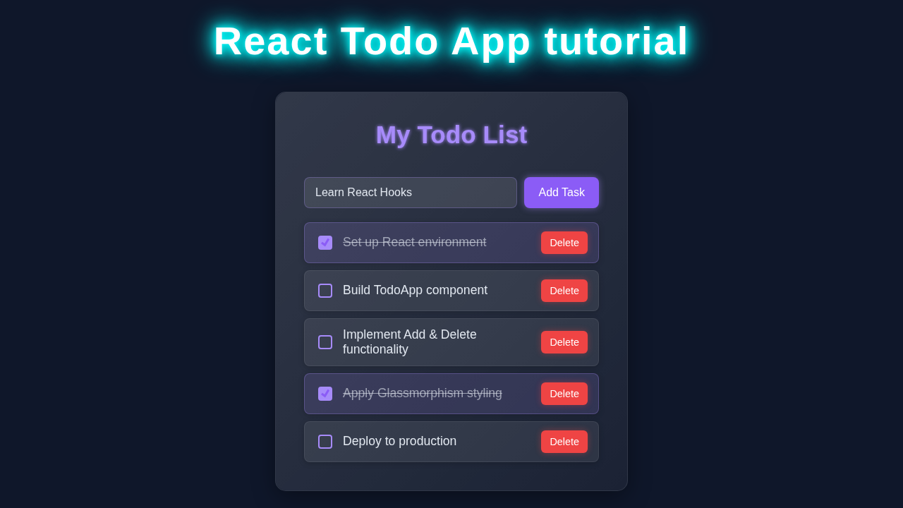
How It All Works Together: Step-by-Step Breakdown
Now that we have all the pieces, let’s connect them. Understanding the flow is key. We combine our JSX, CSS, and React logic. This brings our React Todo App to life. We will break down each major part of the application. This ensures you grasp every concept.
Initial Setup and State Management
First, our main App component initializes our todo list. It uses the useState Hook. This Hook lets functional components have state. For example, const [todos, setTodos] = useState([]); creates a state variable called todos. It also provides a function, setTodos, to update it. Initially, our list is empty. We will then render the input field and the list container. This setup is crucial for our app’s functionality.
Adding New Todos
When you type a new task and hit ‘Add Todo’, a function handles this. It takes the input value. Then, it creates a new todo object. Each todo needs a unique ID. It also needs a text description. Furthermore, it needs a completed status (initially false). We then update our todos state using setTodos. We add the new todo to the existing list. This triggers a re-render of our components. React Reconciliation Explained – Visual UI/UX Guide efficiently updates the UI. This only changes what is necessary.
Displaying Todos
Our App component maps over the todos array. It renders a TodoItem component for each one. The TodoItem receives props. These include the todo’s text, its ID, and its completion status. It also receives functions to mark it complete or delete it. This is a common pattern in React. We break down our UI into smaller, reusable components. You can see this similar structure when building something like a React Chat App with JSX. Each `TodoItem` is responsible for its own display. This keeps our code organized.
Marking Todos as Complete
Each TodoItem has a checkbox. When you click it, a specific function runs. This function receives the todo’s ID. It then finds the matching todo in our state array. It toggles its completed status. Finally, setTodos updates the state. This causes React to re-render only the affected TodoItem. The visual change reflects the new completion status. This is a powerful way to manage UI updates efficiently. It ensures a smooth user experience.
Deleting Todos
Similarly, a ‘Delete’ button on each TodoItem triggers another function. This function filters the todos array. It creates a new array without the deleted item. Then, setTodos updates the state. The deleted todo magically disappears from the UI. This process is very efficient. It avoids direct DOM manipulation. React handles all the complex UI updates for us. This is the beauty of declarative UI. You just tell React what the state should look like.
Tips to Customise Your React Todo App
You’ve built a functional React Todo App! Now, how about making it even better? Here are some ideas:
- Persist Data: Implement clever CSS techniques to integrate Local Storage. This will save your todos even after you close the browser. No more lost tasks!
- Filter Options: Add buttons to filter todos. Show ‘All’, ‘Active’, or ‘Completed’ tasks. This makes your list much more manageable.
- Edit Functionality: Allow users to edit existing todo texts. This means a little more state management for each item. It’s a great challenge!
- Animations: Add subtle animations for adding or deleting todos. This can make the user experience even smoother and more engaging.
Conclusion
Congratulations! You have successfully built your very own React Todo App from scratch. You’ve used functional components. You’ve also mastered the basics of React Hooks like useState. This is a huge accomplishment! You now understand fundamental React concepts. You have also created a useful, interactive application. Share your creation with friends! Tweak it, break it, and then fix it. That is how we learn best. Keep coding, and keep building amazing things!