Glassmorphism Card: Build with Tailwind CSS & HTML Utilities
Hey there, pro coder! If you’ve wanted to build a captivating Glassmorphism Card but had no idea where to start, you are in the right place. We’ll explore this popular design trend. We’ll make a beautiful, translucent card. Best of all, we’ll use the fantastic utility-first approach of Tailwind CSS!
Get ready to add a touch of modern elegance to your web projects. This tutorial is packed with simple steps. You’ll master Glassmorphism in no time. Let’s dive right in!
What We Are Building
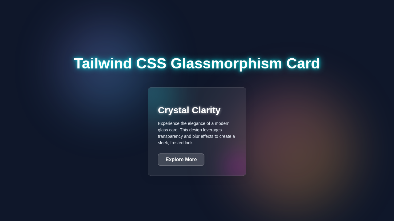
Today, we’re crafting a sleek, frosted-glass effect card. Think of it as looking through a blurred window. You can see the background, but it’s subtly obscured. This design feels light and airy. It adds remarkable depth to your UI. Our card will feature soft borders and a cool shadow. It truly mimics real glass. Indeed, this effect is perfect for portfolios, dashboards, or eye-catching feature sections. Your users will love this modern touch. We’ll build it with ease and efficiency using Tailwind CSS. It’s a quick way to elevate your designs!
HTML Structure
Our HTML will be super straightforward. We will create a simple container `div`. This container will hold our Glassmorphism card. The card itself will be another `div`. Inside, we’ll add some basic text content. It’s clean and semantic. Moreover, it’s easy to understand. Here’s the basic setup for your project:
index.html
<!DOCTYPE html>
<html lang="en">
<head>
    <meta charset="UTF-8">
    <meta name="viewport" content="width=device-width, initial-scale=1.0">
    <title>Tailwind CSS Glassmorphism Card</title>
    <!-- Link to your compiled Tailwind CSS file -->
    <!-- Run `npx tailwindcss -i ./styles.css -o ./dist/styles.css --watch` during development -->
    <link href="./styles.css" rel="stylesheet">
</head>
<body class="bg-gradient-to-br from-slate-900 to-slate-700 min-h-screen flex items-center justify-center font-sans">

    <!-- Glassmorphism Card Container -->
    <div class="relative w-80 p-8 bg-white/10 border border-white/20 rounded-xl shadow-lg backdrop-blur-md overflow-hidden text-slate-100">

        <!-- Optional: Background "blob" for extra visual interest within the card -->
        <!-- This creates a subtle animated glow inside the glass card -->
        <div class="absolute inset-0 bg-gradient-to-br from-blue-500/20 to-purple-500/20 opacity-50 blur-3xl rounded-full scale-150 -z-10 animate-pulse"></div>

        <h2 class="text-3xl font-bold mb-4 text-white drop-shadow-lg">Crystal Card</h2>
        <p class="text-sm mb-6 leading-relaxed">
            This is a beautiful glassmorphism card created using Tailwind CSS utility classes. It features a blurred background, subtle borders, and a soft shadow, providing a sleek, modern look.
        </p>
        <button class="relative px-6 py-2 bg-white/20 border border-white/30 rounded-lg text-white font-semibold hover:bg-white/30 transition-colors duration-300 transform hover:scale-105 active:scale-95 focus:outline-none focus:ring-2 focus:ring-white/50 drop-shadow-md">
            Learn More
        </button>
    </div>

</body>
</html>
CSS Styling
Now for the exciting part: styling! We’ll leverage Tailwind CSS utilities directly in our HTML. This means less custom CSS. We’ll achieve the frosted glass look with a few key classes. The `backdrop-filter` property is crucial here. Tailwind provides a convenient way to apply it. Let’s see how simple it is:
styles.css
/*
 * This file is where Tailwind CSS directives are imported.
 * Tailwind will process these and generate your utility classes.
 *
 * To get started with Tailwind CSS:
 * 1. Initialize a new project (if you haven't already): `npm init -y`
 * 2. Install Tailwind CSS and its peer dependencies: `npm install -D tailwindcss postcss autoprefixer`
 * 3. Create a Tailwind config file: `npx tailwindcss init -p` (creates tailwind.config.js and postcss.config.js)
 * 4. Configure your `tailwind.config.js` to scan your HTML files:
 *    module.exports = {
 *      content: [
 *        "./index.html",
 *        // Add other HTML, JS, or template files that use Tailwind classes
 *      ],
 *      theme: {
 *        extend: {},
 *      },
 *      plugins: [],
 *    }
 * 5. Add the following directives to this `styles.css` file.
 * 6. Compile your CSS: `npx tailwindcss -i ./styles.css -o ./dist/styles.css --watch`
 *    (The output path `./dist/styles.css` should be linked in your `index.html` file).
 *    For this tutorial, we assume `./styles.css` is both input and output for simplicity.
 *    Adjust `index.html` link if using `dist` folder.
 */

@tailwind base;
@tailwind components;
@tailwind utilities;

/*
 * Custom CSS can be added below if needed.
 * The Glassmorphism effect is primarily achieved with Tailwind's
 * built-in utilities like `backdrop-blur-*`, `bg-opacity-*`, `border-opacity-*`, and `shadow-*`.
 *
 * Tailwind CSS v3+ includes `backdrop-blur` by default.
 */

/* Ensure safe fallback fonts as per requirements */
body {
    font-family: Arial, Helvetica, sans-serif;
    /* Apply global box-sizing for consistent layout */
    box-sizing: border-box;
    /* Prevent horizontal scrollbar on body */
    overflow-x: hidden;
}

/* Ensure images and other replaced content don't overflow their containers */
img, video, canvas, svg {
  display: block;
  max-width: 100%;
  height: auto;
}

/* Apply box-sizing to all elements for consistent layout behavior */
*, *::before, *::after {
  box-sizing: border-box;
}

/* You can define custom animations if not using built-in Tailwind ones for specific effects */
@keyframes pulse {
  0%, 100% { opacity: 0.5; transform: scale(1.5); }
  50% { opacity: 0.7; transform: scale(1.6); }
}
.animate-pulse {
  animation: pulse 4s cubic-bezier(0.4, 0, 0.6, 1) infinite;
}
As you can see, the `
styles.css
/*
 * This file is where Tailwind CSS directives are imported.
 * Tailwind will process these and generate your utility classes.
 *
 * To get started with Tailwind CSS:
 * 1. Initialize a new project (if you haven't already): `npm init -y`
 * 2. Install Tailwind CSS and its peer dependencies: `npm install -D tailwindcss postcss autoprefixer`
 * 3. Create a Tailwind config file: `npx tailwindcss init -p` (creates tailwind.config.js and postcss.config.js)
 * 4. Configure your `tailwind.config.js` to scan your HTML files:
 *    module.exports = {
 *      content: [
 *        "./index.html",
 *        // Add other HTML, JS, or template files that use Tailwind classes
 *      ],
 *      theme: {
 *        extend: {},
 *      },
 *      plugins: [],
 *    }
 * 5. Add the following directives to this `styles.css` file.
 * 6. Compile your CSS: `npx tailwindcss -i ./styles.css -o ./dist/styles.css --watch`
 *    (The output path `./dist/styles.css` should be linked in your `index.html` file).
 *    For this tutorial, we assume `./styles.css` is both input and output for simplicity.
 *    Adjust `index.html` link if using `dist` folder.
 */

@tailwind base;
@tailwind components;
@tailwind utilities;

/*
 * Custom CSS can be added below if needed.
 * The Glassmorphism effect is primarily achieved with Tailwind's
 * built-in utilities like `backdrop-blur-*`, `bg-opacity-*`, `border-opacity-*`, and `shadow-*`.
 *
 * Tailwind CSS v3+ includes `backdrop-blur` by default.
 */

/* Ensure safe fallback fonts as per requirements */
body {
    font-family: Arial, Helvetica, sans-serif;
    /* Apply global box-sizing for consistent layout */
    box-sizing: border-box;
    /* Prevent horizontal scrollbar on body */
    overflow-x: hidden;
}

/* Ensure images and other replaced content don't overflow their containers */
img, video, canvas, svg {
  display: block;
  max-width: 100%;
  height: auto;
}

/* Apply box-sizing to all elements for consistent layout behavior */
*, *::before, *::after {
  box-sizing: border-box;
}

/* You can define custom animations if not using built-in Tailwind ones for specific effects */
@keyframes pulse {
  0%, 100% { opacity: 0.5; transform: scale(1.5); }
  50% { opacity: 0.7; transform: scale(1.6); }
}
.animate-pulse {
  animation: pulse 4s cubic-bezier(0.4, 0, 0.6, 1) infinite;
}
` section is practically empty! This is the magic of Tailwind CSS. Most of our “CSS” will live right in the HTML attributes. We will define a custom background for our demo page. This background will help showcase the Glassmorphism effect. For the card itself, Tailwind utility classes handle everything. You’ll attach them directly to your HTML elements. It keeps your styling super organized. Furthermore, it makes future adjustments a breeze.
JavaScript
Good news! For this static Glassmorphism card, we won’t need any JavaScript. Our focus is purely on HTML structure and Tailwind CSS styling. This project is all about making a beautiful visual component. Therefore, no complex interactions are required today. We’re keeping it simple and elegant.
Isn’t that great? Sometimes, less is more. We’re building a visually stunning element. No extra scripting is necessary. This means faster load times for your page. It also simplifies your development process. You can always add interactivity later. But for now, let’s admire the pure CSS magic! It’s amazing what you can achieve without a single line of JS.
How It All Works Together
Let’s break down the individual pieces. We will see how they combine. This creates our fantastic Glassmorphism effect. Every utility class plays a vital role. Understanding each step helps you customize further. You’ll soon be building unique cards with confidence.
The Page Container & Background
First, we wrap everything in a main `div`. This ensures our card is centered beautifully. It also provides a crucial backdrop. A vibrant background image or gradient is key here. The Glassmorphism effect works by blurring whatever is *behind* it. So, a visually interesting background is a must. We use Tailwind classes like `min-h-screen`, `flex`, `items-center`, and `justify-center`. These center our card perfectly. The `min-h-screen` ensures the background covers the entire viewport. `flex` and alignment utilities then place the card right in the middle. We also apply a `bg-[url(‘…’)` class for a dynamic background. This makes the frosted effect pop. Without a background, the blur has nothing to blur! It’s an essential first step. Consequently, choose your background wisely.
The Glassmorphism Card Effect
Here’s where the magic truly happens! We apply several Tailwind classes to our card `div`. The `bg-white/10` class gives a semi-transparent white background. This is crucial for the frosted look. Then, `backdrop-blur-lg` applies the actual blur. This blurs whatever is underneath the card. It truly creates that glass effect. You can learn more about `backdrop-filter` on MDN Web Docs. We also add `border border-white/20`. This gives a subtle, frosty edge. A `rounded-xl` adds nice soft corners. Finally, `shadow-xl` provides depth. It lifts the card off the background. It truly makes it feel like a physical object.
Pro Tip: The `backdrop-blur` utility is powered by the CSS `backdrop-filter` property. It’s a modern feature, so ensure good browser support if targeting older browsers. Tailwind makes applying it super easy!
This combination of transparency, blur, border, and shadow defines Glassmorphism. Each class contributes to the overall aesthetic. Adjusting these values allows for endless variations. You can experiment with different levels of blur. You can also change border transparency. That’s the power of Tailwind! It gives you immense control with minimal code.
Card Content & Styling
Inside our Glassmorphism Card, we add the actual text. We apply padding with `p-8`. This gives our content some breathing room. The `text-center` class centers our text. We use `text-white` for readability. This contrasts nicely with the translucent background. A `font-semibold` makes our heading stand out. We also set a `max-w-sm` to limit the card’s width. This keeps it from becoming too wide on larger screens. It ensures the card remains aesthetically pleasing. A small `text-lg` for the paragraph improves readability too. You can easily swap out these content styles. Just use any other Tailwind text utilities. Remember, consistent spacing and typography make a design feel polished. Therefore, pay attention to these details.
Responsiveness and Accessibility
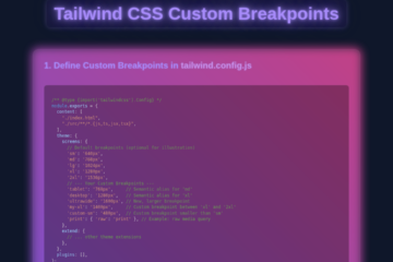
While this tutorial focuses on the core effect, responsiveness is vital. Tailwind CSS makes it simple. You can use utility classes like `md:max-w-md` or `lg:text-xl`. These adjust styles based on screen size. This ensures your card looks great everywhere. For more advanced responsive layouts, check out our guide on Tailwind Custom Breakpoints. Always consider contrast for accessibility. Ensure your text is readable against the blurred background. Light text on a dark, blurred background often works best. This ensures your beautiful design is usable for everyone.
Tips to Customise Your Glassmorphism Card
You’ve built a fantastic Glassmorphism Card! Now, let’s make it truly yours. Here are some ideas to push your design further:
- Change the Background: Experiment with different background images or gradients. The effect changes dramatically. A dynamic, colorful background makes the card truly come alive.
- Adjust Transparency and Blur: Play with `bg-white/5` or `bg-white/20` for different levels of translucency. Try `backdrop-blur-md` or `backdrop-blur-xl`. Find the perfect level of frosted glass for your project. This small tweak can alter the entire mood.
- Add Hover Effects: Use Tailwind’s `hover:` prefix. For instance, `hover:scale-105` makes the card gently grow on hover. Or `hover:border-blue-300` changes the border color. These subtle interactions enhance user experience.
- Integrate with Other Components: This card can be a part of bigger projects. Imagine it as a sleek widget in a dashboard layout. You can learn more about building complex structures in our Tailwind Dashboard Layout Tutorial. It fits perfectly into modern interfaces.
- Explore Different Shadows: Tailwind offers various `shadow` utilities. Try `shadow-2xl` for more depth or `shadow-inner` for a recessed look. You could even customize your own shadow for a unique look. Learn more about box shadows on CSS-Tricks.
- Combine with Interactive Elements: Think about using this card as a container for forms, buttons, or navigation links. You could even adapt it for a Tailwind Product Filter component, making each filter option a glassmorphic button. The possibilities are endless!
Keep Experimenting: The beauty of Tailwind CSS is its flexibility. Don’t be afraid to tweak values. Try new combinations. This is how you develop your unique design style! Every small change can lead to a big discovery.
Conclusion
Wow, you did it! You successfully built a modern and stylish Glassmorphism Card using Tailwind CSS. We covered everything from the basic HTML structure to applying those awesome utility classes. You now have a fantastic, reusable component in your web development toolkit. This effect adds a premium feel to any design. It’s a testament to how powerful and efficient Tailwind CSS can be.
We hope you enjoyed this tutorial. Now, go forth and sprinkle some glassmorphism magic on your projects! Don’t forget to share your creations. Show us what you’ve built on social media. We’d love to see them. Happy coding, pro coder!