Hey there, fellow coder! If you’ve ever felt limited by Tailwind’s default breakpoints, you’re in for a treat. Maybe you needed a layout that just *didn’t quite fit* the standard sm, md, or lg sizes. Today, we’re diving deep into Tailwind Custom Breakpoints, showing you exactly how to set them up and use them to craft truly unique, pixel-perfect responsive layouts. We’re going to build a cool, multi-column design that adapts beautifully to different screen sizes, giving you total, granular control over your project. This is a super powerful skill. It lets you create pixel-perfect responsiveness. You can make your designs look amazing everywhere. Ready to become a responsive layout master? Let’s get building!
What We Are Building
We’re going to construct a sleek, adaptable content layout. Picture a page showcasing articles, product cards, or portfolio pieces. It will have three distinct content sections. On the smallest mobile screens, these sections will stack neatly, one on top of the other. As the screen size increases, you’ll see them gracefully transition into a two-column grid. And here’s the cool part: on our *very own custom breakpoint*, they’ll snap into a perfect, spacious three-column layout! This project isn’t just about columns. It’s about teaching you how to dictate layout changes at *your* chosen screen dimensions. It’s dynamic, it’s efficient, and it looks incredibly professional. This technique is super useful for blogs, landing pages, e-commerce product displays, or any content-heavy page where precise responsiveness is key. You’ll truly master responsive control.
HTML Structure
Our HTML for this project will be refreshingly simple and semantic. We’ll use a single main <div> container to wrap all our content. Inside this container, we’ll place several smaller <div> elements, each acting as a distinct content card or section. These cards will represent the different parts of our layout that need to respond. All the intricate styling and responsive magic will come from Tailwind’s powerful utility classes. Don’t worry about complex CSS files here; your HTML will largely define the structure, and Tailwind will paint the picture. Here’s the basic, clean structure we’ll be using:
index.html
<!DOCTYPE html>
<html lang="en">
<head>
    <meta charset="UTF-8">
    <meta name="viewport" content="width=device-width, initial-scale=1.0">
    <title>Tailwind CSS Custom Breakpoints Example</title>
    <!--
        Link to your compiled Tailwind CSS file.
        Make sure to compile input.css to output.css using the Tailwind CLI.
        Command: npx tailwindcss -i ./input.css -o ./output.css --watch
    -->
    <link rel="stylesheet" href="./output.css">
    <style>
        /* Ensure safe fonts if not explicitly set by Tailwind or custom CSS */
        body {
            font-family: Arial, Helvetica, sans-serif;
            box-sizing: border-box; /* Good practice for all elements */
        }
        .container-box {
            max-width: 100%; /* Ensure responsiveness */
            overflow: hidden; /* Prevent content overflow if needed */
        }
    </style>
</head>
<body class="bg-gray-50 flex items-center justify-center min-h-screen p-4">

    <div class="container-box w-full max-w-2xl bg-white rounded-lg shadow-xl p-6 text-center space-y-4">
        <h1 class="text-2xl font-bold text-gray-800">Responsive Box with Custom Breakpoints</h1>
        <p class="text-gray-600">Resize your browser window to see how the box below adapts using both default and custom breakpoints.</p>

        <div class="p-4 border-2 border-gray-300 rounded-md
                    text-lg font-semibold transition-all duration-300 ease-in-out
                    bg-red-200 text-red-800

                    sm:bg-blue-200 sm:text-blue-800 sm:text-xl
                    md:bg-green-200 md:text-green-800 md:text-2xl

                    my-xl:bg-purple-200 my-xl:text-purple-800 my-xl:text-3xl my-xl:font-extrabold
                    ultrawide:bg-indigo-200 ultrawide:text-indigo-800 ultrawide:text-4xl ultrawide:tracking-wide">

            <p class="block sm:hidden">I'm default (below 640px)</p>
            <p class="hidden sm:block md:hidden">I'm <span class="font-extrabold">sm</span> (640px+)</p>
            <p class="hidden md:block my-xl:hidden">I'm <span class="font-extrabold">md</span> (768px+)</p>
            <p class="hidden my-xl:block ultrawide:hidden">I'm <span class="font-extrabold">my-xl</span> (1400px+ custom)</p>
            <p class="hidden ultrawide:block">I'm <span class="font-extrabold">ultrawide</span> (1600px+ custom)</p>
        </div>

        <p class="text-sm text-gray-500 mt-4">
            The <span class="font-mono text-gray-700">my-xl</span> and <span class="font-mono text-gray-700">ultrawide</span> breakpoints are custom-defined in <span class="font-mono text-gray-700">tailwind.config.js</span>.
        </p>
    </div>

</body>
</html>
CSS Styling (Tailwind Config)
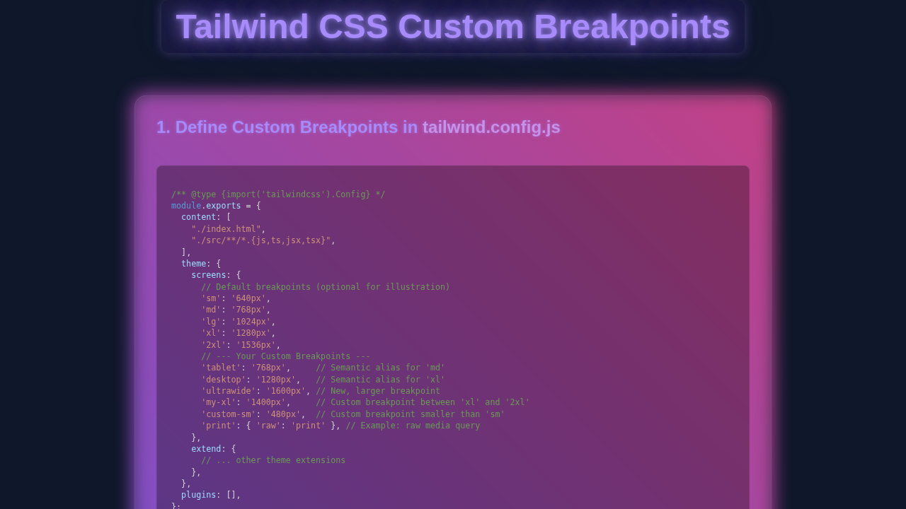
This is truly where the magic happens when working with Tailwind Custom Breakpoints! Instead of writing traditional CSS rules for different screen sizes, we’ll be configuring Tailwind itself. We need to explicitly tell Tailwind about our brand-new breakpoints. This crucial step involves editing your project’s tailwind.config.js file. Specifically, we’ll be extending the default screens property within the theme object. By doing this, we unlock a whole new set of utility classes, ready for you to use in your HTML. For this tutorial, we’ll add just one custom breakpoint, but remember, you have the flexibility to define as many as your project demands!
First, ensure you have a basic input.css file in your project. This file typically contains only the `@tailwind` directives, pulling in Tailwind’s base, components, and utilities. It’s usually very short and serves as the entry point for Tailwind’s compilation. Next, we update our tailwind.config.js. Let me explain what’s happening here and why it’s so powerful.
input.css
/* input.css */
/* This file will be processed by Tailwind CSS to generate your output.css */

@tailwind base;
@tailwind components;
@tailwind utilities;
See how concise the input.css remains? That’s a hallmark of a well-structured Tailwind project. The real heavy lifting for our responsive layout, especially for defining custom behaviors, is centered in that configuration file. It’s exciting to see how much granular control you gain over your responsive design strategy with just a few lines of code!
How It All Works Together
Alright, you’ve successfully prepared your lean HTML structure and meticulously updated your Tailwind configuration. Now, let’s connect all the dots and see this responsive layout come to life! We’ll explore precisely how these interconnected pieces combine to create our awesome, adapting design. The entire process hinges on applying the correct utility classes to your HTML elements. These classes, crucially, change their effect based on the screen size, thanks to our custom breakpoint.
Defining Your Custom Breakpoint
The very first and most foundational step was within your tailwind.config.js file. We specifically added 'mybp': '1024px' to the screens object inside theme.extend. What does this achieve? This entry essentially declares to Tailwind: “Hey, I now have a brand-new breakpoint, which I’ve named mybp. Any styles prefixed with mybp: should activate when the screen width is 1024 pixels or wider.” Suddenly, you have a powerful new tool. It’s like having your own custom ruler for responsiveness, perfectly tailored to your design’s specific needs!
Pro Tip: Tailwind’s breakpoints operate on a mobile-first philosophy. This means any utility classes *without* a breakpoint prefix (like
text-red-500orgrid-cols-1) will apply to all screen sizes by default. Breakpoints with a prefix (such asmd:or your custommybp:) will then apply their styles from that breakpoint *upwards*.
This mobile-first approach is incredibly efficient and powerful. You start by designing for the smallest screen, ensuring a solid base experience. Then, you incrementally layer on design changes for progressively larger screens. This method keeps your CSS lean, logical, and easy to manage. You’ll quickly find yourself thinking responsively from the very beginning of a project. This makes the entire development process much smoother and more intuitive. To understand more about the underlying layout principles, consider exploring CSS Grid Layout concepts.
Applying Responsive Classes in HTML
Let’s revisit our HTML structure and the classes we applied. You’ll notice a sequence of utility classes like grid-cols-1, md:grid-cols-2, and mybp:grid-cols-3. Each of these plays a vital role in dictating the column layout at different screen sizes.
grid-cols-1: This is our mobile-first baseline. On the smallest screens, by default, our content cards are arranged in a single, vertical column. This ensures readability and usability on tiny displays.md:grid-cols-2: As the screen reaches Tailwind’s default ‘medium’ breakpoint (typically 768px), our layout intelligently switches. The content cards now neatly arrange themselves into a two-column grid. This provides a more balanced and visually appealing presentation on tablets and smaller desktops.mybp:grid-cols-3: And here’s where our custom magic truly shines! Once the screen hits our bespokemybpbreakpoint (1024px), the layout elegantly transforms once more. It expands into a spacious three-column grid. This makes full and effective use of wider screens, ideal for desktop monitors.
This intelligent layering of responsive classes is fundamental to achieving precise control over your designs at every breakpoint. You dictate exactly how your content reflows and rearranges itself. Mastering this technique is a huge step towards becoming proficient in modern responsive web design. For more on responsive navigation, which often goes hand-in-hand with layout changes, check out our guide on a Responsive Navbar Dark Mode with Tailwind CSS & HTML.
Flexibility with Utility Classes
Tailwind’s utility-first approach truly shines in scenarios like this. Each class you apply has a single, atomic purpose. By thoughtfully combining these simple, single-purpose classes, you can rapidly construct incredibly complex and custom designs. Your HTML effectively becomes a comprehensive blueprint of your design. You can quickly visualize and understand exactly how your layout will behave across different screen sizes. This approach is not only super fast for prototyping new ideas but also incredibly beneficial for long-term maintenance. Any developer can easily understand, modify, or extend the styles simply by reading the HTML. This level of clarity is a huge advantage. Explore more utility classes and their powerful combinations in our Tailwind Dashboard Layout Tutorial: HTML & Utility Classes.
Think of these utility classes as highly specialized building blocks. You stack them up, and they immediately respond to your custom breakpoints, dynamically adjusting the layout. It’s truly amazing to see your layout adapt in real-time as you resize your browser window. Observe the smooth transitions and how the content reflows. This immediate visual feedback is a powerful learning tool. It empowers you to build with confidence and precision, knowing exactly what your users will experience.
Remember: Tailwind’s core philosophy involves generating CSS from your configuration and usage. So, every time you make changes to your
tailwind.config.jsfile (especially when adding new breakpoints), you will typically need to re-run your Tailwind build process. A common command for development isnpx tailwindcss -i ./src/input.css -o ./dist/output.css --watch. This ensures your custom settings are compiled into the final CSS file, making your new breakpoints available for use.
This build step is crucial. It’s how your custom configuration is translated into actual, usable CSS that your browser can understand. It ensures that your newly defined breakpoints are ready and waiting to style your HTML. This process is usually very quick and integrates seamlessly into most modern development workflows. You’ll get used to it in no time, and it becomes a natural part of your building process!
Tips to Customise Your Tailwind Custom Breakpoints
Congratulations! You’ve successfully built a solid, custom-responsive layout. Now, let’s explore how you can truly make this technique your own and push your responsive design skills even further! Here are some exciting ideas to extend and personalize your projects:
- Add More Custom Breakpoints: Why limit yourself to just one? Experiment with defining several more breakpoints within your
tailwind.config.js. Think about specific device widths that are important for *your* audience or *your* design. Perhaps you need a ‘tablet-wide’ breakpoint at 900px, or a ‘desktop-compact’ at 1150px. The beauty is you can name them anything you like and tailor them perfectly to your project’s unique requirements. This precision lets you target specific devices or user experiences. - Combine with Existing Breakpoints: Don’t forget to leverage Tailwind’s fantastic default breakpoints such as
sm,md,lg, andxl. The real power comes from mixing and matching these with your custom ones. For example, you could have a layout that’sgrid-cols-1on small, thenmd:flex, thenlg:grid-cols-2, and finallymybp:grid-cols-3. This combination allows you to create incredibly intricate and nuanced responsive behaviors across many different screen sizes. Try combining seemingly contradictory classes likemd:block mybp:hiddenjust to observe and understand the cascade! - Build More Complex Layouts: Take your new custom breakpoint knowledge and apply it to different, more intricate parts of your website. Challenge yourself to create a fully responsive header, a dynamic footer, or even a full-page hero section that adapts dramatically. What about a complex product display page, complete with filtering and sorting, much like the one we tackled in our Tailwind Product Filter: Build with HTML & Tailwind CSS Utilities tutorial? The possibilities for sophisticated, custom responsive designs are truly endless!
- Responsive Typography and Spacing: Responsive design isn’t solely about column layouts! Use your custom breakpoints to subtly adjust font sizes for optimal readability (e.g.,
text-base md:text-lg mybp:text-xl) or modify padding and margin values (e.g.,p-4 md:p-6 mybp:p-8). This granular control over typography and spacing adds an essential layer of polish to your responsive designs. It ensures your text is always legible and your layouts feel balanced on any screen size. For a deeper dive into responsive typography, resources like CSS-Tricks offer great techniques. You will build truly tailored user experiences.
Conclusion
Amazing job, fellow coder! You’ve just completed a significant step in your web development journey. You learned how to unlock the full power of Tailwind Custom Breakpoints. You successfully built a dynamic, truly responsive layout from scratch, one that perfectly adapts to your own defined screen sizes. This skill is incredibly valuable and will empower you to create web experiences with unprecedented precision and control. Take immense pride in what you’ve achieved today; it’s a testament to your growing expertise!
Keep experimenting with your new knowledge. Build more layouts, test different breakpoint values, and challenge yourself to adapt a wide variety of designs. The more you practice and play, the more intuitive and second-nature responsive design with Tailwind will become. We’d absolutely love to see what incredible projects you create! Share your responsive masterpieces with us on social media; tag procoder09.com in your posts. Happy coding, and keep building awesome, responsive things!