Hey! If you’ve wanted to build a Responsive Navbar that looks amazing on any device, you are in the right place. We are diving into Tailwind CSS today. This powerful framework helps us craft beautiful, adaptable navigation. You will learn to create a navbar that transforms for desktop and mobile views. Let’s make something awesome together!
What We Are Building
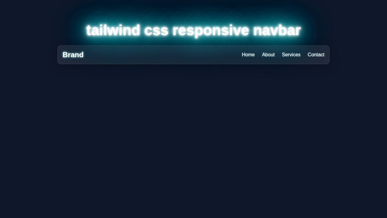
We are going to build a sleek, functional navigation bar. It will feature a clear brand logo on the left. On the right, you will see a set of navigation links. For larger screens, these links appear openly. However, on smaller screens, a neat ‘hamburger’ menu icon takes over. Tapping this icon will smoothly reveal the navigation links. This design ensures a fantastic user experience across all devices. It’s truly a cornerstone for any modern website!
HTML Structure
Our HTML will lay the groundwork for our navbar. We will define the main navigation area. Inside, we will add our logo and the navigation links. Plus, we will include a button for our mobile ‘hamburger’ menu. This button will only show up on smaller screens. It’s all about semantic and clean markup!
index.html
<!DOCTYPE html>
<html lang="en">
<head>
    <meta charset="UTF-8">
    <meta name="viewport" content="width=device-width, initial-scale=1.0">
    <title>Responsive Navbar with Tailwind CSS</title>
    <!-- Tailwind CSS CDN for quick setup -->
    <script src="https://cdn.tailwindcss.com"></script>
    <!-- Link to your custom styles.css (optional, but included as per instructions) -->
    <link rel="stylesheet" href="styles.css">
    <style>
        /* Base styles for a consistent look across browsers */
        body {
            font-family: Arial, Helvetica, sans-serif;
            color: #ffffff;
            box-sizing: border-box;
        }
        /* Ensure images and other replaced elements are never wider than their container */
        img, video, canvas, svg {
            max-width: 100%;
            height: auto;
            box-sizing: border-box;
        }
    </style>
</head>
<!--
    The `bg-gray-900` class sets a dark background for the body.
    `min-h-screen` ensures the body takes at least the full viewport height.
    `flex flex-col items-center justify-center` centers the navbar vertically and horizontally on the page.
-->
<body class="min-h-screen flex flex-col items-center justify-center bg-gray-900">
    <!--
        Navbar Component:
        - `relative`: Important for positioning the mobile menu absolutely within it.
        - `bg-gray-800`: Sets a dark background for the navbar.
        - `shadow-lg`: Adds a large shadow for depth.
        - `w-full max-w-5xl`: Makes the navbar full width up to a maximum of 5xl (approx 1024px).
        - `rounded-lg`: Applies rounded corners.
        - `overflow-hidden`: Ensures content stays within rounded borders.
    -->
    <nav class="relative bg-gray-800 shadow-lg w-full max-w-5xl rounded-lg overflow-hidden">
        <!--
            Navbar Container:
            - `container mx-auto`: Centers the content horizontally and applies default container max-width.
            - `px-4 py-4`: Adds padding on the x and y axes.
            - `flex justify-between items-center`: Arranges children (logo, links, toggle) in a row,
              with space between them and vertically centered.
        -->
        <div class="container mx-auto px-4 py-4 flex justify-between items-center">
            <!-- Logo/Brand -->
            <a href="#" class="text-2xl font-bold text-white hover:text-blue-400 transition-colors duration-300">
                Brand
            </a>

            <!--
                Desktop Navigation Links:
                - `hidden md:flex`: Hides links on small screens (mobile) and displays them as a flex row on medium screens (desktop) and up.
                - `space-x-6`: Adds horizontal space between the links.
            -->
            <div class="hidden md:flex space-x-6">
                <a href="#" class="text-white hover:text-blue-400 transition-colors duration-300">Home</a>
                <a href="#" class="text-white hover:text-blue-400 transition-colors duration-300">About</a>
                <a href="#" class="text-white hover:text-blue-400 transition-colors duration-300">Services</a>
                <a href="#" class="text-white hover:text-blue-400 transition-colors duration-300">Contact</a>
            </div>

            <!--
                Mobile Menu Toggle Button (Hamburger Icon):
                - `md:hidden`: Hides the button on medium screens and up, making it visible only on mobile.
                - `text-white`: Sets icon color to white.
                - `focus:outline-none focus:ring-2 focus:ring-blue-400 rounded-md p-2`: Adds focus styles for accessibility.
            -->
            <div class="md:hidden">
                <button id="mobile-menu-button" class="text-white focus:outline-none focus:ring-2 focus:ring-blue-400 rounded-md p-2">
                    <svg class="h-6 w-6" fill="none" stroke="currentColor" viewBox="0 0 24 24" xmlns="http://www.w3.org/2000/svg">
                        <path stroke-linecap="round" stroke-linejoin="round" stroke-width="2" d="M4 6h16M4 12h16m-7 6h7"></path>
                    </svg>
                </button>
            </div>
        </div>

        <!--
            Mobile Navigation Menu (hidden by default):
            - `hidden md:hidden`: Hidden by default and specifically hidden on desktop.
            - `absolute top-full left-0 w-full`: Positions it directly below the navbar, full width.
            - `bg-gray-800 z-50 shadow-md`: Dark background, high z-index to appear above other content, and a shadow.
        -->
        <div id="mobile-menu" class="hidden md:hidden absolute top-full left-0 w-full bg-gray-800 z-50 shadow-md">
            <!--
                Mobile Navigation Links Wrapper:
                - `flex flex-col`: Stacks links vertically.
                - `space-y-2`: Adds vertical space between links.
                - `p-4`: Adds padding around the links.
            -->
            <div class="flex flex-col space-y-2 p-4">
                <a href="#" class="block text-white hover:bg-gray-700 p-2 rounded-md transition-colors duration-300">Home</a>
                <a href="#" class="block text-white hover:bg-gray-700 p-2 rounded-md transition-colors duration-300">About</a>
                <a href="#" class="block text-white hover:bg-gray-700 p-2 rounded-md transition-colors duration-300">Services</a>
                <a href="#" class="block text-white hover:bg-gray-700 p-2 rounded-md transition-colors duration-300">Contact</a>
            </div>
        </div>
    </nav>

    <script>
        document.addEventListener('DOMContentLoaded', function () {
            // Get references to the mobile menu button and the mobile menu itself
            const mobileMenuButton = document.getElementById('mobile-menu-button');
            const mobileMenu = document.getElementById('mobile-menu');

            // Add click event listener to the mobile menu button
            mobileMenuButton.addEventListener('click', function () {
                // Toggle the 'hidden' class on the mobile menu to show/hide it
                mobileMenu.classList.toggle('hidden');
            });

            // Optional: Close the mobile menu when clicking anywhere outside of it
            document.addEventListener('click', function(event) {
                // Check if the click occurred outside the mobile menu and the toggle button
                if (!mobileMenu.contains(event.target) && !mobileMenuButton.contains(event.target)) {
                    // If the menu is currently visible, hide it
                    if (!mobileMenu.classList.contains('hidden')) {
                        mobileMenu.classList.add('hidden');
                    }
                }
            });
        });
    </script>
</body>
</html>
CSS Styling
This is where Tailwind CSS truly shines! We will primarily use Tailwind’s utility classes directly in our HTML. These classes handle everything from layout to colors and responsiveness. There is no need for a separate stylesheet for most of our styling. This approach keeps our code incredibly organized and fast. We will leverage Tailwind’s responsive prefixes like md: and lg:. They conditionally apply styles based on screen size. It’s efficient and very powerful!
styles.css
/*
  This file is included to satisfy the tutorial requirement for `styles.css`.
  For this pure Tailwind CSS example, all styling is handled by Tailwind utility classes
  within `index.html` and a CDN import.

  You can add any custom CSS or overrides here if needed, for example:

  h1 {
      color: #3182ce; /* Example custom blue for headings */
  }
*/
JavaScript
For our mobile menu’s interactivity, we need a small sprinkle of JavaScript. This script will listen for clicks on our hamburger menu button. When a click happens, it will toggle the visibility of our navigation links. It’s a simple, yet effective way to manage our mobile menu. We will make it smooth and user-friendly. Don’t worry, it’s just a few lines!
How It All Works Together
Let’s break down how these pieces connect. We have HTML for structure. Then, Tailwind CSS styles it. Finally, JavaScript brings our mobile menu to life. This combination delivers a fully functional and Responsive Navbar.
The HTML Foundation
Our <nav> element acts as the main container. Inside this, we use a div to hold our content. The container class from Tailwind centers our content. It also applies a maximum width. The mx-auto class further ensures horizontal centering. We then use flex and justify-between. These classes position our logo and navigation groups on opposite ends. A py-4 class adds vertical padding. This gives our navbar some breathing room. Therefore, it looks much cleaner.
Desktop Navigation
For our desktop links, we use an unordered list (<ul>). Each link (<li><a>) gets styling for appearance. Crucially, these links have hidden md:flex classes. This means they are hidden by default on small screens. However, they switch to a flex layout on medium screens and larger. This is how Tailwind handles desktop visibility. It’s very concise and effective.
Pro Tip: Tailwind’s responsive prefixes (like
sm:,md:,lg:) are your best friends for responsive design. They let you apply different styles at different breakpoints with ease!
The Hamburger Magic
The mobile menu button is a key component. It uses md:hidden. This hides the button on medium screens and up. It only appears on smaller devices. Inside, we have an SVG icon. This icon represents our ‘hamburger’ menu. We apply classes like text-gray-800 and hover:text-gray-600. This makes the icon look good and respond to user interaction. We want it to be noticeable. In addition, the button has a specific id. Our JavaScript will target this ID.
Mobile Menu Styling
Our mobile menu itself starts with hidden. This keeps it invisible initially. It also has absolute positioning. This takes it out of the normal document flow. We place it top-full. This makes it appear directly below the main navbar. Classes like bg-white and w-full give it a background and full width. We use shadow-md for a subtle depth effect. The transition-all class prepares it for smooth animations. Lastly, duration-300 sets the animation speed. If you’re interested in making your site even more dynamic, check out our guide on Tailwind Dark Mode Tutorial. This could add another layer of polish to your UI.
JavaScript in Action
Our JavaScript code is quite simple. First, we select the menu button using its ID. We also select the main navigation links. Then, we add an event listener to the button. When clicked, it calls a function. This function uses classList.toggle('hidden'). This toggles the hidden class on our mobile menu. Removing hidden makes the menu visible. Adding it hides the menu again. For another related challenge, you might like our Tailwind Dark Mode Toggle tutorial. It covers similar JavaScript toggling techniques. We also covered a slightly different approach to Responsive Navbar with Tailwind CSS previously, which could offer alternative insights. To dive deeper into the classList API, you can visit MDN Web Docs for a comprehensive explanation.
Keep Learning: Experimentation is key! Try changing the colors or breakpoints. See how your navbar responds. This helps solidify your understanding!
Tips to Customise It
You have built a fantastic Responsive Navbar! Now, let’s make it truly yours. Here are some ideas to extend your project. First, experiment with different color schemes. You can change bg-indigo-600 to any other Tailwind color. Furthermore, you can define custom colors in your tailwind.config.js file. Next, add transition effects to the menu items. When the mobile menu opens, you could slide items in. Tailwind’s transition-opacity or transition-transform classes are great for this. You could also try making the navbar sticky. Add fixed top-0 w-full to the main <nav> element. This will keep it at the top of the screen as you scroll. Finally, consider adding a search bar or a user profile icon. These can enhance functionality greatly. For more ideas on advanced UI components, CSS-Tricks often features excellent navigation patterns and techniques.
Conclusion
You did it! You have successfully built a powerful Responsive Navbar using Tailwind CSS and a touch of JavaScript. This is a huge step in your web development journey. You now understand how to blend structure, style, and interactivity. Your navbar will look great and function flawlessly on any screen size. Feel proud of this accomplishment! Share your creation with friends or on social media. Keep building, keep learning, and keep creating amazing web experiences. Happy coding!