Tailwind Article Card: Responsive HTML & CSS Tutorial
Hey there, fellow coders! If you’ve ever wanted to build a beautiful, responsive Tailwind Article Card but weren’t sure where to begin, you’re in the perfect spot. We are going to craft a sleek article card today. It will look fantastic on any device. Plus, it will support dark mode right out of the box. How cool is that?
This tutorial will walk you through every single step. You’ll use modern HTML and the power of Tailwind CSS. Soon, you will have a reusable component ready for your projects. Let’s dive in and build something awesome together!
What We Are Building
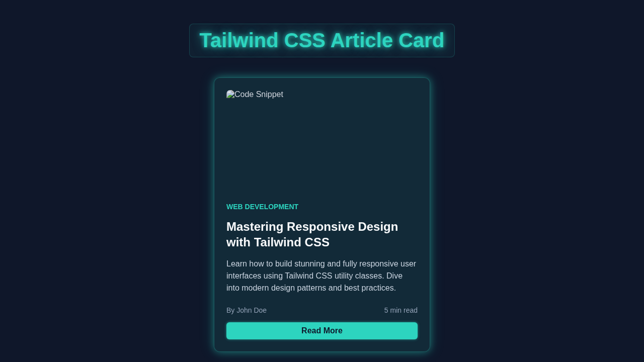
We’re building a versatile article card component. This card will display an image, a title, a brief description, and a call-to-action button. Think of a blog post preview or a news article snippet. It will automatically adjust its layout. This means it looks great on mobile phones, tablets, and large desktop screens. Furthermore, we are giving it a smooth dark mode toggle. Your users will absolutely love that feature. It adds a touch of modern professionalism to any website.
This project is perfect for enhancing your portfolio. Also, it is great for understanding responsive design principles. It leverages Tailwind’s utility-first approach effectively. You’ll gain practical experience with Tailwind’s powerful classes. Therefore, you will build confidence in creating adaptive UIs. Get ready to impress!
HTML Structure
First, we need to set up our basic HTML. This structure will provide the foundation for our article card. We will use semantic elements like <div> and <img>. These elements ensure our content is well-organized. We’ll also include a simple button for our dark mode toggle. Don’t worry about the styling just yet. We will get to that with Tailwind CSS.
Pro Tip: Always prioritize semantic HTML. It improves accessibility and SEO. Screen readers can better understand your content. Search engines also appreciate well-structured pages.
index.html
<!DOCTYPE html>
<html lang="en">
<head>
    <meta charset="UTF-8">
    <meta name="viewport" content="width=device-width, initial-scale=1.0">
    <title>Tailwind CSS Article Card</title>

    <!--
        Tailwind CSS CDN for quick setup.
        For production, it's recommended to install Tailwind via npm and
        configure your build process for optimal performance and file size.
    -->
    <script src="https://cdn.tailwindcss.com"></script>

    <!--
        Custom styles for safe fonts and basic resets.
        These ensure cross-browser consistency and adhere to font requirements.
    -->
    <style>
        /* Apply a safe, widely available font-family */
        body {
            font-family: Arial, Helvetica, sans-serif;
        }

        /* Ensure images and other media respect container boundaries */
        img {
            max-width: 100%;
            height: auto;
            display: block; /* Removes extra space below images */
        }

        /* Universal box-sizing for consistent element dimensions */
        *, *::before, *::after {
            box-sizing: border-box;
        }
    </style>
</head>
<body class="bg-gray-900 flex justify-center items-center min-h-screen p-6">
    <!--
        Article Card Component
        - max-w-sm: Sets a maximum width for smaller screens.
        - mx-auto: Centers the card horizontally.
        - bg-gray-800: Dark background for the card.
        - rounded-lg: Applies large border-radius to corners.
        - shadow-lg: Adds a large shadow for depth.
        - overflow-hidden: Clips content that exceeds the card's boundaries (especially for the image).
        - md:max-w-md lg:max-w-lg: Makes the card wider on medium and large screens for responsiveness.
        - transition-all duration-300 ease-in-out: Smooth transitions for hover effects.
        - hover:shadow-xl hover:scale-105: Enhances shadow and slightly scales up on hover for interactivity.
    -->
    <div class="max-w-sm mx-auto bg-gray-800 rounded-lg shadow-lg overflow-hidden
                md:max-w-md lg:max-w-lg transition-all duration-300 ease-in-out
                hover:shadow-xl hover:scale-105">
        <!--
            Card Image
            - w-full h-48: Full width and fixed height (12rem) for the image.
            - object-cover: Crops the image to fill the container while maintaining aspect ratio.
            - object-center: Centers the cropped image.
        -->
        <img class="w-full h-48 object-cover object-center"
             src="https://images.unsplash.com/photo-1488590528505-98d2f5ddcd9f?q=80&w=2070&auto=format&fit=crop&ixlib=rb-4.0.3&ixid=M3wxMjA3fDB8MHxwaG90by1wYWdlfHx8fGVufDB8fHx8fA%3D%3D"
             alt="Code editor on screen">

        <!-- Card Content Area -->
        <div class="p-6">
            <!-- Category Tag -->
            <span class="text-sm font-semibold text-teal-400 uppercase tracking-wide">Web Development</span>

            <!-- Article Title -->
            <h2 class="mt-2 text-2xl font-bold text-white leading-tight">
                Crafting Modern UIs with Tailwind CSS
            </h2>

            <!-- Article Excerpt/Description -->
            <p class="mt-4 text-gray-300 text-base">
                Discover the power of utility-first CSS to build responsive and beautiful user interfaces efficiently. This article dives deep into practical examples and best practices.
            </p>

            <!-- Metadata (Author and Read Time) -->
            <div class="flex justify-between items-center mt-6 text-sm text-gray-400">
                <span>By Jane Smith</span>
                <span>7 min read</span>
            </div>

            <!-- Read More Button/Link -->
            <a href="#" class="mt-6 block w-full bg-teal-500 hover:bg-teal-600 text-white font-bold py-3 px-4 rounded-md text-center
                              transition-colors duration-200 ease-in-out">
                Read Full Article
            </a>
        </div>
    </div>
</body>
</html>
CSS Styling
Now for the fun part: styling with Tailwind CSS! We will apply various utility classes directly in our HTML. These classes handle everything. They manage spacing, typography, colors, and responsive behaviors. We’ll use the dark: variant to easily add dark mode styles. This makes switching between themes super simple. You will be amazed at how quickly you can style complex components. It’s a huge time-saver compared to writing custom CSS from scratch. If you’re curious about how Tailwind streamlines styling, check out our comparison on Tailwind CSS vs Plain CSS: The Ultimate Comparison.
We won’t need a separate CSS file for our card’s main styling. Tailwind does all the heavy lifting within the HTML. Remember to include your Tailwind CSS setup in your project. This ensures all these magical classes actually work. Here’s what your main CSS file (likely input.css or similar) might look like:
styles.css
/* This file is intentionally left blank. */
/* All component styling is handled directly by Tailwind CSS utility classes in index.html. */
/* Base styles like font-family and box-sizing are included in the <style> tag of index.html for simplicity. */
JavaScript for Dark Mode Toggle
To make our dark mode toggle functional, we need a small piece of JavaScript. This script will listen for clicks on our toggle button. Then, it will add or remove a dark class from the <html> element. Tailwind CSS then automatically applies the dark mode styles. It’s a neat and efficient way to manage themes dynamically. This script is lightweight and easy to understand. Thus, it is perfect for beginners!
How It All Works Together
Let’s break down how these pieces combine. We are creating a robust and responsive Tailwind Article Card. Each part plays a specific role. Understanding this synergy is key. It helps you build more complex components later on.
The Main Card Container
Our article card starts with a main <div>. This div acts as the container for everything else. We apply classes like max-w-4xl to limit its width. Also, mx-auto centers it on larger screens. The bg-white and dark:bg-gray-800 handle our background colors. They gracefully switch between light and dark modes. Furthermore, rounded-xl gives it nice rounded corners. A little shadow-lg adds depth. Padding classes like p-6 create internal space. This prevents content from sticking to the edges. It ensures a polished look.
Responsive Layout with Flexbox
Inside our card, we use flexbox for the main layout. The md:flex class is crucial here. It makes the card content stack vertically on small screens. However, it displays horizontally on medium and larger screens. This is the heart of its responsiveness. The md:space-x-8 adds horizontal spacing. Meanwhile, md:flex-row ensures the correct flex direction. Similarly, flex-col ensures vertical stacking on mobile. Responsive design principles are fully embraced here. They guarantee a great user experience on any device.
Image and Content Sections
The card is divided into an image section and a content section. The image container uses md:w-1/3. This makes the image take up one-third of the width on medium screens. On small screens, it takes the full width. The h-48 and w-full ensure consistent sizing. We use object-cover for perfect image scaling. It prevents distortion. Then, rounded-lg gives the image smooth corners. The content section takes the remaining width with md:w-2/3. It has its own padding and text styling. This separation keeps things organized. It also allows independent styling.
Beginner Tip: Tailwind’s utility-first approach means you compose designs. You combine small, single-purpose classes. This is different from traditional CSS. Traditional CSS often uses larger, custom class names. It’s a powerful and efficient way to build UIs.
Dark Mode Functionality
Our dark mode is truly magical. It relies on Tailwind’s dark: prefix. This prefix applies styles only when the html element has the dark class. Our JavaScript handles toggling this class. When you click the moon icon, JavaScript adds or removes dark. Tailwind then automatically swaps colors. For example, dark:bg-gray-800 makes the background dark. Similarly, dark:text-white makes text white. This system is efficient and declarative. Furthermore, it simplifies theme management immensely. You can explore more about dark mode techniques if you’re interested.
Interactive Elements
We’ve added some hover effects to our button. The hover:bg-blue-600 class changes the button’s background on hover. This provides visual feedback to the user. It makes the button feel more interactive. Small details like this greatly enhance user experience. Remember, user engagement is key to a successful component. Similarly, the dark mode toggle also has a hover effect. This indicates it is clickable.
Tips to Customise It
You’ve built a fantastic foundation! Now, let’s think about how you can make this Tailwind Article Card even better. Customization is where your creativity shines. Try these ideas to extend your project:
- Add Categories/Tags: Integrate a small section for article categories or tags. You could use
<span>elements with distinct Tailwind classes for styling. Think about different colors for different tags. - Change Fonts and Colors: Experiment with different Google Fonts. Tailwind makes it easy to extend your theme. You can also swap out the blues and grays for your brand colors. This personalizes the card.
- Integrate Real Data: Instead of static content, imagine fetching article data from an API. You could dynamically populate the image, title, and description. This is a step towards building real-world applications.
- Animate on Hover: Add more subtle animations. For instance, you could slightly scale the card or image on hover. Tailwind’s
transitionandtransformutilities are perfect for this. - Explore other card designs: If you enjoyed building this, you might like to explore other creative card layouts. For inspiration, check out our guide on building a Glassmorphism Card: Build with Tailwind CSS and HTML.
Conclusion
Wow, you did it! You just built a fully responsive and dark-mode-ready Tailwind Article Card. You used modern HTML, powerful Tailwind CSS, and a touch of JavaScript. This is a huge accomplishment! You now have a versatile component. It’s perfect for any blog or content-heavy website. You also deepened your understanding of responsive design. Furthermore, you learned about theme switching.
Feel proud of what you’ve created. Keep experimenting with different styles and layouts. The best way to learn is by building and trying new things. Share your creation with us and your friends! We love seeing your projects. Keep coding, and happy building!