React Product Tour Tutorial: Build a Step-by-Step Guide with JSX
Hey there, future React wizard! If you’ve ever wanted to build a really engaging user experience for your web app, you’re in the right place. Today, we’re diving into how to create a fantastic React Product Tour component. This interactive guide will gently walk your users through your app’s main features. It’s super cool, highly customisable, and incredibly useful for onboarding new visitors! You will love how dynamic it feels.
What We Are Building: Your Interactive React Product Tour
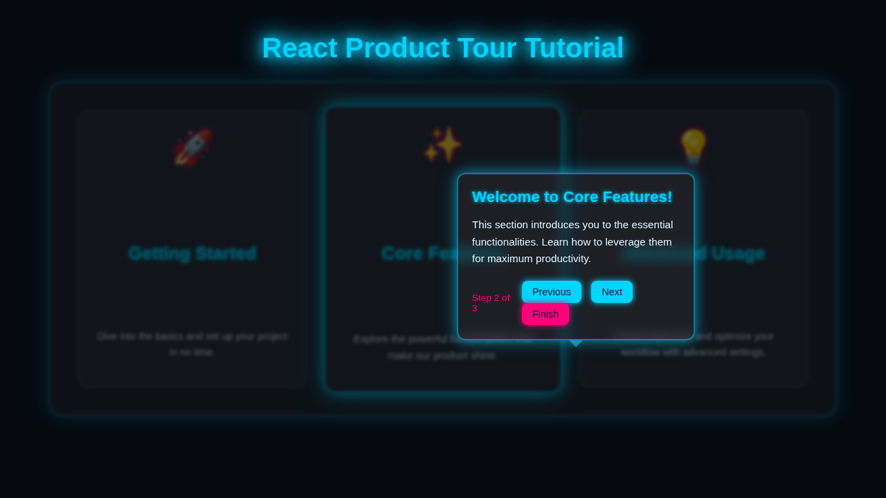
We’re going to build a dynamic product tour that truly stands out. It will highlight specific elements on your page, moving one step at a time. Imagine a user lands on your shiny new app. This tour will gently guide them, showing off key features and explaining their purpose. We will make it super easy to navigate with clear “Next” and “Back” buttons. Plus, we’ll add a “Skip Tour” option for those who already know their way around. This project will teach you so much about React state management and dynamic element positioning. Get ready to impress your users with a professional touch!
HTML Structure
In React, we build our components using JSX. JSX lets us write HTML-like code directly within our JavaScript files. For our product tour, we’ll need a main container to hold everything. This container will dynamically appear on screen. It will hold our tour step’s descriptive content and all the navigation buttons. We also need to include a translucent overlay to properly focus user attention. This provides a clear visual hierarchy.
public/index.html
<!DOCTYPE html>
<html lang="en">
<head>
    <meta charset="utf-8" />
    <meta name="viewport" content="width=device-width, initial-scale=1" />
    <meta name="theme-color" content="#000000" />
    <meta name="description" content="React product tour tutorial" />
    <title>React Product Tour App</title>
    <!-- Link to the global stylesheet -->
    <link rel="stylesheet" href="%PUBLIC_URL%/styles.css">
</head>
<body>
    <noscript>You need to enable JavaScript to run this app.</noscript>
    <div id="root"></div>
    <!--
      This HTML file is a template.
      If you open it directly in the browser, you will see an empty page.

      You can add webfonts, meta tags, or analytics to this file.
      The build step will place the bundled scripts into the <body> tag.

      To begin the development, run `npm start` or `yarn start`.
      To create a production bundle, use `npm run build` or `yarn build`.
    -->
</body>
</html>
CSS Styling
Next, we’ll make our product tour component look absolutely amazing with some CSS magic! We need crucial styles for the overlay that dims the background. This overlay ensures the user’s focus stays on the tour popup. We also need to style the tour box itself. This box will display the step’s title, content, and the current step number. Furthermore, we will style the navigation buttons, ensuring they are clear and user-friendly. Pay attention to position: absolute and z-index for proper layering. Explore more about advanced CSS transitions on CSS-Tricks to add smooth animations!
src/styles.css
/* General styling for the React application */
body {
    margin: 0;
    font-family: Arial, Helvetica, sans-serif;
    -webkit-font-smoothing: antialiased;
    -moz-osx-font-smoothing: grayscale;
    background-color: #1a202c; /* Dark background */
    color: #e2e8f0; /* Light text */
    box-sizing: border-box;
    overflow-x: hidden; /* Prevent horizontal scroll */
}

#root {
    display: flex;
    flex-direction: column;
    align-items: center;
    padding: 20px;
    min-height: 100vh;
}

h1, h2, h3, h4, h5, h6 {
    color: #4299e1; /* A nice blue for headings */
    margin-top: 0;
    margin-bottom: 0.5em;
}

button {
    cursor: pointer;
    border: none;
    padding: 10px 20px;
    border-radius: 8px;
    font-size: 1em;
    transition: background-color 0.2s ease, transform 0.2s ease, box-shadow 0.2s ease;
}

button:hover {
    transform: translateY(-1px);
}

button:disabled {
    cursor: not-allowed;
    opacity: 0.6;
    transform: none;
    box-shadow: none;
}

/* App-specific content for demonstration */
.app-content {
    display: flex;
    flex-wrap: wrap;
    gap: 30px;
    justify-content: center;
    padding: 40px 20px;
    max-width: 1200px;
    width: 100%;
    margin-top: 40px;
}

.feature-card {
    background-color: #2d3748; /* Slightly lighter dark background */
    border: 1px solid #4a5568;
    border-radius: 12px;
    padding: 25px;
    width: 300px;
    box-shadow: 0 4px 6px rgba(0, 0, 0, 0.1);
    text-align: center;
    transition: transform 0.3s ease, box-shadow 0.3s ease;
    display: flex;
    flex-direction: column;
    align-items: center;
    justify-content: center;
    min-height: 200px;
}

.feature-card:hover {
    transform: translateY(-5px);
    box-shadow: 0 8px 12px rgba(0, 0, 0, 0.2);
}

.feature-card h3 {
    margin-top: 15px;
    margin-bottom: 10px;
    color: #63b3ed; /* Lighter blue */
}

.feature-card p {
    font-size: 0.95em;
    color: #a0aec0;
}

.start-tour-button {
    background-color: #63b3ed;
    color: #1a202c;
    font-weight: bold;
    margin-top: 20px;
}

.start-tour-button:hover {
    background-color: #4299e1;
    box-shadow: 0 0 15px rgba(66, 153, 225, 0.6);
}

/* ProductTour Component Styles */
.product-tour-backdrop {
    position: fixed;
    top: 0;
    left: 0;
    width: 100vw;
    height: 100vh;
    background: rgba(0, 0, 0, 0.7); /* Dark semi-transparent overlay */
    backdrop-filter: blur(3px); /* Glassmorphism effect */
    z-index: 9990; /* Below the popover and highlight */
}

.product-tour-popover {
    position: fixed;
    background-color: #2d3748;
    border: 1px solid #4299e1;
    border-radius: 10px;
    padding: 20px;
    width: 300px;
    max-width: calc(100vw - 40px);
    box-shadow: 0 0 20px rgba(66, 153, 225, 0.4);
    z-index: 9999; /* Above backdrop and highlight */
    transition: all 0.3s ease-out; /* Smooth positioning */
    display: flex;
    flex-direction: column;
    opacity: 0; /* Hidden by default, shown by React */
    transform: scale(0.95); /* Little animation */
    pointer-events: none; /* Allows interaction with elements behind it when not visible */
}

.product-tour-popover.visible {
    opacity: 1;
    transform: scale(1);
    pointer-events: auto;
}

.product-tour-popover h4 {
    color: #63b3ed;
    font-size: 1.3em;
    margin-bottom: 10px;
}

.product-tour-popover p {
    color: #a0aec0;
    font-size: 0.95em;
    line-height: 1.6;
    margin-bottom: 20px;
}

.product-tour-footer {
    display: flex;
    justify-content: space-between;
    align-items: center;
    margin-top: auto; /* Push buttons to bottom */
    padding-top: 10px;
    border-top: 1px solid rgba(255, 255, 255, 0.1);
}

.product-tour-step-indicator {
    font-size: 0.85em;
    color: #a0aec0;
}

.product-tour-buttons button {
    background-color: #63b3ed;
    color: #1a202c;
    padding: 6px 12px;
    font-size: 0.85em;
    margin-left: 8px;
    border-radius: 6px;
    box-shadow: 0 0 10px rgba(66, 153, 225, 0.3);
}

.product-tour-buttons button:hover {
    background-color: #4299e1;
    box-shadow: 0 0 12px rgba(66, 153, 225, 0.5);
}

.product-tour-buttons button.skip-button {
    background-color: #e53e3e; /* Red for skip/finish */
    color: white;
    box-shadow: 0 0 10px rgba(229, 62, 62, 0.3);
}

.product-tour-buttons button.skip-button:hover {
    background-color: #c53030;
    box-shadow: 0 0 12px rgba(229, 62, 62, 0.5);
}

/* Highlighted element styles */
.tour-highlighted-element {
    position: absolute;
    z-index: 9995; /* Above backdrop, below popover */
    box-shadow: 0 0 0 5px #63b3ed, 0 0 0 1000px rgba(0, 0, 0, 0.4); /* Inner glow + darkening overlay */
    outline: 2px solid #63b3ed; /* Border for emphasis */
    border-radius: 12px; /* Match card border radius */
    animation: tour-glow 1.5s infinite alternate;
    pointer-events: none; /* Do not block clicks on the actual element */
}

@keyframes tour-glow {
    from { box-shadow: 0 0 0 5px #63b3ed, 0 0 0 1000px rgba(0, 0, 0, 0.4); }
    to { box-shadow: 0 0 0 8px #4299e1, 0 0 0 1000px rgba(0, 0, 0, 0.5); }
}

/* Cleanup for highlighted elements - remove dynamic styling on tour close */
.tour-target-active {
    /* This class is added by JS to the actual target element */
    /* Can be used to apply specific styles to the actual element if needed, */
    /* but the .tour-highlighted-element handles the visual highlight */
}
JavaScript Logic (React)
Now for the exciting part: the React JavaScript logic! This is where our tour truly comes alive. We will use React’s useState hook to effectively manage our tour’s current step. This important hook helps us keep track of which specific step in the sequence we are currently displaying. We will also define a clear list of tour steps, where each step has its own unique content and identifies its target element. Then, we will implement clever functions to move forward through the tour, go backward, or completely skip the tour. This dynamic logic is truly where the magic happens and your app feels responsive!
src/index.js
import React from 'react';
import ReactDOM from 'react-dom/client';
import App from './App';
import './styles.css'; // Import the global styles

const root = ReactDOM.createRoot(document.getElementById('root'));
root.render(
  <React.StrictMode>
    <App />
  </React.StrictMode>
);
src/App.js
import React, { useState } from 'react';
import ProductTour from './ProductTour';

// Define the steps for our product tour
const tourSteps = [
    {
        selector: '#feature-card-1',
        title: 'Welcome to Feature A',
        content: 'This card highlights our amazing Feature A. It helps you organize your data efficiently.',
    },
    {
        selector: '#feature-card-2',
        title: 'Discover Feature B',
        content: 'Here\'s Feature B! It provides powerful analytics and insights.',
    },
    {
        selector: '#feature-card-3',
        title: 'Explore Feature C',
        content: 'And finally, Feature C – perfect for collaborating with your team.',
    },
    {
        selector: '#start-tour-button', // Target the button itself
        title: 'Tour Complete!',
        content: 'You\'ve seen the main features! Click "Start Tour" again anytime.',
    }
];

function App() {
    const [isTourOpen, setIsTourOpen] = useState(false);

    const startTour = () => {
        setIsTourOpen(true);
    };

    const handleTourClose = () => {
        setIsTourOpen(false);
        // Optional: Remove any leftover highlight classes from elements
        document.querySelectorAll('.tour-target-active').forEach(el => {
            el.classList.remove('tour-target-active');
        });
    };

    return (
        <div>
            <h1>React Product Tour Tutorial</h1>

            <button
                id="start-tour-button"
                className="start-tour-button"
                onClick={startTour}
            >
                Start Product Tour
            </button>

            <div className="app-content">
                <div id="feature-card-1" className="feature-card">
                    <h2>🚀 Feature A</h2>
                    <p>Effortlessly manage your tasks and projects with our intuitive interface.</p>
                </div>
                <div id="feature-card-2" className="feature-card">
                    <h2>✨ Feature B</h2>
                    <p>Unlock advanced analytics to make data-driven decisions faster.</p>
                }
                <div id="feature-card-3" className="feature-card">
                    <h2>💡 Feature C</h2>
                    <p>Collaborate seamlessly with your team in real-time on shared documents.</p>
                </div>
            </div>

            <ProductTour
                steps={tourSteps}
                isOpen={isTourOpen}
                onClose={handleTourClose}
            />
        </div>
    );
}

export default App;
src/ProductTour.js
import React, { useState, useEffect, useRef, useCallback } from 'react';

const POPOVER_OFFSET = 15; // Distance between target element and popover

function ProductTour({ steps, isOpen, onClose }) {
    const [currentStepIndex, setCurrentStepIndex] = useState(0);
    const [popoverPosition, setPopoverPosition] = useState({ top: 0, left: 0 });
    const [targetElementRect, setTargetElementRect] = useState(null);
    const popoverRef = useRef(null); // Reference to the popover element itself

    const currentStep = steps[currentStepIndex];

    // Function to calculate and set the popover's position
    const calculatePopoverPosition = useCallback(() => {
        if (!currentStep || !isOpen || !popoverRef.current) return;

        const targetElement = document.querySelector(currentStep.selector);
        if (!targetElement) {
            console.warn(`ProductTour: Target element for selector "${currentStep.selector}" not found.`);
            // Try to proceed to the next step or close the tour if a target is missing
            if (currentStepIndex < steps.length - 1) {
                setCurrentStepIndex(prev => prev + 1);
            } else {
                onClose();
            }
            return;
        }

        // Remove highlight from previous target, add to current
        document.querySelectorAll('.tour-target-active').forEach(el => {
            el.classList.remove('tour-target-active');
        });
        targetElement.classList.add('tour-target-active');

        const targetRect = targetElement.getBoundingClientRect();
        setTargetElementRect(targetRect); // Store rect for the highlight effect

        const popoverRect = popoverRef.current.getBoundingClientRect();

        let top = 0;
        let left = 0;

        // Default position: above the target
        top = targetRect.top - popoverRect.height - POPOVER_OFFSET;
        left = targetRect.left + (targetRect.width / 2) - (popoverRect.width / 2);

        // Adjust if popover goes off-screen (top)
        if (top < 10) { // 10px margin from top
            top = targetRect.bottom + POPOVER_OFFSET; // Position below
            // If still goes off-screen (bottom), try left/right or fallback to top-center
            if (top + popoverRect.height > window.innerHeight - 10) {
                // Fallback to top-center if it fits within viewport
                top = Math.max(10, (window.innerHeight - popoverRect.height) / 2);
            }
        }

        // Adjust if popover goes off-screen (left/right)
        if (left < 10) { // 10px margin from left
            left = 10;
        } else if (left + popoverRect.width > window.innerWidth - 10) { // 10px margin from right
            left = window.innerWidth - popoverRect.width - 10;
        }

        setPopoverPosition({ top, left });

        // Scroll into view if target is not visible
        if (targetRect.top < 0 || targetRect.bottom > window.innerHeight || targetRect.left < 0 || targetRect.right > window.innerWidth) {
            targetElement.scrollIntoView({ behavior: 'smooth', block: 'center', inline: 'center' });
        }
    }, [currentStep, currentStepIndex, isOpen, onClose, steps.length]);

    // Effect to recalculate position on step change or window resize
    useEffect(() => {
        if (isOpen && currentStep) {
            calculatePopoverPosition();
            window.addEventListener('resize', calculatePopoverPosition);
        } else {
            // Cleanup: remove highlight class when tour is closed
            document.querySelectorAll('.tour-target-active').forEach(el => {
                el.classList.remove('tour-target-active');
            });
            setTargetElementRect(null); // Clear highlight element position
        }
        return () => {
            window.removeEventListener('resize', calculatePopoverPosition);
        };
    }, [isOpen, currentStep, calculatePopoverPosition]);


    // Handlers for navigation
    const handleNext = () => {
        if (currentStepIndex < steps.length - 1) {
            setCurrentStepIndex(prev => prev + 1);
        } else {
            onClose(); // Tour finishes
            setCurrentStepIndex(0); // Reset for next time
        }
    };

    const handlePrevious = () => {
        if (currentStepIndex > 0) {
            setCurrentStepIndex(prev => prev - 1);
        }
    };

    const handleSkip = () => {
        onClose();
        setCurrentStepIndex(0); // Reset for next time
    };

    if (!isOpen || !currentStep) {
        return null; // Don't render anything if tour is not open or step is missing
    }

    const isLastStep = currentStepIndex === steps.length - 1;

    // Render the backdrop and the popover
    return (
        <>
            <div className="product-tour-backdrop" onClick={handleSkip}></div>

            {/* Dynamic highlight effect (border and background darkening) */}
            {targetElementRect && (
                <div
                    className="tour-highlighted-element"
                    style={{
                        position: 'absolute',
                        top: targetElementRect.top + window.scrollY,
                        left: targetElementRect.left + window.scrollX,
                        width: targetElementRect.width,
                        height: targetElementRect.height,
                    }}
                ></div>
            )}

            <div
                ref={popoverRef}
                className={`product-tour-popover ${isOpen && currentStep ? 'visible' : ''}`}
                style={{
                    top: popoverPosition.top,
                    left: popoverPosition.left,
                }}
            >
                <h4>{currentStep.title}</h4>
                <p>{currentStep.content}</p>

                <div className="product-tour-footer">
                    <span className="product-tour-step-indicator">
                        Step {currentStepIndex + 1} of {steps.length}
                    </span>
                    <div className="product-tour-buttons">
                        <button onClick={handlePrevious} disabled={currentStepIndex === 0}>
                            Previous
                        </button>
                        <button onClick={handleNext}>
                            {isLastStep ? 'Finish' : 'Next'}
                        </button>
                        <button onClick={handleSkip} className="skip-button">
                            Skip
                        </button>
                    </div>
                </div>
            </div>
        </>
    );
}

export default ProductTour;
How It All Works Together
Let’s tie all these fantastic pieces together! We are creating a truly interactive experience for your users. This structured approach ensures they get a super smooth introduction to your application. It also makes learning your app’s features much more engaging and fun!
Setting Up Our Tour Data
First, we thoughtfully define an array of objects. Each individual object beautifully represents a single step within our product tour. Therefore, each step contains a selector property. This selector property points directly to the specific HTML element we want to highlight on the page. Furthermore, each step also holds a title and content for that particular tour segment. We can very easily add or remove steps from this array later on. This design makes our entire tour component incredibly flexible and easy to update!
Controlling the Tour Steps
We cleverly use React’s useState hook for two key pieces of state: currentStepIndex and isTourOpen. The currentStepIndex variable tells us precisely which step is currently active in the sequence. On the other hand, isTourOpen is a boolean that determines if the product tour is even visible to the user. When a user clicks the “Next” button, we simply increment currentStepIndex. Conversely, clicking “Back” decrements it, allowing easy navigation. If they click “Skip Tour” or reach the very end, isTourOpen instantly becomes false. This straightforward state management powers our entire dynamic tour experience. It’s surprisingly elegant!
Pro Tip: Mastering state management is absolutely crucial in React development! Using hooks like
useStatehelps you efficiently track and update dynamic data in your components. Dive deeper and practice with our React To-Do List Tutorial: Functional Components & Hooks.
Displaying the Tour Overlay
Our active tour step needs to appear perfectly positioned right next to its target element. We achieve this clever positioning with a combination of JavaScript and CSS. First, we programmatically find the target element on the page using its unique selector. This is often done with document.querySelector(). Then, we accurately calculate its exact position and dimensions using getBoundingClientRect(). You can learn more about element positioning on MDN’s getBoundingClientRect documentation. We then apply these calculated values to our tour overlay and popup box using inline styles. This ensures they are positioned perfectly over or very near the highlighted element. We also make absolutely sure the background is appropriately dimmed. This keeps the user’s focus laser-sharp on the current tour step. This dynamic and precise positioning creates a super polished and professional user experience.
Tips to Customise Your React Product Tour
You’ve built an awesome and functional product tour component! Now, let’s think about some fantastic ways you can make it even better and truly unique. Personalization is key for a great user experience.
- Add Progress Indicators: Show users exactly how many steps are left in the tour. You could easily add simple dots at the bottom or a clear progress bar. This feature helps manage user expectations and provides a sense of accomplishment.
- Implement Keyboard Navigation: Improve accessibility and user comfort significantly. Allow users to navigate through the tour using arrow keys (left/right). You could also let the ‘Escape’ key gracefully close the tour. This provides a more robust interaction method.
- Tour Persistence with Local Storage: Use
localStorageto remember if a user has already completed the tour. This clever trick prevents showing it repeatedly on subsequent visits. For more insights on managing user preferences, definitely check out our React Theme Switcher Tutorial: Build a Dark/Light Mode with Hooks! - Custom Animations and Transitions: Add some really fancy CSS transitions or integrate a library like React Spring for smoother step changes. For example, make the tour box gently fade in or slide into view. This adds a delightful touch of flair and professionalism.
- Tour Completion Callbacks: Execute a function when the tour finishes. Perhaps you want to show a “Welcome Aboard” message. Or maybe trigger another action in your app. This makes your tour part of a larger workflow.
Keep Learning: Want to make your React application even faster and more responsive? Optimizing rendering cycles can drastically improve performance and user satisfaction. Read our comprehensive guide on React Performance Optimization: Master Faster UIs for advanced techniques and best practices!
Conclusion
Absolutely amazing job, pro coder! You have successfully built a powerful and interactive React Product Tour component from scratch. You now possess a solid understanding of React state management, dynamic element positioning, and handling user interaction. This particular skill is incredibly valuable for creating engaging and user-friendly applications that stand out. Go ahead and confidently integrate this awesome tour component into your next exciting project! Please share your incredible creations with us on social media. We always love seeing what you build and accomplish. Keep coding, keep experimenting, and keep creating fantastic web experiences!