React To-Do List Tutorial: Functional Components & Hooks
Hey there, future React wizard! If you’ve wanted to build a React To-Do List but weren’t sure where to begin, you’ve landed in the perfect spot. We’re going to create a super useful to-do app together. It’s a fantastic way to master React’s core concepts. Get ready to learn state and props by building something real!
What We Are Building
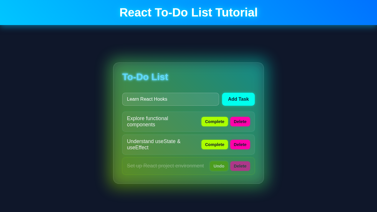
Let’s build a simple yet powerful to-do list. This app will help you track your daily tasks. You can add new tasks easily. You can mark them as complete. You can even delete them when done! It’s interactive and super useful. You’ll see your React skills grow with every line of code.
HTML Structure
We need a place for our React app to live. Our HTML will be quite simple. It will hold the root element for our application. This is where React takes over control. Don’t worry, we’re setting up the stage!
public/index.html
<!DOCTYPE html>
<html lang="en">
<head>
    <meta charset="UTF-8">
    <meta name="viewport" content="width=device-width, initial-scale=1.0">
    <title>React To-Do List App</title>
</head>
<body>
    <noscript>You need to enable JavaScript to run this app.</noscript>
    <div id="root"></div>
    <!--
        This is the main entry point for your React application.
        The 'div' with id 'root' is where your React components will be rendered.
        In a typical Create React App setup, the bundled JavaScript (e.g., bundle.js)
        is automatically injected here during the build process.
    -->
</body>
</html>
CSS Styling
Next, we’ll make our app look good. We will add some basic CSS. This makes the to-do list clean and readable. We want a friendly user interface. Don’t worry, our focus is functionality today. But good styling makes everything better.
src/index.css
/* src/index.css */
/* Global styles for the entire application */

body {
  margin: 0;
  font-family: Arial, Helvetica, sans-serif; /* Safe font stack */
  background-color: #282c34; /* Dark background for consistency */
  color: #f0f0f0; /* Light text color */
  -webkit-font-smoothing: antialiased;
  -moz-osx-font-smoothing: grayscale;
  box-sizing: border-box; /* Ensure padding and border are included in element's total width and height */
  overflow-x: hidden; /* Prevent horizontal scrollbars */
}

/* Basic reset for all elements */
*, *::before, *::after {
  box-sizing: border-box;
}

/* Styling for code snippets, if any */
code {
  font-family: source-code-pro, Menlo, Monaco, Consolas, 'Courier New',
    monospace;
}
src/App.css
/* src/App.css */

/* General App Styles */
.App {
  text-align: center;
  display: flex;
  flex-direction: column;
  align-items: center;
  justify-content: center;
  min-height: 100vh; /* Full viewport height */
  background-color: #282c34; /* Dark background */
  color: #f0f0f0; /* Light text */
  font-family: Arial, Helvetica, sans-serif; /* Safe font */
  box-sizing: border-box; /* Ensure padding/border don't add to total width/height */
  overflow: hidden; /* Prevent body scrollbars */
  padding: 20px; /* Add some padding around the app content */
}

.App-header {
  margin-bottom: 2rem;
  font-size: clamp(1.5rem, 5vw, 2.5rem); /* Responsive font size for title */
  color: #61dafb; /* React blue accent */
  text-shadow: 0 0 5px rgba(97, 218, 251, 0.5),
               0 0 10px rgba(97, 218, 251, 0.4); /* Subtle neon glow */
}

/* To-Do Container - Glassmorphism Effect */
.todo-container {
  background: rgba(255, 255, 255, 0.08); /* Semi-transparent white */
  backdrop-filter: blur(10px); /* Glass effect */
  -webkit-backdrop-filter: blur(10px); /* For Safari */
  border: 1px solid rgba(255, 255, 255, 0.2); /* Light border */
  border-radius: 15px;
  box-shadow: 0 8px 32px 0 rgba(0, 0, 0, 0.4); /* Deep shadow for depth */
  padding: 2.5rem;
  max-width: 90%; /* Responsive max width */
  width: 500px; /* Fixed width for better control on larger screens */
  display: flex;
  flex-direction: column;
  gap: 1.5rem;
  box-sizing: border-box;
}

/* To-Do Form */
.todo-form {
  display: flex;
  gap: 0.8rem;
  margin-bottom: 1rem;
  max-width: 100%;
  box-sizing: border-box;
}

.todo-input {
  flex-grow: 1;
  padding: 0.8rem 1rem;
  border: 1px solid rgba(255, 255, 255, 0.3);
  border-radius: 8px;
  background-color: rgba(255, 255, 255, 0.1);
  color: #f0f0f0;
  font-size: 1rem;
  outline: none; /* Remove default outline */
  box-sizing: border-box;
  max-width: 100%;
}

.todo-input::placeholder {
  color: rgba(255, 255, 255, 0.6);
}

.todo-input:focus {
  border-color: #61dafb; /* React blue on focus */
  box-shadow: 0 0 8px rgba(97, 218, 251, 0.6); /* Glow on focus */
}

.todo-button {
  padding: 0.8rem 1.5rem;
  background-color: #61dafb; /* React blue button */
  color: #282c34; /* Dark text for contrast */
  border: none;
  border-radius: 8px;
  cursor: pointer;
  font-size: 1rem;
  font-weight: bold;
  transition: background-color 0.3s ease, transform 0.2s ease, box-shadow 0.3s ease;
  box-sizing: border-box;
}

.todo-button:hover {
  background-color: #37b7e8;
  transform: translateY(-2px); /* Slight lift effect */
  box-shadow: 0 4px 10px rgba(97, 218, 251, 0.4); /* Button shadow on hover */
}

/* To-Do List */
.todo-list {
  display: flex;
  flex-direction: column;
  gap: 0.8rem;
  max-height: 400px; /* Limit height for scrollable list */
  overflow-y: auto; /* Enable scrolling if too many items */
  padding-right: 5px; /* Space for scrollbar */
}

/* Custom Scrollbar for Webkit browsers */
.todo-list::-webkit-scrollbar {
  width: 8px;
}

.todo-list::-webkit-scrollbar-track {
  background: rgba(255, 255, 255, 0.05);
  border-radius: 10px;
}

.todo-list::-webkit-scrollbar-thumb {
  background-color: rgba(97, 218, 251, 0.4); /* React blue translucent scrollbar */
  border-radius: 10px;
  border: 2px solid rgba(255, 255, 255, 0.05);
}

.no-todos {
  color: rgba(255, 255, 255, 0.7);
  font-style: italic;
  margin-top: 1rem;
}

/* To-Do Item */
.todo-item {
  display: flex;
  justify-content: space-between;
  align-items: center;
  padding: 0.8rem 1.2rem;
  background-color: rgba(255, 255, 255, 0.05);
  border-radius: 8px;
  border: 1px solid rgba(255, 255, 255, 0.1);
  transition: background-color 0.3s ease, border-color 0.3s ease, transform 0.2s ease;
  box-sizing: border-box;
  max-width: 100%;
}

.todo-item:hover {
  background-color: rgba(255, 255, 255, 0.08);
  border-color: rgba(255, 255, 255, 0.2);
  transform: translateX(5px); /* Slight slide effect on hover */
}

.todo-item.completed {
  opacity: 0.7; /* Dim completed items */
  background-color: rgba(144, 238, 144, 0.05); /* Light green tint for completed */
  border-color: rgba(144, 238, 144, 0.1);
}

.todo-text {
  flex-grow: 1;
  text-align: left;
  margin-right: 1rem;
  cursor: pointer;
  font-size: 1.1rem;
  word-break: break-word; /* Allow long words to break */
}

.todo-actions {
  display: flex;
  gap: 0.5rem;
}

.todo-actions button {
  padding: 0.6rem 1rem;
  border: none;
  border-radius: 6px;
  cursor: pointer;
  font-size: 0.9rem;
  font-weight: bold;
  transition: background-color 0.3s ease, transform 0.2s ease;
  box-sizing: border-box;
}

.complete-button {
  background-color: #28a745; /* Green */
  color: #fff;
}

.complete-button:hover {
  background-color: #218838;
  transform: translateY(-1px);
}

.delete-button {
  background-color: #dc3545; /* Red */
  color: #fff;
}

.delete-button:hover {
  background-color: #c82333;
  transform: translateY(-1px);
}

/* Responsive adjustments */
@media (max-width: 600px) {
  .todo-container {
    padding: 1.5rem;
    width: 95%; /* Even smaller width on small screens */
  }

  .todo-form {
    flex-direction: column; /* Stack input and button vertically */
    gap: 0.5rem;
  }

  .todo-button {
    width: 100%;
    padding: 0.9rem;
  }

  .todo-item {
    flex-direction: column;
    align-items: flex-start;
    gap: 0.5rem;
    padding: 0.8rem;
  }

  .todo-text {
    width: 100%;
    margin-right: 0;
    margin-bottom: 0.5rem;
  }

  .todo-actions {
    width: 100%;
    justify-content: flex-end; /* Align buttons to the right */
  }

  .todo-actions button {
    flex: 1; /* Make buttons take equal width */
    padding: 0.8rem;
  }
}

@media (max-width: 400px) {
  .todo-actions {
    flex-direction: column; /* Stack buttons vertically on very small screens */
  }
}
JavaScript: The Heart of Our React To-Do List
Now for the exciting part: the JavaScript! This is where React truly comes alive. We’ll use modern functional components. We will also dive into handy React Hooks. You’ll learn about useState and useEffect. These are super important for any React developer. Let’s make this React To-Do List interactive!
src/index.js
import React from 'react';
import ReactDOM from 'react-dom/client';
import './index.css'; // Global base styles for the application
import App from './App'; // The main App component

// Create a React root to render the application
const root = ReactDOM.createRoot(document.getElementById('root'));

// Render the App component into the root element
// React.StrictMode helps identify potential problems in an application.
// It activates additional checks and warnings for its descendants.
root.render(
  <React.StrictMode>
    <App />
  </React.StrictMode>
);
src/App.js
import React, { useState, useEffect } from 'react';
import './App.css'; // Component-specific styling
import TodoForm from './TodoForm'; // Component for adding new todos
import TodoItem from './TodoItem'; // Component for displaying individual todo items

/**
 * The main application component that manages the To-Do list.
 * It uses functional components and React hooks (useState, useEffect).
 */
function App() {
  // State to hold the list of todos. Each todo is an object { id, text, completed }.
  const [todos, setTodos] = useState([]);

  // useEffect hook to load todos from local storage when the component mounts.
  // The empty dependency array `[]` ensures this runs only once after the initial render.
  useEffect(() => {
    const storedTodos = JSON.parse(localStorage.getItem('todos'));
    if (storedTodos) {
      setTodos(storedTodos);
    }
  }, []);

  // useEffect hook to save todos to local storage whenever the 'todos' state changes.
  // The dependency array `[todos]` makes sure this effect re-runs when 'todos' is updated.
  useEffect(() => {
    localStorage.setItem('todos', JSON.stringify(todos));
  }, [todos]);

  /**
   * Adds a new todo item to the list.
   * @param {string} text - The text content of the new todo.
   */
  const addTodo = (text) => {
    if (text.trim() === '') return; // Prevent adding empty todos
    const newTodo = { id: Date.now(), text, completed: false }; // Create a unique ID using Date.now()
    setTodos([...todos, newTodo]); // Add the new todo to the existing list
  };

  /**
   * Toggles the 'completed' status of a todo item.
   * @param {number} id - The unique ID of the todo item to toggle.
   */
  const toggleComplete = (id) => {
    setTodos(todos.map(todo =>
      todo.id === id ? { ...todo, completed: !todo.completed } : todo
    ));
  };

  /**
   * Deletes a todo item from the list.
   * @param {number} id - The unique ID of the todo item to delete.
   */
  const deleteTodo = (id) => {
    setTodos(todos.filter(todo => todo.id !== id));
  };

  return (
    <div className="App">
      {/* Application Header */}
      <header className="App-header">
        <h1>React To-Do List</h1>
      </header>

      {/* Main To-Do container with glassmorphism styling */}
      <div className="todo-container">
        {/* Component for adding new tasks */}
        <TodoForm addTodo={addTodo} />

        {/* List of todo items */}
        <div className="todo-list">
          {todos.length === 0 ? (
            <p className="no-todos">No tasks yet! Add one above.</p>
          ) : (
            todos.map(todo => (
              <TodoItem
                key={todo.id} // Unique key for list rendering optimization
                todo={todo} // Pass the todo object as a prop
                toggleComplete={toggleComplete} // Pass the toggle function
                deleteTodo={deleteTodo} // Pass the delete function
              />
            ))
          )}
        </div>
      </div>
    </div>
  );
}

export default App;
src/TodoForm.js
import React, { useState } from 'react';

/**
 * A functional component for adding new todo items.
 * It includes an input field and an "Add Task" button.
 * @param {object} props - Component props.
 * @param {function} props.addTodo - Function to call when a new todo is submitted.
 */
function TodoForm({ addTodo }) {
  // State to manage the input field's value
  const [inputValue, setInputValue] = useState('');

  /**
   * Handles the form submission event.
   * Prevents default form behavior and calls the addTodo function with the current input value.
   * @param {Event} e - The form submission event.
   */
  const handleSubmit = (e) => {
    e.preventDefault(); // Prevent page reload
    addTodo(inputValue); // Call the addTodo function passed from parent (App.js)
    setInputValue(''); // Clear the input field after submission
  };

  return (
    <form onSubmit={handleSubmit} className="todo-form">
      <input
        type="text"
        className="todo-input"
        value={inputValue} // Controlled component: input value is tied to state
        onChange={(e) => setInputValue(e.target.value)} // Update state on input change
        placeholder="Add a new task..."
        aria-label="New task input field"
      />
      <button type="submit" className="todo-button">Add Task</button>
    </form>
  );
}

export default TodoForm;
src/TodoItem.js
import React from 'react';

/**
 * A functional component to display a single todo item.
 * It shows the todo text and includes buttons to toggle its completion status and delete it.
 * @param {object} props - Component props.
 * @param {object} props.todo - The todo object { id, text, completed }.
 * @param {function} props.toggleComplete - Function to toggle the todo's completion status.
 * @param {function} props.deleteTodo - Function to delete the todo.
 */
function TodoItem({ todo, toggleComplete, deleteTodo }) {
  return (
    <div className={`todo-item ${todo.completed ? 'completed' : ''}`}> {/* Apply 'completed' class if todo is completed */}
      {/* Todo text, clickable to toggle completion */}
      <span
        className="todo-text"
        onClick={() => toggleComplete(todo.id)}
        style={{ textDecoration: todo.completed ? 'line-through' : 'none' }} // Apply line-through if completed
        aria-label={`Mark task "${todo.text}" as ${todo.completed ? 'incomplete' : 'complete'}`}
      >
        {todo.text}
      </span>

      {/* Action buttons (Complete/Undo, Delete) */}
      <div className="todo-actions">
        <button
          className="complete-button"
          onClick={() => toggleComplete(todo.id)}
          aria-label={`Toggle complete for task "${todo.text}"`}
        >
          {todo.completed ? 'Undo' : 'Complete'}
        </button>
        <button
          className="delete-button"
          onClick={() => deleteTodo(todo.id)}
          aria-label={`Delete task "${todo.text}"`}
        >
          Delete
        </button>
      </div>
    </div>
  );
}

export default TodoItem;
How It All Works Together: Building Your React To-Do List
Setting Up Your Project
First, we need to create a new React project. We use Create React App for this. It sets up everything for us. Open your terminal and run npx create-react-app my-todo-app. Then, navigate into your new project. You can start the development server with npm start. This gets our development environment ready.
The App Component
Our App.js is the main component. It’s the brain of our whole application. Here, we will manage the list of tasks. We use the useState hook for this. `useState` lets us add state to functional components. State is simply data that changes over time. It holds our `todos` array. This array stores all our tasks.
We will also define functions here. These functions will add, toggle, and delete tasks. These are crucial for interactivity. Let me explain what’s happening here. When addTodo is called, it creates a new task. This task gets a unique ID. It also gets its text and a completed status. Then, it updates the todos array.
toggleTodo finds a task by its ID. It then flips the completed status. This is how we mark tasks as done. deleteTodo removes a task entirely. It filters the array. This keeps only the tasks we want. These state updates trigger a re-render. This means your UI always stays fresh. Learning about state and props is key to React. Want to dive deeper? Check out our guide on React Props & State: Master Data Flow in Components!
Pro Tip: State management is at the core of all interactive React applications. Mastering
useStateis a huge step forward in your React journey!
The TodoItem Component
Next, we have the TodoItem component. This component is responsible for displaying one single task. It receives todo, toggleTodo, and deleteTodo as props. Props are how data flows from parent to child components. They are like arguments for functions. They allow components to be reusable.
Each TodoItem shows the task text. It also has a checkbox. This checkbox lets you toggle the task’s completion. There’s also a delete button. This button removes the task from the list. This modular approach keeps our code clean. It also makes our components highly reusable. Learn more about how components fit together in React Components Explained: Node Tree & Neon Glow.
The TodoForm Component
Finally, we build the TodoForm. This is where you will add new tasks. It has an input field. It also has an “Add Task” button. We use useState here too. It manages the current input value. This keeps our input field controlled.
When you submit the form, it calls addTodo. This function comes from the parent App component. It’s passed down as a prop. This is a common pattern in React apps. It ensures our data flows correctly. This interaction makes our app dynamic.
Putting It All Together in App.js
Our App component renders the TodoForm. It also renders a list of TodoItem components. We map over the todos array. For each todo, we create a TodoItem. We pass the necessary props. This ensures each item behaves correctly. This modular approach is very React-like. We break our app into smaller, reusable pieces. Want to learn more about mapping arrays in JavaScript? Learn more about array mapping on MDN. We also add some conditional rendering. This shows a message if there are no tasks. It’s a nice user experience touch. This makes our React To-Do List user-friendly.
Tips to Customise Your React To-Do List
You just built a functional React To-Do List! That’s awesome! Now, how can you make it even better? The possibilities are endless. Keep experimenting with what you’ve learned. Here are some ideas to get you started:
- Local Storage: Save your tasks! Make them persist even after closing the browser. This uses the browser’s
localStorageAPI. Check out this guide on CSS-Tricks for localStorage. - Filtering Tasks: Add buttons to show “All,” “Active,” or “Completed” tasks. This requires more state management. It improves user experience.
- Edit Functionality: Allow users to edit existing task text. This can be a fun challenge. It adds more interactivity.
- Styling: Make it look amazing! Use a CSS framework like Tailwind CSS. Or try a component library like Material UI. Give it your own personal touch!
- Due Dates/Priorities: Add more features to each task object. This could include due dates or priority levels. This makes your app more powerful.
Don’t Stop Here: Keep experimenting with what you’ve learned. The best way to learn React is by building! Each new feature solidifies your knowledge.
Conclusion
Wow, you did it! You just built a complete React To-Do List application. You learned about functional components. You mastered state management with useState. You also saw how props pass data between components. These are fundamental React concepts. You should be super proud! This is a big achievement.
Now, go show off your new creation! Share it with your friends or colleagues. Keep building and keep learning. Your coding journey is just beginning. What will you build next? Want to take your React skills even further? Check out our React TypeScript Tasks App Tutorial – Build a To-Do List for a more advanced version!