Hey there, amazing coder! Have you wanted to add a dynamic Tailwind Dark Mode toggle to your website? It makes your site super user-friendly. And guess what? You are in the perfect place! Today, we will build a beautiful, functional dark mode switch. It uses Tailwind CSS and a little JavaScript magic. You will impress your users with this cool feature!
What We Are Building: Your Dynamic Tailwind Dark Mode Toggle
We are going to craft a sleek dark mode toggle. Think of it as a little button. When you click it, your entire website theme will flip! It goes from light to dark and back again. This is not just a style choice. It gives your users control. They can browse your content comfortably, day or night. Plus, it looks incredibly professional on any website. You will love how easy it is to implement with Tailwind CSS.
HTML Structure for Your Toggle
First, we will set up the basic HTML. This structure will hold our toggle switch. It is very simple and easy to understand. We need a container for the switch itself. Then we will add a small icon or text. This helps us visualize the state of our dark mode.
index.html
<!DOCTYPE html>
<html lang="en">
<head>
<meta charset="UTF-8">
<meta name="viewport" content="width=device-width, initial-scale=1.0">
<title>Tailwind CSS Dark Mode</title>
<!--
To get this working:
1. Initialize Tailwind CSS in your project:
npm install -D tailwindcss
npx tailwindcss init -p
2. Configure `tailwind.config.js`:
Ensure 'darkMode' is set to 'class'.
module.exports = {
darkMode: 'class', // <--- IMPORTANT: This enables class-based dark mode
content: [
"./index.html",
"./script.js", // If you process JS for Tailwind classes (optional, but good practice)
// Add other paths to your templates that use Tailwind classes
],
theme: {
extend: {},
},
plugins: [],
}
3. Create an input CSS file (e.g., `input.css` or `src/input.css`)
with the Tailwind directives. (Our `styles.css` file serves this purpose).
@tailwind base;
@tailwind components;
@tailwind utilities;
4. Build your CSS using the Tailwind CLI. This will generate the `output.css` file.
npx tailwindcss -i ./styles.css -o ./dist/output.css --watch
(You might need to create a `dist` folder first.)
5. Link the generated CSS file below.
-->
<link rel="stylesheet" href="./dist/output.css">
<style>
/* Base styles for a smooth transition, can be integrated into Tailwind config if desired */
html {
/* This ensures a smooth transition for background and text colors */
transition: background-color 0.3s ease-in-out, color 0.3s ease-in-out;
/* Using safe fonts */
font-family: Arial, Helvetica, sans-serif;
box-sizing: border-box;
}
body {
/* Prevent unwanted scrollbars if content is slightly larger than viewport */
overflow-x: hidden;
box-sizing: border-box;
margin: 0; /* Reset default body margin */
}
/* Ensure images and other media don't overflow */
img, video, canvas, svg {
max-width: 100%;
height: auto;
}
</style>
</head>
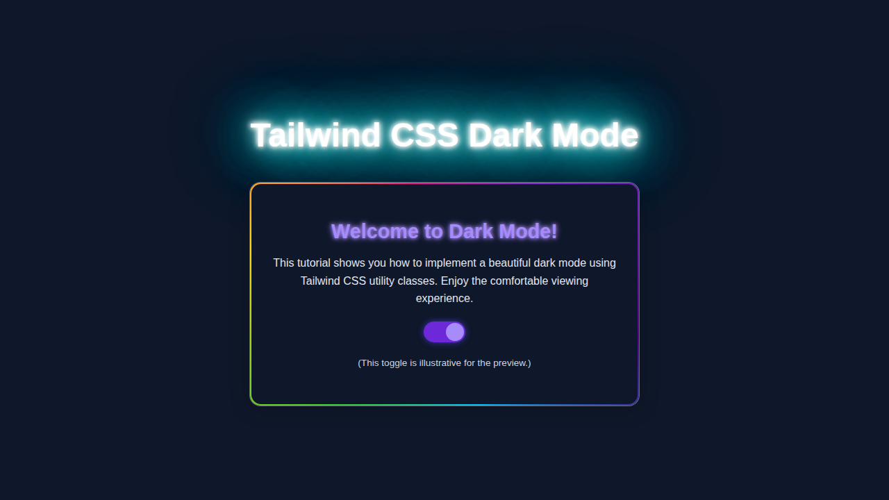
<body class="min-h-screen flex flex-col items-center justify-center p-6 bg-gray-50 text-gray-900 dark:bg-gray-900 dark:text-gray-100 transition-colors duration-300 ease-in-out">
<div class="mb-8 text-center">
<h1 class="text-3xl sm:text-4xl font-bold text-gray-800 dark:text-blue-300 mb-4 transition-colors duration-300">
Tailwind CSS Dark Mode
</h1>
<p class="text-base sm:text-lg text-gray-700 dark:text-gray-300 transition-colors duration-300">
Implement a dynamic dark mode using Tailwind CSS utility classes and a little JavaScript.
</p>
</div>
<div class="w-full max-w-md bg-white dark:bg-gray-800 rounded-lg shadow-xl p-6 sm:p-8 transition-all duration-300 ease-in-out border border-gray-200 dark:border-gray-700">
<div class="flex items-center justify-between mb-6">
<h2 class="text-xl sm:text-2xl font-semibold text-gray-900 dark:text-white transition-colors duration-300">
Theme Switcher
</h2>
<button id="themeToggle" role="switch" aria-checked="false" class="relative inline-flex flex-shrink-0 h-7 w-14 border-2 border-transparent rounded-full cursor-pointer transition-colors ease-in-out duration-300 focus:outline-none focus:ring-2 focus:ring-offset-2 focus:ring-blue-500
bg-gray-200 dark:bg-blue-600">
<span class="sr-only">Toggle theme</span>
<span aria-hidden="true" class="pointer-events-none inline-block h-6 w-6 rounded-full bg-white shadow transform ring-0 transition ease-in-out duration-300
translate-x-0 dark:translate-x-7">
<!-- Sun/Moon SVG icons for visual feedback -->
<svg class="h-full w-full p-0.5 text-gray-700 dark:text-yellow-400 dark:hidden" fill="none" viewBox="0 0 24 24" stroke="currentColor">
<path stroke-linecap="round" stroke-linejoin="round" stroke-width="2" d="M12 3v1m0 16v1m9-9h1M3 12H2m15.394 5.606l.707.707M5.293 5.293l-.707-.707M18.707 5.293l.707-.707M5.293 18.707l-.707.707M12 7a5 5 0 100 10 5 5 0 000-10z"></path>
</svg>
<svg class="h-full w-full p-0.5 text-gray-700 dark:text-yellow-400 hidden dark:block" fill="none" viewBox="0 0 24 24" stroke="currentColor">
<path stroke-linecap="round" stroke-linejoin="round" stroke-width="2" d="M20.354 15.354A9 9 0 018.646 3.646 9.003 9.003 0 0012 21a9.003 9.003 0 008.354-5.646z"></path>
</svg>
</span>
</button>
</div>
<p class="text-gray-700 dark:text-gray-300 mb-4 transition-colors duration-300">
This card, its text, and the background will gracefully adapt their colors based on the theme preference.
The toggle also saves your choice for future visits.
</p>
<button class="w-full py-2 px-4 rounded-md text-white font-medium
bg-blue-500 hover:bg-blue-600 focus:outline-none focus:ring-2 focus:ring-offset-2 focus:ring-blue-500
dark:bg-blue-700 dark:hover:bg-blue-800 dark:focus:ring-blue-700
transition-colors duration-300 ease-in-out">
Explore More Features
</button>
</div>
<script src="script.js"></script>
</body>
</html>CSS Styling with Tailwind CSS
Now, let’s make it look good! Tailwind CSS is going to do most of the heavy lifting here. We will use its utility classes. This lets us style our toggle without writing any custom CSS. We will define how our dark mode works. It will change backgrounds and text colors. This all happens automatically when the ‘dark’ class is present on the HTML element.
styles.css
/*
    This file acts as the input for Tailwind CSS CLI.
    It contains the core Tailwind directives.

    To process this file and generate your final CSS (e.g., to ./dist/output.css),
    make sure you have Tailwind CSS installed (npm install -D tailwindcss)
    and then run the following command in your terminal:

    npx tailwindcss -i ./styles.css -o ./dist/output.css --watch

    Ensure your tailwind.config.js is set up for 'darkMode: "class"'.
*/

@tailwind base;
@tailwind components;
@tailwind utilities;
JavaScript for Interactivity
Finally, we add the brains of our operation: JavaScript! This little script will handle the click events. It will also remember your user’s preference. This means if they leave your site in dark mode, it will stay in dark mode when they return. It is all about a smooth user experience, isn’t it?
script.js
/**
 * Script for Toggling Dark Mode
 *
 * This script manages the dark mode state by adding/removing the 'dark' class
 * on the `<html>` element and persists the user's preference in localStorage.
 * It also respects the system's preferred color scheme.
 */

document.addEventListener('DOMContentLoaded', () => {
    const themeToggle = document.getElementById('themeToggle');
    const htmlElement = document.documentElement; // Represents the <html> tag

    // Function to set the theme based on the 'isDark' boolean
    const setTheme = (isDark) => {
        if (isDark) {
            htmlElement.classList.add('dark');
            localStorage.setItem('theme', 'dark');
        } else {
            htmlElement.classList.remove('dark');
            localStorage.setItem('theme', 'light');
        }
        // Update ARIA attributes for accessibility
        themeToggle.setAttribute('aria-checked', isDark);
    };

    // Check for saved theme preference or system preference on load
    const savedTheme = localStorage.getItem('theme');
    const prefersDark = window.matchMedia('(prefers-color-scheme: dark)').matches;

    if (savedTheme === 'dark' || (!savedTheme && prefersDark)) {
        setTheme(true);
    } else {
        setTheme(false);
    }

    // Add event listener to the toggle button
    themeToggle.addEventListener('click', () => {
        const isCurrentlyDark = htmlElement.classList.contains('dark');
        setTheme(!isCurrentlyDark); // Toggle the theme
    });

    // Optional: Listen for changes in system preference if no explicit user preference is set
    window.matchMedia('(prefers-color-scheme: dark)').addEventListener('change', (e) => {
        if (!localStorage.getItem('theme')) {
            setTheme(e.matches);
        }
    });
});
How It All Works Together: Your Tailwind Dark Mode In Action
Let’s break down how these pieces fit together. This is where the real magic happens. We connect our HTML, Tailwind styles, and JavaScript. You will see your dark mode toggle spring to life!
The HTML Foundation
Our HTML provides the visual elements. We have a main container. Inside, there is a button. This button acts as our toggle switch. We also use an SVG for a sun or moon icon. This icon changes based on the theme. It gives clear visual feedback to the user. The HTML is super clean and semantic. This makes it easy to read and maintain for you.
Pro Tip: Always use semantic HTML elements where possible. This improves accessibility for everyone! Your website will be better for it.
Tailwind CSS: The Styling Powerhouse
Tailwind CSS is a game-changer for styling. It handles our dark mode beautifully. We define our dark mode colors in the tailwind.config.js file. Then, we use the dark: prefix with our utility classes. For example, dark:bg-gray-800 means ‘when the dark class is on the HTML tag, apply bg-gray-800.’ Otherwise, it uses the default light mode style. This approach makes your CSS very organized. It also prevents style conflicts. You can learn more about how Tailwind CSS handles dark mode directly from their documentation.
You can also check out our post on Tailwind CSS vs Plain CSS to see why these utilities are so powerful. It’s a great comparison!
JavaScript: The Brains Behind the Toggle
Our JavaScript is simple but powerful. It listens for a click on our toggle button. When clicked, it does two main things. First, it toggles the ‘dark’ class on the HTML <html> element. This tells Tailwind to switch its dark mode styles. Second, it saves the user’s preference. It uses localStorage for this. This way, the theme persists even after the user closes their browser. Check out the MDN Web Docs on Web Storage API for more on localStorage. It’s an important browser feature!
Remember: Persistence makes a huge difference in user experience. No one likes their settings to reset constantly. You’ve got this!
For more inspiration on dark mode designs, take a look at our Dark Mode Card with Tailwind CSS tutorial. It shows another cool implementation!
Tips to Customise It
You have built a fantastic dark mode toggle! Now, let’s make it uniquely yours. Here are some ideas to customize and extend your project:
- Change the Icons: Swap out the sun and moon SVGs. Use different icons from a library like Font Awesome. This can match your site’s aesthetic.
- Add Animations: Implement subtle transition effects. Make the background and text color changes smoother. Tailwind’s
transitionutilities are perfect for this. - System Preference Check: Enhance your JavaScript. Make it check the user’s system preference first. Use
window.matchMedia('(prefers-color-scheme: dark)'). This provides a truly native experience. - Multiple Themes: Go beyond just light and dark. Add a third ‘sepia’ or ‘high contrast’ theme. You can expand the logic in your JavaScript and Tailwind config.
Conclusion: You Did It!
Wow, you just built a fully functional and dynamic Tailwind Dark Mode toggle! Give yourself a huge pat on the back. You have integrated HTML, Tailwind CSS, and JavaScript seamlessly. This is a crucial skill for any modern web developer. You now have the power to enhance user experience significantly. Feel proud of what you’ve accomplished today. Share your creation with your friends. Show off your new skill! Keep coding, keep building, and stay awesome. We can’t wait to see what you create next!