Responsive Landing Page with Tailwind CSS: A Complete Guide
Hey there, future web wizard! If you've ever dreamed of building a professional-looking Responsive Landing Page but felt overwhelmed, you're in the perfect spot. Today, we're diving into creating a gorgeous business landing page. We will use plain HTML and the super powerful Tailwind CSS. Get ready to impress! This project is exciting and totally achievable.
What We Are Building
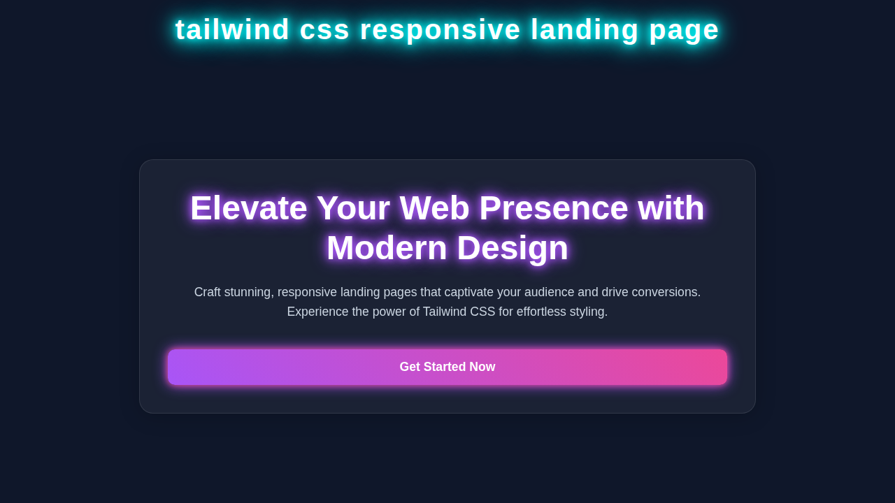
We're going to craft a modern, clean, and fully responsive business landing page. This page will look fantastic on any device. From a giant desktop monitor to a tiny phone screen, it will adapt beautifully. It's perfect for showcasing a product, service, or your own portfolio. Plus, you'll learn key responsive design techniques!
HTML Structure
Our HTML will provide the backbone for our page. We will use semantic tags to ensure good accessibility and structure. Don't worry, we'll keep it clean and easy to understand. Each section will have a clear purpose. We will then sprinkle Tailwind CSS classes throughout.
index.html
<!DOCTYPE html>
<html lang="en">
<head>
    <meta charset="UTF-8">
    <meta name="viewport" content="width=device-width, initial-scale=1.0">
    <title>Responsive Landing Page with Tailwind CSS</title>

    <!-- Tailwind CSS CDN for quick setup. For production, consider a build process. -->
    <script src="https://cdn.tailwindcss.com"></script>

    <!-- Custom styles for any overrides or base settings (e.g., box-sizing) -->
    <link rel="stylesheet" href="styles.css">

    <!-- Tailwind CSS configuration (optional, but good for custom themes/plugins) -->
    <script>
        tailwind.config = {
            theme: {
                extend: {
                    fontFamily: {
                        sans: ['ui-sans-serif', 'system-ui', '-apple-system', 'BlinkMacSystemFont', "Segoe UI", 'Roboto', "Helvetica Neue", 'Arial', "Noto Sans", 'sans-serif', "Apple Color Emoji", "Segoe UI Emoji", "Segoe UI Symbol", "Noto Color Emoji"]
                    },
                    animation: {
                        'fade-in-up': 'fadeInUp 0.8s ease-out'
                    },
                    keyframes: {
                        fadeInUp: {
                            '0%': { opacity: '0', transform: 'translateY(20px)' },
                            '100%': { opacity: '1', transform: 'translateY(0)' }
                        }
                    }
                }
            }
        }
    </script>
</head>
<!--
    Production-ready:
    - Safe fonts (font-sans uses a stack including Arial, Helvetica, sans-serif).
    - Antialiased text for better rendering.
    - Consistent leading and tracking.
    - Dark background and light text for a modern feel.
-->
<body class="font-sans antialiased text-gray-100 bg-gray-900 leading-normal tracking-wide">
    <!-- Header Section -->
    <header class="bg-gray-800 p-4 shadow-lg">
        <nav class="container mx-auto flex items-center justify-between flex-wrap">
            <!-- Logo -->
            <a href="#" class="flex items-center flex-shrink-0 text-white mr-6">
                <span class="font-bold text-xl tracking-tight">YourLogo</span>
            </a>

            <!-- Mobile Navigation Toggle -->
            <div class="block lg:hidden">
                <button id="nav-toggle" class="flex items-center px-3 py-2 border rounded text-gray-200 border-gray-400 hover:text-white hover:border-white">
                    <svg class="fill-current h-3 w-3" viewBox="0 0 20 20" xmlns="http://www.w3.org/2000/svg"><title>Menu</title><path d="M0 3h20v2H0V3zm0 6h20v2H0V9zm0 6h20v2H0v15z"/></svg>
                </button>
            </div>

            <!-- Navigation Links & CTA -->
            <div id="nav-content" class="w-full flex-grow lg:flex lg:items-center lg:w-auto hidden lg:block pt-6 lg:pt-0">
                <div class="text-sm lg:flex-grow">
                    <a href="#" class="block mt-4 lg:inline-block lg:mt-0 text-gray-300 hover:text-white mr-4 transition duration-300">Home</a>
                    <a href="#features" class="block mt-4 lg:inline-block lg:mt-0 text-gray-300 hover:text-white mr-4 transition duration-300">Features</a>
                    <a href="#testimonials" class="block mt-4 lg:inline-block lg:mt-0 text-gray-300 hover:text-white mr-4 transition duration-300">About</a>
                    <a href="#contact" class="block mt-4 lg:inline-block lg:mt-0 text-gray-300 hover:text-white transition duration-300">Contact</a>
                </div>
                <div>
                    <a href="#signup" class="inline-block text-sm px-4 py-2 leading-none border rounded text-white border-white hover:border-transparent hover:text-gray-900 hover:bg-white mt-4 lg:mt-0 transition duration-300">Sign Up</a>
                </div>
            </div>
        </nav>
    </header>

    <!-- Hero Section -->
    <section class="relative bg-gradient-to-r from-gray-900 to-indigo-900 py-20 md:py-32 flex items-center justify-center min-h-[calc(100vh-64px)] overflow-hidden">
        <div class="container mx-auto px-6 text-center z-10">
            <h1 class="text-4xl md:text-6xl font-extrabold text-white mb-6 animate-fade-in-up">
                Launch Your Vision with Stunning Landing Pages
            </h1>
            <p class="text-xl md:text-2xl text-gray-300 mb-10 max-w-3xl mx-auto animate-fade-in-up delay-200">
                Beautifully designed, fully responsive, and easy to customize with Tailwind CSS.
            </p>
            <div class="space-x-4 animate-fade-in-up delay-400">
                <a href="#get-started" class="bg-indigo-600 hover:bg-indigo-700 text-white font-bold py-3 px-8 rounded-full shadow-lg transition duration-300 ease-in-out transform hover:scale-105">
                    Get Started
                </a>
                <a href="#learn-more" class="bg-gray-700 hover:bg-gray-600 text-white font-bold py-3 px-8 rounded-full shadow-lg transition duration-300 ease-in-out transform hover:scale-105">
                    Learn More
                </a>
            </div>
        </div>

        <!-- Background decorative elements for visual interest (subtle, abstract shapes) -->
        <div class="absolute inset-0 z-0 opacity-10">
            <svg class="w-full h-full" viewBox="0 0 100 100" preserveAspectRatio="xMidYMid slice" fill="url(#gradientOverlay)">
                <defs>
                    <linearGradient id="gradientOverlay" x1="0%" y1="0%" x2="100%" y2="100%">
                        <stop offset="0%" style="stop-color:rgb(79,70,229);stop-opacity:0.2" />
                        <stop offset="100%" style="stop-color:rgb(168,85,247);stop-opacity:0.2" />
                    </linearGradient>
                </defs>
                <!-- Example abstract path - could be more complex or multiple paths -->
                <path d="M0 0h100v100H0zM50 0C22.386 0 0 22.386 0 50s22.386 50 50 50 50-22.386 50-50S77.614 0 50 0z" />
            </svg>
        </div>
    </section>

    <!-- Features Section -->
    <section id="features" class="py-16 bg-gray-800">
        <div class="container mx-auto px-6 text-center">
            <h2 class="text-3xl md:text-4xl font-bold text-white mb-12">Powerful Features for Your Success</h2>
            <div class="grid grid-cols-1 md:grid-cols-2 lg:grid-cols-3 gap-10">
                <!-- Feature 1 -->
                <div class="bg-gray-700 p-8 rounded-lg shadow-xl hover:shadow-2xl transition duration-300 ease-in-out transform hover:-translate-y-2">
                    <div class="text-indigo-400 mb-4">
                        <!-- Example Icon -->
                        <svg class="w-12 h-12 mx-auto" fill="currentColor" viewBox="0 0 20 20" xmlns="http://www.w3.org/2000/svg"><path fill-rule="evenodd" d="M10 18a8 8 0 100-16 8 8 0 000 16zm3.707-9.293a1 1 0 00-1.414-1.414L9 10.586 7.707 9.293a1 1 0 00-1.414 1.414l2 2a1 1 0 001.414 0l4-4z" clip-rule="evenodd"></path></svg>
                    </div>
                    <h3 class="text-xl font-semibold text-white mb-4">Fully Responsive</h3>
                    <p class="text-gray-300">
                        Your landing page will look perfect on any device, from desktops to mobile phones, thanks to fluid layouts.
                    </p>
                </div>

                <!-- Feature 2 -->
                <div class="bg-gray-700 p-8 rounded-lg shadow-xl hover:shadow-2xl transition duration-300 ease-in-out transform hover:-translate-y-2">
                    <div class="text-purple-400 mb-4">
                        <!-- Example Icon -->
                        <svg class="w-12 h-12 mx-auto" fill="currentColor" viewBox="0 0 20 20" xmlns="http://www.w3.org/2000/svg"><path d="M11 3a1 1 0 10-2 0v1a1 1 0 102 0V3zM15.657 5.157a1 1 0 00-1.414-1.414l-.707.707a1 1 0 101.414 1.414l.707-.707zM18 10a1 1 0 01-1 1h-1a1 1 0 110-2h1a1 1 0 011 1zM14.293 15.707a1 1 0 00.707 1.707h.001a1 1 0 00.707-1.707l-.707-.707a1 1 0 00-1.414 1.414l.707.707zM10 18a1 1 0 01-1 1H9a1 1 0 110-2h1a1 1 0 011 1zM5.157 14.293a1 1 0 00-1.414 1.414l-.707.707a1 1 0 101.414 1.414l.707-.707zM3 10a1 1 0 01-1 1H2a1 1 0 110-2h1a1 1 0 011 1zM6.343 4.343a1 1 0 00-1.414 1.414l-.707-.707a1 1 0 10-1.414-1.414l.707.707z"></path><path fill-rule="evenodd" d="M10 12a2 2 0 100-4 2 2 0 000 4z" clip-rule="evenodd"></path></svg>
                    </div>
                    <h3 class="text-xl font-semibold text-white mb-4">Easy Customization</h3>
                    <p class="text-gray-300">
                        Leverage Tailwind CSS utility classes to effortlessly tailor every aspect of your design.
                    </p>
                </div>

                <!-- Feature 3 -->
                <div class="bg-gray-700 p-8 rounded-lg shadow-xl hover:shadow-2xl transition duration-300 ease-in-out transform hover:-translate-y-2">
                    <div class="text-cyan-400 mb-4">
                        <!-- Example Icon -->
                        <svg class="w-12 h-12 mx-auto" fill="currentColor" viewBox="0 0 20 20" xmlns="http://www.w3.org/2000/svg"><path d="M9 12l2 2 4-4m6 2a9 9 0 11-18 0 9 9 0 0118 0z"></path></svg>
                    </div>
                    <h3 class="text-xl font-semibold text-white mb-4">High Performance</h3>
                    <p class="text-gray-300">
                        Optimized for speed and SEO, ensuring a fast loading experience for your users.
                    </p>
                </div>
            </div>
        </div>
    </section>

    <!-- Testimonials Section -->
    <section id="testimonials" class="py-16 bg-gray-900">
        <div class="container mx-auto px-6 text-center">
            <h2 class="text-3xl md:text-4xl font-bold text-white mb-12">What Our Users Say</h2>
            <div class="grid grid-cols-1 lg:grid-cols-2 gap-10">
                <!-- Testimonial 1 -->
                <div class="bg-gray-800 p-8 rounded-lg shadow-xl flex flex-col items-center text-center hover:shadow-2xl transition duration-300 ease-in-out">
                    <img class="w-24 h-24 rounded-full mx-auto mb-6 border-4 border-indigo-500" src="https://via.placeholder.com/150/805ad5/ffffff?text=User1" alt="User Avatar">
                    <p class="text-lg text-gray-300 italic mb-4">
                        "This landing page template is exactly what I needed! Super easy to use and looks incredibly professional."
                    </p>
                    <p class="font-semibold text-white">- Jane Doe, CEO of ExampleCo</p>
                </div>

                <!-- Testimonial 2 -->
                <div class="bg-gray-800 p-8 rounded-lg shadow-xl flex flex-col items-center text-center hover:shadow-2xl transition duration-300 ease-in-out">
                    <img class="w-24 h-24 rounded-full mx-auto mb-6 border-4 border-purple-500" src="https://via.placeholder.com/150/c084fc/ffffff?text=User2" alt="User Avatar">
                    <p class="text-lg text-gray-300 italic mb-4">
                        "The responsiveness is flawless, and the utility-first approach of Tailwind made customization a breeze."
                    </p>
                    <p class="font-semibold text-white">- John Smith, Founder of CreativeHub</p>
                </div>
            </div>
        </div>
    </section>

    <!-- Call to Action Section -->
    <section id="contact" class="py-20 bg-gradient-to-r from-indigo-800 to-purple-800 text-white text-center">
        <div class="container mx-auto px-6">
            <h2 class="text-3xl md:text-5xl font-extrabold mb-6">Ready to Transform Your Online Presence?</h2>
            <p class="text-xl md:text-2xl mb-10 max-w-3xl mx-auto">
                Join thousands of satisfied users and create stunning, high-converting landing pages today.
            </p>
            <a href="#start-trial" class="bg-white text-indigo-700 hover:bg-gray-200 font-bold py-4 px-10 rounded-full shadow-lg transition duration-300 ease-in-out transform hover:scale-105 text-lg">
                Start Your Free Trial
            </a>
        </div>
    </section>

    <!-- Footer Section -->
    <footer class="bg-gray-900 py-10">
        <div class="container mx-auto px-6 text-center text-gray-400">
            <p class="mb-4">© 2023 YourCompany. All rights reserved.</p>
            <div class="flex justify-center space-x-6">
                <a href="#" class="hover:text-white transition duration-300 ease-in-out">Privacy Policy</a>
                <a href="#" class="hover:text-white transition duration-300 ease-in-out">Terms of Service</a>
                <a href="#" class="hover:text-white transition duration-300 ease-in-out">Sitemap</a>
            </div>
        </div>
    </footer>

    <!-- JavaScript for responsive navigation toggle -->
    <script>
        document.getElementById('nav-toggle').onclick = function() {
            document.getElementById('nav-content').classList.toggle('hidden');
        }
    </script>
</body>
</html>
CSS Styling
This is where Tailwind CSS shines! Instead of writing custom CSS, we will apply utility classes directly in our HTML. Tailwind provides classes for everything: colors, spacing, typography, and responsive breakpoints. This makes styling incredibly fast and consistent. We will see how these classes bring our design to life.
styles.css
/*
 * styles.css
 * This file contains any custom global styles or resets not fully covered by Tailwind CSS.
 * For this tutorial, we primarily rely on Tailwind utilities, so this file is minimal.
 */

/*
 * Ensure consistent box model across all elements.
 * Tailwind's preflight typically handles this, but it's good practice to ensure.
 */
*,
::before,
::after {
    box-sizing: border-box;
}

/*
 * Apply base font family as a fallback, though Tailwind's font-sans stack is comprehensive.
 * It also helps ensure 'safe fonts only' in case Tailwind CDN fails or isn't loaded.
 */
body {
    font-family: Arial, Helvetica, sans-serif; /* A safe, widely available sans-serif font */
    /* Prevent horizontal scroll if content might overflow.
     * Tailwind's container class and max-width utilities usually manage this,
     * but it's a good global safety measure for a full page.
     */
    overflow-x: hidden;
}
JavaScript
We will add a touch of JavaScript to enhance our user experience. Specifically, we'll implement a simple toggle for our mobile navigation menu. This makes the navigation usable on smaller screens. It's a small but mighty addition!
How It All Works Together
Let's now explore how these individual code pieces combine. They form your amazing, fully functional Responsive Landing Page. Indeed, each section plays a crucial role. It contributes significantly to the overall user experience.
The Head Section and Tailwind Setup
First, we include the necessary boilerplate HTML. This includes <!DOCTYPE html> and the <html>, <head>, <body> tags. Inside the <head>, we link our Tailwind CSS stylesheet. This link is absolutely essential for all our styling. Without it, Tailwind's utility classes would not work. Furthermore, we set up our viewport meta tag. This tag is incredibly important. It tells browsers how to control the page's dimensions and scaling. Specifically, width=device-width, initial-scale=1.0 ensures your page adapts to the device's screen size. This setup is crucial for true responsiveness. You can delve deeper into the importance of the viewport meta tag on MDN Web Docs.
The Navigation Bar
Our navigation bar is key for user experience. It needs to be perfectly functional on all devices. We achieve this using Tailwind's powerful responsive classes. For example, we might use hidden md:flex on our main menu items. This hides the menu on small screens by default. Then, it gracefully displays it as a flex container on medium screens (md) and larger. We also include a "hamburger" icon for mobile navigation. This icon is usually only visible on small screens. It typically has classes like md:hidden. When a user clicks it, our JavaScript will reveal the hidden menu. Building a truly responsive navigation bar is a fundamental web development skill. In fact, you can find more detailed guidance in our tutorial on Responsive Navbar with Tailwind CSS: HTML & JavaScript Tutorial.
Utility-first CSS, like Tailwind, means you build complex components from a small set of single-purpose classes. It's like having a giant box of LEGOs. You can construct almost anything you can imagine, piece by tiny piece!
The Hero Section
The hero section is the very first thing visitors see. Therefore, it needs to be impactful and grab attention immediately! We will use a strong, benefit-driven headline. We will also add a clear, compelling call-to-action button. Tailwind classes like text-5xl md:text-6xl ensure our text scales beautifully with different screen sizes. This keeps the text readable and prominent. Background images or colors add significant visual appeal. Furthermore, generous padding and margins, such as py-20 (padding-top and -bottom) and px-4 (padding-left and -right), create essential breathing room. This improves readability and overall aesthetic.
Features or Services Section
Here, we highlight what our business proudly offers. This section often benefits greatly from a grid layout. Tailwind's grid grid-cols-1 md:grid-cols-2 lg:grid-cols-3 is absolutely perfect for this. It makes our feature cards stack vertically on very small screens. Then, they gracefully arrange into two columns on medium screens. On larger screens, they align into three columns. Each individual feature card will typically contain an engaging icon, a clear title, and a concise description. These elements work together to present information effectively.
Call-to-Action (CTA) Section
This vital section aims to encourage users to take the next desired step. That might be signing up for a service, contacting your team, or learning more. A prominent, well-designed button is absolutely key here. We use Tailwind for robust button styling. For example, bg-blue-600 hover:bg-blue-700 text-white font-bold py-3 px-6 rounded-full creates a visually appealing button. The hover: prefix adds a subtle but effective interactive element. This combination ensures a polished and clickable button.
The Footer
The footer typically resides at the bottom of your page. It contains important, secondary information. This includes copyright details, contact information, and sometimes additional navigation links. It should remain simple, clean, and highly functional. We'll leverage Tailwind for consistent spacing, typography, and layout. Perhaps we'll even add some sleek social media icons! This provides a professional and complete feel to your page.
Don't just copy-paste! Seriously, take the time to experiment with different Tailwind classes. Change up colors, fonts, and spacing to truly make the design uniquely yours. This hands-on exploration is exactly how you deepen your learning!
JavaScript for Mobile Navigation
Our small but mighty JavaScript snippet serves one crucial purpose. It detects click events on the mobile menu button. When a user clicks this button, the script toggles a specific class on the navigation menu element. This class usually changes the menu's display property from hidden to block, or it applies a transform to slide it into view. This ensures a smooth and accessible mobile navigation experience. It's a very common and essential pattern in modern web development. You can further explore similar JavaScript interactions, like those for a Tailwind dark mode toggle, to enhance your interactive skills.
Tips to Customise Your Responsive Landing Page
Now that you have a solid foundation, let's make it truly yours!
- Change the Color Scheme: Tailwind's configuration allows you to extend or override default colors. Experiment with different
bg-andtext-classes. You can even implement a dark mode! Check out our guide on Tailwind Dark Mode: HTML & Utility Classes Tutorial for inspiration. - Add More Sections: Think about testimonials, pricing plans, or an "About Us" section. Apply the responsive grid techniques you learned.
- Integrate Forms: Add a contact form or a newsletter signup form. You can style these beautifully with Tailwind classes. Learn more about form styling with CSS properties like
border-radiusandbox-shadowon CSS-Tricks. - Animate Elements: Use Tailwind's animation utility classes or custom CSS keyframes. Add subtle transitions on hover or when elements appear. This adds a polished feel to your page.
Conclusion
Wow, you did it! You just built a fully functional and beautiful Responsive Landing Page using HTML and Tailwind CSS. Give yourself a huge pat on the back. You've mastered key concepts in responsive design and modern styling. This project is a fantastic addition to your portfolio. Go ahead, show it off to your friends and colleagues! Keep coding, keep building, and keep learning. The web awaits your next awesome creation!