React Password Strength Indicator with Hooks Tutorial
Hey! If you have wanted to build a real-time Password Strength Indicator but had no idea where to start, you are in the right place. We are going to build something super cool today! This component helps users create stronger passwords. It gives instant feedback as they type. You will learn React Hooks and practical UI development.
What We Are Building: A Real-Time Password Strength Indicator
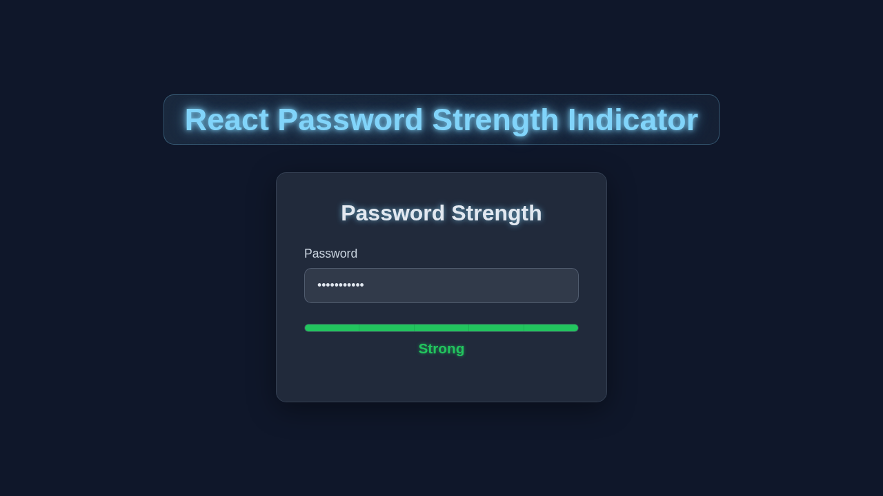
We are crafting a sleek and functional Password Strength Indicator. This component will show visual feedback. It tells users how strong their password is. Think of colored bars changing, or text messages updating. We will use React Hooks to manage its state. This makes our component dynamic and responsive. It’s not just cool, it’s a vital security feature. Your users will love this instant guidance!
HTML Structure
First, let’s lay out the basic structure for our component. This is where our password input lives. We also need a place to display strength feedback. It’s simple and clear. This foundational HTML makes everything else possible. Make sure you understand how <input> elements work. Check out the MDN docs on password input types for more details.
public/index.html
<!DOCTYPE html>
<html lang="en">
<head>
    <meta charset="utf-8" />
    <link rel="icon" href="%PUBLIC_URL%/favicon.ico" />
    <meta name="viewport" content="width=device-width, initial-scale=1" />
    <meta name="theme-color" content="#000000" />
    <meta
      name="description"
      content="React Password Strength Indicator with Hooks"
    />
    <title>React Password Strength Indicator</title>
</head>
<body>
    <noscript>You need to enable JavaScript to run this app.</noscript>
    <div id="root"></div>
</body>
</html>
CSS Styling
Next, we will make our component look fantastic with some CSS. We’ll add styles for the input field. Then, we will style the strength indicators. Colors will change based on strength. This visual feedback is super important for users. We can use cool features like CSS custom properties. These make our styles more flexible. Learn more about CSS custom properties on CSS-Tricks.
src/index.css
/* Apply box-sizing globally for consistent sizing */
*, *::before, *::after {
  box-sizing: border-box;
}

/* Basic body styles for the React app */
body {
  margin: 0;
  font-family: Arial, Helvetica, sans-serif; /* Safe font stack */
  -webkit-font-smoothing: antialiased;
  -moz-osx-font-smoothing: grayscale;
  background-color: #1a202c; /* Dark background for the app */
  color: #e2e8f0; /* Light text color */
  min-height: 100vh;
  display: flex;
  justify-content: center;
  align-items: center;
  padding: 20px;
}

/* Root div for the React app */
#root {
  width: 100%;
  display: flex;
  justify-content: center;
  align-items: center;
}
src/App.css
/* Container for the password strength indicator */
.password-strength-container {
  background: rgba(45, 55, 72, 0.8); /* Darker glassmorphism base */
  backdrop-filter: blur(10px);
  border-radius: 12px;
  border: 1px solid rgba(71, 85, 105, 0.5); /* Lighter border */
  padding: 30px;
  box-shadow: 0 8px 32px 0 rgba(0, 0, 0, 0.37);
  max-width: 450px;
  width: 100%;
  text-align: center;
  overflow: hidden; /* Prevent content overflow */
  transition: all 0.3s ease;
}

/* Title styling */
.title {
  color: #e2e8f0;
  font-size: 1.8em;
  margin-bottom: 25px;
  text-shadow: 0 0 5px rgba(129, 212, 250, 0.7); /* Subtle neon glow */
}

/* Input group styling */
.input-group {
  margin-bottom: 20px;
  text-align: left;
}

.input-group label {
  display: block;
  margin-bottom: 8px;
  color: #cbd5e0;
  font-size: 1em;
}

.input-group input[type="password"] {
  width: 100%;
  padding: 12px 15px;
  border: 1px solid rgba(113, 128, 150, 0.5);
  border-radius: 8px;
  background-color: rgba(255, 255, 255, 0.1);
  color: #e2e8f0;
  font-size: 1em;
  outline: none;
  transition: border-color 0.3s ease, box-shadow 0.3s ease;
}

.input-group input[type="password"]::placeholder {
  color: #a0aec0;
}

.input-group input[type="password"]:focus {
  border-color: #81d4fa; /* Neon blue focus effect */
  box-shadow: 0 0 8px rgba(129, 212, 250, 0.6);
}

/* Strength meter wrapper for layout */
.strength-meter-wrapper {
  margin-top: 25px;
  margin-bottom: 20px;
}

/* Strength meter bar */
.strength-meter {
  display: flex;
  width: 100%;
  height: 10px;
  background-color: #374151; /* Inactive bar color */
  border-radius: 5px;
  overflow: hidden;
  margin-bottom: 10px;
  transition: background-color 0.3s ease;
}

.strength-meter .strength-segment {
  height: 100%;
  transition: background-color 0.3s ease, width 0.3s ease; /* Smooth transitions */
}


/* Strength label text */
.strength-label {
  font-weight: bold;
  font-size: 1.1em;
  transition: color 0.3s ease;
}

/* Suggestions styling */
.suggestions {
  margin-top: 20px;
  text-align: left;
  background-color: rgba(55, 65, 81, 0.6);
  border-radius: 8px;
  padding: 15px;
  border: 1px solid rgba(71, 85, 105, 0.3);
}

.suggestions p {
  margin-top: 0;
  font-size: 0.95em;
  color: #cbd5e0;
}

.suggestions ul {
  list-style: none;
  padding: 0;
  margin: 10px 0 0 0;
}

.suggestions ul li {
  margin-bottom: 5px;
  font-size: 0.9em;
  color: #a0aec0;
  position: relative;
  padding-left: 15px;
}

.suggestions ul li::before {
  content: '•'; /* Bullet point */
  color: #81d4fa; /* Neon accent for bullets */
  font-size: 1.2em;
  position: absolute;
  left: 0;
  top: -2px;
}
React Component Logic
Now for the exciting part: the React component logic! We will use modern React Hooks here. useState will manage our password value and strength. useEffect will handle real-time strength calculations. This is where the magic happens, giving instant feedback. It makes our component intelligent.
src/index.js
import React from 'react';
import ReactDOM from 'react-dom/client';
import './index.css'; // Global styles for the app
import App from './App'; // The main App component

// Create a root and render the App component into it
const root = ReactDOM.createRoot(document.getElementById('root'));
root.render(
  <React.StrictMode>
    <App />
  </React.StrictMode>
);
src/App.js
import React, { useState, useEffect } from 'react';
import './App.css'; // Component-specific styles

const App = () => {
  const [password, setPassword] = useState('');
  const [strength, setStrength] = useState({ score: 0, level: 'None', color: '#cbd5e0', suggestions: [] });

  // Function to evaluate password strength
  const evaluatePasswordStrength = (pwd) => {
    let score = 0;
    let suggestions = [];

    // Rule 1: Length
    if (pwd.length >= 8) {
      score += 1;
    } else {
      suggestions.push('Minimum 8 characters');
    }

    // Rule 2: Contains lowercase letters
    if (/[a-z]/.test(pwd)) {
      score += 1;
    } else {
      suggestions.push('Lowercase letters');
    }

    // Rule 3: Contains uppercase letters
    if (/[A-Z]/.test(pwd)) {
      score += 1;
    } else {
      suggestions.push('Uppercase letters');
    }

    // Rule 4: Contains numbers
    if (/[0-9]/.test(pwd)) {
      score += 1;
    } else {
      suggestions.push('Numbers');
    }

    // Rule 5: Contains special characters
    if (/[!@#$%^&*()_+\-=\[\]{};':"\\|,.<>/?~]/.test(pwd)) {
      score += 1;
    } else {
      suggestions.push('Special characters');
    }

    let level = 'Weak';
    let color = '#ef4444'; // Red

    if (score >= 4) {
      level = 'Strong';
      color = '#22c55e'; // Green
    } else if (score >= 2) {
      level = 'Medium';
      color = '#f59e0b'; // Orange
    }

    // If password is empty, reset to 'None'
    if (pwd.length === 0) {
      level = 'None';
      color = '#cbd5e0'; // Gray
      score = 0;
      suggestions = [];
    }

    return { score, level, color, suggestions };
  };

  // UseEffect hook to re-evaluate strength whenever the password changes
  useEffect(() => {
    setStrength(evaluatePasswordStrength(password));
  }, [password]);

  // Determine meter segments based on score
  const getMeterSegments = () => {
    const segments = [];
    const maxScore = 5; // Max possible score
    const segmentWidth = 100 / maxScore;

    for (let i = 0; i < maxScore; i++) {
      let segmentColor = '#374151'; // Default inactive segment color
      if (i < strength.score) {
        // Active segments get the strength color
        segmentColor = strength.color;
      }
      segments.push(
        <div
          key={i}
          className="strength-segment"
          style={{
            width: `${segmentWidth}%`,
            backgroundColor: segmentColor,
          }}
        ></div>
      );
    }
    return segments;
  };

  return (
    <div className="password-strength-container">
      <h2 className="title">Password Strength Indicator</h2>
      <div className="input-group">
        <label htmlFor="password-input">Password:</label>
        <input
          type="password"
          id="password-input"
          value={password}
          onChange={(e) => setPassword(e.target.value)}
          placeholder="Enter your password"
          aria-label="Password input"
        />
      </div>

      <div className="strength-meter-wrapper">
        <div className="strength-meter" role="progressbar" aria-valuenow={strength.score} aria-valuemax="5" aria-valuetext={strength.level}>
          {getMeterSegments()}
        </div>
        <div className="strength-label" style={{ color: strength.color }}>
          {strength.level}
        </div>
      </div>

      {strength.level !== 'Strong' && password.length > 0 && strength.suggestions.length > 0 && (
        <div className="suggestions">
          <p>Improve your password by adding:</p>
          <ul>
            {strength.suggestions.map((suggestion, index) => (
              <li key={index}>{suggestion}</li>
            ))}
          </ul>
        </div>
      )}
    </div>
  );
};

export default App;
How Our Password Strength Indicator Works Together
Let me explain what’s happening here. This section breaks down the interaction. We connect our HTML, CSS, and React logic. Each piece plays a crucial role. You will see how they create a seamless user experience. This shows the power of modern web development.
Setting Up Our State with useState
Our Password Strength Indicator needs to track two main pieces of information. First, it tracks the actual password text the user types into the input field. We will store this text in a state variable. Let’s call this password. When the user types, this password state updates instantly. Then, our component needs to know the calculated strength level of that password. This strength could be a number, like a score from 0 to 4. Or, it could be a descriptive string, such as ‘weak’, ‘medium’, or ‘strong’. The useState hook is perfect for managing both of these dynamic pieces of data. It ensures our component remains responsive. When either the password or the strength state changes, React efficiently re-renders the necessary parts of our UI. This keeps everything synchronized and fast for the user.
Calculating Password Strength
This section is truly the brain of our component! Whenever the user types a new character, we need to assess the strength of their password in real-time. We will set up a robust set of checks for different criteria. These include evaluating the password’s length. We will also check for the presence of numbers, special symbols, and a mix of uppercase and lowercase letters. A common and effective approach is to assign a score or ‘points’ for each criterion that the password successfully meets. We then sum up these individual points to get an overall strength score. To ensure these calculations happen immediately as the user types, we will leverage a useEffect hook. This hook cleverly watches our password state variable. It runs our strength calculation logic every single time the password changes. This guarantees instant and accurate feedback, making our indicator truly dynamic. It helps users craft secure credentials effortlessly.
Pro Tip: For robust password strength calculations, consider using a library like
zxcvbn. It handles many complex patterns and common passwords. This saves you a lot of manual effort!
Dynamic Styling and Feedback
Providing clear and instant visual feedback is absolutely crucial for a fantastic user experience. Our component will dynamically change its appearance. This visual shift happens directly based on the recently calculated password strength. We achieve this by applying different CSS classes conditionally. These classes will instantly adjust the colors or widths of our progress bars. For a password deemed ‘weak’, you might see a striking red bar. For a ‘medium’ strength password, an orange bar could appear. And for a truly ‘strong’ password, a reassuring green bar lights up! Furthermore, we can update text messages. These messages will guide the user, like “Great password!” or “Needs improvement”. This instant visual cue is incredibly helpful for users. It makes the indicator intuitive, clear, and very easy to understand at a glance.
Putting It All Together in Our Component
Finally, we bring all these thoughtfully designed pieces together within our main React component. The input element is the starting point. It actively captures every character the user types. This input directly triggers an update to our password state variable. Once the password state updates, our useEffect hook springs into action. It diligently recalculates the password’s strength based on the new input. Then, our component’s rendering logic takes over. It carefully uses this updated strength value. This logic applies the correct, dynamic styles. It also ensures the appropriate feedback messages are displayed to the user. This entire flow creates a seamless, interactive, and highly responsive Password Strength Indicator. It’s a complete, helpful user journey, integrated right into your form experience.
Tips to Customise It
You have built a truly great foundation for a powerful component! Now, how can you take this further and make it even better for your specific needs?
-
More Detailed Feedback: Instead of simply displaying ‘weak’ or ‘strong’, dive deeper. Show specific suggestions to your users. You could tell them things like “add a number” or “use a special symbol.” This provides actionable advice. It guides them towards creating a stronger password effortlessly.
-
Custom Strength Rules: The beauty of building it yourself is flexibility. You can easily adjust the strength criteria. Maybe your application requires passwords to be a minimum of 12 characters. Or perhaps it demands two symbols instead of one. You can completely tweak the calculation logic to fit your precise security policies.
-
Visual Enhancements: Don’t stop at basic colors! Experiment with even more engaging UI elements. Try animated progress bars that smoothly fill up. You could also integrate custom icons that visually represent strength levels. For incredibly precise control over the visual sizing and animations of your indicator bars, you might even consider using a specialized React Element Size Hook! This makes your UI truly unique and delightful.
-
Integrate with Form Validation: Connect this intelligent indicator to your overall form validation system. You could prevent form submission if the password is still too weak. This adds another critical layer of security to your application. If your form starts getting quite complex, managing state across many input fields can become tricky. In such cases, exploring a React Context API Guide: Master State Management approach could be incredibly beneficial. This helps avoid common issues like extensive prop drilling for components deeper down your tree.
Conclusion
Amazing job! You just built a functional and dynamic Password Strength Indicator using React Hooks. This is a valuable component for any web application. You mastered state management and real-time feedback. Feel proud of your work! Now, go ahead and integrate this into your next project. Share what you have built with the procoder09.com community! We love seeing your creations.
Keep experimenting, keep learning, and never stop building! Every component you create makes you a stronger developer. You’ve got this!