Hey there, fellow coder! You’ve probably been hearing the buzz about something called Tailwind CSS, right? It’s genuinely everywhere these days, dominating tech discussions. Maybe you’ve seen snippets, or perhaps you’re wondering what all the fuss is truly about. Today, we’re diving deep into the core idea behind it: Utility-First CSS. This approach is truly changing how many of us build websites. It represents a fresh, incredibly efficient way to think about styling. And I promise you, it’s far simpler to grasp than it initially sounds.
So, what exactly is Utility-First CSS in plain language? Imagine you’re building with high-quality LEGO bricks. Each individual brick has one very clear, specific purpose. One brick creates a flat surface. Another connects two pieces with a specific angle. You combine these distinct, simple bricks, assembling them directly, to construct something truly amazing. That’s precisely what Utility-First CSS does for your web styling. Instead of writing sprawling, custom CSS rules for every unique component, you consistently use tiny, single-purpose CSS classes. These classes are designed to do just one job, and they do it well. For example, text-red-500 makes your text a specific shade of red. Similarly, p-4 consistently adds a standard amount of padding around an element. You attach these small, descriptive helper classes directly to your HTML elements, right where you need them. This represents a significant shift from the way we traditionally write CSS. Usually, you would create larger, semantic classes. You might typically have .card-title or perhaps .button-primary. With the utility-first philosophy, however, you combine many small utility classes. Tailwind CSS is undoubtedly the most popular tool embracing this powerful methodology. It provides you with a vast, thoughtfully organized collection of these invaluable “LEGO bricks,” ready for instant use.
Why Utility-First CSS Matters to You, The Developer
This new, streamlined way of styling brings incredibly tangible benefits, especially for you, the busy developer. First and foremost, you will develop user interfaces much, much faster. Consider this: you no longer need to spend precious time debating verbose class names. You simply pick the precise utility you need, applying it directly. This saves immense amounts of development time. Consequently, you can focus more on functionality. Second, your designs will achieve remarkable consistency. When you rely on pre-defined utilities, you drastically reduce the number of custom, one-off styles. This then translates to fewer visual inconsistencies across your entire project. Every element, every component, will look and feel cohesive and professional. Your site will simply radiate polish.
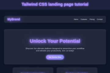
Furthermore, it vastly improves the maintainability of your codebase. Changes become incredibly localized. If you ever need to tweak a specific button’s appearance, you modify the classes on that very button directly within your HTML. You don’t have to hunt through a massive, potentially convoluted CSS file to find the right selector. This makes finding and fixing things an absolute breeze for you. Also, it’s fantastic for building responsive layouts. Tailwind CSS, for instance, has cleverly built-in utilities specifically for different screen sizes. You can effortlessly make an element appear one way on a mobile phone and another, distinct way on a larger desktop screen. It’s truly powerful. If you’ve ever wrestled with complex, nested media queries, this system will feel like pure magic. Want to see this responsive power in action? Learn how to craft a beautiful Responsive Landing Page with Tailwind CSS right here on our blog! It masterfully shows how these versatile utilities come together. You’ll build faster. You’ll build better. And you will absolutely love the clean, predictable results.
Peeking Behind the Curtain: How Utility-First CSS Actually Works
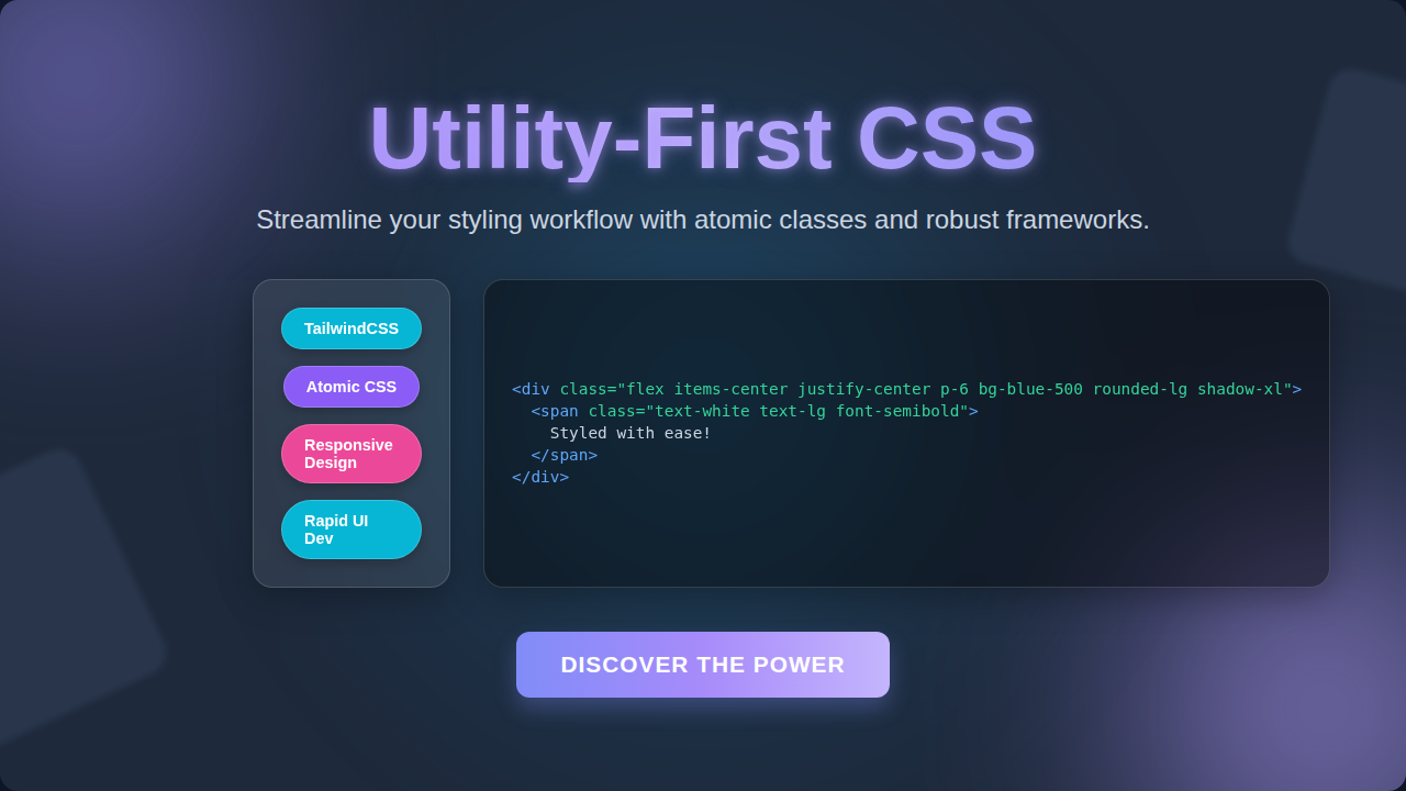
Let’s zoom in a bit more on the mechanics. How does this remarkable styling system truly operate day-to-day? Instead of opening your traditional style.css file to laboriously write brand-new rules, you go straight to your HTML markup. You then add very specific, single-purpose utility classes directly to your HTML tags. Do you want to center some text? You simply add the class text-center. Do you perhaps need a consistent amount of space around an image? You effortlessly add m-4 for a standard margin all around. It’s truly like meticulously picking individual ingredients for a gourmet meal. You might combine flex, justify-center, and items-center to perfectly position a group of elements within a container. These small, descriptive classes map directly to single, often atomic, CSS properties. For example, the font-bold class is essentially an efficient shortcut for font-weight: bold;. The real beauty here is that Tailwind provides hundreds, even thousands, of these well-defined utilities. You don’t invent new styles. You simply use what’s already thoughtfully available to you.
This approach means you intuitively spend more of your time working within your HTML. Consequently, you spend much less time context-switching back and forth between separate HTML and CSS files. This speeds up your workflow considerably. The coolest part about Tailwind specifically? It intelligently processes your code during the build stage of development. It only generates the CSS that you actually use in your project. This “tree-shaking” keeps your final stylesheet incredibly lean and highly performant. It effectively prevents the dreaded problem of bloated CSS files. For a very practical, hands-on look, make sure to check out our detailed guide on how to build a stunning Tailwind Product Card. You’ll visually observe how all these tiny, individual classes collaboratively create a complete, elegant UI component. You can also explore how to implement cutting-edge features like Tailwind Dark Mode by leveraging these very same utility classes. Imagine styling complex UIs without writing a single line of custom CSS! It’s genuinely a game-changer for many developers. You are effectively describing the desired style directly within your markup, making the intention clear. Want to dive even deeper into the fundamental CSS properties themselves? Check out this excellent, comprehensive resource on CSS Layouts from MDN. It’s a goldmine of information.
“But Isn’t That Just Inline Styles?” Clearing Up Common Utility-First CSS Confusions
This is probably the most frequent question you’ll encounter. You might understandably think, “This looks uncannily like inline styles!” It’s a fair point. After all, you are applying styles directly within your HTML markup. However, there’s a crucial, fundamental difference you need to grasp. Traditional inline styles, like style="color: red; font-weight: bold;", are fundamentally arbitrary. You can type any value. They also inherently possess the highest specificity. This makes them notoriously difficult to override later.
Utility classes, conversely, are profoundly different. They are always constrained. You don’t freely pick any color: #123456;. Instead, you use text-red-500 or text-blue-700. These specific values come from a meticulously pre-defined design system. This system ensures consistent visual language. It actively prevents design drift. Moreover, utility classes are inherently reusable. You apply the very same flex class across countless different elements. Inline styles are unique to that one specific element. Furthermore, Tailwind beautifully handles responsive design. You can effortlessly specify md:text-lg for different text sizes across different screen sizes. Inline styles simply cannot offer that. You can even style complex pseudo-classes like hover states with hover:bg-blue-500. Inline styles are incapable of achieving this directly.
When you thoughtfully use Tailwind, it processes your entire project. It intelligently removes any unused utility classes from your final CSS bundle. This crucial “purging” step keeps your file size incredibly tiny. Inline styles, on the other hand, just add unnecessary bloat directly into your HTML.
“Utility classes are truly like a carefully curated, highly versatile wardrobe. You effortlessly mix and match pre-chosen, complementary pieces that always look good together. This is far more efficient than needing to custom-sew a brand-new, unique outfit for every single occasion you encounter.”
It’s a powerful and essential distinction to make. Understanding this helps you deeply appreciate the true power and elegance of Utility-First CSS. To see how traditional CSS structuring works, you might find this insightful article on BEM Naming Convention on CSS-Tricks interesting for a direct comparison of methodologies.
Your Toolkit for Success: Key Takeaways
So, what absolutely essential points should you remember from our friendly chat today? First, Utility-First CSS, especially when powered by Tailwind, fundamentally prioritizes development speed. You will undoubtedly build impressive user interfaces much, much faster than you ever have before. Second, it rigorously enforces design consistency. This means your projects will consistently look polished, professional, and entirely cohesive across the board. Third, maintenance becomes an absolute breeze for you. You’ll spend significantly less time debugging elusive style issues and more time building. You gain incredible, granular control over your designs. There is a small, manageable learning curve, of course. You’ll need to familiarize yourself with Tailwind’s specific class names and conventions. However, once you comfortably grasp them, your entire workflow will undergo a remarkable transformation. It’s very much like learning a brand-new language. At first, it might feel a little awkward, perhaps even a bit clunky. Yet, very soon, you’ll find yourself speaking it fluently and intuitively. Many experienced developers, myself definitely included, find it genuinely hard to revert to traditional CSS after experiencing this level of efficiency.
“Embrace the journey and the small steps along the way. Each individual utility class you learn is a powerful new tool to add to your ever-growing styling arsenal. Very soon, you’ll be confidently crafting beautiful, highly responsive interfaces with unparalleled speed and immense satisfaction.”
This modern approach is not merely a passing trend. Instead, it’s a proven, effective methodology. It specifically helps you focus directly on the user interface, right in your markup. You receive instant, gratifying visual feedback as you build. It truly streamlines and supercharges your entire development process. You’re effectively building directly in the browser, seeing results immediately.
You’ve now successfully gained a solid, foundational grasp of Utility-First CSS and precisely why Tailwind is proving to be so incredibly impactful in modern web development. This isn’t just about adopting a new tool; it’s profoundly about embracing a powerful new mindset for styling your projects. It unequivocally empowers you to build truly amazing, high-quality user interfaces with remarkable efficiency. So, please, don’t be afraid to dive in and enthusiastically experiment! Start with a small, manageable project. Perhaps build a simple product card or a dynamic navigation bar. You’ll very quickly witness the styling magic happen right before your eyes. The exciting web development landscape is always evolving, and Utility-First CSS represents a significant, powerful evolution. It will absolutely make your styling life easier, more predictable, and much more enjoyable. Go on, give it a real try! You’ve definitely got this, and I’m excited for you.