Glassmorphism Card CSS Tutorial: HTML & CSS Only
Hey! If you have wanted to build a captivating Glassmorphism Card but weren’t sure where to begin, you’re in the perfect spot. We’re diving into creating that sleek, frosted glass look that designers absolutely love. Get ready to build something truly stunning with just HTML and CSS!
What We Are Building
We are going to craft a beautiful UI component today. This component features a translucent, frosted glass effect. It’s perfect for modern web interfaces. Imagine a sleek card that subtly blurs whatever is behind it. It adds depth and sophistication to your designs. We’ll make it responsive too. This project will teach you key CSS properties. These properties are super useful for many other cool effects. You will love adding this to your portfolio.
HTML Structure
First, we need a solid foundation for our card. Our HTML will be straightforward and semantic. It creates the basic elements we’ll style into our beautiful glassmorphism card. We will wrap everything in a main container. Then we’ll add a card element inside it. That card will hold our content. It’s a simple, clean setup for maximum impact.
index.html
<!DOCTYPE html>
<html lang="en">
<head>
<meta charset="UTF-8">
<meta name="viewport" content="width=device-width, initial-scale=1.0">
<title>Glassmorphism Card</title>
<!-- Link to our stylesheet -->
<link rel="stylesheet" href="styles.css">
</head>
<body>
<!-- Main container to center the card on the page -->
<div class="container">
<!-- The Glassmorphism Card Component -->
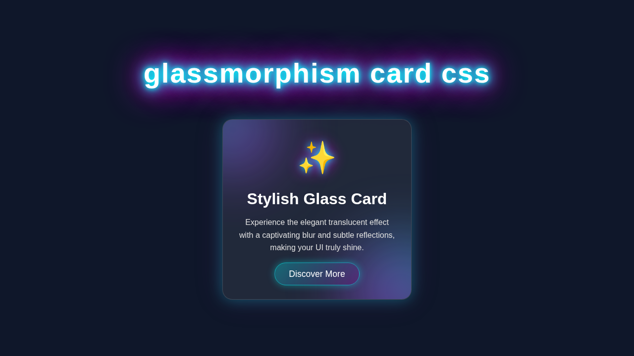
<div class="glass-card">
<!-- Card Icon (using an emoji for simplicity) -->
<div class="card-icon">🌟</div>
<!-- Card Title -->
<h2 class="card-title">Elegant UI Component</h2>
<!-- Card Description -->
<p class="card-text">
This beautiful card showcases the popular glassmorphism effect,
providing a modern and sleek translucent design for your web interfaces.
</p>
<!-- Call to Action Button -->
<a href="#" class="card-button">Learn More</a>
</div>
</div>
</body>
</html>
CSS Styling
Now for the exciting part: bringing our card to life with CSS! This is where all the magic happens. We’ll apply styles to create the translucent effect. We’ll also add subtle borders and shadows. These details are key to the glassmorphism look. Get ready to make your card shine.
styles.css
/* Global Box-Sizing Reset */
/* Ensures consistent box model behavior across all elements */
* {
    box-sizing: border-box;
}

/* Body Styling: Centers content and sets a base background */
body {
    margin: 0;
    font-family: Arial, Helvetica, sans-serif; /* Safe, widely available fonts */
    background-color: #1a202c; /* A dark, subtle background */
    display: flex;
    justify-content: center;
    align-items: center;
    min-height: 100vh; /* Full viewport height */
    color: #ffffff; /* Default text color */
    overflow: hidden; /* Prevent body scrollbars if content slightly overflows */
}

/* Container for centering the card */
.container {
    display: flex;
    justify-content: center;
    align-items: center;
    width: 100%;
    max-width: 100%;
    padding: 20px; /* Add some padding around the card */
}

/* Glassmorphism Card Styling */
.glass-card {
    width: 350px;
    padding: 40px 30px;
    background: rgba(255, 255, 255, 0.1); /* Semi-transparent white background */
    border-radius: 15px;
    border: 1px solid rgba(255, 255, 255, 0.2); /* Subtle light border */
    backdrop-filter: blur(10px); /* The core glassmorphism blur effect */
    box-shadow: 0 4px 30px rgba(0, 0, 0, 0.1); /* Soft shadow for depth */
    text-align: center;
    overflow: hidden; /* Ensures inner elements don't spill */
    max-width: 100%; /* Responsive sizing */
    transition: transform 0.3s ease, box-shadow 0.3s ease; /* Smooth transitions for hover effects */
}

/* Hover effect for the card */
.glass-card:hover {
    transform: translateY(-5px); /* Lift the card slightly */
    box-shadow: 0 8px 40px rgba(0, 0, 0, 0.2); /* Enhance shadow on hover */
}

/* Card Icon Styling */
.card-icon {
    font-size: 3.5em;
    margin-bottom: 20px;
    color: #a0aec0; /* A light grey for the icon */
}

/* Card Title Styling */
.card-title {
    font-size: 2em;
    margin-bottom: 15px;
    font-weight: bold;
    color: #e2e8f0;
}

/* Card Text Styling */
.card-text {
    font-size: 1em;
    line-height: 1.6;
    margin-bottom: 30px;
    color: #cbd5e0;
}

/* Card Button Styling */
.card-button {
    display: inline-block;
    background: rgba(255, 255, 255, 0.15); /* Semi-transparent button background */
    border: 1px solid rgba(255, 255, 255, 0.3);
    color: #ffffff;
    padding: 10px 25px;
    border-radius: 25px;
    text-decoration: none;
    font-size: 1.1em;
    cursor: pointer;
    transition: background 0.3s ease, border-color 0.3s ease, transform 0.3s ease; /* Smooth transitions */
}

/* Button Hover Effect */
.card-button:hover {
    background: rgba(255, 255, 255, 0.25); /* More opaque on hover */
    border-color: rgba(255, 255, 255, 0.5);
    transform: translateY(-2px); /* Slight lift on hover */
}
JavaScript
For this specific Glassmorphism Card tutorial, we won’t need any JavaScript. Our goal is to achieve this stunning effect using pure HTML and CSS. This means no extra scripts are loaded. It keeps our project lightweight and fast. Pretty neat, right?
How It All Works Together
Let’s break down the magic behind our beautiful card. Each CSS property plays a vital role. Understanding these parts helps you customize your designs. You can then apply these concepts to other projects. Therefore, pay close attention to each step.
The Outer Container and Background
We start with a `body` element. It acts as our overall canvas. We set its height to fill the entire viewport. This ensures our card is nicely centered. We also add a background image. This image is crucial for showcasing the glassmorphism effect. The blur behind our card will be obvious against it. It’s an important visual anchor.
The .container class uses Flexbox. Flexbox helps us center our card perfectly. It aligns items both horizontally and vertically. This makes our layout robust. Check out our CSS Popover Positioning: Pure HTML & CSS Tutorial for more on precise element placement. It’s a fundamental layout technique for modern web design.
Creating the Glass Effect: The .glass-card
This is the heart of our Glassmorphism Card. First, we give it a subtle white background. We make it slightly transparent using rgba(). This allows the background image to show through. Then, the real star arrives: backdrop-filter: blur(10px);. This property applies a blur effect to whatever is *behind* the element. It’s like looking through frosted glass! This single line does most of the heavy lifting. Furthermore, we add a border. This border also uses an rgba() value for transparency. It provides a crisp edge to our card. This subtle detail enhances the effect greatly.
Pro Tip: The
backdrop-filterproperty is fantastic for modern UI. It creates unique depth effects. However, always check MDN Web Docs for browser compatibility. Most modern browsers support it well, though!
Adding Depth with Shadows
A good shadow makes your card pop. We use the box-shadow property here. We apply two distinct shadows. One is a softer, diffused shadow. This creates a general sense of depth. The second is a tighter, slightly darker shadow. It mimics a light source hitting the card. This combination gives a realistic, lifted appearance. It truly makes the card stand out. The shadows are subtle but powerful.
Styling the Card Content
Inside our .glass-card, we have some content. We give it padding for visual breathing room. Text color is set to white. This ensures good contrast against the translucent background. A `text-shadow` helps the text pop even more. It makes it legible and adds a touch of sophistication. Also, we center the text. This gives the card a clean, balanced look. Every detail contributes to a polished final product.
Educator’s Note: Understanding how `rgba()` works for colors and opacity is key. It allows you to create transparent elements. This is essential for any modern design trend!
Bringing it to Life with Hover Effects
Finally, we add a simple hover effect. When you mouse over the card, it scales up slightly. This provides subtle feedback to the user. It also makes the card feel interactive. The transition property ensures this movement is smooth. It adds to the overall premium feel. Simple interactions like this enhance user experience dramatically.
Tips to Customise It
You’ve built a fantastic card! Now, let’s make it truly yours:
- Change Backgrounds: Experiment with different background images or gradients. A colorful, vibrant background will make the blur effect even more striking.
- Adjust Blur Strength: Play with the pixel value in
backdrop-filter: blur();. A higher value means more blur, while a lower value makes it clearer. See what you like best! - Add More Elements: How about adding an icon or a button inside the card? You could even create a set of these cards to make a gallery!
- Interactive Elements: Explore more advanced hover effects. You could change the shadow or background color. Or, for more complex interactions, check out our guide on CSS Scroll Animations for inspiration. You might also want to look at creating interactive components like an Accessible CSS Dropdown Menu Tutorial with a similar aesthetic.
Conclusion
You did it! You’ve successfully built a beautiful Glassmorphism Card using nothing but HTML and CSS. You now understand the core concepts behind this popular design trend. We covered backgrounds, filters, shadows, and smooth transitions. These are powerful tools for any web developer. Share your creations with us on social media! We can’t wait to see what amazing designs you come up with. Keep coding, and keep creating!