Hey there, fellow coders!
If you’ve wanted to build a Responsive Navbar but had no idea where to start, you are in the right place. We’re going to create something truly awesome today. Imagine a navigation menu that looks great on any device. That’s exactly what we will build, step-by-step. Get ready to make your websites shine!
What We Are Building
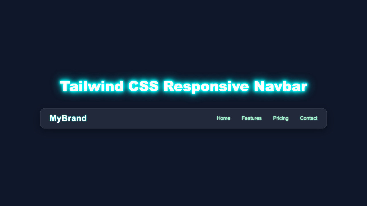
We’re diving into creating a modern, sleek navigation bar. This isn’t just any navbar. It fluidly adapts to different screen sizes. On big screens, you will see a clean horizontal menu. But then, on smaller devices, a neat toggle button appears! Clicking it reveals a mobile-friendly menu. This design is super useful for any website. It ensures a great user experience every time. You will learn fundamental responsive design principles too.
Before We Start
Before we dive into the code, let’s quickly make sure you have everything ready. You will need a basic understanding of HTML, CSS, and JavaScript. That’s it! Also, for Tailwind CSS, you should ideally have it set up in your project. If not, don’t worry. You can always use a CDN for this tutorial. Just know that a proper Tailwind setup is best for real-world projects. It’s super easy to get started. This guide will walk you through the core concepts regardless.
HTML Structure
Let’s kick things off with our HTML. This is the skeleton of our project. We will set up the main navigation elements. This includes our logo, menu items, and the special button for mobile views. Don’t worry, each part has a clear purpose. We’re keeping it simple and semantic.
index.html
<!DOCTYPE html>
<html lang="en">
<head>
    <meta charset="UTF-8">
    <meta name="viewport" content="width=device-width, initial-scale=1.0">
    <title>Responsive Navbar with Tailwind CSS</title>
    <!-- Link to your compiled Tailwind CSS (styles.css) -->
    <!-- For local development, ensure you've built your CSS: npx tailwindcss -i ./styles.css -o ./output.css -->
    <!-- Then link to output.css or whatever name you used. For this tutorial, we assume styles.css is the compiled output. -->
    <link href="./styles.css" rel="stylesheet">
</head>
<body class="font-sans antialiased bg-gray-900 text-gray-100 min-h-screen flex items-center justify-center p-4 box-border">

    <nav class="bg-gradient-to-r from-blue-600 to-purple-700 p-4 w-full max-w-6xl rounded-lg shadow-xl">
        <div class="container mx-auto flex justify-between items-center">
            <!-- Logo/Brand -->
            <a href="#" class="text-2xl font-bold text-white tracking-wide hover:text-blue-200 transition-colors duration-300">
                MyBrand
            </a>

            <!-- Desktop Navigation Links -->
            <div class="hidden md:flex space-x-6">
                <a href="#" class="text-white hover:text-blue-200 transition duration-300 ease-in-out px-3 py-2 rounded-md">Home</a>
                <a href="#" class="text-white hover:text-blue-200 transition duration-300 ease-in-out px-3 py-2 rounded-md">Features</a>
                <a href="#" class="text-white hover:text-blue-200 transition duration-300 ease-in-out px-3 py-2 rounded-md">Pricing</a>
                <a href="#" class="text-white hover:text-blue-200 transition duration-300 ease-in-out px-3 py-2 rounded-md">Contact</a>
            </div>

            <!-- Mobile Menu Button (Hamburger Icon) -->
            <div class="md:hidden">
                <button id="mobile-menu-button" class="text-white focus:outline-none p-2 rounded-md hover:bg-blue-800 transition-colors duration-200">
                    <svg class="w-8 h-8" fill="none" stroke="currentColor" viewBox="0 0 24 24" xmlns="http://www.w3.org/2000/svg">
                        <path stroke-linecap="round" stroke-linejoin="round" stroke-width="2" d="M4 6h16M4 12h16m-7 6h7"></path>
                    </svg>
                </button>
            </div>
        </div>

        <!-- Mobile Menu (Dropdown) -->
        <!-- This div uses max-h-0 and opacity-0 for its closed state, allowing for smooth CSS transitions. -->
        <!-- JavaScript will toggle these classes to max-h-screen and opacity-100. -->
        <div id="mobile-menu" class="md:hidden overflow-hidden transition-all duration-300 ease-in-out max-h-0 opacity-0 bg-blue-700/50 mt-4 rounded-lg py-0">
            <a href="#" class="block px-4 py-2 text-white hover:bg-blue-600 transition duration-200 ease-in-out rounded-md">Home</a>
            <a href="#" class="block px-4 py-2 text-white hover:bg-blue-600 transition duration-200 ease-in-out rounded-md">Features</a>
            <a href="#" class="block px-4 py-2 text-white hover:bg-blue-600 transition duration-200 ease-in-out rounded-md">Pricing</a>
            <a href="#" class="block px-4 py-2 text-white hover:bg-blue-600 transition duration-200 ease-in-out rounded-md">Contact</a>
        </div>
    </nav>

    <!-- Link to your JavaScript file -->
    <script src="./script.js"></script>
</body>
</html>
CSS Styling with Tailwind CSS
Now, for the styling! We’re using Tailwind CSS today. It’s a fantastic utility-first framework. This means we add classes directly to our HTML. We will style everything from text size to layout. Tailwind helps us make our Responsive Navbar look perfect. No more writing custom CSS from scratch!
styles.css
/*
 * Tailwind CSS setup:
 * This file contains the directives for Tailwind CSS.
 * To generate the actual CSS, you need to set up Tailwind CSS in your project.
 *
 * 1. Install Tailwind CSS: `npm install -D tailwindcss`
 * 2. Initialize Tailwind CSS: `npx tailwindcss init`
 * 3. Configure your `tailwind.config.js` to scan your HTML files (e.g., content: ["./*.html"]).
 * 4. Build your CSS: `npx tailwindcss -i ./styles.css -o ./output.css --watch`
 *    Then link to `./output.css` in your HTML.
 *
 * For a quick start without a build step, you can use the Tailwind CDN in your HTML's <head>:
 * <script src="https://cdn.tailwindcss.com"></script>
 * (However, local build is recommended for production for performance and customization.)
 */

@tailwind base;
@tailwind components;
@tailwind utilities;

/*
 * Custom styles can be added below if necessary, but the goal is to use Tailwind utilities primarily.
 * The mobile menu transition is handled by Tailwind's `transition-all`, `max-h-*`, and `opacity-*` classes,
 * toggled by JavaScript.
 */
JavaScript Magic
Finally, we add some interactivity with JavaScript. This little script brings our navbar to life. It handles the toggling of our mobile menu. When you click the button, the menu will show or hide. We only need a few lines of code. It’s super easy to understand.
script.js
/**
 * script.js
 * Handles the toggle functionality for the mobile navigation menu.
 */
document.addEventListener('DOMContentLoaded', () => {
    // Get references to the mobile menu button and the mobile menu itself
    const mobileMenuButton = document.getElementById('mobile-menu-button');
    const mobileMenu = document.getElementById('mobile-menu');

    // Add a click event listener to the mobile menu button
    mobileMenuButton.addEventListener('click', () => {
        // Toggle the 'max-h-0' class:
        // - When present, max-height is 0, hiding the menu content.
        // - When removed, it implies a larger max-height (e.g., max-h-screen or a specific value if set by other classes/inline style),
        //   allowing the content to be visible and animate its height.
        mobileMenu.classList.toggle('max-h-0');

        // Toggle the 'opacity-0' class:
        // - When present, opacity is 0, making the menu transparent.
        // - When removed, it implies opacity is 100%, making it fully visible.
        mobileMenu.classList.toggle('opacity-0');

        // Optional: Add/remove padding based on menu state for better visual transition
        // This ensures py-0 is active when closed and py-2 when open
        if (mobileMenu.classList.contains('max-h-0')) {
            mobileMenu.classList.add('py-0');
            mobileMenu.classList.remove('py-2');
        } else {
            mobileMenu.classList.remove('py-0');
            mobileMenu.classList.add('py-2');
        }
    });
});
How It All Works Together
Let’s break down how these pieces connect. Understanding this connection is key. We’re building a robust and interactive component. Therefore, let’s explore each part.
The HTML Foundation
First, our nav element acts as the absolute main container for everything. It holds our entire navigation structure. Inside this nav, you will find two primary sections. One section, often a div or span, is dedicated to your branding or logo. This is what users first see. The other main part holds our navigation links. These are the ul and li elements. They list out all the places users can go on your site. Also, a special button is there exclusively for mobile users. This button is super important! It will become visible on smaller screens. Its job is to toggle the menu’s visibility. Furthermore, notice the hidden class initially applied to the mobile menu itself. This is a brilliant Tailwind CSS class. It makes the menu invisible by default. However, the md:flex class ensures our menu appears horizontally and is visible on medium screens and larger. This shows our responsive design in action!
Styling with Tailwind CSS Classes
Now, for the really fun part! Tailwind CSS handles all the visual aspects of our navbar. It’s like having a superpower for styling. For example, bg-gray-800 quickly sets a dark, professional background color. Then, p-4 adds consistent padding around our entire navigation bar. This creates breathing room. We use flex and justify-between on the main nav container. These classes work together to space your logo and menu items perfectly. Your elements will spread out nicely. These utility classes are incredibly powerful. They let us control every detail: layout, spacing, colors, and typography.
Here’s the cool part: when the screen size changes, Tailwind’s responsive prefixes kick in. Classes like md:hidden or md:block are magical. They show or hide elements based on breakpoints. For instance, the mobile menu button is md:hidden, meaning it disappears on medium screens and up. Conversely, the main menu is hidden by default but md:flex, so it only shows horizontally on larger screens. This ensures our layout adjusts seamlessly to any device. Thus, the mobile menu only shows up precisely when it’s truly needed. This responsiveness is the beating heart of our Responsive Navbar!
Bringing it to Life with JavaScript
Our JavaScript code adds the dynamic behavior that makes our navbar interactive. First, we need to grab specific elements from our HTML. We use document.getElementById to select the menu button and the navigation links container. It’s like giving them a name in our script. We then attach an ‘event listener’ to the button. What exactly does an event listener do? It diligently waits for a specific action, like a user clicking the button. When that click happens, the fun begins!
Inside our event listener, we simply toggle the hidden class on the navigation links container. This means if hidden is there, it’s removed, making the menu appear. If hidden is not there, it’s added, making the menu disappear. It’s a simple yet incredibly effective interaction. This JavaScript makes our mobile menu fully functional. You can really see your code in action here! Observing your creation respond to user input is a very satisfying feeling. This small script ties everything together beautifully.
Tips to Customise It
You’ve built an awesome Responsive Navbar! Now, make it uniquely yours.
- Change the Colors: Play with different Tailwind
bg-andtext-classes. Maybe abg-blue-500ortext-yellow-300? See what fits your brand! - Add More Links: Simply add more
<a>tags inside yourulelements. Make sure they have relevanthrefattributes. - Smooth Transitions: For a fancier touch, add Tailwind’s
transition,duration, andease-in-outclasses to your menu. This makes the menu slide in smoothly. Check out the MDN Web Docs on CSS Transitions for more. - User Authentication: Consider adding “Login” and “Sign Up” buttons. You could make them appear conditionally. This creates a more dynamic user experience. CSS-Tricks has great articles on class manipulation with JavaScript.
- Explore other UI components: Now that you’ve mastered the navbar, try building a Retro Terminal UI: HTML & CSS Component Guide or even a cool Glitch Text Effect with HTML & CSS for your next project.
Conclusion
You did it! You successfully built a dynamic Responsive Navbar using Tailwind CSS and JavaScript. Give yourself a huge pat on the back. This is a foundational skill for any web developer. You now have a fantastic component for your future projects.
Building interactive components like this navbar sharpens your problem-solving skills and makes your portfolio shine. Keep building!
Remember, practice makes perfect. Try to integrate this into one of your own projects. Perhaps you can even style it like a GeoCities Card Design: HTML & CSS Tutorial for a nostalgic touch! Don’t hesitate to experiment with the code. Share your creations with us on social media. We love seeing what you build!
Every line of code you write is a step forward. You’re becoming an incredible developer, one project at a time.